Showing posts with label color. Show all posts
Monday, June 21, 2010
Saturday, April 28, 2007
IS COLOR EVIL?
I'm exaggerating of course, color isn't really evil, but it certainly is aggressive, scary, and alien.
What do you think of the Kokoschka watercolor above? Probably Kokoschka started out with the intention of making a weird, "edgy" picture but I can't help regarding it as a normal picture gone awry. I imagine the artist beginning by filling in a line drawing with color then wondering what would happen if he let the gray and red dabs find their own boundaries based on the intrinsic "will to power" of the color.
I imagine the artist being horrified to find color oozing out of every pore of the drawing til it mutilates and almost obliterates the human subject. In my fantasy the painter is amazed to see how blithely color takes a human-like life.
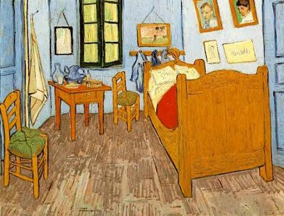
No, I'm not crazy. I'm just trying to see what would happen if I identified with the color I was using and gave it a sort of personality. I have a feeling a lot of painters do this. In the Van Gogh above I imagine the color feels tied down and restrained by all the lines. Artists frequently use lines and textures to anchor a color, to pin it in place, to subordinate it to line.
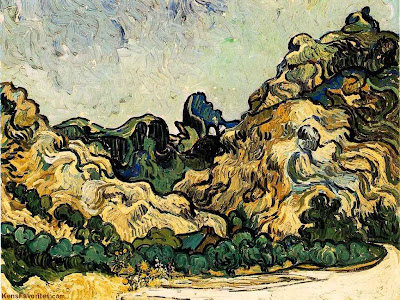
Here, in the bedroom painting, color is restrained another way, this time by being diluted with white or gray( or color mixtures that have the same effect as adding gray). The muted color is confined and imprisoned by the additives. It's made a slave to the line drawing that contains it. That's not a bad thing for us viewers. The restless color wants to break out of its bonds and our subconscious awareness of this struggle makes the muted color seem more alive and intense.
Another way to restrain color is with shape as in the Gauguin above. Simplified shapes make for strong walls that effectively keep color inside.
Gauguin got the idea of creating drawings that would approximate the natural borders the color would create for itself if it were unshackled. I don't mean that the color naturally wants to take the shape of a girl and a man's face. I mean the colors found a natural proportion in relation to one another and the girl is the subject the artist imposed on that proportion. The color still comes off as aggressive and unleashed but it's been tamed a little to suit the artist.
Monday, April 09, 2007
KANDINSKY'S COLOR THEORIES
It's unfortunate that most of the color theorists since Chevreul have been abstract painters rather than representational ones. I like to thumb through my Itten, Albers and Kandinsky color books once in a while but I have to admit that they're not very usefull. They are a lot of fun, though. Here just for the heck of it, are a couple of Kandinsky color theories. Maybe they'll spur you on to make theories of your own.
According to Kandinsky certain colors (above) have an affinity for certain forms. A dull shape like a circle deserves a dull color like blue. A shape with intermediate interest like a square deserves an intermediate color like red. A dynamic, interesting shape like a triangle deserves an enegetic, luminous, psychotic color like yellow.
A hexagon is midway in interest between a square and a triangle so it gets the midway color it deserves, orange. Toilet cover seats get green.
Lines also have an affinity for certain colors. Bold, dynamic lines like diagonals get a bold color like yellow. Less drastic diagonals get a less drastic color, red. Dead lines that are nearly horizontal get a dead color like black. Slightly active lines like verticals get a dull color like blue.
Kandinsky even has a theory about coloring lines according to their centrality in the composition. Lines in the middle get yellow. Sad, unloved lines that hug the edge of the frame should get dull colors.
Wednesday, February 07, 2007
A COUPLE MORE FAUVE PICTURES
Most of the cartoonists who visit here hate the Fauves. Me, I love them. Here's (above) a 1906 Derain showing the Thames near Charing Cross bridge in London. His color seems to have poured down into the water, caught fire, then was guided toward the indigo bridge by seething bits of green energy. What's not to like?
It would be a mistake to think of this as some kind of drug-induced LSD vision. Derain uses false colors in order to make us realize that the colors we see every day are just as bizzare. We should see color the way a formerly blind man would see them on his first few minutes of sight. For such a man shadows wouldn't be subordinated to local color, they'd be independent forms. Lines would just be lines, they wouldn't define a shape and colors would battle for dominance. This is the violent, alien world Derain paints for us!
Here (above) is Vlaminck, also 1906. Red leaves on the red trees are no longer content to be decoration. They radiate and burn themselves into the blue sky behind them. Leaves seperate from the trees and gyrate in mid-air. The red and pink path carries this crazy energy to other trees. It's an alien force being unleashed, a force that was there all the time but we never noticed it.
Of course I'm only guessing that this is what Vlaminck had in mind. Artists need to have fantasies about the pictures they paint so they can see their subjects in new and exciting ways, and the same goes for viewers.
Subscribe to:
Posts (Atom)