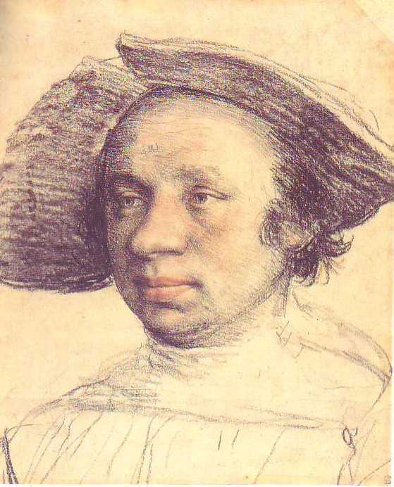
MOTHER EDDIE, WHAT'S THE BEST TIME TO MARRY?
The best time to marry is.....(drumroll!)...... in your early twenties! I know this runs counter to the common wisdom which says, "Enjoy life before you settle down! When you're finally ready, maybe in your early 30s, you'll have sown your wild oats and will be ready for a mature relationship." That's silly. If you wait that long you may not have any relationship at all. Here's why.
Let me digress and say that I came to this conclusion after watching Zeffirelli's "Romeo and Juliette" about a half dozen times in the span of a couple of weeks. When you see it that often it becomes clear that the play is not only about love but about youth. Only young people can love so passionately. Only young people would rather die than be seperated. Only young people can see each other through rose-colored glasses, ignoring each other's flaws and emphasizing each other's assets. Only young people are adaptive enough to change themselves to fit the requirements of the person they love. At this age nature is shouting at you through a bullhorn: "Get married!" "Have kids!" "This is the time!"

If you're still unmarried by the time you're 30 then you've been around the block. You know that life will continue even if you're jilted and that there's always other fish in the sea. You have standards the other person is expected to meet and if they don't...well, there's the door. You're guarded because you've had bad experiences with love. You always withold a little of yourself so you won't be devastated if the worst happens. You still want a romantic relationship but you've unwittingly removed the foundation that would make that possible.
By the time you're forty the list of attributes that you expect a lover to have is incredibly specific. If you like cats then he better like them too, in fact he better like the specific kind of cat that you like or else. I don't see a romance here but rather a legalistic negotiation.

I believe in romance. I want to be seen through rose-colored glasses and I want to see the person I'm attached to that way. Very few of us look good in the cold light of reality. I don't think romance is possible without a total commitment, without the belief that nothing will be right if you loose the other person. Since only young people can feel this way I conclude that all great romances must begin when the couples are young.
Are there exceptions? Yes, millions of them! So many that I hesitated to write what I did. I know people who met late in life and are as happy as it's possible to be. I also know people who've divorced because they married too early. Even so, I'll stick by romance and early marriage as the standard model from which there are many legitimate and happy variations.
BTW, Let me acknowledge the happy exception represented by two recently married friends, Kr. and Shv. These guys are perfect for each other and I don't think they could be any happier, even if they were teenagers like Romeo & Juliette.

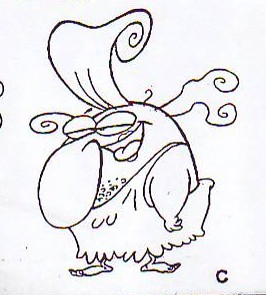
 I love to draw hands. That's because hands have a life of their own.
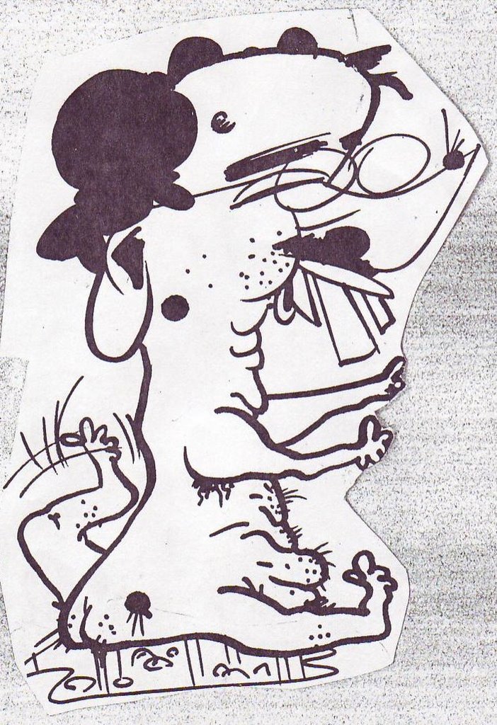
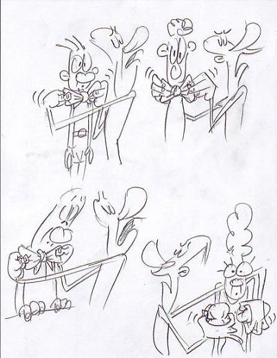 Hands are pretty good at revealing what their owner really thinks. A face may listen to a boring speaker with what looks like rapt attention but way down below the hands are playing with keys or tapping on the table. Sometimes the hands are more than just magnifiers of their owner's true feelings. Sometimes they have feelings of their own. Hands may be macho, gay, happy, sad, lecherous or virginal, even if their owner possesses none of these qualities (these thoughts cry out for drawings to illustrate them. Sorry, I didn't plan this post very well). I'd love to do a short, pencil-test film of an extreme version of this idea where a guy's hands, acting completely on their own, grope the people around him and get him into trouble.
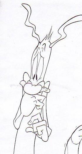 Here's a drawing where the excitable hand is frightened and clings to the face, which is only mildly disturbed. At least that's what I had in mind when I drew it. The understory about the excitable hand is sometimes for the artist only. Sometimes you want the understory to be so subtle that the audience isn't even aware of it.
 Most stories don't lend themselves to this hand theory and those I board the normal way, as above. Even so, it still works for the occassional scene. I'll try to find some examples.