Monday, January 09, 2012

A POST MODERN "MIRACLE ON 34TH STREET"


Which do you prefer: the old 1947 version of "Miracle on 34th Street," or the newer 1994 version? It's not a fair comparison because the older version had a bigger budget and some of the best stars and technicians of the day. Good writing, too. Even so, comparison is still possible.

I maintain that the biggest advantage the old version had was a philosophical one. People in those days had a more interesting way of seeing the world. We see things through a depressing Post Modern filter, or at least we did back in 1994 when the remake was made.

Let's take a look at some examples.....


Here's the start of the 1947 version: the titles are superimposed over a traveling backshot of Santa walking along Manhattan streets.  Introducing a robust, confident character with a backshot is a great way to create suspense, and the immersion in the life of the city alerts us to the film's subtext, which is that the modern world (and specifically New York) is a wonderful place to live.


The titles finish and Santa, who we'd only seen from the back til now, rounds a corner and stops to kibbitz when a shopkeeper goofs up his reindeer display. The back and forth between the two men establish Santa's personality. It works fine.


Now here's (above) the 1994 version. It starts with a frontal shot of Santa walking down a single street. The shot is made with a long lens, which flattens the background and robs it of its character.  No reveal, no subtext, and no color. Why is everything brown? I understand that it's cheaper to shoot this way, but is this really the best the director could do? What went wrong?

What went wrong is that the producer handed off a sentimental 40s story to an unsentimental Post Modern director. Unlike Woody Allen, the director just couldn't bring himself to cast New York in a positive light.


In the newer film Santa's character (above) is established by having him react to an astonished kid who recognizes him. It's not a bad way to go, but the handling was unimaginative. Too many close-ups, too long lenses, too few extras and pedestrian dialogue. And that's not all. 

Also at fault is the flat, deliberately deadening Post Modern way of staging.  Like atonal music, it's a bleak style that's deliberately meant to be flat and unsettling. Flat anesthetizes the senses. It's a style that fights the sentimental story it's trying to tell. It's a shame because you can tell that Richard Attenburough (Santa) had real enthusiasm for the role.


Here's the old version again. Santa (unseen here) discovers that the parade Santa is drunk , and storms off to report the problem to the coordinator, Maureen O'Hara, pictured above. It's all staged perfectly and there's plenty of extras. Everybody's looking at O'Hara...she's the center of attention, which is a good way to introduce a star. 


Here's (above) how the Post Modern version introduces its star. She's in a dark media truck loaded with video monitors. What gives? The parade coordinator is our star, and we can hardly see her.  

Okay, it's a cheap way to shoot, but it also fits with the Post Modern, Phillip Glass, trance rhythm of the film. The Post Modern style looks for broad patterns, and resists the notion of making scenes stand out. That's an odd style to choose for a classy story that begs for virtuoso scenes.  

I'll add that video monitors are a Post Modern symbol of alienation. How depressing!


Here's (above) the old version showing Natalie Wood and John Payne watching the parade from O'Hara's apartment. Seeing the parade reminds us of the exuberance and grandeur of the city. What the characters say has extra weight because the visuals connect them to the grand adventure below. 


Here's (above) a similar shot in the new version. No grand adventure here. Why is everything so dark and flat? And why is the parade reduced to shapes passing by the window? Couldn't the filmmaker afford to rent some stock parade footage? 

The bleak graphic treatment makes me feel that the parade is either menacing or uninteresting, and that the foreground figures are hiding out to avoid it. How odd for a film that's supposed to be glorifying Christmas. You get the feeling that the director doesn't really care much about the holiday or about the city. What was the studio thinking? 

Do you agree? Rent both versions from Netflix and make the comparison yourself. 


Saturday, January 07, 2012

ME AT THE UNION NEW YEARS PARTY

No, that's not our party above, but if feels like our party felt. It was wild, and I enjoyed every minute of it. 

On arrival, the first order of business was to find the food area and do some serious chowing down. The problem was, I met so many friends on the way to the food that it took forever to get there. I confess to  hoping that girls I'd known in the past would take me aside and admit that they'd secretly lusted after my body way back when but, alas, nothing like that happened. 

What did happen was that I met lots of old friends who I sorely missed. Half were out of work and half were doing just fine. The guys who weren't working put on a brave front, which was about all they could do.


I forgot to say that all this took place in the Gene Autry Museum, and I gradually made my way to the area where the exhibits were. What I'd hoped to see was their retro boys bedroom from the 50s, and I was not disappointed.

Holy Mackerel! There it was, the cowboy bed I had when I was a little kid! The chenille bedspread with embroidered lariat thrower,  the wheel headboard...I almost broke into tears. What was missing was the arsenal of cool plastic guns that every kid had in those days. No kid would dream of leaving the house without packing. You needed a Derringer water pistol at the very least.


The exhibit was full of photos of armed children. Here's (above) a lucky kid who had the complete line of Hopalong Cassidy merchandise. Those films were made way before I was born, but TV gave them new life, and I and every other kid watched cartloads of cowboys chasing each other around the Chatsworth Hills. I'll add that we watched them on  tiny screens that required constant vertical and horizontal adjustment.


On the way out of the exhibit area I stumbled on staggeringly beautiful pictures like this one (above) by Thomas Moran. 


Or this one (above) by...er...I don't know. 


Or this one (above), by...I'm guessing...Thomas Moran again. It's called "Slave Hunt."


The museum also owns this picture (above) by California watercolorist Phil Dike. Wow!  Autry had good taste!


Back in the main hall (above) the party had really caught fire, and was even getting rowdy in spots. A couple of people I didn't know recognized me from pictures of myself on Theory Corner, and that was great. Unfortunately I punished them by going on and on about things they were only vaguely interested in. 

Oh well, I guess a party isn't really a party unless every guest makes a fool of himself at least once. 


Thursday, January 05, 2012

TRACING THE EVOLUTION OF GEORGE HERRIMAN'S STYLE


A lot of people don't know that Herriman tried several different styles before he settled on the Krazy Kat style that he's most remembered for. When he first started out in 1901 he worked in the German style of the day, and was pretty good at it. That's his very first strip, above. It was done for Pulitzer's New York World.

How do you like the story? 


Only two months later we find him experimenting with an illustration style (above).


 By 1902 (above) he's dumped illustration and tries pure cartooning, a bit in the Opper/"Kattzenjammer Kids" style. 


He comes under the influence of a lot of other artists in 1902, possibly including Windsor McKay (above).


Now HERE'S (above) an interesting strip! It looks like something Milt Gross might have done, or maybe the young Sterrett.  My source attributed this to Herriman, with a date of 1903, but I can't remember where I got the picture from, so I can't check it. If Herriman did draw this then it seems fair to say that both Gross, Sterrett, Barks and others were influenced by this strip, and Herriman the copier of others transformed during this period in to Herriman, whom others copy.

Gee, I got to say "whom."

I'm aware that Gross fans will find this connection between Herriman and Gross to be shocking. I'm not a historian, so if I'm wrong I hope a reader will let me know.


Somewhere in this period Herriman began to experiment with a scratchy pen and ink style. You see it in some of Herriman's "Baron Bean" drawings. I'm guessing that he got it from Bud Fisher, who did Mutt and Jeff.

I wonder if Kurtzman was influenced by this strip. Some of the Baron Bean sketches (not shown) look like Kurtzman's could have drawn them.


By 1907 (if not earlier) Herriman had perfected yet another style (above). Maybe it came out of the political cartoons he was doing in in 1904 and 5. This is my hands down favorite Herriman
.

With Krazy Kat, Herriman's pen and ink style evolved even farther, Here the scratchy, funny lines appear slightly liquid, as if they were brushed on. Were they? I don't think so. Maybe he smeared his ink lines with a little benzine. Or maybe the lines look liquid because they weren't photocopied right. I wish I knew.


Wednesday, January 04, 2012

LIFE DRAWING FOR CARTOONISTS

Classical figure drawing (above) is helpful for an artist, no doubt about it. It's indispensable, even for cartoonists.


The problem is, that this kind of drawing disciplines an artist to think of the body in terms of beautiful shapes and forms. That's important, of course, but cartoonists are like baggy pants comedians. We also have to think of the body as a colony of mismatched and uncooperative parts, which are generally an embarrassment to its owner.

So, sure, cartoonists need classical figure drawing, but we also need practice in drawing figures that are more earthy and ignorant.


If you were teaching figure drawing to cartoonists what kind of models would you hire? Me, I'd choose funny models, like the girl above. She's a real country cyclone of a woman, straight out of Dogpatch. It doesn't get more earthy than this.


Geez, what a find! Every time I look at her (above) whole stories pop into my mind.
A model like this, with an expressive face, would probably work best in a small class of not more than fifteen students.


A first-rate female model like that would require a male model (above) to set her off. I'd choose a short, understated Mr. Meek type.


Or maybe someone like Arnold Stang (above).


For a model like this woman I'd say the ideal ratio of draped to undraped poses should be 50/50. You have to see her undraped to get an idea of what kind of structure adds up to a body like that, but draped is the only way you'll get the cool story ideas.


I'd choose models who were ham actors, and that kind of acting requires a loose story of some sort, something visual that's fun to act out.


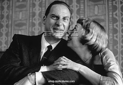
It seems to me that the three most useful male types for a cartoonists to draw are Mr. Meeks, Leading Men (above, left) and Lumoxes. Fortunately Mr. Meeks and Lumoxes are abundant, but Leading Men are a rare type, very hard to find.

These three types should always be draped, with the Leading Man wearing only a bathing suit.


The ideal cartoony model would have been the late Imogene Coca, always draped. She was a genius actor and undraped would have broken the spell.

Physical comedians make great cartoon models, but if they're not used to doing it the poses should probably be short.


The blonde bombshell (above) is an absolute necessity for many comedic drawing sessions. The model would have to be someone worldly who looks good in a fuzzy bikini. Petite and wholesome types are fun to draw too, but not in the same session.

Hmmm....I think I'd team up this kind of woman with a Mr. Meek or a Leading Man. This kind of model would have to be frequently undraped in order to avoid a rebellion among the male students.


It would be great if a bombshell could be found who was also a dancer. If the budget permitted, I'd team her up with a sideman or two who could also dance.

In a case like this the instructor would serve as ersatz director and choreographer. It sounds complicated but I've worked with this kind of model before and, believe it or not, it comes together quickly and smoothely when the instructor makes it fun for the models.


After each new pose is settled on the cartoonist instructor might do a quick sketch of it on a large chalkboard. Seeing how an instructor organizes the shapes and spaces, and exaggerates for humor might help students who have trouble with things like that. After he does that, the instructor might make himself available for one-to-one teaching.

This woman's costume (above) is nice and cartoony: a big fluff ring to emphasize the hips, and a slit gown to empasize the legs.

Did I leave anything out, anything regarding model types? Oh yes. Some sessions should feature overweight girls in tight skirts.  This kind of girl is really versatile. They can play sexy sirens or nagging housewives...almost any role. They do need to have muscle tone, though, in spite of the weight. 


Sunday, January 01, 2012

WHAT I DID AT CHRISTMAS


Is it too late to post a Christmas card?  Here's one (above) that I never finished. I just couldn't get enough time in the days before Christmas. The caricature of me is from the sidebar. John K drew it and I redrew it.

Well, Christmas was great, one of my best ever. It was indescribably wonderful to have my son home for a week. I refrained from lecturing him, which parents are apt to do, and just enjoyed the experience of hanging out with him.


My Christmas present to him was a truly enormous "Russian Divers Watch" (above) which I got from Amazon. He hated it, and now it has to be returned. I didn't mean to get a watch that big. It looked normal size in the promotion, but in real life the thing was big and heavy as a grandfather clock. It might even be a real divers watch, something you wear over a wet suit when you're way down in the Marianas Trench spearing luminescent devil fish. 


The present he seemed to like best was one given to him by a girl FBI agent. It was a book about running barefoot called "Born to Run." Apparently there's an Indian tribe of super runners in Mexico who beat everybody in races, and who never wear shoes. They admit that padded shoes reduce pain, but they say that's the problem; only by allowing yourself to experience pain do you undertake the necessary correctives in your stride and stance. They believe padded shoes lead to permanent injury. Now my kid is hot to run over gravel in his bare feet. 

I'm dying to tell you about my wife and daughter's Christmas adventures but they won't let me, so I'll have to keep those stories to myself.


John just got back from Europe and Canada. He says that British guys are wearing low crotch pants like the pair pictured above, except the pants he saw were torn all over. Fascinating!


Mike is back from the East Coast and he's discovered a new fez site. 


Some of his favorite designs (below):


Man! Those are classy hats!