Monday, May 14, 2012

THE MEANEST COMIC STRIP EVER


I just stumbled on what I consider the meanest newspaper comic strip ever. It's not the one above, it's something else. I'll come back to this subject in a minute, but first let me put it into context with a little history.

The common wisdom is that newspaper comics experienced a Golden Age starting somewhere around 1925. That's the era when physical comedy artists like Ridgewell (above) were nudged aside in favor of sedate, story-oriented strips like (several years later) "Little Orphan Annie."

Above, more Ridgewell. In my opinion the real Golden Age of the newspaper strip was 1903-1924, or thereabouts. Most of the characters of that era weren't especially memorable but the drawings were really creative. 

Live action comedy films evolved along similar lines. Physical silent comedians like Chaplin and Keaton were phased out in favor of personality actors like (a decade later) Cray Grant.


Surely something valuable was lost when purely comedic artists like Frank Leet (above) were deleted from the papers. Why couldn't physical comedy co-exist side by side with the newer, more story-oriented stuff? 


Alan Holtz, creator of the blog "Stripper's Guide" (link on the sidebar) and my source for these strips, speculates that original physical gags may have been just too hard to come up with over the long haul. Take the Leet strip above. The idea of unleashing an attack dog on two ne'er-do-wells must have been used hundreds of times before Leet got hold of it. I can imagine Alan asking, "How many more times can you do a gag like that?"

I'm only half in agreement with that explanation. It seems to me that physical comedy could have evolved like everything else. Look at Fearless Fosdick, Milt Gross, Don Martin, Jerry Lewis, Jim Carey. 


Gee, comics (above) were so experimental in that era.


The point I want to make is that early comic strips were an anything-goes hodge-podge of everything that was considered funny in that era. Maybe that's why they were so creative. Political correctness hadn't discovered them yet. You could even do death gags in those strips. And talking about death gags........

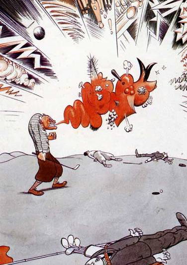
What do you think of these death gags (above) in the strip I call "the meanest strip ever,"  Frank King's "Jonah" from 1910. I kinda like it. Here Jonah assists a woman in her attempt to commit suicide. Click to enlarge. 


The strip (above) was unbelievably drastic. You just never knew what would show up there. 


How do you like this one (above)? Jonah deliberately pushes a baby into a pond. Try to do a story like that today.


Saturday, May 12, 2012

SOME USEFUL LIFE LESSONS


I wouldn't make a very good guru. I haven't really learned much about life, and much of what I do know is so commonplace that it wouldn't be worth repeating.  Even so, there are a few little odds and ends that you might be interested in hearing. See what you think of these minor pearls of wisdom:

The first has to do with the proper way to apologize. If you're sincere about an apology, never dilute it with qualifiers. Never say, "I'm sorry I left the gate open and the dog got out, but it never would have happened if you hadn't......."  That's not a real apology. You're still blaming the other person. It's better to say, "I'm sorry I left the gate open. I just wasn't paying attention." You take all the blame on yourself...because it's an apology, remember?

The second pearl of wisdom has to do with the proper way to comfort a friend who's just had a setback. Never say, "I'm sorry you missed the party. It was great!" Say instead, "How come you missed the party? Everybody was asking for you!" A friend just let me down that way, and it made me feel better.


For the same reason never say, "After you were laid off the rest of us adjusted and the work is going smoothly now." Say instead, "After you were laid off there was chaos. We're still struggling with it."  Why pass up a chance to make somebody feel good about themselves?


Let's see....is that all? No wait, there's one more item: when insulting a person in the heat of a shouting argument, always use profanity. Never say, "You incompetent idiot! My kid could do better than that!" Say instead: "You bastard! Get your head out of your ass!" People remember personal insults about their competence. They forget profanity.

This advice arises from a profanity laden fight I witnessed between an employer and an employee. The employee finally stormed out, slamming the door behind him, and I was certain that he'd never work there again. Amazingly he was back at the desk a couple of days later. Why? In spite of all the shouting, neither had said anything very personal about the other. In some circles profanity is an acceptable way of letting off steam.  Nobody gets permanently offended by it.

Interesting, huh?


Wednesday, May 09, 2012

PRETTY FACES


I have a file of pretty faces that I add to once in a while. Looking at them just makes me feel good. See if you feel the same way.


Geez, this (above) is one of the sharpest photos I've ever seen on the net. I'd like to see the camera it was taken with.


Tuesday, May 08, 2012

NEW YORK: PARADISE FOR PAINTERS

I came across this painting (above) when I was a kid. It was a cover illustration on a book of short stories by Jack London, which included his famous story about ferries and The Hudson River called, "Fog."

I'm guessing this picture is by John Sloan. It seems odd that the ship should be so low, almost at sea level. You'd think the water would spill in and sink the ship. I imagine that ferries have big, heavy keels to stabilize them. It also seems odd that such a dirty, gritty, big-city boat could venture out into raw nature. Of course, nature itself seems pretty dirty and soupy here. 


Here's (above) a famous painting by Reginal Marsh. He seems to be equally repelled and attracted by the people he paints. 


Here's (above) one of Red Grooms' city scenes. Grooms has fallen out of favor lately, but  I still like the guy. Few modern painters capture the dirty, crazy, wonderful intensity of New York the way he can. In film, I'd say that Bakshi captured that in Fritz and Heavy Traffic.

hmmmm. Grooms pictures would make great "pop-out" greeting cards.


Above, a Grooms newstand. I don't know why, but buying a newspaper or magazine from a stand like this was a lot more fun than buying the same item from a bookstore. Maybe it's because you get to enter the dingy, 16-watt world of the news troll. Maybe it's because the magazines seem so current and exciting in this format, as if they were just snatched off the printing press.


Lots of New York artists did subway themes, but none as successfully as Grooms (above). It's hard to imagine that all those different kinds of people managed to co-exist, even for the short time it takes to ride a train.


Glackins took this fascinating photo of a real New York subway interior. Parisians especially are always lamenting how cold and impersonal people appear when riding the Metro but, really, all big city mass transit is like that. I kinda like it that way.


Here (above) Glackins captures a girl having her hair dyed while the public watches. I wish all architects had a print of this in their offices. We need to have buildings that are designed for people watching. People like to watch other people at work, which is one of the reasons McDonald's is such a success.


Is this picture by Sloan? I can't tell. The arching bridge is a great idea, one which we should duplicate today.


I think this picture of a small indoor theater is by Glackins. I imagine the same theater hosted boxing and equestrian shows. I like the fact that it's somewhat upscale and elegant. We need small modern theaters like this.


Here's (above) a picture by the man I consider America's most wrongly neglected artist, Cecil Bell.


For a long time I couldn't figure out why Bell (above) was so neglected by the critics, but now I think I know. It's because only a small number of his pictures are so stylistically sophisticated that they can be said to stand alone. You only get an idea of the great soul of the man when you have a chance to see a whole book of his pictures.


Unlike Reginald Marsh, Bell had a great deal of affection for his subjects (above). He knew there was nobility in the city dwellers he saw all around him, that the unique quality of the city wouldn't last forever, and that the future would have need to be reminded of it.


What a keen observer Bell was! Your first impression of the scenario he paints (above) is how seedy it is, but if you look at it long enough the wider context becomes apparent. You see the technology, the feel for how much work must have gone into making it, the way that humans divide themselves into vocations, the idea that people...even when pursuing raw basics like sex...never stop being thinking creatures, and can still be regarded as possessing destinies and interesting life stories.


I envy art students who are able to study in New York City. The teachers are among the best the country has to offer and the environment is stimulating. Look at the interesting and unorthodox model and the beautiful backdrop behind her. Look at the intensity of the teacher.


Here's (above) a student's homework assignment from The School of Visual Arts. I've often thought that one of the best things a student can do to learn color and composition is to do lots of rough, vague color thumnails of classic paintings. I was suprised to see that a teacher at SVA agreed with me. Now that's a class worth taking!

Sunday, May 06, 2012

ADDICTIVE ANIMATION

John Kricfaluci's working on a Bobby Bigloaf commercial, and he's doing most of the animation himself. I recently saw some of the latest scenes. How do they look? Well, they're funny, beautifully drawn and animated, wildly innovative, ahead of their time, will probably sell a ton of product, and will still be watched 200 years from now....in other words, they're examples of typical John greatness...or are they?

In the last 6 months John's done a lot of animation experiments, and they've really paid off. You should see what the man is capable of now! I credit him with coming up with a new animation technique...for lack of a better term, I call it addictive animation. That's animation that you want to see over and over again, and when it stops...well, you get mad at the animator for not giving you more.

By "mad," I mean really mad. When it's over your only emotions are anguish and anger. You find yourself self saying, "MORE!!!!," not as a request but as a command. You want to chain the guy who drew it to his desk and make him turn out another scene. Sure he has human rights, sure you have no right to make him do that ...but who cares!!!???  Like a true addict, YOU MUST HAVE MORE!!!!!!! You're beyond reason or compassion.


That's what I felt when saw the latest Bigloaf scenes. I felt that I had a right to the remainder of the scenes, which weren't even animated yet, and that the artist was maliciously withholding them.  I found myself saying, "Is that it??? You mean, that's all there is???? For God's sake,why did you invite me here if you weren't going to show me the whole thing???" I wanted to shake the computer in case more scenes were hiding in there. Geez. I probably had madness in my eyes. The animation was that good.


This revises my thoughts about the purpose of animation. Sure it has to be entertaining, and plausible and appealing and all that......but surely it should also be addictive. It should reduce the audience to nervous wrecks who unwillingly go home and yell at their children and kick their dog just to release the nervous energy. After the scenes are shown there should be a groundswell of increasingly urgent audience foot stomping and a hue and cry of "More! More! MORE!" John's the only currently practicing animator I know whose work has the potential to provoke emotions like that.


I probably shouldn't write about John's work this way. I mean, nobody can live up to that kind of hype, and I'm sure this will embarrass him. But I have to do it...just because it's the truth.

BTW: I'm sick as a dog right now and haven't been able to obtain stills from the film. I'm illustrating this with old John legal pad drawings gleaned from his blog.

http://johnkstuff.blogspot.com/

Thursday, May 03, 2012

AURALYNN RANTS ABOUT SHEETS


INT. MALL: 

AURALYNN: "Alright, you're wondering what I wanted you to see in this department store. I'll give you a hint: it has to do with something you said on your blog."

EDDIE: "My blog? Really?" 

AURALYNN: "Yeah. Follow me!"


EDDIE: "Auralynn, wait a minute! Let me try out this sofa. Ooooooh, man! This feels good! The problem is, if I allowed myself to be this comfortable in front of a TV, I'd turn into a couch potato."


AURALYNN: "How 'bout a shot for Roberto?"


AURALYNN: "Cheekster panties or cotton hipster? What do you think I should get, Eddie?"

EDDIE: "Er...what I think is that somebody I know is going to come along and I'll have to dive under the counter."


AURALYNN: "Okay, down to business! What we want is riiiiiiight around this corner......"


AURALYNN: "Okay, here we are! This is what I wanted to show you. This...THIS...is what a real bed looks like! You see how inviting this is? This is what I tried to tell you about the other day. THIS is the kind of thing girls like: quality white sheets, double pillows for each person, and a big old white comforter."


AURALYNN: "I can't believe how many men expect their girlfriends to get all worked up about jumping into a bed that looks like like an army cot. Girls hate that! On your blog you mentioned clean white sheets. That's not anywhere near enough! Tell the Theory Corner people that we're girls! We like beautiful things! Tell the guys to get a real bed with real sheets!"


AURALYNN: "(Sigh!) I love to let myself fall backward onto something big and fluffy (*Sigh*) It's like...falling...into.......a cloud."


EDDIE (VO): "It looks great, but what if a guy's strapped for cash?"


AURALYNN: "It doesn't cost much. Now here's what you need: 700 or 800 thread white cotton sheets, probably Queen size. Queen is the smallest bed that'll hold two people."


AURALYNN: "This looks like a good set: one fitted sheet, one flat sheet, and two pillow cases; 700 threads. It's on sale for $109...$90 if you have the newspaper coupon. That's a good price."


LATER, AT THE FOOD COURT:

AURALYNN: "So, did you like the sheets?"

EDDIE: "Yeah, they're great. Right now my whole family sleeps under sheets with pictures of animals and fire engines on them. That's what happens when you have kids. But you're right about the sheets."