Wednesday, June 29, 2016

THEN AND NOW COMPARISONS

Like a lot of people I'm a fan of British painter John Constable who painted the Flatford Mill (above) somewhere around 1820. His color choices remind me of El Greco's palette...very grey and gritty, almost expressionist. 

He also seems to have been influenced by the Dutch landscape painters of Rembrandt's time. You see that instantly if you compare the painting with the recent color photo of the same mill below.

If this (above) is what Constable really saw then he's added a lot to what was actually there. 

Constable's painting gives a Dutch emphasis to the sky and to the activities of man. I'm guessing that the Dutch focus on the sky was religiously motivated and their nod to the ingenuity of man was to portray humans as contributing in a small way to the creation described in Genesis.


 Here's (above) another Constable from the same period. He's more sentimental here and less expressionist. Once again nature is portrayed as being improved by the presence of man.


 Here's (above) a close shot photo of the same area as it exists today. Unlike Constable's picture, the trees and shrubs reflect the modern taste for nature untouched by man. The landscape is still cultivated here but the cultivation is disguised. I guess my tastes are modern because I like the newer look. I still like Constable, though.


I don't want to confine my comparisons to paintings, so here's (above) a comparison of two photos. The first shows a village intersection taken in 1910 or 20. I like the way the winding road invites the viewer to take a stroll up the hill.


Here's the same intersection, a hundred years later. The earlier view is better, but the hill is still somewhat inviting and the tree is a nice addition. I do wish, though, that the view of the house on the hill had been preserved. Also, the structures on the right seem to have been built without sensitivity to the area they have to fit into.

This (above) is a postcard showing a bridge in Derbyshire, I'm not sure about the date. I'll guess the 1910s. The trees on the nearby hill are sparse but still picturesque.


 Here's (above) the same bridge a hundred years later. A near forest has grown up. IMO, the lush vegetation is a bit less beautiful than the sparse version, but I'm so happy to see new growth that I support the later version nevertheless.


How about one more? What do you think of this street (above)? I'm guessing the picture was snapped between 1900 and 1920. The houses on the left make a nice contrast to the shops on the right. I like the way the street ends at a perpendicular row of houses.


Here (above, a hundred years later) the houses on the right have been preserved...well, sort of...but the structures on the left have been badly altered and the street seems awkwardly wider than before.

I don't think parked cars hurt the appearance of a street but I miss the molding along the top of the windows of the foreground shop, and the second floor balcony supports (corbels).

Friday, June 24, 2016

"THE OTHER PARIS"


I'm reading a recent book called "The Other Paris." It's mostly about that city in it's heyday in the 19th and early 20th Century. People used to say about the city, "I'd rather be poor in Paris than rich anywhere else."


You can see why they felt that way. The city's narrow streets remained beautiful even when flooded as they were when this picture (above) was taken in 1909. 


Above,  the exterior of a famous artists' cabaret in Clichy.


It was pretty nice inside (above).


But there were even fancier places (above) for those who could afford it.

Above, Monjol, where the poorest, most desperate women of the night offered their wares. It's odd to see it on a picture postcard.


It was cleaned up a bit by 1922 when this picture (above) was taken. The clean-up had unintended consequences, though. The enforced closing of bordellos put the women on the street where they needed tough guy pimps for protection.


This (above) is the gigantic Les Halles market. Lots of the poor lived directly and indirectly off the market.


The market was renovated and made more sanitary in (I think) 1960. That put a lot of poor out of work, necessitating broader social programs and more taxes.


Today the city is still wonderful and now it's mostly well lit and well ordered...maybe too much so. The book seems to ask the question: can any modern city ever achieve the magic of the old Paris? Exactly what did the magic of the old city consist of? Those are interesting questions.  


Wednesday, June 22, 2016

THE ULTIMATE HOME OFFICE

Thanks to Alexander Calder I found it! The ultimate home office!!!!!!!!!!!!!! Of course it's a kitchen in the photo but it's not hard to imagine the kind of accessory changes that would transform it into an artist's workplace.

The Chinese kite's a great idea as is the homemade copper baking mold lights and the Moroccan tapestry.

Nice, eh?


Tuesday, June 21, 2016

ELVIS GIFs

Gee, I miss Elvis. I was only a little kid when he was at his peak, but even kids knew there was something special there.


Above, my favorite Elvis GIF.


Very nice!!!!


Elvis was the all time best projector of teen angst. He did it even better than James Dean. Amazingly, some men of my generation never got over their angst. It's weird to see it in an adult. Maybe they hung on to it because it looked so good on Elvis.


Ah, I see it clearly now. The moves are all in the footwork.


Sunday, June 19, 2016

A FATHER'S DAY GIFT!


As a Father's Day gift to you dads out there I offer two songs. Both are completely inappropriate for the holiday but I'm in a hurry and the songs just happened to be on my mind. Anyway, I know you'll like them, so I won't have to feel guilty for wasting anyone's time.

The first song is The Queen of the Night song from Ingmar Bergman's version of Mozart's "Magic Flute." The young princess has been kidnapped by a lecherous troll so that she may be brought to her mysterious father, who she's never met. Her crazy, vengeful mother, the Queen of the Night, appears and gives the princess a dagger so that she can kill her dad. That's what the Queen's singing about in the video above.

I didn't choose this song because it had any special significance for Father's Day but, coincidentally, the opera...especially this version of it... does take the stand that a good father has necessary virtues that only a male can impart to a child...yes, even if that child is a girl.


Here's (above) another of my favorite Mozart songs, this one sung by a woman in drag, pretending to be a man. It's from "Marriage of Figaro." This also is inappropriate for the holiday but I found myself singing it for days in the shower so it's found a place here.

The lyrics don't fit what the melody is saying very well. Lots of songs were like that up to about 150 years ago...I don't know why. The music without lyrics seems to be pleading for understanding, for some ideal combination of human intellect and passion. That's only partly reflected in the lyrics. Go figure. Anyway, it's beautiful.

So, Happy Fathers' Day all you dads!


Wednesday, June 15, 2016

GREEK ISLAND ARCHITECTURE

Boy, I'd like to visit the Greek Islands and see how life is lived in those beautiful hillside towns. Imagine what the architecture must be like!


I wonder what it's like to live in homes (above) that are like theatrical stage sets.


And on hills. What's that like?


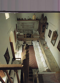
Greek exteriors are great, but everybody knows that already. I wonder what the homes are like inside.


 The interiors you see in books (above) are radically different than anything you'd find in America. Do they work? I don't know. I'd have to spend some time in them before I could tell. There's no doubt that they're beautiful, though. 


When I researched this I was surprised to find that a lot of island interiors looked Turkish. An internet site says the Greeks were slaves of the Turks from the fall of Constantinople in the 1400s to Greek independence in 1830, so I guess that explains it.


Here's another home with a similar bedroom. The beds are on what appears to be a theatrical stage, complete with theater curtains. Wow! What an interesting idea!

I do wonder, though, how you get sex privacy if everyone sleeps in the same room. Also, what do you do about snoring?


Beds are frequently left unmade during the day. Even so, the rooms still look good.


Meals are often eaten outside.


Sometimes dining areas are similar to outdoor rooms (above).


This idea of a room that's both indoors and outdoors is intriguing.


I'll end with this open-air basement for drying clothes. Geez, a place that can make the drying of clothes look interesting sounds like a destination to me.

Sunday, June 12, 2016

JOHN K CARICATURE

HAW! Fresh from a box in the garage...another caricature of me by John K. Geez, that guy can draw!


Friday, June 10, 2016

NEWSPAPER COMICS' GOLDEN AGE

Good old Milt Gross! That's his work above. Sometimes I think the man was incapable of making an unfunny drawing.


And Rube Goldberg (above), cartoonist extraordinaire! I love the way he thinks of excuses for people to hold their own heads, hands and knees... just what you weren't supposed to do in polite society. The thinking at the time was that poses like that made you look dumb and low class.


Here (above) Milt Gross tries his hand at the same thing. I love the opening pose with the raised shoulders and clutched arms. How do you like the mustachioed head with hair greased back?

I also like the shaking fist in the middle drawing. The pointing finger on the other hand is the perfect counterpoint. He's no doubt pointing at his own image in the mirror, but it (probably unintentionally) also looks like he's pointing at his elbow, as if he was making a dirty gesture of some kind.


  Back to Rube Goldberg (above). I like the way he used to draw strange heads then think of funny biographies to justify them.

Geez, this was drawn over a hundred years ago!


Wednesday, June 08, 2016

MILT GROSS AND RUBE GOLDBERG

Two of my favorite cartoonists were Milt Gross and Rube Goldberg. Milt Gross often gave top flight poses to all the players in the frame, both the aggressors and the reactors. 


Rube Goldberg staged everybody in the same shot too, but frequently gave the best poses to the reactors, as in the in the strip above.


Okay, he sometimes gave the aggressor (above) the best poses, but you you see what I'm getting at.


I've been influenced by Goldberg so in photo stories, like the kind I do on this blog, I usually give the emphasis to the listener.


 Here's excerpts from a photo story I did in June, 2009. The girl (played by me) is surprised when her stupid ex-boyfriend (off screen) approaches her in a restaurant. I'll leave out the dialogue.


 She humors him, hoping he'll go away.


 But he doesn't.

He says that, now that he knows she hangs out at this restaurant, he'll hang out there too.


 Yes sir, they'll be inseparable from now on.


 The boyfriend bids goodbye for now...


 ...but adds that he'll be back.


 Well, it goes on. You can link to the whole thing on the side bar. The story's called "The Ex-boyfriend."


The odd thing is that, despite my affection for reactive acting, the animation I worked on usually put the emphasis on the speaker.


That's because I like to work with aggressive characters. They're appealing. The audience naturally wants to see what they're doing, and so do I. Even so, I had a lot of Goldbergian fun working on the reactive scenes and I wish I could have done more of them.

BTW: the last two pictures above aren't mine.