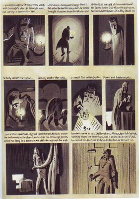
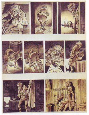
 Kurtzman wanted to pitch a comic book version of Dickens' "Christmas Carol" but after doing one page he decided the project was more likely to sell if he brought in Jack Davis to do it. Consequently we have the same page, even the same panels, done to a finish by two interesting artists. Which do you prefer?
I should mention the book I got these from but I can't find it. The title was something like "Interviews With Artists."

Comparing Kurtzman to Davis is like comparing Cezanne to Thomas Kinkade. In other words, there's no comparison.
ReplyDeleteAmid: LOL! Well, I'm a big fan of Davis's best work but I have to admit that Kurtzman gets the better of him here. Of course Kurtzman was drawing the scene the way he felt it and Davis was just following orders.
ReplyDeleteHey, I finally got around to reading "Cartoon Modern" and it's terrific! Congratulations! I can't believe this subject lacked a comprehensive book before now.
I also much enjoyed the latest "Animation Blast," especially the article about John Sibley. I feel sorry for the writer, Pete Doctor. If he likes the kind of fluid animation Sibley does then he must be dying at Pixar.
I personally wouldn't mind seeing the entire output of Kurtzman at EC, as his rough layouts. I LOVE the stuff so much.
ReplyDeleteI also think it served in a very good way to improve the skills of every artist he worked with. Not knocking those he worked with, of course.
Oddly, the Kurtzman influence doesn't always work out for the best. I once mentioned to Don Rosa, who did some Uncle Scrooge stories for comics in the past 80 years, that his POV, his compositional sense, was entirely indebted to Kurtzman. (whereas my personal preference for story telling for those ducks would have defaulted to Barks, or Dan Jippes, a contemporary Disney Duck comic artist from benelux or the Netherlands. What Rosa picked up second hand, subliminally, from his exposure to Mad, was eye level staging, medium shots, waist up. Whereas Barks most commonly drew the ducks from a point of view of a six foot tall man who might be looking down at a 3 to four foot duck-- which merely gave the scene more depth, and the characters more 3 dimensional appeal in their envronment ( Bad influence from Kurtzman can be as two dimensional as egyptian heiroglyphics)
The Comics Journal Library volume 7, on Kurtzman, may have the same Davis and Kurtzman layouts and art side by side, but it is also currently in a very lovely book on artists studios and work habits, the name of which escapes me, but it contains Kurtzman, Burns, Panter, Ware, and others.
I like 'em both- but the Kurtzman one makes me laugh.
ReplyDeleteAnonymous: I just checked out a Barks book and, sure enough, a lot of the views had a horizon line above Donald's head. I never thought of it til you mentioned it.
ReplyDeleteEddie - Glad you liked Cartoon Modern and the new Blast. The book could have easily been twice as long but I think it's a decent start towards documenting that era.
ReplyDeleteAlso I didn't mean to be so flip in answering your question about Kurtzman/Davis. I think Davis is a facile artist but his drawings never go beyond the surface. It's so boring to look at. And his draftsmanship and character staging/layouts are too often clumsy, stiff or cluttered. I don't want to paint his entire career with such a broad stroke because he did do some nice work, but in general, I find it very difficult to get excited about his work.
Davis.
ReplyDeleteI love me some Kurtzman, but the style kind of clashes with the subject matter. It's a cool look though - is it just me, or does it look a little like the kind of stuff Mignola would do later?
I like the hint of seriousness in the Kurtzman page, I don't think I've seen that before. But then again, I know him mostly from Mad. Eddie, do you know Kurtzman's done anything else with this semi-serious look?
The Kurtzman stuff here reads much more clearly. The storytelling is there much more strongly.
ReplyDeleteThe Davis stuff has great construction and form, but as sometimes happens with Davis' stuff the bigger forms get lost in the details.
One at a time his panels are fine, but the whole page doesn't flow like
Kurtzman's.
Plus, lighting.
I like Davis a lot, but Kurtzman is always my favorite.
ReplyDeleteSoos- check out some of Kurtzman's war comics, if you're looking for something more "serious." I discovered them in the Smithsonian Book of Comics when I was little, and was ensnared by them even though the subject of war wasn't something I was interested in. Something about the drawings was really interesting and scary to me.
Thomas Kinkade's last job in animation was painting backgrounds on Ralph Bakshi's "Fire and Ice", then he became the "Painter of Light" and the rest was marketing.
ReplyDeleteI support Kurtzman over Davis in this rendition of Christmas Carol. The bold shadows, the small beady eyes, the powerful facial expressions and the bold body gestures really set forth the foreboding mood in this story. Normally I would not support the narrative text in the strip, but the writing rendition seems appropriate.
ReplyDelete>>Soos- check out some of Kurtzman's war comics, if you're looking for something more "serious." <<
ReplyDeleteYes. That stuff is pure genius! The names of the war comics are "Two Fisted Tales" and "Frontline Combat" (by EC comics). I'm not a fan of war stuff either, but Kurtzman went all out on these. It's great stuff!
Kurtzman is probably the greatest comic artist of all time, but I think there's good qualities in both the pages posted here. Of course Kurtzman's layout is great, and the bold shadows and lighting really add the perfect mood, but I also like the detail in Jack Davis' page. My eyes went staight to it and it's more fun to look at. There's more distinctive facial features in Davis' drawings, and I also like how he draws wrinkles in clothes and more scenery.
But if Davis wasn't following Kurtzman's layout for this, there's no question that it wouldn't be as good as it is.
Many of the artists who worked for Mad did their best stuff WITH Kurtzman. Kurtzman's layouts were fantastic and the other artist's work really flowed much better under his layouts. Try reading Panic (an EC humor comic which had all the same artists who worked on Kurtzman's Mad comics). The art is still great in the Panic comics, and drawn by Davis, Wood, Elder, and others...and very funny too! But compared to Mad, with Kurtzman's writing and layouts, you really can see a huge difference. Kurtzman's layouts really make the stories and art read so much better. Panic is some of my favorite humor comics, but it can't even hold a candle next to the genius of Kurtzman's Mad. It just goes to show that even the best artists need some sort of guidance.
Hey, Vincent, that Eddie Elf is hilarious!
ReplyDeleteKurtzman. No question in my mind.
ReplyDeleteBut I do like like Jack Davis' work - it's just that (more than likely) for me, Kurtzman would win in any comparison with Davis.
i like davis' for the detail and inking, but kurtzman for ligthing, simplicity and flow.
ReplyDeleteAt ye olde bookstore, everytime we try to steer a little old lady looking for a Thomas Kinkade calendar to a Monet calendar instead, she balks. No substitutes.
ReplyDeleteI don't think she necessarily wants the pretty pictures, even when they are better.
I'm a fan of both artists, but Davis can't even compare to Kurtzman's cartooning genius.
ReplyDeleteAlso, when looking for "serious" Kurtzman stories, don't forget the science fiction epics he drew for WEIRD SCIENCE and WEIRD FANTASY. Truly amazing pieces of work.
ReplyDeleteYou've got the best damned blog, Eddie, seriously.
And to weigh in---I'm just not a Davis fan.
So, there's kind of no contest here for me.
Steve, Ryan: Thanks for the compliments!
ReplyDeleteVincent: Wow!!!!!! Shawn was right, that's terrific!!!!! Thanks a million!!!!!!!!!!!!!!!!!!!!!!