I admit that I've been influenced by this photo of photographer Julius Shulman's work place (above). It's an interesting play of horizontals and verticals with the horizontals dominating. Like Shulman, I love to work on big, flat surfaces with a secondary desk behind me.
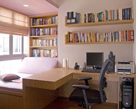
Coming off my recollection of Shulman's space, you can see where I would have been appalled by this (above) corner workspace in a bedroom. Even so, that was stupid of me. This guy had a fraction of the space and budget that Shulman had to work with.
I should have been more sympathetic. After all, there are no books on the subject of how to convert half a small bedroom into a workspace. When designers do write about the subject they design for architecturally sophisticated spaces (above) that aren't really all that small, and which require expensive renovation. You have to ask, if the designer can afford all that, why isn't he living in a house with bigger rooms?
Anyway, in the coming months I'll try to put up what I think are acceptable solutions to this design problem. I have one idea that you can use right away. You have a small room? You like Shulman's wide desk area? Well then copy it and sleep in a sleeping bag or futon under the desk. I mean it. Your desk is where you'll come up with the ideas that'll start your career. Isn't that worth a little inconvenience?
BTW: On a different subject, I think I'll write up a few of the shelf ideas that are on my mind. Let me know if you disagree.
LESSON # 1
Never, ever buy tall, stand alone bookshelves (or tall furniture like the all-in-one desk that started the post).
You don't want to emphasize verticals in a room, you want to emphasize horizontals. Horizontals imply stability, and make you feel tall. Because they can relate to other horizontals in the room, they can imply movement and dynamic sweep. Verticals on the other hand, make you feel small, and their lines run out of gas as soon as they hit the ceiling.
If you must buy a tall bookshelf, don't get stuck with an awkward, empty-looking one like the one above. Be sure to buy an extra shelf plank or two.
Come to think of it, buy more tall bookshelves and bunch them all next to each other. That turns them into a horizontal shape, and that's fine.
LESSON #2: Do buy low bookshelves, but avoid funky designs like the one above.
LESSON #3: BEWARE OF UGLY BLOCK AND PLANK SHELVES.
Block and plank shelves are great, but only if they're low, long, have thick beautiful wooden planks, and minimally obtrusive concrete blocks...in other words, the exact opposite of the one pictured above. The one above seems to exist to show off the 'lovely" concrete blocks, rather than the books.
The bottom shelf should sit no more than three inches above the floor.
LESSON #4: LONG BRACKET SHELVES MAKE A NICE CONTRAST.
I love bracket shelves (above). They're light and airy-looking, like a Caulder mobile that you can put books on. When you remove the shelves they'll leave an impression on the wall, requiring paint and Spackle That's okay, they're worth the trouble. They also need to be firmly anchored to studs behind the wall, otherwise they'll only be able to hold light books.
Avoid the heavy look of the shelves above. I like the beatnik/Caulder variety of bracket shelf: black brackets and natural wood with only one coat of clear varnish, so the grain shows through. They're best when they're long and continuous, almost from wall to wall.
LESSON #5: Artsy shelves are fine, if you have room for them.
They're pricey, though. This (above) is the famous Memphis bookshelf from the 80s. It's a favorite of Auralynn's.
Jo Jo: My apology for my overly harsh crit of your tall bookshelf the other day!


I noticed you didn't talk about metal bookcases. They aren't super common, but I have friends who own them, and if you're like me, you may think they're too cold and sterile for such a warm media as books. Reading is a visceral medium with it's own particular smells, sounds and textures, and I feel like a metal bookcase undermines that.
ReplyDeleteI'll have to remember that when I start living in a college dorm. I'm not even sure if I'm even going to afford any book cases, if at all, but I won't have to worry about it until August and September.
ReplyDeleteWow! love Julius's setup! Had to go find some more photos just to get a grasp of the space:
ReplyDeletehttp://media.dwell.com/images/480*592/shulman-julius-portrait-office.jpg
http://mendetc.com/wp-content/uploads/2011/10/IMG_0725.jpg
It also looks like his large desk towards the front with the green legs is very similar to a DIY door desk...
http://www.apartmenttherapy.com/inspiration-diy-door-desk-73060
Alex: Thanks for the fascinating links!!!! Boy, he has a lot of room back there...in fact, he has a small third desk for his typewriter.
ReplyDelete