
 The best current book bargain I know of is "Playboy 50 Years: The Cartoons" which originally sold for $50 and is now an overstock selling at Barnes & Noble for $13. The colors have been "remastered", i.e., simplified and drained of their subtlety, but for thirteen bucks, hey, it's still worth it!
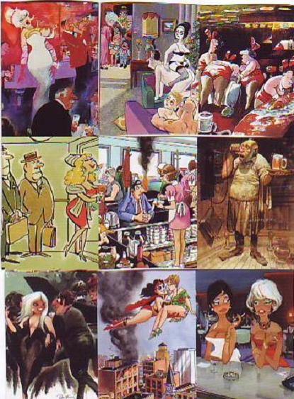
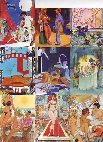 I organized a few of the better pictures above (topmost) by colorists I like: Sokol, Dedini, Davis and Kliban. I also put together a collage by artists whose colors I like a lot less (above) (come to think of it, the center artist above isn't bad...he should be in the "good" pile). What's the difference? Why are the colorists on top so much better than the guys below?
Right away I can see the better artists use a lot more darks. Most of them also use more white. The good ones also seem to have a bold plan while the lesser artists are content to use whatever seems unoffensive. The red, white and blue schemes don't work...maybe they'd look better with more pure white areas.

Nobody ever talks about Kliban's color but the examples in the book are all first-rate. His color is funny, it actually enhances the gag. This restaurant picture is especially good but I can't figure out what the color's doing. Anybody care to venture a guess?
Hey Eddie,
ReplyDeleteIf you like Dedini's art you simply must purchase the huge volume of his Playboy cartoons that has recently been published. His colour is as lush and juicy as you can possibly hope for! A true painter.
I agree you should question your decision of having placed Kiraz in the second grouping - I find his art quite brilliant, both in terms of visual design and colour palette. And the fact that all his long-legged lovelies are highly reminiscent of Brigitte Bardot!
hey eddie, i just wanted to touch back on that "diary" entry a few back... hey man, it's all good keeping a diary or a journal... i do it myself... the key is... carry a man-purse or shoulder bag and NEVER let it leave your side.
ReplyDeleteOther than that, just remember this, some things are meant to be forgotten... don't be so neurotic.
oh, and drugs are bad, mmmkay?
I'm Katy,
ReplyDeletefrom Singapore,
and I'm 21 y.o
Hi, Girl and Boy
I've studied English sinse this Spring .
It's Really difficult
I would like like to meet girls and practisice My English with them.
Thanks!!!
i think that he grabs your eyes first by using the straight black and white of the counter to lead through the focal point. Then he keeps them there by making the colors of the customers at the counter more saturated than the the background colors which he washes out a little. He also establishes a color pattern with the people at the counter by using the same color orange on the alternating diners and breaking it up with the main exchange between the blue of the main guys shirt, and the pink of the waitress. anyway that's what i think, By the way, I dig your blog, its always good for some enlightenment.
ReplyDeleteI'll second that about the Dedini book. It's amazing! It also comes with a DVD of a 30 minute documentary about Dedini!
ReplyDeleteLooks like I'll be headed to Barnes & Noble to check this book out. Thanks for the heads up Eddie!
I will pray for you, you porno head!
ReplyDeleteThose are great. I'm a HUGE Jack Davis fan. It was a thrill of a lifetime to actually talk to him once.
ReplyDeleteClownninja: Wow! Nice answer! I'll try to make a fuller reply as soon as I can!
ReplyDeleteHey so that is Jack Davis on that first page?
ReplyDeleteDid he paint his work? I can't see that picure properly.
Yeah, Davis is amazing.
WOW!! IM GETTING THIS IMMEDIATLEY
ReplyDeletethanks for lettin us know!
All the "bad" ones are unintelligible unless i sqquint and lean in whereas all the "good" images are very clear and readable even in the tiny thumbnails. The good colorists used contrast and clear silhouettes to make their subjects pop! The differnce is even more clear when you change them into grayscale. The backgrounds and subjects of the BAD ones all stay around a middle grey. The Gooood ones generally end up with a large variety of shades.
ReplyDeleteAs for Kliban, I think it works because none of the colors are too strong. He generally treats the very cartoony drawing as black and white image with sharp outlines and the counter's sweeping black shape. The generally pale colors stay very white in comparison to the black ink: the pastels of the diner and the waitresses, the washed denim blue of the man's suit. The extras at the counter are colored more towards the black end of the spectrum, merging them with the big black shape. Therefore they don't stand out individually but they create a general foreground form.
Am I making any sense?
Natebear: Thanks a million for the detailed comment. I'm so rushed right now that I can't reply but I promise I'll return to this subject in a few days and make a better answer.
ReplyDeleteit was fun to think about, drop by my blog sometime. rockandroll
ReplyDeleteThe 'one in the middle' of the second batch is French master illustrator KIRAZ. Check out his ouvre at amazon.fr
ReplyDeleteGoeie dag
ReplyDeleteIt's bad girl!
Sut mae?
Ballpoint Book Guest Pen
Company Moving Newark
Boiler Central Fired Heating Oil
Perennial Landscaping
Benzene Isobutyl Technology
Garnishment Lawyer Stopping Tax Wage
Online Law Degree
Bad Canada Credit In Mortgage
Home Finances
Affiliate Prog4am Sales
Heating System Repair
Attorney Kyrgyzstan Labor
Real Estate Agent Middletown California
Atlanta Foreclosure
Worker Compensation Lawyer North Carolina
Home Health Aide Jobs
Qosh sau bolyngdar