Tuesday, February 27, 2007

THE CAMPFIRE STANDARD


In addition to whatever way the dictionary defines story, a story worth its name is something worth telling and worth listening to. It's so compelling that you just have to tell your friends about it. It's so evocative that it feeds your imagination for weeks or even months after hearing it. Whenever I think about story I imagine indians sitting in rapt attention around a campfire listening to a charismatic storyteller. It seems to me that if a story isn't fit to tell at a campfire then it's just information and belongs in a file cabinet somewhere. It certainly has no place in the entertainment industry.


Imagine trying to tell modern TV animation stories around a campfire, stories like: a little boy tries to pass himself off as something he's not, gets in over his head and learns the value of being himself. A little girl snubs a poor classmate for wearing unfashionable clothes then the poor classmate does a favor for the richer girl and the two become friends. Really, who wants to hear that? Imagine trying to tell stuff like that to a bunch of story-hungry indians. They'd just stare at you. What the indians want to hear is something like: "There I was, backed up against the tree with six drooling wolves moving in for the kill..." You know that's what indians want to hear because that's what everybody wants to hear. Anything else is just wasting our time.
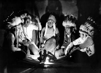


Now I know that cartoon comedy isn't likely to drum up the particular type of excitement generated by viscious wolves but it ought to be an equivalent excitement. Just like the wolf story it should rivet listeners to their seats and should make them want to retell the story to friends. That's the way I felt when I saw John K's shower room sequence in "Naked Beach Frenzy" and Ren's mad scene in "Space Madness." I don't think John would have any problem entertaining indians around a campfire. We need more storytellers like that.

PETER COOK


If you haven't seen Peter Cook then I'm envious. That means you'll be seeing him here for the first time. I only wish I could turn the clock back and see all this for the first time! Enjoy!


Monday, February 26, 2007

"A SEASONAL PLACE"


I'll bet I'll regret publishing these sketches. The drawing and acting sucks, the characters look different in every panel, mis-spelled words...it's a mess! The only reason I'm putting it up is because I know that if I put it in a desk drawer to rework another day, it'll never get done. Besides, if I don't post this then I'll be left without anything to put up tonight. OK, so here it is, flaws and all......"A Seasonal Place."


Friday, February 23, 2007

THE PARIS ART SCENE, CIRCA 1885

There were lots of art schools and lots of type-A art teachers. Here (above) an angry art teacher goes berserk and possibly beats the class with another student.


Paintings often had to be done on a tight schedule. Here (above) an artist puts the finishing touches on a painting as it's being delivered to the buyer.


According to Daumier one painter paints from nature while another paints from what the first painter painted.


Some painters had fancy studios...


...others painted in hovels. No heat, no bathroom. Rats.


Here (above) is Montmare which, because it was situated on a steep hill, had low rents. Lots of artists here.


Here's a Lautrec poster (above) . Is it for the Moulin Rouge? Does it say "The Queen of Joy (Life?) with Victor Jose"? What the heck is that about? Whatever the real meaning the picture, it reminds me that a number of Lautrec's other posters for that club depicted the customers rather than the stars. Sometime the posters seemed to advertize the interesting people and friendly women you'd meet there. Lautrec did a couple of paintings from the vantage point of someone walking behind adventurer-customers looking for excitement.


The Moulin Rouge Gardens. Outdoor entertainment, good food, spirits, a beautiful giant elephant...looks good to me. Why don't we have more places like this now?


Thursday, February 22, 2007

KANDINSKY

Am I the only person here who likes Kandinsky? He was a Russian painter who was infuenced by fauvism but left the movement when Matisse declared that fauvism was incompatible with abstraction. How do you like this railroad painting? I think he and Gaugain (spelled right?) "owned" green!


These "Blue Rider" paintings with the colored frames (above) are terrific in my opinion. He sneaks in some white puffballs...more about that later.


This watercolor (above) looks like a tiny model for a stage set. You can see the Matisse influence but he Russianizes it somehow.


Here's (above) an early example of how Kandinsky adopted pointalism to traditional Russian style. The dabs of paint look like little puffballs. When I first saw them they reminded me of cheesepuffs and I found myself wondering where the Russians ever got the idea of painting on black vevet with junk food. After a moment's reflection I figured that was a pretty superficial observation; the picture obviously referenced balls of lint. It's a pretty picture, though. The dots of light are like stars or fireflies. It makes the whole scene seem magical.

Wednesday, February 21, 2007

SCRIPTS OR STORYBOARDS?

It won't come as a suprise to anyone that I'm on the storyboard side of that controversy, especially if we're talking about animated cartoon comedy. I've written in both script and storyboard formats, and the boarded stories always turn out funnier. That's because a board provides constant feedback on how the visuals are going. Some ideas just don't look funny when drawn and it's nice to be able to toss them in favor of something that draws better.

It's also because scripts are a form of book. They're a medium of their own and what feels good in the medium of print often doesn't feel good in animation. As an example, scripts tend to be dialogue-heavy, even when they're written by artists. That's because ddialogue driven scripts are leaner and easier to read. Dialogue comes in trim little columns surrounded by oceans of white space. It looks better on a page. You can read it faster. It's an amazing but true fact that dull, dialogue-heavy, talking head cartoons get made for the trivial reason that their kind of script is easier to read.

Here's an example. This is an excerpt from a first-draught script I wrote for Animaniacs. A witch's candy-covered house attracts the Animaniacs and she tries to eat them. They turn it around and harass the witch to distraction. The script reads OK whenever it depicts dialogue but watch how hard it becomes to read when it describes visual gags:
Which part would you rather read?

It's also true that stories that originate on storyboards tend to emphasize visual gags, the thing that animation is best at. When I'm drawing I naturally pay more attention to the way a character looks in clothes, the way he bends to pick things up, etc. Sometimes these details are so funny that I end up building a whole sequence around them. That feels right to me. Comedy is best when it's about little things. Scripts, on the other hand, favor the overview, the big things and the complex subplots.

Now that scripts dominate there are very few funny cartoons. Since scripts are uncongenial to visual comedy the powers that be have decided to eliminate visual comedy. This is the shocking price we've had to pay for our script addiction.


Tuesday, February 20, 2007

COVARRUBIAS


'Just a few pictures by the uber-caricaturist, Miguel Covarrubias. Enjoy!


POETRY CORNER


Here's (above) Sylvia Plath's "Daddy," read by Plath. I like this poem, but it seems self-indulgent and even crazy to me. Boy, Sylvia could certainly can hold a grudge. What could her father have done to her to make her write a poem like this? My guess is...not much. It's possible that he had a mentally disturbed daughter who was willing to throw his reputation under the bus in order to establish her own reputation.

Anyway, love it or hate it, you have to admit that it represents an interesting extreme of revenge literature. The unrelenting, venemous intensity reminds me of "Who's Afraid of Virginia Wolfe?" and the several pages long curse in the Bible aimed at anyone who touches the Arc of the Covenant.


Here's (above) Allen Ginsberg reading "America." I confess to liking this poem even though I completely disagree with the content. Walt Whitman popularized this kind of rambling, sloppy, stream-of-consciousness dialogue where the poet argues with an abstraction. Like Whitman, Ginsberg is often silly and easy to parody but you have to admit that it's appealing on some level.


Here's (above) Jack Kerouac reading one of his poems on the old "Tonight Show" with Steve Allen. Kerouac comes off as immensely sincere and the poem is an interesting, example of word music, at least when Jack reads it.


Sunday, February 18, 2007

THEORY CORNER FOR MEN: PICKUP LINES

Hello men! I get a lot of letters asking for advice about dating. Normally I don't answer because, well, some things can't be taught. I recently changed my mind after receiving a gut-wrenching letter from a Theory Corner men who told me that if I couldn't help then there would be nothing for it but a leap into the Grand Canyon. It occurred to me that I might be able to help this man and through him some of the other luckless, blighted males who frequent this site.

I agreed to meet the letter writer outside my favorite Hollywood disco. Out there on the street we'd talk theory then inside we'd put it into practice. 


Uncle Eddie: "Alright, listen up! The basic format is FMAC: find, meet, attract, close. Got that?"

Student: (writing nervously, nearly dropping pencil) "Got it Uncle Eddie!"

Uncle Eddie: "The trick is to play hard to get by deliberately ignoring the woman you're interested in while winning over her friends, including the men. To do that you employ a device called the 'neg'."

Student: "Huh? What's a neg?"

Uncle Eddie: "The neg is a negative comment, a sort of accidental insult. The purpose of a neg is to lower a beautiful woman's confidence. Maybe tell her she has lipstick on her teeth or offer her a breath mint after she speaks. Now what's the number one characteristic of an alpha male?"

Student: (drops pencil; when he leans down to pick it up his glasses fall off) "Um...er, I don't know, Uncle Eddie!"

Uncle Eddie: "The number one characteristic of an alpha male is the smile. Smile from the moment you enter the club! It indicates confidence! OK, let's go in!"


Uncle Eddie (inside the club...the sound is deafening...Thoomp! Thoomp! Thoomp!) : (shouting) "You see how all the guys are dressed? You gotta be bold, over-the-top! Dress average and you'll fade into the background! Wear a conversation piece! Now go up that group over there and start talking! Don't think about it or you'll chicken out! Did you memorize the dialogue? "

Student: (squints to read his notes) "Yes, Uncle Eddie! I walk over to them and say, 'Hey, it looks like the party's over here.' Then I turn to the girl I want and say, 'If I wasn't gay, you'd be so mine!' (he blushes).

'Um...I don't get it, Uncle Eddie. How do I get the girl if she thinks I'm gay?"

Uncle Eddie: (rolls eyes) "Once she feels comfortable and unthreatened by you, you forget the gay thing."
Student: "But isn't that lying?"
Uncle Eddie: "Naw, that's flirting!"

Well, that's enough for one post. Now I don't want to hear anybody talking about diving into the Grand Canyon. I'm a hiker and I don't enjoy stepping over dead bodies.

Editor's Note: This info was derived from a book: "The Game: Penetrating the Secret Society of Pickup Artists" by Neil Strauss.


Saturday, February 17, 2007

WHY I'M NOT A FAN OF "IRON GIANT"


Let me start by saying that I have nothing against Giant's director, Brad Byrd. I'm criticizing his film because that doing that helps me to make a point about the way I believe animated films should be made. In other words I'm contrasting my own pie-in-the-sky ideal of film-making against what Brad was able to do in the face of real-world obstacles. It's not a fair comparison and I recognize that. With that caveat in mind watch the clip above and come back here for discussion.

Well, to start with the robot looks pretty good. Whenever he leans there's a great perspective shift and his glancing back and forth at the rock and tree was impressive in the sense that the space between those items seemed immense. I don't know if I've ever seen that awareness of horizontal space in an animated film before. How did they do that? And the grinding metal SFX were great! Anyway, that's what I liked about the sequence. For me the rest of the clip was all about lost opportunities.

There's no art in the way the kid tried to teach the robot to talk. Theatrical dialogue is supposed to be better than the way real people talk. What if Romeo had said to Juliet," Hey, Juliet! It's me, Romeo! Boy, you look great standing there on the balcony!" Would we still remember the play after all these years? There's no excuse for lackluster dialogue. Hollywood is full of dialogue enhancers. Remember how interesting the language teaching sequences of "My Fair Lady" were? It's an interesting subject if it's handled right, even in an abreviated time frame as it was here.

This dialogue problem set a bunch of dominos to falling. Lackluster dialogue led to a lackluster recording and the lackluster recording led to lackluster animation. The reading and animation were convincing all right, you can't walk off the street and do that, but that's the problem. That's all that they were -- convincing. As I've said elsewhere, it's not enough for an actor to be convincing in a role. Real life is convincing and I get all I want of that for free. When I pay for media I want it to be better than life. I want a performance in the true sense of the word, one that'll blow my mind and make me want to tell my friends about it.


Now there were some good animators on this film, you could tell, but they had nothing to work with. The writing wasn't there. did you feel chemistry between the robot and the kid? I didn't. The exchange between them was cold as ice. The boy's mother called and the kid simply turned his back on the robot and matter-of-factly started for home. Didn't it occur to anyone that if boy didn't care for the robot then we had no reason to care for him either? Imagine if the boy had been a real fleshed-out character like Penny in "The Rescuers." A boy like that would have never have willingly turned his back on his new-found friend.

The writing also hurt the interrogation sequence. The CIA guy's threats were so artless and blunt. Imagine a similar scene played by Darth Vader. Fans would have lovingly quoted the threats for decades. The villain is supposed to be a guy we love to hate. I didn't love to hate this guy.

And why the arid silence? Didn't the filmmakers believe in music? Music might have soothed over some of the writing problems and explained the characters' emotions to us. Maybe the money ran out. If they ever re-release this they should add some sound.

Well, that's it.

Friday, February 16, 2007

JOHN CLEESE, ANDY KAUFMAN, SAM KINISON


I'm probably overdoing this YouTube thing. After all, people don't need me to look up comedy shorts. I did it because I was having such a blast watching these films that I just had to share them with someone. Anyway, here's three more and I'll try to restrain myself after this.


Wednesday, February 14, 2007

MORE CLOUD DRAWINGS

Here's a quick sketch I did while leaning outside my car window. All the time I was driving there were great cloud formations but I couldn't get my hands free to draw. What a pity; no record will ever exist of the flottila of battleships chasing the runaway amoebas or the indian bracing himself to get hit with pies. Finally these came along, the caterpillar with a bonnet and the people in the school bus throwing dogs and cats out the window. It was too good to pass up! I pulled over to the shoulder and drew fast with cars whizzing by only a few feet from my paper.

Here, to fill out the post, is Jerry Lewis's famous elevator scene from "The Errand Boy."


Tuesday, February 13, 2007

VINTAGE SID CAESAR


Here are a couple of sketches featuring Sid Caesar, Carl Reiner and Howard Morris. If you're seeing them for the first time then I envy you.


I love sketch comedy and it breaks my heart that we so infrequently see this kind of thing in animation. I'd love to do some short cartoons that are built around funny sketches. Avery's "King-Size Canary" was a arguably a sketch cartoon as was the "Shampoo Master" and lifeguard sequences of John K's "Naked Beach Frenzy."

Before I close here's a tip of the Theory Hat to Steve Worth, the erstwhile wizard of the ASIFA-Hollywood Animation Archive. Steve just won a well-deserved Annie for his work on the archive, escorted on stage by the famous "Annie Trophy Girls." Way to go, Steve!

CARTOON ACTING


Animation acting isn't the same as live-action acting. Our medium requires that whatever action we draw also moves funny. That means the story has to be written with cartoon posing in mind.

In the action above, the story point might have been satisfied by having a nervous character point to the ground and say, "Here! Dig here!" In the drawings above I use twice as many words as that. Why? Because certain actions look good in cartooning and pointing is one of them. I just wanted to milk the drawing opportunity. The words are repeated simply as an excuse to have fun by drawing more pointing poses. Of course the story has to contain characters that would plausibly act like this. Stories written by writers rather than cartoonists seldom do.

Monday, February 12, 2007

WHAT IS GOOD ACTING?


My intention in this article is to contrast what I consider flawed acting with a sample of the genuine article. The flawed acting is contained in the student film above, a two minute 3D animated film called "Interview." This film is far better than a lot of student work I've seen and I have to say I enjoyed it in spite of the fact that I'm about to rip it. My apology to the talented, deliberately anonymous filmmaker who I hope never reads this. OK, watch the clip then come back and we'll talk about it....

Well, what did you think? My problem with it is that the character is simply giving us a graphic description of what the words say. The visual doesn't add anything. In other words, they're's not acting. Good acting isn't just mouthing the words. Good acting is performance. Good acting is just like tight-rope walking or juggling or ballet dancing. You have to pull off something difficult and entertaining that an audience would be willing to pay for; something they'll imitate and talk about the next day.

A good actor creates a memorable character. He's not content to settle for acting that's simply "convincing." Convincing behavior is all around me, right outside my window and it's free. I don't need to pay an actor for it. What I am willing to pay for is hyper-reality: clever, beautiful, fun artifice that I'm willing to accept as real but isn't. Watch the Peter Lorre clip below and you'll see all these factors operating. Lorre could have played the role as a straight-forward psycho thug. Instead he creates a character who's a sickly, spacey, oddly-appealing troll. See what you think!

Sunday, February 11, 2007

MORE RUBENS!

I hadn't intended to put up another fine art post so soon but I'm too sleepy to write something original and these Rubens drawings really are worth seeing. Be sure to click to enlarge.

The picture of the young girl above is from 1630 or so, done in red and black chalk with a little red ink brushed in and with white chalk for corrections. This stands out even among Rubens' other drawings. The girl is a specific person. We can see how in real life she'd be riddled with flaws as we all are, and yet at the same time she exemplifies an ideal of grace, depth and intellect.

I may have posted this one before, I can't remember. It's a study for a picture showing Daniel in the Lion's den.

I can't remember what this drawing was for. Maybe a crucifiction scene. The right side of the body and the elbow in particular leap out of the drawing. The figure has incredible solidity and weight.

Saturday, February 10, 2007

BABY ANATOMY

Have you ever noticed that babies have an expressive furrow above their eyebrows?


It's not the result of a bulging skull. Here (above) you can see the furrow moves independently of the skull. It seems to be brought about by a muscle that's much more subtle in adults.


My guess is that the furrow exists to make crying expressions read better. Nature really wants us to pay attention to crying infants.


Babies cry a lot broader than adults. They put their whole face into it. This (above) is an interesting picture. Look at the way the baby's chin is tucked up under his lip and the way the lip covers it.


Why on Earth do babies have such big sex organs?


And why are their chins and lower jaws so small? You don't see any babies with Katherine Hepburn chins.


Thursday, February 08, 2007

MORE ABOUT T. S. SULLIVANT

T. S. Sullivant fans should be in heaven now because John K wrote something about Sullivant at the same I started this. If you haven't read it then run, don't walk, over to John's blog "All Kinds of Stuff' and read the entry, "Being Enslaved" which is a brilliant argument for originality in character design, exemplified by Sullivant. I'm incredibly busy today so my own Sullivant entry is much more modest. I simply note my own discovery that he did some of his best work when he was in his 60's. Imagine that! The picture above was done in 1921 when he was 67 years old! For comparison, Vlaminck petered out when he was 30. Boy, you never know when the axe is going to fall!


Jim Woodring, who wrote the article I'm referencing (The Comics Journal, special edition, winter 2002), says he's seen some of the originals and they appear to have been chipped and scraped with a knife in an effort to make the lines look scratchy. Fascinating! My dad was an amateur pen and ink artist and he was always scraping his pictures with a razor blade. More than once he told me that half the work on a picture is done after it's drawn. I wonder if he picked that up from Sullivant?

Wednesday, February 07, 2007

A COUPLE MORE FAUVE PICTURES

Most of the cartoonists who visit here hate the Fauves. Me, I love them. Here's (above) a 1906 Derain showing the Thames near Charing Cross bridge in London. His color seems to have poured down into the water, caught fire, then was guided toward the indigo bridge by seething bits of green energy. What's not to like?

It would be a mistake to think of this as some kind of drug-induced LSD vision. Derain uses false colors in order to make us realize that the colors we see every day are just as bizzare. We should see color the way a formerly blind man would see them on his first few minutes of sight. For such a man shadows wouldn't be subordinated to local color, they'd be independent forms. Lines would just be lines, they wouldn't define a shape and colors would battle for dominance. This is the violent, alien world Derain paints for us!


Here (above) is Vlaminck, also 1906. Red leaves on the red trees are no longer content to be decoration. They radiate and burn themselves into the blue sky behind them. Leaves seperate from the trees and gyrate in mid-air. The red and pink path carries this crazy energy to other trees. It's an alien force being unleashed, a force that was there all the time but we never noticed it.

Of course I'm only guessing that this is what Vlaminck had in mind. Artists need to have fantasies about the pictures they paint so they can see their subjects in new and exciting ways, and the same goes for viewers.


Here (above) is Matisse's famous green stripe painting, also 1906 I think. The face is both flat and three-dimensional. The colors in the backdrop refuse to be background and come forward to compete with the foreground. The face plane is stressed and appears to be in danger of splitting.


The green strip painting influenced a lot of painters in Matisse's time and continues to exert an influence today. Here (above) is a Matisse-influenced face by illustrator Phillip Burke. The surface tension is much reduced from the Matisse original but the color is still exciting.