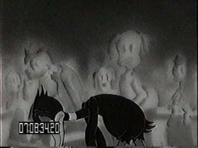
It's amazing how many vintage cartoons contain zombie audience scenes like this one (above) from Clampett's "Henpecked Duck."
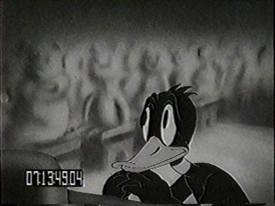 Look at the audience behind Daffy. The characters in the background painting are hazy and ghost-like, with blank faces as if they were just bussed in from Hell.
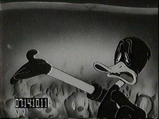
Here the audience has acquired some definition but they're still engulfed by an eerie mist and are lit from only one direction. Why did so many old-time directors favor this kind of weird treatment?
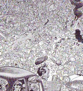
The obvious answer is that drawing each individual head in the crowd would have been time-consuming and take too much attention away from the main characters. Look at these sharply-drawn Jack Davis heads (above). I don't know about you but I spend a lot more time looking at the faces in the crowd than the people in the car. So that might be the answer.....but it's not the only possible answer. Maybe zombie audiences were just plain funny.
 It's amazing how many vintage cartoons contain zombie audience scenes like this one (above) from Clampett's "Henpecked Duck."
 Look at the audience behind Daffy. The characters in the background painting are hazy and ghost-like, with blank faces as if they were just bussed in from Hell.
  Here the audience has acquired some definition but they're still engulfed by an eerie mist and are lit from only one direction. Why did so many old-time directors favor this kind of weird treatment?
  The obvious answer is that drawing each individual head in the crowd would have been time-consuming and take too much attention away from the main characters. Look at these sharply-drawn Jack Davis heads (above). I don't know about you but I spend a lot more time looking at the faces in the crowd than the people in the car. So that might be the answer.....but it's not the only possible answer. Maybe zombie audiences were just plain funny.

22 comments:
Oops! I forgot to thank Mark Deckter for the great pictures!
Check out the zombie audience in Porky and Daffy (by Bob Clampett c. 1938) in the scene where Daffy is unconscious and Porky's trying to wake him up. All the people are frozen with big smiles on their faces. I don't know if Clampett did this on purpose to make the scene extra gooney or if it was just a mistake he didn't catch. Oh well, whatever, it's still a great cartoon.
I don't know about the zombie audience- but that busy Davis drawing is fun to look at. My eyes went straight to the profiled man eating a melting ice cream cone/chicken leg. The Where the fuck is Waldo books must have ripped this style off.
The marching band in the background also brought back some memories of being in band. This scene pretty much replicates perfectly how it felt to be in the christmas parade at Universal Studios. Gah!
I thank deckter too! Hey, eddie you can use the david drawing for whatever you like.
Ha ha i wonder why you posted this ;)
Yeah, im thinking its a time issue. That Jack Davis drawing is exhausting to look at.
The Fleischers also did a ton of weird audience and background characters, starting long before Warners was even established. Sometimes they were animated, inked and painted in light grays to knock them far into the background. When there was a glaring paint flash on a prolonged cycle, it probably triggered audience seizures. Look at that Popeye cartoon that takes place in the skating rink ("A Date to Skate" from 1938) and you'll see what I'm talking about. The ghostly background people work yet that paint flash really messes with the whole cartoon. Too bad they couldn't afford (or had no time) to fix it, since it repeats so very many times. It's a pity since the rest of that cartoon is pretty darned well done.
john aSpeaking of Fleischer Crowd scenes, there a really amazing one in the opening of "Customers Wanted"(1939)All those people walking up and down the boardwalk in front of the Penny Arcade where Popeye and Bluto are working as barkers. Popeye's moving, Bluto's moving,and the crowd is an incredible cycle that must have driven some poor artist crazy doing clean up.
Warners had a very good reason for not doing many moving crowds; they were working under extremely tight budgets, and they normally kept things like crowd scenes and special effects to a minimum. Max and Dave had small budgets too (Except on the Superman cartoons)but whenever there was an opportunity to show off their technical superiority,Max didn't have a problem with paying a few dollars more.
I'm so glad the black and white cartoons are finally coming to DVD, Cartoon Network only runs those horrible traced versions that completely butcher the craftsmanship that went into their cartoons.
doesnt the audience eat daffy's brains at the end of this cartoon?
Zombie audiences are just plain funny. That's as good a reason as any!
That Jack Davis picture makes my head hurt.
With all due respect to the Fleischers, (and the painted background ghost characters in the Betty Boop cartoon SNOW WHITE is a classic of the form) and Jack Davis, (and the incredible crowds of wall-to-wall celebrity caricatures he did for MAD Magazine in the 1950's have never been beat) - THE greatest depictions of cartoon audiences were drawn by the great E.C. Segar. They were all the same guy! Bald heads and swollen, overlapping noses, all crushed together with the same beady-eyed, blank expressions. Sometimes the action would spill out of the prizefighting ring, and Popeye and his opponent would spend a week's worth of daily strips walking around on the (oblivious) audience members' heads. Was that cool, or what?
Once, working on Beany And Cecil, we had to layout a scene at a bullfight - and for simplicity's sake the audience was drawn as a sea of sombreros.
Well, we got an angry note back from ABC's Standards & Practices Dept. informing us that was offensive or something, and it had to be changed immediately. (After all, whoever heard of anyone wearing a sombrero in Mexico?)
So someone, possibly John, suggested changing it to a sea of space helmets instead - which we did. I think S&P asked us to change it back into sombreros.
You can't "out-stupid" a network executive, now can you?
Obviously putting less detail in the background audience would reduce costs and look favorable to the corporate-power-to-be. However, the background audience in these frames were meant to serve as background i.e. entities further in the distance. And objects in the distance will have less clarity then the foreground subject matter.
Mike: Wow! Interesting point! Why not scan a Segar crowd and send it to me? I'll put it up here. Or better still, start a blog and put it up yourself!
Jorge: I like the idea of trying a 3D model background. Either Steve or Cartoon Brew just put up something about that.
It was Cartoon Brew, from a 1939 issue of Popular Mechanics.
No Zombie backgrounds in Popeye's "Customers Wanted"--I was commenting on an actual honest to God crowd scene, with individual characters all shown in complete clarity. Here is the opposite of the zombie background--the crowd is a living undulating mass of individual figures moving to and fro, made even more amazing because some poor bastard worked all these figures out as a cycle, try looking for something like that in a modern cartoon. I think there are Zombie backgrounds in "Morning, Noon, and Nightclub" or "Let's Celebrake".
Marlow: Thanks!!!
Marlo: Excuse me, "Marlo!" Why do I have to spell something wrong every time I sit down to type?
Hey, Eddie, I noticed something else rather interesting about The Hen-Pecked Duck (by Bob Clampett c. 1941). You don't have a picture of it here unfortnately.
Near the end of the cartoon when Daffy pleads with Judge Porky for one more chance, there's a single and quite noticeacle drop of sweat on top of his head. Anime cartoons from Japan have been using a single drop of sweat on their characters' heads pretty much since manga's inception in 1951. Did Bob Clampett invent the now famous "anime sweat drop"??? That would sooooooooo blow everybody's minds if it turns out that he did.
Eddie Fitzgerald said...
Oops! I forgot to thank Mark Deckter for the great pictures!
No problem! Thanks for the great post!
David- I know the sweatdrop was in use in Disney cartoons before then. I believe Ub Iwerks was the first to use it in those, and I'm talking before sound was added.
Can you cite any examples? Vague descriptions will do in lieu of knwoing any titles. I could present those descriptions to Jerry Beck and I'm sure he'd be able to figure out what they are.
Hi, Eddie. Great post.
When they film live action movies they fill the room with smoke to create more depth in the shot. These ghost crowds could be "ghostly" to give them a slightly out of focus effect too.
Who knows, but next time you make a cartoon you should do it too! It looks cool any ways.
Also, Mike. Space helmuts would have been HILARIOUS! My next cartoon will be all about crowds and they'll all be wearing space helmuts and...getting walked on. It'll have to take place in the desert or arctic to keep the BG cost down.
Post a Comment