Thursday, February 18, 2010

"IT MUST BE HIM," SUNG BY VICKI CARR


Argghh! I thought I'd have this (above) science-fiction story up today, but I'm having Photoshop problems again. Will someone please tell me why layers that are supposed to be locked, unlock themselves and change names? The background layer (supposedly locked) becomes layer one, without me doing anything to it. Layer one looses its image and becomes transparent, even though I'm looking at it on the screen, and it's not transparent. AAAAAAARRRGGGHH!!!!!

Just so I don't start throwing things, I think I'll switch to trying out Pages (mac's version of Word) for an hour or so. I need to learn it so I can start writing the pamphlets I want to sell in the Theory Corner Store. The first one's on the subject of showmanship as it relates to animation. Pages looks pretty easy, so I'm not expecting many problems.


On a lighter subject, here's (above) a terrific video of Vicki Carr singing "It Must Be Him." I was reminded of it when I heard it in "Moonstruck," which I saw again for the sixth time last night. Geez, I wish I'd written that story myself! I love the way it pretends to be naturalistic, but is actually much larger than life. It's Shakespearean in the sense that it's a lot of set pieces strung together, with an emphasis on beautiful language, overt theatrics, and surprisingly deep philosophical ideas.

The Carr song is incredible. The woman in the song tries to convince herself that she doesn't need the man who's slighted her, but when the phone rings she turns into an abject, quivering bowl of jelly, ready to give him whatever he wants. In my opinion, that kind of vulnerability to hurt is essential to romance. As the Nicholas Cage character says in Moonstruck, love isn't about perfection...it can be a disaster for the people involved. It might bring them misery and humiliation, but if they fail to seek it out, they'll never have a chance to experience the greatest pleasures of life.


Tuesday, February 16, 2010

PHOTOSHOP'S DILEMMA


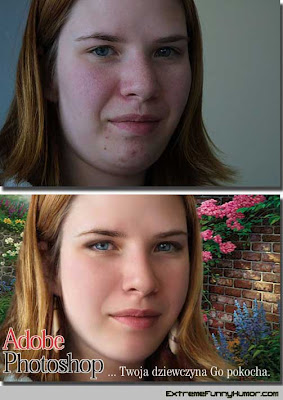
I almost called this, "Why I Hate Photoshop," but you can't hate something that can accomplish miraculous transformations like the one above. Maybe it's more accurate to say that I hate learning Photoshop from books, which is what I've been attempting to do.

What I hate about these books is how it's possible to follow the directions and still not get the same result as the author. When it doesn't work, you have to be Sherlock Holmes to figure out what's wrong. I hate having to do that constantly. Sometimes the answer's buried in some other chapter that dealt with photographers' issues, and which I thought an artist like myself could skip. Very frustrating. Artists need their own book.


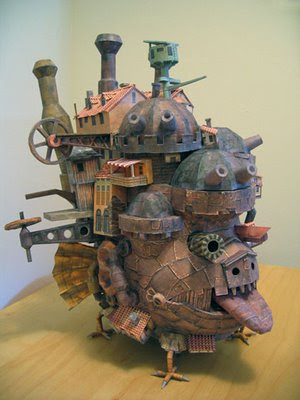
The most striking thing about these books is that the authors never thought to stick ordinary readers of the books in front of the program to see what problems they have. Of course that would be a big undertaking. Photoshop is a big, lumbering behemoth (above) of a program, and reader-testing every part of it could be a chore. Even so, somebody should attempt it, at least for the chapters dealing with the fundamentals.

It's that big, lumbering thing that I want to talk about here. I almost feel sorry for Adobe because every new idea they come up with has to be built mostly on existing architecture. That lumbering architecture is what they own, what they have unassailable patents for. If some third party comes up with something new, say an intuitive, drag and drop version of the same thing, then Photoshop is sunk.


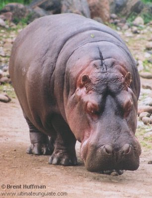
Their answer to third party challenges has been to keep adding functionality to the hippopotamus that they already own, but how long can they continue to do that? What happens when their manuals are 2,000 pages long? Some simplifying revolution is bound to happen.

[NOTE: I don't wish the program was dumbed down, I just wish that it would do what it already does in a simpler, more intuitive fashion. That way I could learn the basics from a book and get on with my life.]

It's interesting to imagine what would happen if Photoshop decided to build a new architecture based on more current ideas. A lot of the new ideas are open source or have legally uncertain paternity. It would be hard to build something really big and exclusive on a mess like that.


It's interesting to see how many current non-Adobe programs also use layers and filters and all that. I wouldn't be surprised if Blogger offered some much simplified, open source version of some of that for free to its users. My favorite non-Adobe Photoshop-type program is Pixelmator, which is a sort of reduced Photoshop for mac users. It does some of what Photoshop does, but it appears to be easier to use and costs a tenth of the price. I say "appears" because I haven't tried it yet.

Here's (above) a nine minute video showing how a composite is done on Pixelmator. Compare it to how the same thing would be done on Photoshop. Pixelmator is so cheap that I assume it's based on open source. It shows how far open source has come in legally approximating what Photoshop does. It's only a matter of time before this OS method is merged with iPad-type drag and drop simplicity.


Sunday, February 14, 2010

VISIT WITH ROMANCE NOVELIST, REBECCA BRANDYTHISTLE


MS. CHEEZWHIZ: "Hello, ladies! This is Velveeda Cheesewhiz, Roving Editor for Theory Corner for Women! I'm so thrilled, because today I get to interview the queen of the best-selling romance novel... a woman with over twenty million books in print, and more movie deals than you could shake a stick at....REBECCA BRANDYTHISTLE!"


CHEESEWHIZ: Finding her home was no easy task. She's located in a part of town where the street signs are covered in grafitti, and the main occupation of the inhabitants appears to be begging.


CHEESEWHIZ: "Anyway, the children were helpful. 'The writer lady? She's up on the hill,' they shouted, 'She's up on the hill!' "

CHEESEWHIZ: "And they were right."


CHEESEWHIZ: "The road ended at the base of a beautiful garden. I parked and walked along a winding path which was studded with flowers and alive with fluttering butterflies.


CHEESEWHIZ: "Finally, through a break in the trees, looking past the shrubs and preening swans, I caught a glimpse of the house. Breathtaking! At the door a butler said I was expected and showed me into a sumptuous living room."


REBECCA BRANDYTHISTLE: (Leaps out from behind a curtain) "BOO!"

CHEESEWHIZ: "Oh, my Gosh!"


BRANDYTHISTLE: "Hee hee! Sorry! I just couldn't resist it!"


BRANDYTHISTLE: "Please, have a seat! Would you like some tea? How about a nice cup of Jasmine stirred with ginger leaves and spider silk? No? Well, let me show you the house, then."


BRANDYTHISTLE: "That piano used to belong to Liberace. They say you can get AIDS just by looking at it, but that's silly."


BRANDYTHISTLE: "Here's one of the bedrooms! Gee, the bed needs a few more pillows."


BRANDYTHISTLE: "Here's my 'wild place.' I get some of my best thinking done here."


BRANDYTHISTLE: "This is my dog Fluffy's room. Hmmmm. Fluffy's roses are wilting. I'll have to get him some more."

DOWNSTAIRS: They return to the living room and Cheesewhiz impulsively glances out the window.


CHEESEWHIZ: "I still haven't seen this part of the grounds yet. I'll bet it's..... GOOD LORD!!!!!! There's nothing out there but desolation! I've never seen anything like it! What happened!?"


BRANDYTHISTLE: "Yeah, it is kinda' bleak, isn't it? I had to spray to get rid of some noisy neighbors.


BRANDYTHISTLE: "But don't worry, the plants'll be back in a few months. The chemical only effects humans. Huh? What's that, on the floor!?"


BRANDYTHISTLE: "It's one of my books! Would you like me to read something? You'll be able to tell your friends that you got a personal reading from Rebecca Brandythistle!"

CHEESEWHIZ: "Why, yes! I'd be delighted!"


BRANDYTHISTLE: "Hee hee! Okay, here's a good passage. It's one of my favorites!"


BRANDYTHISTLE: "It was the time of the French Revolution! In order to escape from the handsome royalist officer, Nichole, the idealistic, perky, red-haired revolutionary, has just jumped off a cliff into the base of a waterfall."


BRANDYTHISTLE (READING): "Nearly distraught with fear, Jean Paul swam to the spot among the reeds where he saw Nichole's hair floating in the water. He hauled her out of the water, shaking her, flooded with relief when he discovered that she was still very much alive."


BRANDYTHISTLE: " 'Damn you girl! I thought you were dead! Dead!' he raged. He carried her to the cave behind the waterfall, despite her flailing. She punched and bit, struggled and kicked."


BRANDYTHISTLE: "As Jean Paul set her down, he meant to tie her up so she wouldn't escape again...but the instant he set his eyes on her naked loveliness, his intent changed. 'Dear Lord,' he whispered! Like Eve before the Fall you are!' "


BRANDYTHISTLE: "His calloused hands gently roamed her curves, and excitement numbed her thinking. Still, Nichole's fingers crept toward the dagger hidden in her furs..."


BRANDYTHISTLE: "....even as he expertly roused her senses to a fever pitch she'd never before experienced. 'Nichole,' he whispered, drawing her shivering body against his warmth...his urgent need! Her fingers tightened on the knife..."


BRANYTHISTLE: "Okay! That's enough heat, even for me! I can't take any more!"


GARDENER: "I'm sorry to interrupt, Miss Brandythistle, but is this how you want the crew to wear the shirts you gave them?

BRANDYTHISTLE: "The shirts? Goodness, no! They're supposed to be torn! You gotta rip them to shreds! Let them hang down! And...um...I don't know how to tell you this, but the pants...they're too...um...too...too..."

GARDENER: "Too tight?"

BRANDYTHISTLE: "Tight!!!??? Heavens, no! They're too LOOSE!!!! Don't you read my books!? Get the tailor to tighten them up!"


BRANDYTHISTLE: "Oh, dear...I'm afraid it's time for me to go. I have to take Fluffy out to have his fur braided. I hope you got everything you needed.'

CHEESEWHIZ: "More than enough! Thank you very much!"


BRANDYTHISTLE: "And remember:It's not the face behind the heart, but the heart behind the face. No, that's not it...It's not the body behind...not the heart behind...not...well, you know what I mean!"

Postscript: Thanks to John for the cool name, "Velveeda Cheesewhiz."


Wednesday, February 10, 2010

WHAT WOULD TRULY ROMANTIC VALENTINES LOOK LIKE?


You know, it's funny....modern girls all think they're above this sort of thing....but they're not. The models in the picture may look plastic, the writing may come off as insincere or cliched, but the card is effective nevertheless.


People respond to elevated speech, to words that conjure up a romantic ideal. It doesn't matter that people don't talk that way in real life. That's precisely why we like it.


Romance is too important to be spoken about in the same language that we use to buy aspirin.


Johnny Depp (above) demonstrates how to seduce with with words alone.

For the curmudgeons out there, here's (above) some valentine vitriol.


Monday, February 08, 2010

DOO WOP AND CIGARETTES


Just when I was in a quandary about what to post about, Kali sent me this video(above). What a pal! What a pal! How do you like the moves the blond-haired guy makes?


"Bread and Butter" got me started watching doo wop videos (above). I still don't understand what happened to do wop. Where did it go?


"Blue Moon" (above) was considered prime makeout music.


I noticed this anti-smoking ad on one of the do wop sidebars. I had to include it here because it contains the most accurate depiction I've ever seen of what every day life was like when I was a kid. People smoked like bandits! Old ladies smoked, doctors smoked, nuns smoked...everybody smoked! Sidewalk gutters were awash with cigarette stubs, and subway platforms had regular sand dunes of stubs sprawling over the tracks. It was great! I miss it!


BTW: I think the blond-haired guy in the Bread and Butter video is the same as the guy who sings "High Boots" in the video above.


Saturday, February 06, 2010

CARICATURES OF PAUL MOYSE


You've probably seen Paul Moyse's work before, but just don't remember the name. The guy's brilliant!


He's done a lot of caricatures for The Weekly Standard in England and they get re-printed over here in all sorts of venues. I highly recommend his web site:


Actually, this link will take you to the page on his web site where he put up caricatures of himself done by other artists. It's VERY instructive!


I thought it might be interesting to study some of these caricatures. Maybe they'll give us an insight into how far a caricature can deviate and still retain a likeness.

Let's start with the way Paul Moyse really looks. In the snapshot above his face appears to have two parts: a rounded, slightly squared-off top, and a weighty, imposing muzzle. The parts are unified by a big nose (Geez, I hope Moyse never reads this!).


Here's (above) Moyse's own caricature of himself. It's a great picture but, being a self-portrait, it attempts to flatter. The head is somewhat unified in design, and not so much in two distinct parts, as in the photo. A unified design is a sign of youth (I talk about this in my previous post on faces). The skin is also robust and tight, also a youthful characteristic. What the heck! When I do pictures of myself I always shave off a few years. That's an artists perogative.


Here's (above) another self-portrait. Wow! A terrific picture! It looks like something Virgil Parch might have drawn. You could say that the nose is too big and the eyes are too close, but it's so funny that it doesn't matter. Boy, if a drawing's funny, people accept it as an accurate caricature, even if it isn't.


Here's an interpretation of Moyse (above) by another artist, one that's more realistic (well, sort of). The eyes are just as close as in the previous picture but here they don't work. You forgive close eyes on a deliberately distorted picture, but on a more realistic picture like this, they seem out of place.


Another snapshot (above). Moyse's dome is round, but it's also squared off a little. The top of the head is de-emphasized and the wide-angle muzzle is thrust at the camera. .


Here's (above) a caricature by another artist that emphasizes the wide angle even more than the photo. The cheeks are less thick than his real cheeks, and the lips are bigger. You could argue that the top of the head might have been smaller, and more detail on the shirt might have been nice.


By another artist (above). The face has a puffy, bee-stung look to it, as if it's pushed out from the inside. The line work is beautiful, but the artist was so intent on capturing the puffy quality that he lost some of the likeness. As in the picture above this one, the dome seems to distract.

In general I think it's a mistake for a caricature to emphasize irregular puffiness, even if the subject really is puffy. I don't know why that is. It's a law laid down by Zeus, and we mortals would do best to follow it without question.

In a comment Niki mentioned that the puffiness makes the face look black. I never thought about it before, but I guess it does.


Here (above) the artist emphasizes the chin. Lots of artists do this, and I have to admit that the effect is appealing. It certainly helps in establishing volume and weight. Even so, it seems inappropriate to the subject.

Being a caricaturist can be scary. Sometimes you realize halfway through that you're starting to lose the likeness, but the drawing is succeeding on its own terms as a work of art, and it demands that you continue as before, subject be damned! You have no choice but to do that, but how do you justify it to the person you're drawing?


Add Image

Wow! A highly-skilled picture (above) that emphasizes a just-woke-out-of-a-deep-sleep look in the subject's eyes. The technique is so wonderful that I hesitate to criticize, but Zeus compels me to remind artists that this quality of the eyes is forbidden to caricaturists. Only Zeus knows why, and he's not telling.

The hairy muzzle is given an emphasis that isn't in the photo reference, but it's done so well that you can't complain. The artist seems to be insinuating his own belief that facial hair is bizarre and unnatural, and I admire him for doing that.

Artists should insinuate their own opinions about the world into their work. That's because an artists first responsibility, even a caricaturists first responsibility, is to create a beautiful work of art that reveals something interesting about the natural world.