Here's (above) Manet's famous Olympia painting. It's said to be the painting that began modern art. If that's true then I'll concede it's historical significance but that doesn't mean I have to like it. The lighting is flat, the head looks grafted on, the body is just a line drawing which makes almost no impression on the bed and the woman is sterile and uninspiring. I like most of Manet's paintings but this Mel Ramos-style pop art just doesn't do it for me.

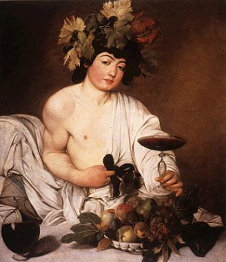
This (above) is a famous Carravagio. I don't like the man. He's a good technician but he has no soul. David Hockney thinks this picture was painted using projection optics and I'll bet he's right. And has there ever been a more bored, kitchy and uninspiring model in the history of fine art? Alright, there's "Olympia" but I'm not counting her.
 Here's (above) Manet's famous Olympia painting. It's said to be the painting that began modern art. If that's true then I'll concede it's historical significance but that doesn't mean I have to like it. The lighting is flat, the head looks grafted on, the body is just a line drawing which makes almost no impression on the bed and the woman is sterile and uninspiring. I like most of Manet's paintings but this Mel Ramos-style pop art just doesn't do it for me.
 This (above) is a famous Carravagio. I don't like the man. He's a good technician but he has no soul. David Hockney thinks this picture was painted using projection optics and I'll bet he's right. And has there ever been a more bored, kitchy and uninspiring model in the history of fine art? Alright, there's "Olympia" but I'm not counting her.

26 comments:
Projection Optics? Does that mean someone projected a photograph on the wall and the "artist" traced it? That's as bad as that Waking Life-esque rotoscoping. Recently, Thad came on here and quoted Milt Kahl saying that video capture is a crutch. In that case, Waking Life is the Special Olympics. >:P
But yeah, those poses look boring. Not as boring as the "heroine sheek" that was popular in the '90's, but boring non-the-less.
I just had a phone call from Caravaggio and he's on his way over to your house to kick your ass!
See ya
Steve
Ahhhhhhhhhhhhhhhhhhhhhgh how can you not like Caaravaggio? I think I said this before at some point in time on your blog. Caravaggio is super influential- everyone that came after him was inspired by his lighting etc. JEESE, I give up.
I'll agree with you on the Manet one. Almost every art class I've had the teacher will drag on a discussion about this painting for an hour.
Btw Waking Life made me dizzy.
Waking life has nice story, I don't understand why it had to be so ugly.
I heard quite a lot of people used those projection optics trick back then. Talk about ruining the magic...
Carravagio's model looks like a very young John Belushi auditioning for Animal House.
BTW. I'm still digging around for that business card.
Hi Uncle Eddie,
I agree about that first painting -I can't put my finger on it, but it looks weird. There are elements on the painting that looks like they weren't there originally, and they were added at the last minute, so it doesn't blend with the original setup.
I agree with you about Caravaggio being a very good technician, but I disagree with you about Caravaggio's painting. I don't think the pose is boring at all. Quite the contrary - I think it's sexual - from the way that he's posed and the "come-and-take-me" look that he's giving.
-- J
I agree on the Manet.. Its even hard to see that black cat on the bed. Not one of my favorite Manets but wasnt he the father of impressionism?
Caravaggio on the other hand deserves his over rating. He is a true master for his lighting and Chariscuro(sp?) This particular painting is homo erotic and very suggestive. Maybe that is why it is such a big deal.
This video goes with your article on drunk animators
See ya
Steve
That's nothing Steve, you should the dents on MY studio wall. I couldn't tell you how they got there.(cause I just don't know)
BTW, What outfit do you suppose that guy worked for?
That portrait of Bacchus has always given me the creeps. I much prefer the Ward Kimball version in Fantasia. Nothing homoerotic about that drunk, lecherous, little rascal! (Although his fascination with centaurettes might betray somewhat of a bestiality fetish...)
I am a fan of fine art, but these paintings are as cold as ice.
On another note, I found some Milt Gross at my local Barnes and Nobles bookseller. It the wordless novel "He done her wrong." Have you ever seen it?
I wonder if you might possibly feel differently if you were able to stand in front of them and really see them for themselves?
That's not to say that one can't have a reaction to paintings from seeing them 2D in books(which is how we see far too many--most--of them), but there've been so many cases where "uninspiring" paintings have seemed so meh to me, and then I see them in real life, up close or at 6 feet, and WOW.
I love figural work, particularly portraiture, and there've been so many instances where a portrait I'd think was ordinary at best looked completely different, had a totally different impact in person.
Rubber Johnny and Chidog
That video was in Res Fest last year.
EW.
Steve: "Rubber Johnny" was
bizarre! It looked like it was pieced together from out takes of David Lynch's "Eraserheard!" Thanks for posting it!
Narthax: Carravagio like John? I don't know about that. John's best characters have plenty of heart, something Carragio wouldn't know much about. I can think of a couple of warm paintings that C did but the experience must have been excrutiating for him because he never returned to it.
I agree the eyes are dead in both paintings.
Wheres the soul?
I'd comment on those paintings, too, but I'm too bleary eyed to view them clearly ever since I took the post about animators and alcohol to heart. I've been on a bender for several days now, and I found out -- contrary to Marlo's advice -- I didn't lose my social retardation. Instead, I became more belligerant and mean. I've been starting fights now over minor provocations.
HEY, ARE YOU LOOKIN' AT ME!?
If you dig Rubber Johnny, check out the photo stills and concept art. The photo stills are just as creepy, especially once you figure out what you are looking at in some of them. A book of it comes with the DVD, or just search the on-line jungle.
P.S. Cunningham, like Manet, would have been banned from the Salon.
If I learned anything in art school, it's that all important artistic movements start with a naked lady.
That, and Manet owned shape. Not that I need to defend him though.
hey eddie, nice post. I do agree with you about the Olympia painting, however, i appreciate it for what it is. I can see how it started the modernist movement because of its satirical nature. This painting is in direct reference to "venus of Urbino" which had the same exact pose and was renderred beautifully. (i forget the artist)...but anywho,manet painted the color flat intentionally and her hand was placed over her crotch which was taboo at the time because people took it as a pass at masturbation. And also, i remember reading that the model Olympia was actually a well known prostitute, so when this was hung in the saloons it was definately a conversation starter. So the history and significance of the painting says more than painting itself.
[color=#58a]
Hi
Very like it!
Very much interesting site. You have to look at this too.
Try this - very useful:
[url=http://celexa-on.blogspot.com/]CELEXA[/url] celexa-on.blogspot.com celexa
Thank's![/color]
Hello
I bookmark your site, best greetings.
We enjoyed visiting your website very much. We enjoyed visiting your website very much.
I know another good sites:
[url=http://rivotril.butkel1.org/]rivotril[/url] http://rivotril.butkel1.org/ rivotril
See ya!
Hi
[url=http://phenterminephentermine.splinder.com/]phentermine[/url] http://phenterminephentermine.splinder.com/
Don`t forget
Dear Uncle Eddie,
Just a quick (but long) note:
I've discovered your blog recently and I'm browsing your archives. So far, most of the post I've read tells me you're a good observer that knows what is talking about on many fields. It´s for that same reason I´m forced to tell you that in that very post you mistake the approach...
When analizing art you can just use you bare eyes and heart to decide wether you like it or not, you'll like the style, composition, colour, brushtroke, subject, etc, etc.
To rank a masterpiece on it's place of importance in history, you must take in account other factors, such as why it was made like that & what represented in that very moment to make a work of art like that.
In other words and using your same examples, Olympia was a whore waiting for her next customer, but Manet represented her as a Goddess, what kind of statement was made. On that time hanging the piece in a gallery for the hypocrite aristocracy,... you can just imagine!!!
Caravagio's piece, works in a similar approach, using beggars and prostitutes to represent Saints and virgins for the catholic church, well I'd say that was quite significant as well given the time he made them...
Anyway, just wanted to explain a bit why those 2 artist and works of art might have reach certain status in history of art.
Nevertheless I'll keep following your blog for other great post!
Regards
PS: Forgive my eenglish as I'm not a fluent native.
Post a Comment