 Don't you hate wind traps? I mean the buildings in big cities that catch the wind and throw it back at you, usually when it's cold outside and you're not dressed for the weather. After a few minutes of walking past a wind trap you feel raw, like you've been sand-blasted.
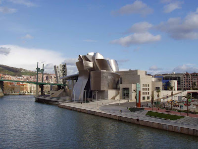 I don't know any ordinary person who likes wind traps but amazingly, architects love them! How about this building by Frank Gehry? How'd you like to walk along the side of this building (above) on a windy day? Of course for wind trap-type buildings, every day is a windy day.
 I've never seen this building close up so I can't tell if it's accessible from the street. It looks like there's half a chance that the main door faces the river, not the front, forcing people from the street to walk around the bleak and arid concrete side. Probably most people come out of what looks like a wind trap parking lot on the right. Imagine how cold the space in front of that lot gets when the wind blows off the river!
Maybe most people don't use the exterior doors and come into the structure from an escalator or an elevator in the parking lot. Maybe it's just me, but that strikes me as sad. The space around a building is so electric and full of potential. I think of a building as a big old shaggy dog of a thing that wants to be part of a community, not an isolated island that's imposed on it.
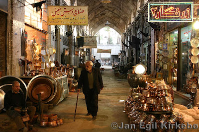 On another point, I've never understood why architects don't make the exterior ground floor of their buildings more interesting. All you have to do is provide space for lots of little shops and let the merchants take care of the rest. Of course you have to make sure the shops are visible from the street. If it's a windy area you make an arcade. Visitors will come from all over to window shop along stores if they have the right "vibe." Architects should be specialists in the art of "vibe."
 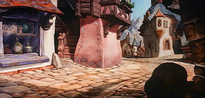 Here's (above) what every architect dreads...the cozy little street full of buildings conceived by by non-architects, and which come out of a specific cultural tradition.
 On such a street you never know what you'll stumble on. Every store reflects the unique character of the owner.
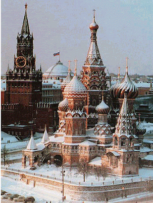 Changing the subject again, here's (above) a nice picture of St. Basil's Cathedral sitting in what used to be called Red Square, next to the Kremlin. This has to be one of the most appealing buildings in the world. Legend has it that Ivan the Terrible had the eyes of the architects put out so they could never again build anything as beautiful.
 You don't see many pictures of the inside of St. Basil's. Maybe that's because it's divided into eight chapels like the one above. What an awesome room! The pattern looks like it was derived from delicate teacups and plates. It gives the room a fragile look, like a sneeze might bring the whole thing tumbling down.

22 comments:
Edward, You REALLY do have a soft spot for architecture! Have you ever built anything? Tree fort, go-cart, tool shed? It's a very satisfying feeling!
My least favorite wind trap.
The walk in Sherman Oaks Galleria Between what used to be Warner's animation and the new Arclight cinemas. Specifically the corner that combines a 100 mile an hour wind tunnel, with a fifty foot long fountain running down the side of the wall that catches the wind at its most fierce. Resulting in a ice cold atomizer from head to toe. Assholes! thats what they are
Unfortunately we're going to see less and less of this natural evolution and character. All cities are being overtaken by the chains and it's getting harder to tell one from another now.
Bland sameness everywhere only broken up by those odd crazy buildings of an architect who thinks they're making a statement when in fact they're just making eyesores.
There are some absolutely lovely European cities and some seem to be fighting to retain their identity but it's getting harder every year I think.
I'm pretty sure it's still called Red Square - the origins of the name are unrelated to communism - as it has been for a couple hundred years I believe. I doubt it would just be changed willy-nilly. But then again, they changed the name of St. Petersburg three times in less than a hundred years...
Nitpicking aside, great post!
St. Basil's is a bit too Toon Town.
I think Antonio Gaudi's buildings are similar to St. Basil's in approach. They're all ornate monuments and highly detailed like St. Basil's but I think they're much more tasteful and appealing.
Most people know the Sagrada Familia
Check out Casa Batlo too. It's my personal favorite.
Now Gaudi, there was a man with some great theories on art and architecture. 'Originality is just returning to the origin,' is one I can remember off the top of my head.
Yes Casa Batio is amazing. Every nook and cranny was planned beautifully.
One of my favorite buildings in the world.
Eddie have you ever been?
Ever visited the witch house in Beverly Hills, Eddie?
http://www.flickr.com/photos/santos/164072267/
I love wind traps. They never last very long if you're walking briskly; you see all kinds of inanimate objects flying as if they had a life of their own in them; they're always unexpected(to me)--and in the flat, dull, constant L.A. weather of beating sunshine and no breeze can be a fun surprise coming out of nowhere. That's it-I think they're fun.
I like being whipped by the wind, assuming I'm dressed warmly enough.
Eddie, you should check out two books on precisely this idea of why cozy streets work and windtunnels don't:
City Comforts
Also a good theoretical (but easy to read) book on people friendly architecture is How Buildings Learn.
I think you'd like both of them!
Also, my nomination for worst building in LA: the downtown DMV building. It's like the Death Star.
Actually, there's a site some may find interesting (and most probably already know about) - http://www.darkpassage.com/
Maybe I'm the only one who finds it fascinating but there's something just... I don't know because 'beautiful' is completely the wrong word. But there's something that draws me to some of the images of the locations there.
For drawing inspiration, it's packed. The abandoned hospital freaks me out but I'd love to wander around inside.
No discussion of architecture is complete without a mention of The Corn Palace.
Nice post. I love the wind, I hate the word "Random" and I think the Russian palace looked better with snow.
Government Center in Boston has my vote for ugliest most wasteful building in the US and the location of one of the nastiest wind traps.
You can see it in this image. On the right side of the building, although it's obscured in this photo, is a set of stairs that you either ascend against gale force winds or descend them with the wind at your back.
What a horrible waste of space and dangerous too. Awful, awful... AWFUL building. And paid for with our tax dollars.
>>Government Center in Boston has my vote for ugliest most wasteful building in the US and the location of one of the nastiest wind traps.<<
Hey Adam,
That area used to be Scollay Square 'til it was torn down in the 60's. It used to be where all the burlesque theaters in Boston were located. Many of the original buildings were quite nice. A real shame they were torn down for that cold, ugly, soulless center now in its place.
I don't think Goverment Center looks all that bad from the ground. I quite like getting off the T and having that space and the ugly buildings (that look uglier in an aerial view like that) sort of push off into the distance opening it out even more.
And it helps that little teapot stand out too - one of the first things I ever saw when I went to Boston.
Many architects rarely appreciate the "organic" look, and the projects destined to be government buildings always take into account the ease of maintenance ands costs before any aesthetic consideration. We have here many buildings with glass fronts, and being in a city with a rather mild to warm weather, these building not only are VERY hot inside, but they rflect the sunlight on the surroundings, making their enviroment particularly inhospitable.
So you'd like to live in Dinseyworld ?
Eddie! I know where the worst wind trap is ever! Outside of Otis! It could be a 90° day but the wind will freeze you and sweep you up into the air!
And hey Luke- I've been to that Witch house- I forgot what street it was on for the last ten years though- thanks!
Hey Eddie,
I believe that first building is the Gugenheim Museum in Spain.... not sure if anyone else mentioned it. My sister who visited it said there's an odd whistling that "howls" out the top of it when the wind blows in from a certain direction.
Great blog as always...
Henry
Sometimes the wind forms a vortex that almost lifts you off your feet.
There's a doozy at Toronto City Hall. They used to wind-tunnel models of the buildings to test for that.
I really hate the vast, sterile concrete plazas between highrises. They look inviting in a scale model & usually include tiny scale-model people socialising & eating their lunch. In real life, they're always deserted.
You can still find those charming shopping lanes in rich neighborhoods in L.A. where they're sustained by strict by-laws. The rest of the world is becoming more like the San Fernando Valley. It's all the same franchise businesses & you can only tell one intersection from another by how they're configured.
I think the future for public spaces in the U.S. is City Walk at Universal Studios. It's still private, so security can simply remove the poor & other undesirables to....wherever it is those people go.
I think the future for public spaces in the U.S. is City Walk at Universal Studios. It's still private, so security can simply remove the poor & other undesirables to....wherever it is those people go.
I prefer my public places to actually be public. Whenever a mall concourse becomes a gathering place it's always depressing. Makes my brain hurt.
Post a Comment