Friday, July 15, 2016

ACTORS AS ART SCHOOL MODELS

Haw! I'm just kidding with the picture above, but it does serve to make my point...that female models dominate art school classes, and not just for the obvious reason. 

Female silhouettes follow lyrical, curved lines that begin at the head and follow through to the feet. They're beautiful, no doubt about it. 


Men, on the other hand, are lumpy. The parts just don't fit together.  Let's face it, realistic men are not as fun to draw as realistic women.


If more evidence is needed I refer you to the comparison above.


Now don't get me wrong. Art and artists need men. If you could boil all of art down to just one principal it would be the combination of force and grace in the same object or situation. We men are half that combination so we have an earned place at the table. Even so, the problem remains....how do we make men more fun to draw?


My own solution is acting. I picture gifted amateur actor-models working in twos, one male and one female. A story outline dominates the session.

It could be a comedy...

..or a drama.

Or some combination of the two.


A script is okay, but I picture improvised situations based on a loose outline, spoken dialogue only if it feels right. A whole story or fragments of different stories. The important thing is that whatever fragments are used,  they should lend themselves to visuals that are fun to act and fun to draw.


It would be fun to alternate comedy with drama, or solos with match-ups. I could see a male actor doing a solo variation a bit like Chris Crocker's "Leave Britany Alone!" Of course you'd have to change the timing to freeze some of the poses and give the class time to draw.


I could see a solo woman doing a sketch like Bette Davis's "I wipe my mouth" from "Of Human Bondage."

Probably the sessions I described would work best with draped models. I'm not sure amateurs could act with their clothes off. That's no problem because I'm not trying to replace classical nude model drawing with these actor sessions. Students need both.

Is that all? Mmmm...no, wait a minute, I forgot something: a good homework assignment for a session like this one is to have the students draw up one or two carefully finished drawings based on the sketches done in class.


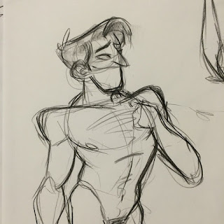
I'm a cartoonist so I see this assignment done in a cartoon style like the one above.


  Lots of styles would work.

BTW: that's not my drawing above. I wish I'd copied down the artist's name.

Monday, July 11, 2016

FLESH-COLORED PANTS

No, these women (above) are not naked...they're simply wearing flesh colored leggings, which are all the rage now. 


Pants like these used to surprise me but now I'm used to them.  They're really nothing new. We white people have always liked things that are flesh colored.


Half the exteriors in my neighborhood (above) look fleshy. 
  

Half the rooms, too.

If you're caucasion like me, you just naturally seek out places to live that look like yourself. Maybe it's the camouflage aspect that appeals to us.


A white man stands against a fleshy wall and...Wow!...he's invisible! Maybe eons ago that's how we foiled the sabertooth tigers. No, wait a minute...they didn't have house paint then. Well then, maybe we just liked the color...I don't know.


Anyway, bathrooms (above) are almost always flesh-colored. A neighbor I talked to bucked the trend and foolishly colored his bathroom sea foam green.  He gave it a nautical look, which seemed to make sense because, after all, it's a room you're always splashing around in. Well...a year later he had to repaint it.


He said the blue walls drove his wife nuts, as if somehow they'd violated a universal law...and in a way, they did.


He repainted the walls flesh and it had an enormous calming effect on his wife. Camouflage? I don't know.


Wednesday, July 06, 2016

MORE EDDIE FITZGERALD CARICATURES


Hey, I found more of my kid's caricatures of me! These were done when she was in 9th or 10th grade, in a burger restaurant near her school. I'd draw her while she ate then she'd draw me while I ate.

How do you like the expression (above) she gave me? I call it eager-stupid. It's set off nicely by the little micro blood vessels in the nose and Dr. Cyclops glasses.


 My turn! I drew her reading. She liked to draw but she hated to pose so I had to draw fast.


 'Back to my kid drawing me again. Good Lord! Look at that ear! Or is it a melting potato?


Aaaaaarghhhh!!!!!  The same day...she beat me again! The way she stretched the face out, across two pages...why didn't I think of that!!??? I'm so jealous!!!


What was my son doing while all this was going on? Well, he wasn't a caricature man...he was more of a comic artist. That's one of his comic covers above. It was for the "I'm Fat Comics" which was all about me; according to the comic, the world's fattest, lumpiest man. Haw!


Sunday, July 03, 2016

VIRTUAL REALITY DANGERS

We all know that virtual reality is just around the corner. The day's coming when men with goggles will be able to enjoy the company of  a beautiful virtual woman right in their own living room. 


It's a computer thing. 


Of course the kind of classy men who frequent Theory Corner want something more than just beauty. They'll want a sweet, intelligent girl... a girl who'll listen to all their problems and...yes...agree with them on just about everything.  Ahhh, that'll be nice, but....

....but one day it's bound to occur, even to the elevated men who come here, that three girls (above) listening to their problems would be better than one. 


And a dozen would be better than three! Yikes! You'll hock everything you've got to buy more RAM!


The day will come when you'll have a house full of virtual women. They'll all be glad to see you and they'll all laugh at your jokes, but don't try to touch them...they don't really exist.


Wait'll you try to use your car.


Or brush your teeth.

How much flossing do you think you'll get done?


 Of course other men will have virtual companions, too. You'll find yourself wondering,  is the male doctor who's operating on me...really paying attention?


Maybe. You'll never know.

We have to face the fact the entire male gender might become hopelessly addicted to the presence of virtual women. Civilization could fall apart.

But let's not be pessimistic. Science has a cure, if we have the courage to apply it. B. F. Skinner said that the only way to extinguish conditioning is by counter-conditioning. Alright then,  let's do that.


Goggles will have to programmed for the extreme opposite type of female...the kind that would discourage virtual addiction. 


Only great mental pain will be able to override great mental pleasure.


Good Luck!

*******************

Oh, yes...on another subject...a word about the Fourth of July:


Wednesday, June 29, 2016

THEN AND NOW COMPARISONS

Like a lot of people I'm a fan of British painter John Constable who painted the Flatford Mill (above) somewhere around 1820. His color choices remind me of El Greco's palette...very grey and gritty, almost expressionist. 

He also seems to have been influenced by the Dutch landscape painters of Rembrandt's time. You see that instantly if you compare the painting with the recent color photo of the same mill below.

If this (above) is what Constable really saw then he's added a lot to what was actually there. 

Constable's painting gives a Dutch emphasis to the sky and to the activities of man. I'm guessing that the Dutch focus on the sky was religiously motivated and their nod to the ingenuity of man was to portray humans as contributing in a small way to the creation described in Genesis.


 Here's (above) another Constable from the same period. He's more sentimental here and less expressionist. Once again nature is portrayed as being improved by the presence of man.


 Here's (above) a close shot photo of the same area as it exists today. Unlike Constable's picture, the trees and shrubs reflect the modern taste for nature untouched by man. The landscape is still cultivated here but the cultivation is disguised. I guess my tastes are modern because I like the newer look. I still like Constable, though.


I don't want to confine my comparisons to paintings, so here's (above) a comparison of two photos. The first shows a village intersection taken in 1910 or 20. I like the way the winding road invites the viewer to take a stroll up the hill.


Here's the same intersection, a hundred years later. The earlier view is better, but the hill is still somewhat inviting and the tree is a nice addition. I do wish, though, that the view of the house on the hill had been preserved. Also, the structures on the right seem to have been built without sensitivity to the area they have to fit into.

This (above) is a postcard showing a bridge in Derbyshire, I'm not sure about the date. I'll guess the 1910s. The trees on the nearby hill are sparse but still picturesque.


 Here's (above) the same bridge a hundred years later. A near forest has grown up. IMO, the lush vegetation is a bit less beautiful than the sparse version, but I'm so happy to see new growth that I support the later version nevertheless.


How about one more? What do you think of this street (above)? I'm guessing the picture was snapped between 1900 and 1920. The houses on the left make a nice contrast to the shops on the right. I like the way the street ends at a perpendicular row of houses.


Here (above, a hundred years later) the houses on the right have been preserved...well, sort of...but the structures on the left have been badly altered and the street seems awkwardly wider than before.

I don't think parked cars hurt the appearance of a street but I miss the molding along the top of the windows of the foreground shop, and the second floor balcony supports (corbels).

Friday, June 24, 2016

"THE OTHER PARIS"


I'm reading a recent book called "The Other Paris." It's mostly about that city in it's heyday in the 19th and early 20th Century. People used to say about the city, "I'd rather be poor in Paris than rich anywhere else."


You can see why they felt that way. The city's narrow streets remained beautiful even when flooded as they were when this picture (above) was taken in 1909. 


Above,  the exterior of a famous artists' cabaret in Clichy.


It was pretty nice inside (above).


But there were even fancier places (above) for those who could afford it.

Above, Monjol, where the poorest, most desperate women of the night offered their wares. It's odd to see it on a picture postcard.


It was cleaned up a bit by 1922 when this picture (above) was taken. The clean-up had unintended consequences, though. The enforced closing of bordellos put the women on the street where they needed tough guy pimps for protection.


This (above) is the gigantic Les Halles market. Lots of the poor lived directly and indirectly off the market.


The market was renovated and made more sanitary in (I think) 1960. That put a lot of poor out of work, necessitating broader social programs and more taxes.


Today the city is still wonderful and now it's mostly well lit and well ordered...maybe too much so. The book seems to ask the question: can any modern city ever achieve the magic of the old Paris? Exactly what did the magic of the old city consist of? Those are interesting questions.  


Wednesday, June 22, 2016

THE ULTIMATE HOME OFFICE

Thanks to Alexander Calder I found it! The ultimate home office!!!!!!!!!!!!!! Of course it's a kitchen in the photo but it's not hard to imagine the kind of accessory changes that would transform it into an artist's workplace.

The Chinese kite's a great idea as is the homemade copper baking mold lights and the Moroccan tapestry.

Nice, eh?