Wednesday, March 27, 2013

THE "NOT SO BIG HOUSE" (REVISED)


Here's (above) an interesting book: Susan Susanka's "Creating the Not So Big House." Actually, the kind of houses she's talking about aren't small, they're just not as big as most in their price range. She believes space is wasted in most new homes and people would be happier with a more compact and complex design for the same price. 

The smaller and better-designed house would feel larger than it is. 


As a case in point, here's part of a living room designed by Susanka herself. It's a bit crowded, but I like it. It feels spacious because it affords a tantalizing glimpse into other rooms, and I love the idea of wrapping a staircase around a fireplace.

A word about fireplaces: they're very controversial these days. They're inefficient at heating but they're a powerful symbol and a home just doesn't seem like a home without one. Modern architects often make them freestanding, allowing for access to other rooms on their sides.


Here's a common variation of the freestanding fireplace (not by Susanka). The fireplace is against an interior wall and visual access to rooms on either side is still maintained. It works fine. I wonder why anyone ever put a fireplace against an exterior wall. Half the heat is lost that way.


Susanka calls our attention to this "away room" (above) by architect Bernie Baker. The room is only the size of a small bedroom and it serves as a study or a temporary guest room that's visually connected to the living room and kitchen.


Sometimes an architect is given the task of remodeling an already existing house or room. My guess is that the original design of this workspace (above) was too dark for Susanka's client. I imagine the client thought she'd take out the tiny windows shown above and put in larger ones.


Instead Susanka wisely left the original space alone and installed large windows (above) over another part of the desk. The contrast between the two types of windows must have livened up the space considerably.


This, believe it or not, is simply the entrance to a raised, first floor bathroom. The sink is to the left and the rest is behind a door to the right. I love the beckoning, mysterious window above the towel rack.

This Craftsman-influenced design reminds me how much I prefer American wooden  architecture to what Europeans were turning out after 1920. Bauhaus has to be the most overrated architectural movement in history. Who wants to live in a concrete house that looks like a factory? That's a dumb idea. Americans combined German, English and Japanese influences to create our own version of cozy, comfortable, and meaningful.


Unfortunately Susanka misses as often as she hits. This Libertyville house she designed (above) is full of design flaws. The kitchen lacks character and the master bedroom is awkward and unimaginative.


And the exterior (above)...Ouch! About that, the less said the better. To be fair the side of the house is plain because it'll face another house, but even so..... Oh, well, the book is still worth having for the good parts, and the philosophy expressed there is solid, even if the author applies it unevenly.


Monday, March 25, 2013

WHAT IF HUMANS BEHAVED LIKE ANIMALS?


The other night I saw a nature documentary at John's house. It was about life in the ocean, how predation was a constant and how creatures were very good at hiding themselves and setting traps for their neighbors. It got me to thinking....what if human beings were like that? What if we lived the way sea creatures do?


In such a world we would still have nice suburban houses and cars, but every morning we would go out looking for prey to eat, and that prey would include other humans. On the street we'd cruise around looking for people and pets to eat, all the while avoiding people who'd eat us.


 By morning's end there'd be quite a few bodies strewn about. No matter. Through long practice communities would become very efficient at cleaning up.


By afternoon everything would be nice and tidy and we'd all be satiated and pose no threat to each other. We'd be fit to work at the office or even help a little old lady cross the street (above).


Night, however, would mark a return to predation. That's because some humans would be night hunters. At night families would lock the doors and pull the shades down to make it appear that nobody was home. They'd be careful to speak in hushed tones and watch TV with the sound low...but that wouldn't always fool the bad guys.


In the morning it would be pretty clear which homes had a bad night.


Apart from food one of our biggest concerns would be finding a mate. Human males would dress colorfully to attract females (above) and have exaggerated red genitalia to make a good show of it. If another male challenged us, we'd fight, sometimes to the death.

Everybody would have big families in the hope that a small number of children would survive to become adults, Of course they wouldn't have even the surviving kids for more than a few years. Kids would leave the house at a fairly early age lest the hungry parents begin to think of them as prey.

Interesting, huh?


Thursday, March 21, 2013

LIMBURGER CHEESE


This post is about Limburger cheese, the world's stinkiest food. I just bought a block but I haven't opened it yet. I figure I'll open it here and take my very first bite with the whole world watching.
"When I was a kid my dad used to bring this stuff home just to watch the rest of us run for the exits. He thought it was funny. I'll bet he never ate any of it!


"Okay, enough babbling. Let's open the sucker!"


"The-e-e-re we go!"


SFX: (SNIFF! SNIFF!)


"Oh, that's nasty!!!!"


"Oooooh, I just caught a second wave. That really is nasty!"


"Now, now...let's not rush to judgement. This is America where every food is entitled to a taste test."


"Well, you know....it's not really half bad. It tastes like Camembert."


"In fact...I think...I think I like it! Who'd'da thunk?"

Tuesday, March 19, 2013

RALPH BAKSHI SKETCHES

At the risk of stating the obvious, Ralph is one heck of a cartoonist! What do you think of the sketch above, particularly of the guy at the bottom? The beautiful lines, the humor, the philosophy and street experience embedded in the drawing...could Hockney or Warhol have done better?


I'm amazed that Ralph (above) was never offered a regular comic strip in the papers. Maybe he was and I just never heard about it.


If I'd been a newspaper editor I'd have offered Ralph a regular space of his own to do whatever he wanted to do. Ralph would have been great with continuing characters, but I'd have been equally happy if he'd decided to simply be a cartoonist observing the world around him the way Herriman (above) used to in the early 1900s. 


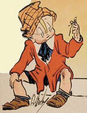
What were Ralph's formative influences? I wish I knew. I know he likes the old Percy Crosby strip "Skippy" (above). Skippy wore loose, oversize clothing and a funky hat, just like the characters in Ralph's doodles.


Crosby was incredibly creative with Skippy's jacket (above), the way it wrinkled and wrapped. Artists get off on things like that.


My guess is that George Lichty (above) was an influence...


...as was Billy De Beck's "Barney Google."

Ash Can artist Reginald Marsh (above) might have been an influence.


Ralph colors his sketches a little bit like Marsh colored his (above).


Crumb must have influenced Ralph. Crumb used Herriman style line technique from the early days of comics to depict what he was seeing on the street in the 60s. I'm guessing that the idea that you could use the old to depict the new was a real revelation to Ralph, who was himself a fan of early cartooning.

Do all these possible influences add up to Ralph? Nope, he's one of a kind. There's no mistaking a Ralph drawing for anyone else's.


************************

BTW: Thanks to Steve Worth for permission to photograph the "Coonskin" drawing at the top.

Friday, March 15, 2013

HOW ARTISTS SHOULD LIVE


This, believe it or not, is a post about the need for fabric and textural variety in interior decoration. I need to make that clear right away because at first glance the whole post looks like a bunch of girls in their underwear. That's because all the images here come from adult sites. I just didn't know any other place where I could find the kind of colorful interiors I had in mind. I'll try to clean up the pictures where I can. It's the best I can do.

Anyway, I think the house shown here (above) is an Australian photographer's collective. This is the kind of environment artsy people of all kinds thrive in. Artists require color. We have to see it all around us every day. It's not enough to put colorful posters on the wall. Color requires texture and pattern to read effectively, and that means fabric, plants, stone, glass, and wood grain.


Look what these windows (above) do for this room.


I like fabric draped over furniture. The example above is a little too girly for my taste, but it makes the point.


I love this picture (above) because it really sells the idea of a sleeping porch that doubles as a sort of greenhouse or potting shed. It's a whole room devoted to color and texture, and to the changing quality of light as the sun makes its way across the sky.

How do you like the muted yellow bedspread and the purple and indigo pillows? What do you think of the weathered old rug on the floor and the artfully sagging old cot?


It wouldn't cost much to build a structure like this (above). The roof is corrugated translucent plastic, and the screens are weighted plastic screening fabric that hangs like drapes. I like the Japanese-style frame.


I like rooms that are drenched in light in the daytime, and are dark and mood-lit at night. For a spot that's dark no matter what the time of day I suggest luxurious, thick, heavy, dark green...either as a carpet (above) or as a drape.


Bed linens (above) are a great excuse for complex color. The patterns here remind me of washi, the Japanese colored rice paper that you see in craft stores.


You can't get away with fabric this flamboyant (above) unless you're a girl. On the other hand, Matisse probably had stuff like this around the house.

********************

Well, that's all I have to say about that. On another subject, I'll be posting twice a week from now on, probably on Monday and Thursday. That's one day less than before. The reason is that since December I've gotten more than a third fewer hits. The number is still pretty good, but I'm a ham and I miss the larger audience. Maybe it's for the best because this'll give me more time to work on income-producing projects.