Sunday, October 04, 2009

MILDRED PIERCE REVISITED


NOTE: IF THE SPACE ABOVE IS BLANK, JUST CLICK ON THE EMPTY SPACE.

With all this talk about typography and movies, it might not be out of line to talk about the trailer (above) for "Mildred Pierce," my favorite 40s melodrama. The trailer is a self-contained work of art, but it's also typical of the high-end trailers of the period, and I thought it might be fun to pick it apart and see what makes the previews of that era so appealing.

As we get into it you'll see that rules of film logic that you clung to til now are repeatedly violated, and with good effect. The violations work! No doubt about it, this trailer will have you re-thinking what you thought you knew about film.


BTW, If this analysis looks familiar, that's because it is...I did this before in July, 2007, but I've had a lot of time to think about it since then, and I think I can do a much, much better job now. If I miss something please let me know.

Well, it starts with a tumultuous fanfare and a title that reads, "WARNER BROS. invite you to witness the first scene of a motion picture the whole world will TALK ABOUT...." [You expect to see the main title 'Mildred Pierce' here but nope, this is just a teaser. The filmmaker is deliberately stimulating a curiosity that he has no intention of satisfying yet.]


DISSOLVE to gunshots heard in an underlit room at night. BAM! BAM! Cut to a figure falling to the floor as the unseen shooter pumps more bullets into him. With his last, dying breath he says the word..."Mildred."

More quick shots and an announcer says: " 'Mildred'...a name gasped in the night...the one last word of a dying man...but one word that tells a thousand stories of a WOMAN...who left her mark on every man she met." This is the last time we hear the announcer. They only used him for one, long sentense at the start!

[I'll interrupt here to say that I read the novel the film is taken from, and the way Mildred is treated in the trailer is much more sensational and lurid than the way she's treated in the book. In the book she's not a femme fatale, but a hard-working, obsessed mother. But let's not quibble. The trailer sucks you in, that's the important thing.]


PLAYBOY: "Mildred had more to offer in a glance than most women give in a lifetime."

HUSBAND: "Mildred knew what she wanted and wasn't too particular about how she got it."

SLEAZY BOYFRIEND: "Loving her was like shaking hands with the Devil!"


Notice that we haven't heard any Mildred dialogue yet. Come to think of it, we haven't heard any dialogue by any character yet. The three men I just quoted were addressing the camera, just selling the film.

[None of this (above) fits with the tone of the book. I guess the Hollywood wisdom was that a film has to be about somebody interesting, and you relentlessly and single-mindedly sell that person before you do anything else. The plot is totally secondary.]


A TITLE sweeps up from the floor: "It's JOAN Crawford....(new title, building music)...in her most DARINGLY DIFFERENT portrayal...(big, new title and furiously building music)...'MILDRED PIERCE'."

[The music reaches a crescendo, and the trailer seems to want to end here, and it almost does...but wait... the filmmaker hasn't told us about the plot yet. Amazingly, after almost drawing to a close, the film music winds up again and we segway from an exit theme to a sentimental fresh start. This isn't a fluke. I see this technique in trailer after trailer. It violates all the rules, but it works beautifully!!!!!! Go figure!]

Do we get to hear dialogue from the film yet? NO! Instead we see clips of Mildred with different men and a new title sweeps in..."THE INTIMATE AFFAIRS of a WOMAN...(new title)...who refused to live BY THE RULES--

Wow! Can you believe that! Even after the new start, they still wouldn't let us hear Mildred!!!!!! Man, they're witholding her until we're drooling with frustration! Finally, we get some dialogue (it's about time), but the dialogue is interrupted by another title: "She tried TO KISS OFF a crime!"


Huh? Crime? What crime? The shooting was a long time ago, back at the start of the trailer. This kiss-off-a-crime title appears between clips of romantic dialogue. The filmmaker deliberately doesn't sync the titles with what's happening on the screen. Once again, the rules are broken! But it works! Watch the film again and see if you don't agree!

Well, the trailer goes on, and there's lots more I could comment on, but I better end here. So, what have we learned? I learned that selling personality is everything, that an audience will tolerate more postponed satisfaction than I ever dreamed possible, that an audience actually wants to be tortured with denial of climaxes, that it's okay if a story stops and starts up again, that visuals don't have to sync with the dialogue, and that film making is a mischievous game that you play with an audience.


Friday, October 02, 2009

SOME INTERESTING FILM TITLES


Mark Simonson, the artist who designed my "Uncle Eddie's Theory Corner" banner, has hooked me on typography. Here's are some examples of interesting film lettering gleaned from the links on Mark's site. See what you think.

I'll start with a fairly normal title card (above) from the 40s. It's straight-forward, flat poster art (above)...very effective when accompanied by good music.


More exciting were the titles that were laid over action. Usually these occurred at the end of trailers. The titles at the beginning of the film itself were usually more conservative.


I love how dramatic titles (above) often were done in a tiki style, as if they were ripped from canoes on cannibal islands. The incongruity of stark, primitive lettering over modern city backgrounds promised a story filled to the brim with raw emotion.


I assume this title (above) is also from the trailer, and not from the film. The title floating over the crowds and cars seems to convey a point that's not emphasized in the film, i.e., that we're going to see a story about grimy, sweaty, but somehow tragic and heroic urban man. It's a manifesto that declares the filmmaker's belief that modern man is a fit subject for great literature. I love manifestos. A film should convey passion. It should grab you by the collar and try to convince you of something.

I also love it when a film's graphics make points that aren't overtly contained in the script. They're best when they address the subtext rather than the text.


Here's a common Noir technique: The title appears over a city background but is framed by fuzzy black borders. You get the feeling that we're looking out at the world through malevolent, satanic eyes. Or maybe we're pulling down the slat of a blind to look at a scene in Hell.


I said that trailers usually contained better graphics than the film, but there were exceptions. Here's (above) a perfectly fine trailer end title...


...and an even better title graphic that appears at the start of the film. Once again the typography conveys weird, primitive, psychological energy, but it's laid over a classical, Rubenesque color scheme. The card promises thrills, but assures us that we're safe in the hands of a master storyteller.


Here's (above) the end title. In a comment Lester said the constable seems to say "Alright, folks, move along. There's nothing to see here. Nothing to see," and that's exactly right. It's a terrific counterpoint to the high-intensity drama we just witnessed.

I would add that there's something weird about the shot. The graphic seems to say, "The story is over now...you can go home and relax...but impish, malevolent magic is still at work in the world, so don't relax too much. "


BTW: The link to Mark's site and the Annyas screenshots that Mark linked to:


Monday, September 28, 2009

THE POET (PART II)


GLURG! GLURG! GLURG! GLURG!


"I'm JOYFULLY INSANE...insane with...with..."


GLURGGLURGGLURGGLURGGLURG!!!!!


"...INSANE with KISSING your TENDER FEET!"


Yes, the TENDER FEET are REALLY NEAT!!!!"


"DONE!"


"Whew!"


"Now for my reward! I think I've earned a little nip!"
NOTE: This is an alteredversion of what I assume is a famous poem but I don't have the name at hand.


Sunday, September 27, 2009

HALLOWEEN TRIBUTE TO PETER LORRE


Talking about Peter Lorre last time made me want do more about him.


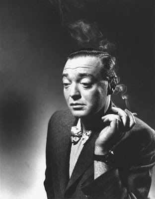
This (above) is a terrific still, but films that go this far over the top may not use Lorre to best advantage.


Lorre has a unique face that seems baby-like and thoroughly adult at the same time. He's like an old baby.


Just like a baby he finds the world confusing. He innocently desires to bring pain to the world and can't understand why anybody would resent that.


He's hunted, despised...treated like an animal.


Backed up against the wall, he snaps. "If they want violence, I'll give them violence!!!"


In real life Lorre always wanted be known as "Pete" Lorre and longed to join a bowling league and be one of the guys. Well, I made up the bowling thing, but you know what I mean.


He got a few roles that were intended to be played almost normal....


...but they came out skewered. Lorre was not born to play the guy next door.


I love it (above) when Lorre smiles. It's a terrific smile but the face nearly cracks with the effort.


Poor Lorre was short.


Maybe because he was self-conscious about his height, he was always asking women to sit on his knee.


Either that, or he would sit on their knees.


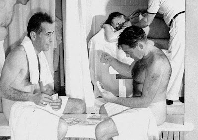
One of Lorre's closest friends was Humphrey Bogart. Here (above) they are in a sauna playing cards. Unbelievable! Lorre is hairy and well-built, and Bogart is pink with an average build!


Want to hear one of Peter Lorre's radio's radio shows? Try this link to The Old Time Radio Network: http://www.otr.net/?p=mita

He's in all the shows shown above, and in a few more that aren't listed. For more info see Cheryl's comment in the comments section, and visit her site for a complete rundown on what Loore we can expect to see on Turner in October.

BTW: Thanks to the Peter Lorre Book site for some of the pictures used here: http://www.peterlorrebook.com/photos03.html


Friday, September 25, 2009

JAYNE MANSFIELD'S HOUSE


There it is (above), the famous Pink Palace at 10100 Sunset Blvd. in Beverly Hills.


Jayne lived there with husband Mickey Hargitay, a body builder and contractor.


Most of the rooms were pink, with a few accents of black or purple. That's Jayne on the balcony overlooking the living room.


Here (above) the wall appears to be painted white, maybe to fit with the white piano. It actually saw a lot of use. Jayne was classically trained on both piano and violin. You can hear her play on the net. She's not bad.


Above, the famous pink bathroom, done in pink shag and terrycloth. You could dry off just by wiggling against the wall.


I like to think that after a nice bath Jayne relaxed in an angora bikini.


Or maybe she didn't. Five kids must've kept her pretty busy. Here's the nursery. It's the way I imagine Liberace must have spent his childhood.


Here (above) she reclines on her black silk bed spread surrounded by...guess what...more pink! But what the heck is that white mist on the floor? Did she have a fog machine in the bedroom? If she did, my admiration knows no bounds.


It must have been hard for Mickey to live around pink all the time.


No doubt there were times when Mickey just had to escape from all that pink....escape into his own room where everything was...red. Quilted red, too...even the ceiling!


This (above) is the way I'd like to think all of Beverly Hills used to be, but maybe only Jayne and Liberace lived up to the ideal. Did they visit each other and compare notes?


Outdoors, the famous heart-shaped pool.


I'm willing to bet the barbecue area was pink too, even though it appears blue in the photo.


I don't know why, but I'd like to think that Peter Lorre and his family lived next door. Can you imagine him at Jayne's back door, borrowing a cup of sugar?