Showing posts with label caricature. Show all posts

Tuesday, December 07, 2010

TOMOKAZU TASATA: MASTER CARICATURIST

If you like to draw caricatures then hold your hat, because this blog will be one of the most important that you're likely to read this year...well, this week, anyway. We'll discuss a wonderful Japanese caricaturist, Tomokazu Tabata, and we'll investigate how he manages to draw drastic portraits without offending people. 


In the previous post commenters EZ, Jennifer and Pappy remarked that some of the recipients of Aaron's caricatures didn't seem too happy about them. The guy above is an example.  Why the sour face? The caricature was a good one; he should have been delighted. Aaron must have felt pretty bad.

My first reaction was that Asians must react negatively to caricatures that give them linear eyes. They don't think of themselves that way, and maybe they're insulted by it.

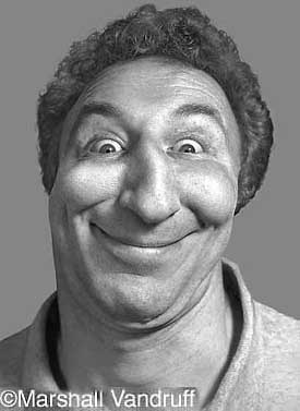
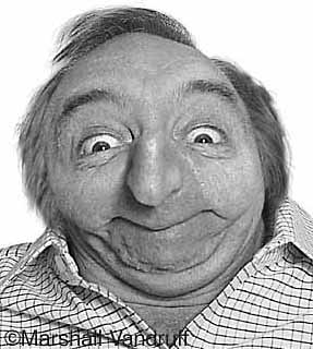
But Tomo, who's Asian himself, routinely draws linear eyes and Asian subjects love it. What gives? How come they accept it from him, and not from Aaron?


I thought about this all morning, then the answer hit me. People accept it from Tomo because his drawings are so doggone happy and cartoony.  His desire is not to humiliate his subjects infront of a crowd, but to bring them into the cartoon world where everybody looks goofy. His purpose is to glorify cartooning. 


Contrast that with this portrait of an American kid who's slightly wall-eyed.  Maybe it wasn't such a good idea to do it this way. It's realistic enough to suggest that the kid actually has a serious deformity. It's bound to make the kid self-conscious about his eyes.


Look at how Tomo handles a similar problem.  The guy in the upper left is handsome, but he's also a bit chunky. An unsympathetic artist could shred him, but Tomo chooses instead to bring him into the world of stylized cartoons where everybody is distorted. The finished drawing of the guy pulls no punches, yet it still succeeds in having a good-time feel.


This (above) is a terrific picture. It's also philosophical. The value of remembering moments of happiness can't be over-estimated. Remembering those gives us hope that good times are ahead. and in moments of solitary depression, reminds us of the importance of being with friends.

Never pass up the opportunity to be drawn by a first-rate caricaturist. it's always worth the money.


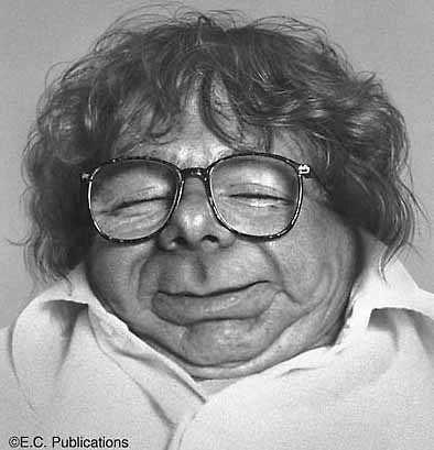
A happy kid (above), with a happy portrait. I suspect that downright gloomy portraits would succeed too, provided the gloom was funny and cartoony. Portraits like that are also happy, just in a different way. It's Tomo's simplicity and directness that sells the picture. 

That approach even works when you pile on a lot of detail (above).  This picture was done by Sakiko Ushiodo.


Tomo also sculpts. Wouldn't it be great to have a sculptured caricature done in his style? It would cost, though. You can't sculpt as quickly as you can draw.


So, have I abandoned Aaron (the two pictures above) for Tomo? No, not at all.


 I like them both for different reasons. Aaron's more grotesque than Tomo, but his best work is so outrageous that it elicits involuntary laughter, and that's the gold standard for caricature. 


Saturday, February 06, 2010

CARICATURES OF PAUL MOYSE


You've probably seen Paul Moyse's work before, but just don't remember the name. The guy's brilliant!


He's done a lot of caricatures for The Weekly Standard in England and they get re-printed over here in all sorts of venues. I highly recommend his web site:


Actually, this link will take you to the page on his web site where he put up caricatures of himself done by other artists. It's VERY instructive!


I thought it might be interesting to study some of these caricatures. Maybe they'll give us an insight into how far a caricature can deviate and still retain a likeness.

Let's start with the way Paul Moyse really looks. In the snapshot above his face appears to have two parts: a rounded, slightly squared-off top, and a weighty, imposing muzzle. The parts are unified by a big nose (Geez, I hope Moyse never reads this!).


Here's (above) Moyse's own caricature of himself. It's a great picture but, being a self-portrait, it attempts to flatter. The head is somewhat unified in design, and not so much in two distinct parts, as in the photo. A unified design is a sign of youth (I talk about this in my previous post on faces). The skin is also robust and tight, also a youthful characteristic. What the heck! When I do pictures of myself I always shave off a few years. That's an artists perogative.


Here's (above) another self-portrait. Wow! A terrific picture! It looks like something Virgil Parch might have drawn. You could say that the nose is too big and the eyes are too close, but it's so funny that it doesn't matter. Boy, if a drawing's funny, people accept it as an accurate caricature, even if it isn't.


Here's an interpretation of Moyse (above) by another artist, one that's more realistic (well, sort of). The eyes are just as close as in the previous picture but here they don't work. You forgive close eyes on a deliberately distorted picture, but on a more realistic picture like this, they seem out of place.


Another snapshot (above). Moyse's dome is round, but it's also squared off a little. The top of the head is de-emphasized and the wide-angle muzzle is thrust at the camera. .


Here's (above) a caricature by another artist that emphasizes the wide angle even more than the photo. The cheeks are less thick than his real cheeks, and the lips are bigger. You could argue that the top of the head might have been smaller, and more detail on the shirt might have been nice.


By another artist (above). The face has a puffy, bee-stung look to it, as if it's pushed out from the inside. The line work is beautiful, but the artist was so intent on capturing the puffy quality that he lost some of the likeness. As in the picture above this one, the dome seems to distract.

In general I think it's a mistake for a caricature to emphasize irregular puffiness, even if the subject really is puffy. I don't know why that is. It's a law laid down by Zeus, and we mortals would do best to follow it without question.

In a comment Niki mentioned that the puffiness makes the face look black. I never thought about it before, but I guess it does.


Here (above) the artist emphasizes the chin. Lots of artists do this, and I have to admit that the effect is appealing. It certainly helps in establishing volume and weight. Even so, it seems inappropriate to the subject.

Being a caricaturist can be scary. Sometimes you realize halfway through that you're starting to lose the likeness, but the drawing is succeeding on its own terms as a work of art, and it demands that you continue as before, subject be damned! You have no choice but to do that, but how do you justify it to the person you're drawing?


Add Image

Wow! A highly-skilled picture (above) that emphasizes a just-woke-out-of-a-deep-sleep look in the subject's eyes. The technique is so wonderful that I hesitate to criticize, but Zeus compels me to remind artists that this quality of the eyes is forbidden to caricaturists. Only Zeus knows why, and he's not telling.

The hairy muzzle is given an emphasis that isn't in the photo reference, but it's done so well that you can't complain. The artist seems to be insinuating his own belief that facial hair is bizarre and unnatural, and I admire him for doing that.

Artists should insinuate their own opinions about the world into their work. That's because an artists first responsibility, even a caricaturists first responsibility, is to create a beautiful work of art that reveals something interesting about the natural world.


Wednesday, December 03, 2008

MARSHALL VANDRUFF: CARICATURIST


Geez, I love Marshall's caricatures. They look like they were done on Photoshop, but they're from the early 1990s and I think they derive from darkroom manipulation and prismacolor enhancement.

Marshall did these when there weren't very many people in the computer caricature field. Interesting, huh? (Marshall deserves a much better intro than this but I'm so sick from medication that I can hardly keep myself from falling off the chair I'm sitting on.)


Monday, October 16, 2006

I FOUND IT! MY DAUGHTER"S NECK HAIR DRAWING!!!

OK, based on this drawing (click to enlarge) I claim that my daughter "owns" neck hairs! If you've got a better neck hair drawing put it up now or forever hold your peace!

I may as well add that the original title of this drawing, emblazoned with marker over the top of the page, was "Hi! My name is Eddie! I am fat!"


Hmmm... this post seems a little sparse. Here's (above) a couple of photos to bulk it up, and a pithy caption to accompany them: "Scrumptious tongue mystery hat!!!! Noodle stretching putty service....tomahawk?"

Satisfied?

Monday, August 21, 2006

MARSHALL VANDRUFF: PIONEERING CARICATURIST

I used to work with Marshall at Cartoon Network. He's funny, passionate and loves people, qualities which manage to find their way into his caricatures.


Marshall did caricatures like these in the 80s and early 90s when professional computer caricature was still somewhat uncommon. I think he had to resort to added photographic and prismacolor enhancement to get what he was looking for.


What a shame that newspapers didn't pick up on what Marshall did...They could have had a Sunday comedy section built around funny pictures like these! As it happened Mad magazine picked up Marshall so it all had a happy ending!

Sunday, May 28, 2006

A TERRIFIC CARICATURE LESSON!

Here's two pictures of me. The top one was drawn by Mike Fontanelli and is influenced a bit by John K's caricature style. The bottom one was drawn 100% by John and was used in a Ren & Stimpy episode called "Onward and Upward."

I find it shocking that two pictures of the same man can be so different. Evidently I'm still recognizably me even when the back of my head sticks out like a torpedo, as it does in Mike's sketch above. It doesn't matter that my head doesn't really have that shape. 

As long as my most recognizable unique features are still there (the nose, teeth,dog ears and chinless neck) a lot of the other features can apparently be changed at will, without harming the likeness.


What this demonstrates is that a caricaturist is not confined to exaggerating what he sees. We only have to do that for the most significant parts. We can make up other parts. We can put something in just because its funny, as long as in some sense it still feels like the person we're drawing.

I don't know about you but I find that liberating!