Wednesday, October 31, 2007
Tuesday, October 30, 2007
A LITTLE HALLOWEEN READING
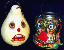
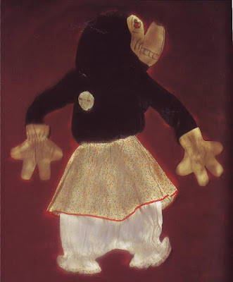
 Holy Cow! It's Halloween already!!!!!!!!!!! Aaaargh! I was so absorbed with work that I completely neglected one of the best holidays of the year! What follows is too little, too late but I refuse to let Halloween pass without at least some recognition here!
 Fortunately I stumbled on a site by a guy named Karswell who has great taste in all things horrifying. I'll loot Karswell's site and shake out the bag here, on the floor of my own blog. If you like what you see check out Karswell's site:
Karswell collects pre-code horror comics. I don't have the bandwidth to reproduce whole stories at a decent size, but here are a few samples. Some of what I reproduce here gives away the ending of the story. That doesn't bother me much because I usually value set-ups more than payoffs, but that's me. If it bothers you then don't read any farther.
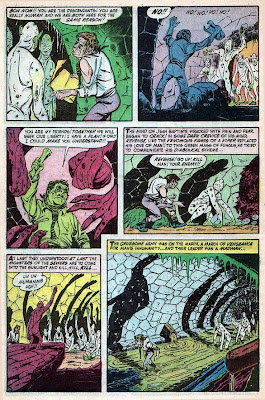
OK, I open up with an excerpt (above) from "The Sewer Monsters." In the part we're missing, it's the eve of the French Revolution and a man is about to be hanged for a crime he didn't commit. Fortunately for him the Revolution breaks out and he manages to crawl into the Paris sewer system with the rope still around his neck. His eyes are bulging and his neck is broken from the near-hanging but at least he's still alive. Under the streets he discovers a race of fungus people who've lived in the sewers for centuries. Here's (above) a page from the middle of the story where he rouses the fungus people to wreck havoc on Paris.
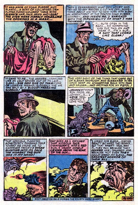 Here's (above) an excerpt from "The Greatest Horror of Them All," a story about a guy who discovers that his loving girlfriend was all along a hideous monster.
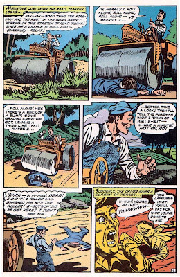 Here's (above) an excerpt from "The Flat Man" where a guy is run over by a bulldozer and survives.
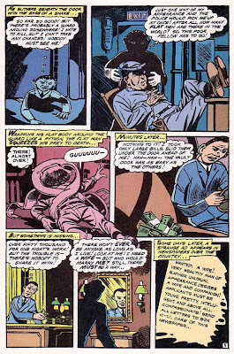 Skipping a bit of story, the flattened man is so angry about what was done to him that he devotes his life to crime. He's perfect for it because he can effortlessly slip under locked doors. Eventually he becomes rich and decides that he wants a wife. The wife angle is sheer genius! As we all know, every monster wants a woman!
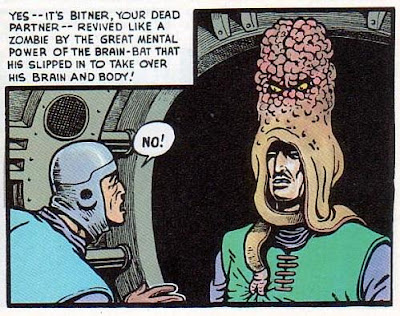 Here's (above) a single panel from Basil Wolverton's "Brain Bats of Venus." I include it because the idea of walking around with a brain bat on your head, controlling everything you do, is just so cool.
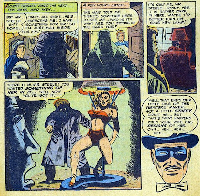 Here's (above) the final panels of "The Modern Designer," about a deranged lamp designer who deals with a scheming wife.
HALLOWEEN IS TOMORROW!
What am I doing talking about architecture (yesterday's post) when Halloween is so close? Forgive me! I must have been addled but I think I'm OK now!
Here's (above) a short trailer for the spook shows they used to hold in movie theaters in the 50s. Whatever happened to spook shows!?
Here's a choice 10-minute sequence from the b&w "Raven," my favorite Bella picture. Come to think of it, it's my favorite Karloff too! The print is pretty good for a YouTube copy but it loaded a bit slow on my computer. It's worth the wait!
Here's (above) a two-minute clip of Martin Landau reciting "Home, I have no home" for Burton's "Ed Wood" film. YouTube has three versions of this, including Lugosi's own reading of it. All are worth seeing but I only had space for one.
Last but not least, Here's a short clip of Criswell delivering the opening narration for "Plan 9 from Outer Space."
Monday, October 29, 2007
I LOVE CALIFORNIA RANCH HOUSES!
 I live in LA, specifically in the San Fernando Valley. California ranch houses (above) are everywhere here. Maybe that's because until recent times the Valley was full of real horse ranches and orange groves. People here are so used to the ranch style that it's invisible. They feel that they don't have an architectural style of their own (apart from bungalows) , but they certainly do, and I like it a lot.
I don't really know how to define the style except to say that it's low and horizontal with sprawling "V"- shaped shingle roofs with wide eaves. A lot of houses in this style look like they've been customized with add-ons, but that's part of the look and a lot of the homes looked like that when they were new.
 Here's (above) an example of the customized look. The three structures don't look like they fit together, but they do and I for one find the combination cozy rather than jarring. The pool is interesting because it's a 50s modern shape. The California ranch style is an interesting amalgam of old and new. It's very horizontal and simple the way 50s modern tended to be, but it also incorporates old ranch and barn ideas, and numbers of old European ideas like French doors.
 But that's not the end of the story! According to a book called "Ranch House" where I got these pictures from, the style was also influenced by the movies!
The biggest influence was the ranch houses seen in singing cowboy films, but designers were also influenced by the Swiss architecture in Disney films. Ghepetto's workshop in Pinnochio and the fairy tale cottage in Snow White made a big impression! That's where the scalloped fascia boards come from and the ultra-low roof tips. How do you like the curly doll-house struts? They're kitchy but in some strange way they seem to fit!
My guess is that film aesthetics still have a big influence on LA architecture. When I added an enclosed back porch to my house a few years ago I asked for a combination of Morbius's house from "Forbidden Planet" with thick, natural wood beams like those in Ghepetto's workshop. The contractor just shrugged. He was used to requests like that. He had both films in his collection at home.
 Here's (above) an example of the French doors that often front the back yards, even of small houses. They let in plenty of light but they're not as sterile as the large sheets of plain glass that modern purists were using at the time.
I also like the lived-in look that characterizes these houses. These were houses for the working masses and they assumed the residents had kids.
 Inside (above) it wasn't uncommon to find sheltering white, beamed ceilings. I love the simplicity of these rooms. The builders used simple, unpretentious materials to keep the price down. And look how cheery it is! These houses had good vibes!
 Here's (above) the barn doors and diamond-shaped windows that you see so often. I love the colors: brown, muted yellow and white. On the yellow wall you can see the board-and-batten struts which look great and were cheap and easy to put up. The shake roofs are probably a fire hazard but they look terrific!
 California ranch homes frequently open into a modest perpendicular corridor like the one above. That's the front door on the left side of the middle of the corridor. I think I can guess why the builders felt so strongly about these. You could argue that the long corridor is wasted space but when you're actually standing in one they seem delightful and absolutely indispensable.
Labels:
architecture,
california ranch house,
cliff may,
ranch house
Saturday, October 27, 2007
Thursday, October 25, 2007
HEINLEIN'S FIVE RULES
 I'm strapped for time but here's something valuable that I can pass on with a minimum of effort. For everybody out there who writes, here's sci-fi writer Robert Heinlein's five rules for writing success. Ignore them at your peril!
Rule 1) You must write.
 Rule 2) You must finish what you start.
 Rule 3) You must refrain from rewriting, except to editorial order.
 Rule4) You must put your story on the market.
 Rule 5) You must keep it on the matket until it has sold.
 Science fiction author Robert J. Sawyer added his own sixth rule, which deserves to be added to the original five:
Rule 6) Start working on something else.

Nifty, huh!?
Labels:
robert heinlein,
rules of writing,
writing
MY SECOND FAVORITE COMIC STRIP
 After Milt Gross my favorite comic strip artist was Al Capp, and my very favorite Capp is "Fearless Fostick," a comic strip within a strip, inside of "L'il Abner. " Every once in a while Abner just had to stop what he was doing in his own story, sit under a tree, and read the latest goings-on of his favorite detective, Fearless Fostick. Click to enlarge.
 Of course, Fosdick was a takeoff of Dick Tracy. Imagine that, a strip that made fun of another strip! Capp even made fun of Chester Gould by creating a cartoonist character who was always being fired from the syndicate, named Lester Gooch.
Somebody who knew Gould is supposed to have said that Gould had had enough of Fostick. "Enough is enough!", he was supposed to have said. Someone else quoted Gould as saying that he loved Fostick because everytime Capp did a Fostick strip a couple more papers would pick up Dick Tracy.
 Fostick was immensely popular in its day. If anybody ever complained about the violence it never reached my kid ears.
 Fostick was a goldmine for Wildroot Cream-Oil. When I was a kid I used to use Wildroot just because Fostick used it. You trusted Fostick. If he said a product was OK that was all the argument that you needed.
 Fostick was immensely popular in its day. If anybody ever complained about the violence it never reached my kid ears.
 Fostick was a goldmine for Wildroot Cream-Oil. When I was a kid I used to use Wildroot just because Fostick used it. You trusted Fostick. If he said a product was OK that was all the argument that you needed.
Just for the heck of it, here's a picture Capp drew of himself. And, by the way, the sample pages above are taken from three different stories. If you couldn't figure out what the story was, that's why.
Tuesday, October 23, 2007
THE RETURN OF THE PHILOSOPHY GIRLS
 MAGNOLIA: "Hey, how do I get to be a Philosophy Girl? I wanna hang out with you girls and talk about....you know, philosophy and stuff."
  MILDRED: "Well, it would help if you were a utilitarian like us. You know, the greatest good for the greatest number?"
 MAGNOLIA: "Utilitarian!?? Pffft! That's so yesterday's news! Who decides what's good? What if slave owners decided?"
 DAISY: "Well, I guess you'd need some way to decide what's good before you could be a utilitarian."
 PETUNIA: "Haw! Well then why do we need Utilitarianism? It can't stand alone! By itself it lapses into absurdity! If killing an orphan results in the greatest good, then by all means, kill the orphan! And who defines good? Hitler? Stalin? Utilitarianism has no objective principals!
 SUNFLOWER: "It kinda feels like Utilitarianism only works in a society where there's a tradition that says what's good."
 SNAP-DRAGON: "I still like Utilitarianism. I mean, what else have we got? Gee, I'm getting itchy!"
Monday, October 22, 2007
TWO VERSIONS OF "TELL HIM"
Here's (above)one of my all-time favorite music videos, the Exciters singing "Tell Him." Assuming that I'm right, and this is as good as I think it is, then what makes it so good?
Well, of course Brenda Reid had a great voice and the song and arrangement was perfect. Reid had soul, no doubt about it, and she sings with utter sincerity. Maybe she had a background in gospel.
When you have a song this bouncy it must be tempting to play it 100% as a dance song as this singer (above) did on American Idol. She does a nice job but she comes off as shallow. Reid makes us feel the point of the song at the same time she plays it for entertainment. In her version the rhythm reinforces the point.
The song is about how colossal and majestic love is. When you have it, drop everything and embrace it because nothing else is more important. That's a powerful statement. You can't convincingly make that point with a second-rate song.
And such a song has to be something that makes people tap their feet, something that's social and reminds people how much they need other people, how much they delight in being with other people. The song warns us that our kind of creature can't be happy unless we give ourselves up to overpowering emotions like love and lust.
Actually, I've always thought of animation this way. You need a central assumption to tell a good cartoon story. Maybe the assumption is something as simple as "It's great to be alive!" If that's what you want to convey then you can't do it with a second-rate story or second-rate cartooning. It has to be the best you can do, otherwise the medium is fighting the message.
Saturday, October 20, 2007
A SPUMCO ARTIST HITS THE BIG TIME
A couple of days ago I watched Tarantino's "Grindhouse" on disc and nearly fell out of my chair when the end credits came up. The song over the credits was "Chick Habit" by April March! April was a layout artist on the second season of Ren & Stimpy! Check out this YouTube version of the song (above).
We all thought April had talent but most of us weren't familiar with the French Yay-Yay (spelled right?) style that she worked in. Now I feel stupid for not having paid more attention. I'm really happy for her. Here's (above) a video of another of her songs, "Mignonette."
Here's a fan favorite (above): "Cet Air-La."
I assume everyone here is familiar with the Yay Yay style, but in case you're not here's (above) a sample by Sylvie Vartan.
Friday, October 19, 2007
MOST PAINTERS DON'T USE ENOUGH DARKS

Thanks to a link on Michael Sporn's site I discovered a terrific blog devoted entirely to animation backgrounds.
Michael's blog: http://www.michaelspornanimation.com/splog/
Rob Richard's background blog: http://animationbackgrounds.blogspot.com/
The one at the top (above) is one of my favorites, maybe from "Saludos Amigos." Man, I'd give a lot to own that! One of these days I'll copy it just to see what I can learn from it! I've learned something already, namely the primal graphic appeal of the dog penis (the red-tipped mountain on the upper right).
 Here's (above) another example of that, from a Popeye film. It does seem to add something.
 Looking at the Disney backgrounds I'm struck by how often the artists used very dark colors. I envy audiences who saw these films in technicolor. Technicolor reproduced rich, saturated darks without losing the details.
 Is this background (above) from "Alice" or "Peter Pan?" It doesn't look like much when shown small like this, so be sure to click to enlarge.
 Here the darks aren't just an an accent, they completely dominate the picture. In spite of that, the picture comes off as colorful. I'll bet characters read beautifully on top of this. I'm guessing that this is inspired by Mary Blair, who in turn might have been inspired by 17th century Dutch flower paintings.
 Rob provides us with a picture (above) for comparison.
 Even Pinocchio BGs (above) had lots of darks.
 TVs used to be bad at reproducing darks. Maybe the Trinitron was the first to do it successfully. A whole generation of artists saw films like Alice only on inferior TV monitors and probably couldn't understand why the backgrounds were so well-regarded.
 Rob provides us with a picture (above) for comparison.
 Even Pinocchio BGs (above) had lots of darks.
 TVs used to be bad at reproducing darks. Maybe the Trinitron was the first to do it successfully. A whole generation of artists saw films like Alice only on inferior TV monitors and probably couldn't understand why the backgrounds were so well-regarded.
 Sometimes Disney took the dark thing too far, as with this downshot of Goofy's home (above). The garish orange house looks like it was pickled in formaldehyde. The darks seem menacing and inappropriate to the subject. Even so, it's an interesting experiment.
Subscribe to:
Posts (Atom)


