Thursday, June 04, 2009

LEYENDECKER AND ROCKWELL


Boy, this recent Leyendecker book is a doosey! I can't believe how good this guy was! I didn't get the book when it came out last year because I thought the pictures overlapped with an earlier book that I had, but I was mistaken. There's some duplication, sure, but an awful lot of what's here is new to me.


Leyendecker has to be one of the manliest illustrators ever. I wish he was alive and working today. The world desperately needs to hear what he had to say. 


The text is fascinating. I heard that Leyendecker was gay, but I didn't know the details. That's his live-in lover, Charles A. Beach, above. Maybe that's also Beach on the book cover pictured at the top. 

Leyendecker met Beach when he was 17 and Beach was 29. Leyendecker was already fully professional and took on beach as a model. Little by little Beach insinuated himself into the artist's life. According to Norman Rockwell, Beach gradually ran the household. He lined up the models, bought the art supplies, paid the gardeners...by 1923 he'd nudged Leyendecker's sister aside and completely took over the artist's business affairs.


Beach sounds like the classic guest who wouldn't leave. Beach was a big guy and used to intimidate Leyendecker's family and friends, even his clients. He especially intimidated Leyendecker's brother, also an accomplished painter and collaborator, and even began taking credit for Leyendecker's paintings.  This is amazing since he didn't paint but simply helped to stretch the canvases, and other small tasks. Leyendecker didn't seem to mind. He thought Beach was funny.


Rockwell was a long-time friend of Leyendecker, but he detested Beach who he described as "a real parasite, like some huge, white, cold insect clinging to Joe's back. And stupid. I don't think I ever heard him say anything vaguely intelligent."


The book portrays Norman Rockwell as a weasel who pumped Leyendecker for information  on contacts and clients, then stole jobs from him. Rockwell was the intensely competitive younger artist who followed his idol around, imitated his swagger, and even moved to the same town to be near him.


The book alleges that Rockwell stole his approach to cover art from Leyendecker. Rockwell's use of white backgrounds with figures that overlap the text and borders was actually copied from Leyendecker's. Ditto Rockwell's holiday themes and Americana. Rockwell's style was so similar to his mentor's that some readers of The Post couldn't tell them apart.  You wouldn't get that from the ultra-manly pictures I put up here, but the book is full of the cheerful, reverential, exquisitely crafted covers of the type we normally associate with Rockwell...only Leyendecker did it first.


The book further alleges that Leyendecker was defenseless against Rockwell because he was temperamentally quiet and reclusive, whereas Rockwell was a tireless self-promoter. Rockwell even put himself in his paintings. 


I grew up loving Rockwell as so many people did, and I admit that it's hard for me to change my opinion about him on the basis of only one book.  Even so, something about the allegations seems to ring true, if only in part.


Tuesday, June 02, 2009

ACTORS: HOW TO FIND YOUR SCREEN PERSONNA


Here it is (above), "The Beast." How many actors have come to grief because they sought roles that fit their real personalities, rather than their potential cinematic ones? The truth is that The Beast doesn't care what roles you play or would like to play. It arbitrarily accepts you in some roles and not in others. Or maybe it doesn't accept you at all. It's scary!


As an example, here's me in a YouTube spoof on Match.com. Fast forward to the two minute mark where I play a seedy gigolo, turning around to face the camera. I play a lot of characters in this film, but that's the one that seems to come off the best. It's odd because in real life I'm the opposite of a seedy gigolo. I only discovered that I was passable at it because I tried a bunch of random things in front of the camera that day, and that was one of the few the camera would accept...that and an old lady, another unlikely pick. You could say that the camera decided what I'd do, not me.

 In my opinion beginning film actors should film and photograph themselves constantly, then comb through the footage for what may be the few seconds that actually work. If the camera likes you,  if only for a short time, then that's a clue as to what the camera will accept from you, and you can build on that.


Sunday, May 31, 2009

WHAT THEY'RE WEARING IN BULGARIA


Embroidery is a huge subject which I won't even attempt to do justice to here. I just want to promote an exceptionally good book on the subject, the one pictured above by Sheila  Paine. 


The book has a number of pictures of textile bazaars, like this one (above) in central Asia.  If you're there and you're an artist, then this is where you'll spend most of your travel money. 


Here's (above) a market place in Guatemala. A riot of color!


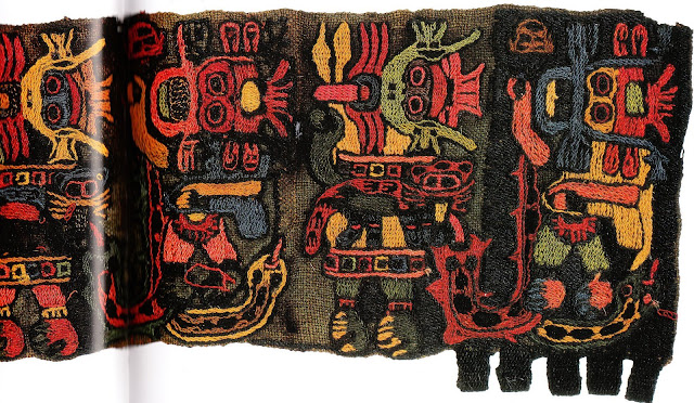
Above, a Peruvian textile scroll depicting all sorts of deities, including river gods. Ma-a-a-an! Very Nice!


Embroidery is still alive and well in Spain and Portugal. The guy above is wearing a shirt with symbols of love on it.  I find that touching. The man proudly wears a shirt that declares that he's loved by a woman who's handy with a needle. It's so charming and primal.

White shirts with understated red trim like this also used to be common in Poland and North Germany. 
 

Oddly enough France, which taught the world about color during the Impressionist period, put most of its embroidery energy in recent centuries into plain white lace.


Not so with the Czechs. Here's a Moravian girl (above) in traditional dress. A long time ago Moravia used to be a separate country but is now incorporated into The Czech Republic, Slovakia and Germany.


Elaborate embroidery is often associated with power or status, as it is with these African chiefs (above). It's a mostly woman's art.  You could say that it's a gift that women have been giving family members and the powerful for possibly thousands of years.  It's a terrific present, but I find myself wondering how people who live in the outback manage to keep it clean. They must sell a lot of stain remover in those countries. 


You've probably seen variations of this Pakistani costume (above) before. There's a village there that outdoes everybody in the region.


Here's (above) a small hanging from Tajikistan, which I assume is near Afghanistan. It's mostly blue anchoring down red with an amazing greenish-grey highlight. I've never seen grey used as a highlight color before.


Here (above) a Transylvanian woman wears an outfit consisting of different kinds of wool. The region is still famous for its embroidery but it's transitioning into weaving and other techniques. Embroidery is becoming a lost art; it's just too labor intensive.


Did anyone do more elaborate embroidery than the Chinese? Here's a detail from an official court robe, replete with the dragons, cranes, and traditional flaming pearl. The multiple shades of blue blobs (clouds?) with white highlights are an awesome background for the dragon. 


Saturday, May 30, 2009

"ANONYMOUS" WRITES ABOUT ELECTRO-SHOCK THERAPY


I recently wrote a post about electro-shock therapy (ECT) where I also touched on the treatment of people who hear voices. I know nothing about these subjects and I was hoping that someone who did would correct me if needed. Well, someone did! Many thanks to two anonymous commenters for the replies which are re-printed below.  


No one is getting forced ECT anymore. It has been a long long time since that sort of thig happened.

ECT is used for severe refractory depression where either drugs and therapy has not worked and the patient agrees, or where the patient is so depressed they have shut down and would need a feeding tube to be placed!


I taught the psychiatry class at our Med College and have since specialized in Anesthesiology and see maybe 10 ECTs a week. They are pretty benign now. The current is much lower, the patient is paralyzed so they can't hurt themselves, and the main side effect is a few hours of confusion and occasionally some "word salad", which is where the patient tries to say something but random words come out. They realize what is going on and you have to tell them that it will only last a little while. Most laugh about it later (A good sign compared to lying in bed starving to death) and one guy actually asked my nurse to record him if he had it again. He did, and she did, and he played it for his family.

The goal of ECT isn't to cure depression, although in the minority of cases it can do that. The goal is to break the untreatable deep depression so that the meds and therapy can work before the person shuts down again.


As for the lady in the video (Liz Spikol, above). Its pretty clear she is having some thought content and process issues. Makes for an interesting show though.

And psychiatrists are not telling people to talk to their voices or that they are "real" in the sense people are making here. They do know that there are neural connections misfiring and the person is actually hearing the voices, so it is "real" in that sense, but they are not having people reason and engage the voices. That does no good. They are having people realize what they are and try to work around them, but not to encourage them to talk to them.


And Jung (above) was crazy. Read his actual writings and it is clear he was as crazy as many of his patients. I wonder if he was doing the Coke like Freud did... may explain it.

And the guy with the Egyptian delusion/myth/whatever you want to call it. How is it unreasonable that the person would be exposed to that? Starting in the 40s and 50s we started seeing tons of alien abductions and alien obsessed delusions, and many were consistent with each other. In Jung's time Egyptology was VERY popular both to the upper classes and the common man. Even if not, the idea that the big visable thing in the sky blows the air around isn't that special.

Here's the second comment, also anonymous:


Hey Uncle Eddie - long time follower, first time commenter... er. I was thinking about your blog on the train today, especially about the entry Mad Pride and the comments by Anonymous. I guess, as with many things, everyone is a little bit right and a little bit wrong about most things. Like Spikol, I have experienced long term major depression which resulted in numerous hospitalisations and on three of those occasions I underwent varying numbers of ECT episodes (the most intensive being 18 treatments over a 6 week period). Unlike Spikol, I was not issued with any incontinence products and fortunately all the staff I ever encountered were most empathetic. However, I did experience headaches, tension in my jaw, disorientation and significant short term (and ultimately long term) memory loss. A number of years later there are still large pockets of memory that I never regained, I believe it has probably been exacerbated by the ECT but I think such a long and entrenched depression has wreaked havoc on my comprehension skills and memory – which provides great opportunities for my siblings to invent histories for me! My protests of “I would never get drunk and fall asleep in the shower recess, missing Christmas dinner and forever disgracing the family” are only half hearted, because I can’t really be sure... but then I am also painfully aware of what my sibling’s idea of fun is too. It can be disconcerting to look at photos of your adult self and not remember the occasion when it was taken. I am aware of a number of people who have benefited from ECT, even though I don’t believe I was one of them. Ah, but there is a happy end note... I am now the most ‘well’ I have been in years thanks to a combination of a therapy program that worked for me and greater access to mental health services and probably good luck: I still find myself weeping sometimes during the news (but that’s probably healthy) and I sometimes become overwhelmed with anxiety (but that’s probably because I’m doing things I haven’t done in years). When I think of my years in ‘the wilderness’ I do feel a sort of pride: In the same way those that have survived a terrifying holiday-from-hell might – so you planned on sun, sea and sand but you got a cyclone, a military-cop, a missing captain and a drunk navigator! You can only wear the scabs and scars of the Bed Bug bites with pride... what else is there do? A note from the Outpost...

Thursday, May 28, 2009

MORE FACES TO DRAW


I thought I'd lead off with a beautiful face (above), but there's more to this face than meets the eye. I'll talk about it later. Hint: it has to do with the muzzle.


An ironic smile (above) which comes off very strong because of the simple, broad, uncomplicated face around it


Above, a Judith Anderson look-alike.  Remember Anderson in Hitchcock's "Rebbecca?" What do you think of the tiny mouth made prominent by lipstick, the long nose, the eerie, murderous eyes, and the devilish eyebrows? Don't eat or drink anything she offers, and never, ever spend the night.


An odd face (above) because the features appear to be floating on it.


Some faces (above) just naturally seem to be wide-angled, or CinemaScoped. It doesn't hurt her looks, though.


A good-looking girl (above) caught with disdainful "yuck"wrinkles above the nose. The wrinkles don't cross her nose horizontally, but rather fan out from the eyes. Come to think of it, her nose is oddly vertical, and her hair looks like an askew helmet.


Here's a face (above) that looks like it was pushed out slightly from the inside. This is a fairly common trait. 


Here's that face again. Did you figure out what was so unusual about it? It's the muzzle. The mouth is wrapped around a vertical cylinder which is inserted deep into the cheeks. The big lower lip and pointed chin make for interesting embellishments.


Here's (above) a less pronounced version of the same thing. The mouth cylinder is still visible, and it's set off by the teeth and a linear, horizontal eye mask. 


Another muzzle cylinder (above), but one which is not buried too deep into the cheeks.  The mouth with rounded corners, the V-shaped nasal bridge, and the interesting half-open eyes and flair eyebrows make for a fascinating appearance. 


A good-looking woman (above) whose face below the nose recedes inward.


And the opposite (above): a good-looking woman whose face below the mid-point extends outward. 

BTW, Thanks to Lester for the correction about the name of the actress in the Hitchcock film.

Tuesday, May 26, 2009

SHOULD CARTOONS END WITH A MESSAGE?


I'm always amazed when Saturday Morning cartoons end with an ethical lesson. I mean the cartoon itself is often incredibly unimaginative and intellectually deadening. It's pretty clear that this celebration of mediocrity is the real message of the show, regardless of what's tacked on at the end.


TV producers aren't the bad bad guys. They're just putting on what they think the public wants. It's the public that needs to be educated about cartoons and I think I'll take a shot at that right now. Sorry if I appear to be preaching to the choir.


Good, funny cartoons don't need a message at the end. The whole cartoon is a positive message.

First and foremost, a good cartoon always stimulates the intellect of the viewer, even when the subject matter is stupidity.  In the cartoon above Rube Goldberg makes everybody look hilariously awkward but he manages to convey real sentiment as well. The two friends at the top and the married couple below are genuinely touching. This is the power real cartooning has. It can convey deep meaning at the same time it clowns around. 


Even the color in a good cartoon is educational. I look at this creek BG above and I'm filled with wonder about the beauty of nature, and of shadow and silhouettes and hidden places. I'm reminded that spots of color in relative darkness can be awesomely mysterious and satisfying. Backgrounds like this remind us of the ability of subtle things to amaze.


Good cartoon color is immensely stimulating, all by itself. An artist will deliberately take two colors that clash and make them work together by adding a third color that relates them. When you first see them you rebel and want to say, "Hey, you can't do that!" but before you can get the thought out, you realize that the color does work. Improbable as it is, the darn thing works. That means the picture has educated you, made you more graphically sophisticated.


It's silly to take a cartoon (above) that never even attempts to do anything like that and praise it to the skies because it has a single positive message tacked on to the end. The cartoon itself is the message. By the time the fake message comes at the end, the real message has found its mark, and that message is sometimes: "Kids, never try to achieve. Do the easy thing. Let your mind go to sleep." 


Funny cartoon drawings are often the most stimulating.  The dog above is silly and hilarious for sure, but the hilarity forces you to pay more attention to the animal, and when you do you realize that the dog is the very essence of playful good will, energy and loyalty. The drawing exudes life force and seems to say, "Isn't it great to be alive?" It makes you want to be happy and make others happy. It may take a writer a whole book to achieve that, but a cartoonist can do it in a few strokes. 


Cartoon drawings often get their effect by innovating or calling our attention to something we'd overlooked before. Here (above) the artist reminds us of the graphic nature of our own bodies, how we ourselves are designs which can be manipulated. Just thinking about this makes me want to draw. Good cartoons create artists, and people who appreciate art.


Can good cartoon drawings make kids think? You bet they can! The two hand drawings above certainly make me think. They increase my awareness of hands as an expressive instrument and fill me with awe to think that the human mind can find such a wealth of possibility in such a commonplace thing as a hand.


This drawing (above) isn't just lampooning one individual. It asks questions about the nature of femininity and beauty. It applies sophisticated design to a joke, and because the drawing is funny the questions it brings up stick in our minds.


There's something about this picture (above) that's...I don't know what to call it...mischievous.  It makes me want to acquire skill so I can play jokes on people too. The skill of the humorous artist makes me want to hone my own skill, even if it's not related to art. 

It's the job of artists to raise the bar in society. Our achievement in a public forum like TV should inspire others to be good at the things they do. But you can't inspire people if the cartoon is bland, even with a message tacked on to the end.


This (above) is a complex drawing disguised as a simple one. Here two worlds collide. It says a lot about the gulf between different types of people, and encourages us to see the clash of worlds in a humorous light, which is not a bad lesson to teach a kid. The little guy is made to seem rigid and ridiculous for disdaining the offer of friendship. No lengthy lecture. It's accomplished painlessly, in one funny drawing. 

Should cartoons have messages tacked on? I can't imagine why. Good cartoons by their nature are already full of messages, even before the end comes along, and they're more nuanced and sophisticated than the phony, tacked-on kind.


Sunday, May 24, 2009

WHY DO KIDS DRAW LIKE THAT?


Like everybody else I'm always surprised by the vitality of  art made by kids. Something about collecting bugs and wearing pajamas with feet gives young artists the ability to draw with shocking freshness and immediacy.  I don't pretend to know how they do it, but it's been on my mind lately and I thought I'd record my thoughts here.

To start with, surely some of the magic comes from the little rugrats never cleaning their brushes. When they want to paint with yellow they use the same dirty brush they used a minute before when they were painting with red. The kids benefit from a lucky accident because this unintentional mixing gives the new color texture, which always makes color more appealing. Not only that but the sloppy colors benefit from the kind of optical mixing that impressionists like Seurat used to talk about.    


Then there's the kid belief that every living thing disturbs the air around them and emits an aura of grief marks or sunbeams (above). Where kids get that from I can't even guess. Exceptions to this rule are army men, ghosts and dinosaurs, which are never granted sunbeams.

Thanks to "N" for pointing out that the picture above is of a lion and the sunbeams are simply its mane. I don't know how I could have overlooked something so obvious, and I almost changed the caption, but my long experience with my own kids' drawings seems to confirm that kids will deliberately choose subjects that lend themselves to sunbeams, cilia and fringe. Primitive masks are often like that.  


The subject of kid pictures is never a unified whole, but is rather a collection of parts, which are separate and distinct. The lady above is a nothing more than a dress, legs and shoes. The bike is wheels and a frame. Usually the collection of parts is given grief by some evil being. Here (above) the collection of parts that is the woman is beset by a demon newsboy...or is that just the just the artist hitching a ride? 


Here's (above) a raging duck man surrounded by blue dots. Since kids like to menace their their subjects I'll guess that the blue dots are killer bees or bombs. Whatever they are, it's a safe bet that the kid who drew it had a definite idea about what they were. Kids don't draw for the sake of drawing. Everything always represents something. 

How do you like the color here? That yellow and orange ground really makes the blue pop out, and the black is a perfect counterpoint. 


Here (above) the warship goes into battle with all guns blazing. Kids don't get distracted by nuances like the color of a late afternoon sky reflected in the sea water. For kids a battle scene portrays battle, clear and simple, and the battle is one of epic dimensions. The nobility of the brave ship is honored by cilia-type sunbeams of fire power.

Interesting huh?