Saturday, October 30, 2010

TIME TO CARVE THAT PUMPKIN!

I couldn't resist leading with this picture by commenter Joel Brinkerhoff. The baby is Joel's granddaughter and the picture was taken by the baby's aunt, Joanne Zarana, kittens by Joel. Man, Joanne and Joel make a great team. Imagine how this would sell if it was a Halloween poster!

Now, to get down to the business of carving...how did the carver do this (above)!? I doubt that he did smooth, rounded lines like that with a knife  Maybe he used an electric hand saw, but then how did he do the teeth? I'm guessing it was done by hand with an X-acto and a file.


It seems like every year there's a new fashion in pumpkin carving. This year it's gotta be the Aztec head (above), replete with face tattoos. I saw a bunch on the net.

Niiiice (above)!

A variation on the Aztec pumpkin...the Tiki mask!


Ah, the perennial favorite (above), the psycho midget pumpkin!

Lotsa good designs here (above)!


Here's (above) a nice variant on the pumpkin-eating-pumpkin motiff. 


A black scarecrow (right) with black clothes, backlit here by the sky... but an electric light and fog machine would do a good job, too.


Some squashes (above) are red, right? And you gotta love the Super Big Mac pumpkin.


Excellent, excellent!!! The horns really make it!

Haw! Fire pumpkins! Who wouda' thought!?


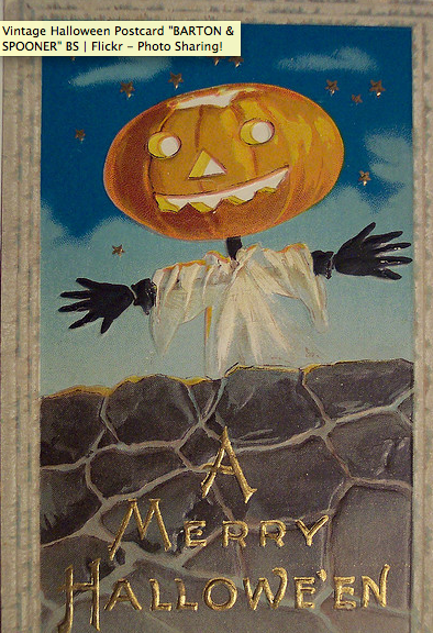
Above, a pumpkin scarecrow. I put up one of these on my lawn for three years in a row, and kids loved it. I used torn white rags. big black gloves, and a really wide pumpkin with the hole cut on the bottom, just like you see here. I got the design from an old-time greeting card similar to this one. 


Wednesday, October 27, 2010

H. J. WARD: ILLUSTRATOR

H. J. Ward was incredible, wasn't he? I thought it might be fun to take one of his pulp illustrations (above) and see how it was done, step by step. I'm not aware that those kind of pictures exist, but maybe we can get the same kind of effect (sort of) with Photoshop filters.  Let's try it!


Wow! A "squint" (daub) filter really helps to simplify things.  It's possible that when Ward laid in his first colors, the canvas looked something like this (above). Without distracting details it's easy to see that the picture is mostly red, yellow, blue and orange, the classic newsstand colors. There's some green and brown in the part of the picture we can't see.

Hmmmm. I see a mushy "X" pattern, with a creamy flesh-yellow on one diagonal, and an orange on the other. I also see a large triangle consisting of three dark points. The triangle might have carried our eye out of the picture if the point on the lower left hadn't been so small.


Sharpening the squint a little (above) gives us our first shadow colors. Maybe this is how Ward handled it. He laid in basic color fields first, then started to add shadows for volume and modelling.


Maybe next he spotted his darks (above).  The filter reveals spatters of dark all over, but not on the girl's abdomen or stomach, and not on the cowboy's orange shirt. The middle and top of the picture form a cascading wedge of light.

Notice too, how the villain cowboy's hat touches the blond hair of the hero in the foreground. Ward probably had a fit wondering if he should let them be or disconnect them. When you see the finished painting it doesn't seem to matter.


Here's (how) how he spots his lights...sort of. The balance is distorted because I used an infra-red filter. I love the way the white of the hills cascades down across the girl's stomach, and further down her arm.


There's a new book on Ward that looks pretty good. I ordered it, but it hasn't arrived yet. He's one of the all-time best illustrators. After WWI, illustration and cartooning partly displaced fine art, then later on photography partly displaced illustration and cartooning. Where does it stand now? I'm not sure.

Tuesday, October 26, 2010

RAMBLING THOUGHTS ABOUT HALLOWEEN

There's no structure in this post. I thought I'd just free associate on the subject of Halloween, which is just days away. It's one of my favorite holidays. It's not only about pumpkins and ghosts, it's also about Freud and fairy tales, weird technology, murders, age, sex, culture, thrills,  magic, senseless loss, mardi-gras, the cuteness of children, pageantry, fear of the dark, incongruities and luck. It's the only day of the year devoted exclusively to imagination.

How do you like the robot above? It's funny and menacing, awe-inspiring and primal...just like Halloween itself.


Above, Kevin McCarthy from "Invasion of the Body Snatchers." What he's just seen has apparently brought him to the edge of madness.

Above, a terrific pulp cover by Ward. Only moments before the scene might have been tranquil, but something has set in motion utter chaos. What a reminder of how uncertain life is!

 Talk about tranquility...nothing is more calm than the patient, slow moving attempt of a medium to contact the spirit world. The spirits have to be cajoled into talking to us.

Strangeness is such a part of human life. Did you ever think how downright odd it is that every 12 hours we're carried around to the other side of the Earth?

It's cold there (above), and dark. Dangerous, too. Everybody goes inside and locks their doors.

Only the desperate (above) venture out.

Inside our houses we sleep and have bizarre dreams (above) where we can fly and walk through walls. If we're lucky, we'll stay in that state until...

...until morning comes (above) and we're back to the sunny side again...

...but it won't last.


BTW: the terrific robot picture is from a site called "Mechanical Bride of the Uncanny."

Saturday, October 23, 2010

WHAT'S NEW IN ELLE AND VOGUE

My local library just gave away a bunch of magazines, among them some Elles and some Vogues. I took home some samples which I'll share with you. It's pretty weird stuff.

How do you like this cover (above)? I haven't read the article which explains it, but it appears to be about Drew Barrymore who has just fallen into a pool in her new bondage evening gown. She managed to pull herself out just as a gunman came along and announced that he's going to shoot her. Wow! Heavy stuff!

Vogue ran a "Daring Evening" article (above). Boy, it's daring alright! Let's see...a cheetah bra with thick satin drapery pants, and gold ultra-heel snakeskin shoes wrapped in white velvet ribbon.  Wow! I wish I could have seen the Lucy Ricardo moment when she brought it home and showed it to her husband.

Photos like this always come with quotes. They're surprisingly deep. Does the magazine hire philosophers?

Here's (above) a "Daring Duo." It's a super thin, skin-tight body stocking with a breast-eradicating bra and chattering teeth necklace. Add to that jewel-studded raspy pantaloons and black peek-a-boo heels.  Less than $4,000 before tax. A steal!

Wait a minute, the article doesn't tell us what the handbag costs. It's a tiny thing, so maybe they throw it in for free.

  Most handbags in the ads (above) are enormous. I guess a woman needs a big handbag to set off her feathered crotch.

Here's (above) another picture associating handbags with crotches.  The signifigance of this will probably hit me when I'm walking down the street a month from now, but right now I haven't got a clue.  Boy, women are hard to figure out!


A lot of the pages in Elle and Vogue are devoted to ads. Here's an ad for Bed Head Foxy Curls. It takes five Foxy Curl products to get that zombie look. You've got your Foxy shampoo and "moisturelicious" conditioner, your "extreme" mousse, your Foxy contour  cream (whatever that is), and your Foxy hair spray.

Bare skin abounds in women's magazines, but the gay men in the ads never seem to be turned on by it. This guy (above) is positively repulsed by the idea that his girlfriend took her blouse off.  His whole day has been ruined, you can tell.

By the way, the guy is wearing black lipstick and has slicked-down fascist future hair. Is that what lies ahead for men?

Haw! Cartoon Steve (http://cartoonsteve.weebly.com/)  sent me this picture of me ogling the Calvin Klein girl. Thanks Steve! I hope I get a modeling job out of it!

Thursday, October 21, 2010

OLD CARDBOARD HALLOWEEN DECORATIONS

Here's some cardboard Halloween decorations from (I'm guessing) the period ranging  from 1910-1950. Look at the surface detail! You'd expect something like this to be expensive,  but they weren't pricey at all, in fact they were sold at outlets like five and dime stores.


These die cuts (above) were imported from Germany. I didn't know the Germans celebrated Halloween the way we do. Were they going to all that trouble just to sell us decorations for our own version of the holiday? Fascinating! Maybe we could make supplies for other countries' holidays.


 Believe it or not, there was a time when everybody collected the greeting cards (above) they received. They were done so well that people couldn't bear to throw them away.


There used to be lots of decorations on black themes (above).

Today that's thought of as racist, but I wonder if part of the intent was to make the cutouts appealing to black buyers.

Halloween lamp covers (above) used to be popular.  The orange part is tissue paper so the light can get through.


Lots of decorations (above) were influenced by animated cartoons.


Here's (above) a decoration that looks like it was meant to double as a mask. It's great, but would have been even better if it had a raised surface.

Weird, psychological sculptures (above) used to be popular.  The face on this one is disturbingly realistic, as if to hint that some of the women you pass on the street could be witches.


Everybody has a relative like this (above): an earthy, jovial, gossipy, broad-faced woman with a heightened sense of life. Halloween is a great time to celebrate the wonder of human diversity. How boring Halloween decoration would be if all we saw were mean black cats and grinning pumpkins.


One more die cut (above). Sheesh!

Thanks to riptheskull for the great die cuts! See more at:


http://www.flickr.com/photos/vintagehalloweencollector/sets/72157594443647911/

Wednesday, October 20, 2010

BOY, DO I LOVE BIPLANES!

My dad was a private pilot and his airplane of choice was the biplane (above). No wonder, it's a plane for people who like to fly.  It flies low and slow, lands on grass, is cheap to buy and easy to repair, and glides so well that you need a lot of determination to crash it.


The biggest selling point though, is the open cockpit. This is the way a man should fly, with the wind in his face. You buzz your friends' houses and wave hello to the girls.


After that you rev up and head for the clouds (above) where you fly through caves of cotton candy, without a care in the world. Well, I'm exaggerating. What I described is the way things used to be. Nowadays you can get in a lot of trouble for flying through clouds.

Biplane pilots of old treated their planes with love, like they were members of the family.  Pilots were always doing stunts (above) and playing pranks on one another.

They were a lot easier to fly than modern airplanes. Early pilots learned to fly them without ever going to school.  For a while you didn't even need a license.

That's the control panel above. Not many more gauges than you find in the average car.

I understand why we have laws and regulations governing flying today. Planes are noisy and you don't want them crashing in your living room.  Even so, a lot of regulations could be taken off the books without doing much harm that I can see.

I'd love to see small, inexpensive biplanes make a comeback, especially if something could be done to dampen the pesky engine noise. Turn them loose over thinly populated areas, with common sense limits so they don't interfere with commercial aviation. Let them fly through clouds and over people's heads. Let a few accidents happen, they're inevitable. Let's legalize fun!

BTW:  Pappy sent me a link to a promotion for the new Icon A5 sports plane (below). Geez, if I ever become a millionaire....

Sunday, October 17, 2010

THE BEST BLUEGRASS CLOG DANCING VIDEO

Here's a YouTube video you have to see! It's called "The Best Bluegrass Clog Dancing Video Ever, " and it might just be the best. It's the best one I've ever seen.


The link:

http://www.youtube.com/watch?v=cs2j8f7H2WY