Saturday, December 18, 2010

CHOICE WOLVERTON

Mike sent me these Wolvertons, which almost made me fall out of the chair.  According to Mike the artist's name is Colin Batty.  Man, Batty's done a service to the whole cartoon world here! Nice job, Colin!

Batty's site: http://www.freakybuttrue.com/wolverton.htm


You have to wonder if characters like this could work in 3D animation.


The underlighting (above) makes this "Lena the Hyena" look menacing.


Aaaah...true art!


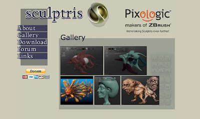
What program were these pictures done on? My first guess was ZBrush, but maybe they were done on "Sculptris," which is something I just found out about. It's a free program.

Here's some Wolverton-style stop motion animation courtesy of commenter Ben Leeser. It's a YouTube video called "Ugly Girl," posted by Necrofinger (!). This got over 11,000,000 hits! Thanks, Ben!


Friday, December 17, 2010

WHERE WERE THE HARRY POTTER TOYS?

It's been 13 years since the first Harry Potter book came out in America, and ten years since the first Potter film debuted. Since Potter books and films were enormous money makers almost right from the start, you have to wonder why Warners was so slow to license toys from the stories.  Oh, there were notebooks and scarves and wands, but little else for years. What happened? Why did Warners drag its feet for so long when there were hundreds  of millions of dollars to be made?

The toy I wanted to buy was a tree...just a nicely designed evil tree with flexible arms. The one above is from an illustration in a Lord of the Rings calendar.


Potter toys were so slow coming out that fans took to making their own Potter toys...like the toy of this  triple-decker "Knight Bus" that Harry rode after the Muggles kicked him out.  Eventually Lego put out a bus toy, but it was a case of too little too late. Also, the Lego toys cost too much.


Set designs in the films (above) suggested lots of interesting toy possibilities, but Warners wasn't interested. You get the feeling that no one in the Warners hierarchy really liked toys.


Too bad Weasley used an ordinary car to rescue Harry from the Muggles. Using a neat old car (above) would have opened up a nice toy possibility. Come to think of it though, you could still sell toys like this in a Potter store.

I'd like to see what posters (above) are available in the Potter theme park...the park that opened up for the first time in the Summer of this year, 10 years after the first movie. By the time it opened the last book in the series had come out.

Talking about posters, I'd like to have seen posters which speculated on what other wizard schools around the world (above) might have looked like.


You used to be able to buy terrific maps (above) of the British Isles.  Potter fans would love to get hold of maps like that. Can you get those in the Park?

It would be nice to have a building block set (above) that you could actually make Hogwarts-type stuff with, and that wouldn't cost an arm and a leg.


Maybe the ghosts that roam through the school (above) need their own action figures.


I love steam punk watches. The Park could clean up by selling inexpensive ones with great design and with secret compartments.


You could sell plastic mad scientist equipment in a Potter store. Get somebody good to design them. The mad scientist gear you see in Halloween stores is terrible.


How about funny Muggle masks?


I like the idea of doing up a corner of a kids room like Voldemort's cave in the "Prince" story. Cardboard or painted styrofoam kits could do the trick.


Computer and keyboard skins?


It;s fun to imagine what Potter bookshelves (above)might look like.  


Toy Hogwarts Express trains will need trestle kits.


The right window shades could add moody, Potteresque color to a bedroom.


I have a ton more pictures which cover a lot more territory than I was able to touch on here. Maybe sometime in the future I'll do a follow up post.

One of the things I like about the Potter stories is that they attract bright and imaginative kids, and making toys and media for a quality audience like that is an interesting challenge. The Potter books touch on architecture, magic, English history and tradition, engineering, mythology and monsters. The toy possibilities are endless!

BTW, the Mayan wall above is there because it reminds me of the moving bricks in the first two Potter films. There must be some way to get a decent toy out of those bricks!

Also BTW, an anonymous commenter who seems to be in the know about selling toys had this to say about my criticism of Warners:

  • "It wasn't Warner Brothers---they wanted to license and tried like crazy. There were more toys licensed for the very first film than people might remember, but they didn't sell.

  • it was the distributors and stores. They were spooked by the new Star Wars films debacle. Although Lucas got paid up front, a majority of the toys were unsold, and the distributors had to eat the cost. Lots of cost.

  • The window for selling these toys/shelf space is also very, VERY short. 

  • I don't agree with all the short term thinking a company like WalMart (the largest distributor in the word) has, but it's their business.

  • Movie toys mostly just don't sell very well. The lead time is long, and films are no sure but. Remember The Simpsons? When it first came out...no toys. Same with Toy Story. Few toys (until later)

  • While specialty toy makers make wonderful stuff, they're often expensive, and have a very limited market."  


Wednesday, December 15, 2010

I TELL THE STORY OF "DIE WALKURE" (AND PLUG ZUBIN MEHTA)


My retelling of Wagner's story was inspired by a the version on DVD by Zubin Mehta and the Valencia Community Orchestra. Trust me, this version is worth seeing and is reputed to be one of the best Walkuries recorded in the digital era. I saw it at Steve Worth's place last night and it bowled me over.

I needed examples to illustrate the story but I could find only one good clip of the Mehta version, and that was  a rehearsal. It's still well worth seeing, though. It's the last video on the bottom; don't miss it. Most of the excerpts here are by other artists. If you're hearing this music for the first time, then I envy you.


Anyway, here's the story. It's one of the greatest stories in all of opera, so I don't think it'll put anyone to sleep.

A good place to start is with the action described in the clip from the top of the post, the one where Siegmund and Sieglinde sing about their love for each other.  This is no wimpy, half-hearted crush...these guys have just met their kindred souls (each other), the one who they'll both fight to the death for. Sieglinde's already married to a brutal neanderthal (I'm taking liberty with the story in order to condense it) who's enslaved her. They run into the night to escape him.

The problem is that the gods have witnessed all this and have taken sides.  In order to prevent a civil war in Valhalla, Wotan orders Brunhilda and her Valkyries to kill Sigmund. This is a big deal because the Valkyries are the ultimate lethal weapon. No human army could stand up to them, let alone a solitary hero like Siegmund.


Brunnhilda finds the couple and prepares to kill them, but can't go through with it. Theirs is the purest example of love she's ever seen. She can't prevent the other Valkyries from helping the enraged husband to kill Siegmund, but she's determined to prevent harm from coming to Sieglinde. She begs the other Valkyries to help the mortal woman escape. If need be, she's willing to stand up to Wotan himself.


Wotan finds out and is outraged. Not even the Valkyries can help Brunnhilde now. He punishes her by making her mortal and putting her to sleep. The first human slob who finds her and wakes her up will take possession of her. She'll live in misery like a slave, will feel pain, and will grow old and die.

I forgot to say that Brunnhilda was Wotan's favorite child. They love each other fiercely. As sleep overcomes her, Brunnhilda begs Wotan for one last favor. Let a wall of intense fire surround her sleeping body. Make it so horrific that only the greatest of heroes could penetrate it. Wotan grants her wish then, grief-stricken, he exits. The lights slowly fade out on her inert body covered with a shield and surrounded by a ring of intense supernatural fire. Neat story, huh?  The events continue in the next opera in the cycle, "Siegfried."


This Christmas, consider giving yourself a Christmas present...the Blue-Ray DVD of Mehta's "Die Walkure." It's $35 on Amazon. Netflix doesn't seem to have it. If you're hard up for dough, maybe you can pester your local library to buy a copy.  I recommend watching it on video, rather than listening to it on CD. The English subtitles are indispensable aids to understanding the story.

BTW, I wonder if this post will find itself on the radar of Wagner aficionados. Those people are brutal. They address each other with openers like, "Dear stupid" and "Dear Dumb Ass." Differences of opinion are treated like heresies. 

Sunday, December 12, 2010

WHY I LIKE HARRY POTTER

I didn't always like it. When the first book came out in 1997 I spot read in it and wasn't impressed.  It seemed like a rehash of Lord of the Rings, which in book form I never liked much. On the eve of the movie debut in 2001 you could hear my yawn a block away. Then I saw the film.

Holy Cow! It was fascinating! I came out of the theater muttering, "So THAT'S what Rowling had in mind!" I couldn't believe what a blockhead I was for being so dense.


Looking back on it, I think my resistance had to do with Rowling's disappointingly normal dialogue and  and narrative. It's not bad, it's just not special. You expect English writers to dazzle with language, and she doesn't. No only that but she writes in a mass market adolescent style, which strikes me as somewhat simplistic.


So why do I like her? It's because great assets outweigh great liabilities. She has an astonishing imagination. Add to that a wonderful ability with characters,  an infectious idealism,  and a marvelous way with scenes and images. On the film side, she's amazingly good at picking collaborators. Her choice of actors (above) and art directors was perfect, and her out-of-left-field choice of Chris Columbus to direct was inspired.


Here's (above) the real star of the story: Hogwarts Castle. It's a wonderful image. All by itself the picture of the school asks the question: "What if school was fun, what if it combined serious purpose with tradition and life and death struggle? What if the buildings themselves were monuments to the efficacy and noble purpose of man? What if  marvelous, life-changing truths were revealed there? What if students were expected to be clever and adventurous, and not just passive receivers of knowledge? What if you made loyal, lifelong friends there? What if your own life, the only one you'll ever have, wasn't scrinched by muggles?"


Of course you don't travel to the world's best school on a plain old bus. Rowling has us take a real steam-driven train over trestles and through beautiful countryside that looks as much like Hawaii as England.


 In the films directed by Chris Columbus, the interior of the school is beautifully art directed. I love this idea of candles hovering above tables in the dining hall (above). The addition of ghosts walking through doesn't hurt either.


Terrific set design (above) for the staircase sequences.


Above, the Defence Against the Dark Arts classroom. Very nice!


Above, Dumbledore's office as it's reconstructed in the theme park that opened in July. Can you believe that it took 13 years to get a small park going?


The park is okay, just okay. Can you believe how lame this candy store (above) is? It looks like the identical design used in the Zany Brainy stores. Come to think of it, Disneyland is full of stores like this. Did the designer take time to read any of the books?

The merchandising on Harry Potter has been woefully unimaginative. Potter could have sold 10 times the toys that it did. This reaffirms my belief that 80% of all toy executives should be tarred and feathered.


At least the park cafeteria (above) has an interesting ceiling. I think all ordinary high schools should have cafeterias with complex, interesting ceilings. Occasionally a kid will get hurt when illegally trying to climb in them, but that's to be expected. You don't want the world to be so safe that no one can have fun anymore.

Friday, December 10, 2010

19TH CENTURY FRENCH CARTOONS AND CARICATURES

I'm ashamed to say that I don't know enough about 19th Century French history to comment on the exact political context of these prints. Evidently Napoleon III met a lot of resistance from republican artists,  and that worked its way into the cartoons of the time.

The print above derives from republican sympathies but it would be a mistake to think that republicans were united in support of the new trends in art. An awful lot of them, including some of the funniest caricaturists, were against them.  Caricature magazines roasted Courbet, Manet, and even Rodin.

Lithography created a whole new market for cartoons like the one above. Most of the prints I've seen were relatively small. I guess that made them cheaper and easier to hide if need be. It's too bad because poster size reproductions would have been so much more appealing.


What's being sold here (above) is a lifestyle, a way of seeing the world. The anti-establishment reader is encouraged to imagine himself as artistically and culturally sophisticated and the defenders of the establishment are served up to him as boobs. It's argument by ridicule, which is not a very good way to get at the truth, but its appeal to artists and readers alike is irresistible.


A commenter wondered if this was the era that pioneered caricature with big heads (above) and little bodies. Is it? Who's responsible for that?  BTW, click to enlarge.

Here's a color lithograph by Daumier. Was a different stone used for each major color? It sounds expensive. Maybe silk screen or hand coloring would have been cheaper. I'm not sure.


According to Alberto's comment, even Monet did caricatures (above) for the humor magazines. It looks like he was pretty good at it.

Thursday, December 09, 2010

A COUPLE OF MY REJECTS

I spent part of the morning deleting old files of pictures and projects that were intended for this blog, but which didn't make the final cut. Most were okay I guess, but they didn't grab me on the second viewing. I thought you might be interested in seeing what gets rejected around here.


Aaargh! I had high hopes for this post (above and below) but it just didn't look funny in print. I talked to John about it and he came up with gags that were absolutely hilarious, but which just didn't seem to fit somehow. What you see here are fragments of what would have been a longer "Dating Game"-type story. The title card (above) is from a real site that actually arranges dates for dogs. 

Sigh! I think it (above) would have come off better if I'd drawn it. Photos are too conservative for this type of thing.. 


Here (above) I tried out a scene from "David Copperfield." I played both David and McCawber.


I thought I made a pretty good McCawber (the role W.C. Fields played in the film), but my David was nothing to write home about, so I put the story on hold. Hmmm....maybe I was a little hasty. I think I'll move this over to the active file. 


One of these days I hope I can do a blog story with Kristen McCabe. She looks great distorted like this. Imagine her as the wicked Queen of Hearts in "Alice in Wonderland."