Thursday, March 31, 2011

VIDEO LIGHTING PROBLEMS


I'm taking a couple of days to redo the lighting on the computer desk I'm using. Most of the photo stories I've shot til now were lit with a little table lamp off to the side of my computer. I could get lots of variation in the lighting just by tilting the shade.  It worked pretty well up until recently and now, for some reason I can't understand, everything I shoot looks terrible.  Maybe the computer's built-in camera is on the fritz, or maybe the lamp has an electrical problem. I wish I knew.

Anyway, I'll be gone for a couple of days while I wrestle with this problem. My computer's up against a wall so 3/4 frontal lighting is out.  Tomorrow I'll hang a mirror in front of me and try to bounce a light off it. Maybe that'll give the illusion of frontal lighting. Aaaargh! What a hassle!

Anyway, just to fill the space for a couple of days, here's some photos that I've been dying for an excuse to post. That's Hitchcock above. Here he makes fat look fashionable.  The tight clothes come off as comedic, but they're also a serious graphic statement. You take orders from people who look like that.


Here's (above) a self-portrait of Weegee, the famous New York press photographer. Aaaargh! A beautiful but creepy picture!


Poor Weegee lived in a bare bones one room apartment in Manhattan. He slept next to receivers that picked up shortwave broadcasts from the police and fire department. 


Here's (above) a nicely lit picture of Charles Laughton. It makes me want to draw a pen and ink version of it, with lots of crosshatching around the eyes and mouth. 


Thanks to Mike, a rare frontal picture of Mortimer Snerd. It's funny, but kind of evil, too. 


Boy, the right kind of lighting can make anybody look evil, even Harpo Marx who was reputed to be one of the nicest guys in Hollywood. 


If you're wondering how to give your place a touch of class, I suggest hanging a poster size picture of Reginald Van Gleason III (above). The frame should be a gold baroque design with lots of carved grape clusters and cupids. 


I'll end with another picture of Hitchcock, this time with Claudette Colbert. Hitch looks like he's having a good time. I hope he had lots of moments like this. The biographies make it seem like he never had any fun. 


Sunday, March 27, 2011

EXOTIC DANCES FROM GLADIATOR FILMS


Above: Salome, who the Bible says performed the Dance of the Seven Veils for the head of John the Baptist. It must have been quite a dance because it inspired a gazillion dances in Hollywood Biblical epochs and adventure films.


You know the kind of films I mean; the ones where where primitive women do sexy, cheesy dances when they're summoned by a hand clap. Film posters used to have sidebar pictures with captions like "TREMBLE AS YOU PEEK AT THE DANCE NO WHITE MAN HAS EVER SEEN AND LIVED TO DESCRIBE!" Ah, that was a golden age of cheese, no doubt about it.

Well, a fan named pwgr2000 has a YouTube channel where he collects this stuff. He has more than 30 of the fifties dances up, and he's gotten a start on a forties collection. Embedding wasn't allowed, so here's a  link to the clip shown above, from the film, "Bowanga  Bowanga" (a.k.a. "Wild Women"). Be sure to watch the whole video.

http://www.youtube.com/watch?v=pSw272lq2CM&feature=related


It's no fun if someone isn't watching. Sometimes it's guys with pith helmets who peek out from behind palm fronds. Sometimes, as in "Serpent of the Nile" (above), it's a Roman general who ogles lustily while guzzling wine from a birdbath-size goblet.


The entrance of the dancers in this film is one of the best in all of cheesecake dancerdom. I'd love to be hauled into a room like this with me on a throne looking bored.

http://www.youtube.com/watch?v=PaX8kKjeD08&feature=player_embedded


Here's my favorite ogler, from a Howard Hughes film called "Zarak." This guy is so good at ogling that he almost steals the show from the dancer, who can't dance very well.


 Of course if you look like she does (above), you don't need to know how to dance. I  think the dancer is Anita Ekberg.

http://www.youtube.com/watch?v=2fKetnPkPJo&feature=related


Thanks to Violet Stereo for this bit of exotica (above) by Joi Lansing.

Saturday, March 26, 2011

CREPES: THE NEW PIZZA?


A while back I blogged about a local pizza-by-the-slice business that was making out like Gangbusters.  They fronted on a busy street that had lots of foot traffic, and they were near a bus stop that was never empty. Not only that but the pizza was delicious...the owners must have done "Tampopo"-type  research on the recipe. And it was cheap!  My guess is that they sold the pizza for cost and made their money on the drinks. Pretty smart.

I wish somebody would sell crepes like that. I love crepes, and they're perfect for eating on the run. Watch the video above, which shows how Parisian street crepes are made. They're cheap to make and can rival sit-down restaurants for quality when they're made right.


It helps if crepe vendors put on a show.  This guy is selling pancakes in India, and I'll bet he gets huge crowds.

Er...maybe I'm splitting hairs here, but I'll digress to say that crepes aren't exactly pancakes. They're thin and buttery, and don't rise like pancakes because they don't contain yeast. It's a different experience. A crepe is a thoroughbred among pancakes. With the right handling they're serious gourmet food.


Crepes Suzettes, the crepes that are made with cognac and set on fire are, after all, just orange-flavored crepes. You can make this dish cheap at home with recipes from the internet. If you don't have Grand Marnier or Cointreau try brandy, which is a lot cheaper, but which may not contain enough alcohol to burn. The TV cook Alto Brown claims it doesn't matter because the crepes taste better if doused with booze and not set on fire.

Come to think of it, Crepes Suzettes could be street food too, minus the alcohol. They still taste really good, alcohol or no.

Am I thinking about dumping cartooning in order to sell crepes on the street? Nope, no way. I just wish someone else would do it so I could get some good, cheap food.

P.S. Here's a fascinating variation on the classic recipe. It sounds like it could work.

http://www.youtube.com/watch?v=hzdbG3f3vQo&feature=related

Wednesday, March 23, 2011

THE SCARIEST BROTHERS GRIMM STORY


And it's their shortest, too! Only one paragraph long. In German it's called "das eigensinnige Kind." In English it's called:

THE STUBBORN CHILD
From The Brothers Grimm, translated by Maria Tatar

There once lived a stubborn child, and she never did what her mother told her to do. And so our dear Lord did not look kindly on her, and let her become ill. Doctors could not cure her, and before long she was lying on her deathbed. Her coffin was being lowered into the grave and they were about to cover it with earth when suddenly one of her little arms emerged and reached up into the air. They pushed it back in again and covered the coffin with more earth, but it was no use. The little arm kept reaching out of the grave. Finally her mother had to go to the grave and strike the little arm with a switch. After she did that, the arm withdrew, and the child finally began to rest in peace beneath the earth.

Thanks to Dr. Psycho at the Childhood Fear site for the nifty graphic:

http://childhoodfear.com/tag/undead/

Thursday, March 17, 2011

LABAN GESTURE EFFORTS


Recently I promised a teacher friend to repost what I'd put up about Ed Hooks (mistakenly referred to as "Hook" above) and the Laban theory of movement that he teaches. Well here are the sketches, pizza stains and all. I wonder if I made another mistake when I drew effort number one? My sketch looks like pinching rather than flicking. I don't have the book now, so I can't check it. 

I'm sorry to say that I'm not a fan of Laban's theories. I think animators would better off spending the time learning how to draw. I have to admit though, that there's a germ of an interesting idea here. Seeing the ideas laid out like this does make me wonder if some type of just-for-fun, cartoonist Kata (a martial arts term) might be possible. 


Here's (above) all eight of the Laban gestures performed by acting students. The teacher shouts out the names of different gestures, and they have to adapt the gesture to their acting of the lines.  I don't think Shakespeare's very well served here, but it's just an exercise.


This video (above) on stage movement looks like a kind of yoga for actors and cartoonists. There's some nice moves here.


Tuesday, March 15, 2011

HOW "COAL BLACK" COULD HAVE CHANGED ANIMATION


I'll start by stating the obvious, that Clampett's "Coal Black" was the best cartoon that Warners ever made. If you think about it, it also had the best soundtrack of any Warner cartoon. It weaved a lot of different black themes into a European orchestral matrix. It did so more successfully than Gershwin was able to do in "Porgy and Bess," and it told a story and wasn't just a sort of rock video. Thanks to Bob and Stalling and the gifted black musicians they worked with, the soundtrack holds together as a street smart, satisfying whole. It fit the jazz/swing sensibility like a glove.


Of course the voices are part of that matrix. They drive the film along as surely as the music does. According to Wikipedia those voices included Beulah Dandridge (above) as the voice of the Wicked Queen (did she also do the throaty "Prince and the gal, what a sickinin' sight" dialogue?)....


...Vivian Dandridge (above) as the voice of Coal Black....


.
...and comedian and singer Leo Watson (above) as the voice of Prince Chawmin'....a great cast!


Now I have a question for you....what would have happened if Clampett hadn't left Warners in 1946?  What if he and his unit, including Scribner and McKimson, had been able to stay together for a few more years? What if they had done more "Coal Black"-type cartoons? And here's an interesting question...what if they had given the whole Coal Black treatment to 40s nascent Rock 'n Rollers like Louis Jordan and his band? 

Do you see what I'm getting at? What if Clampett's Warner style had allied itself to early Rock 'n Roll? It could have happened, and if it had...why, the whole medium of animation might have taken a different turn. Rock and Roll ripped through the era like a tornado and animation and cartooning might have hitched a ride with it. Animation and cartooning would have had a contemporary feel, and we would have been spared all the stupid animated films where we learn a life lesson at the end. 


Imagine...animation that's street smart, that's for the whole family, not just kids, and that's genuinely entertaining with no condescension...the mind boggles.  

Of course I'm dreaming. It could never really have happened. Soon after Clampett left Warners the film industry changed. The courts ruled that studios couldn't own theaters, the theaters deleted shorts in favor of double features, the Baby Boom took hold and people stayed home with their kids and watched TV...there was no money to do expensive shorts, and after a time, no venue.  

Bob made a big sacrifice to do Coal Black. He had to do one, maybe even two cheater cartoons to pay for that film, and I imagine that couldn't have gone down well with the Warners management.  He took risks to give us something new and exciting, but the world yawned and went in a different direction. Man, life is hard on creative people. 

Here's a link to Coal Black. YouTube wouldn't let me embed it.


Thursday, March 10, 2011

ABOUT SLUMPS


This is about a painful subject...artistic slumps. Of course artists aren't the only people who have slumps. Baseball people (above) get them all the time. The TV camera goes in tight on the players and you see looks of fear that are positively chilling.  The players can't hide what amounts to a dread of the supernatural. They wonder if this is the day that a slump will drift in like a dark cloud and cling to them, maybe forever.  It's scary. I know how they feel because I'm experiencing an artistic slump right now, and its driving me nuts.

I have a guess about what causes slumps, but it's only a guess. It has to do with relying too much on intuition.


You spend the first part of your career learning things and applying them. You imitate your heroes and by comparing your work to theirs you have a pretty good way of gauging your progress. You have slumps in this period, but they never last long.  Generally your progress graphs up and up.

The problem comes when you decide to turbo charge that progress and move to a more intuitive mode. This is especially true if you feel you have it in you to be a stylist. In that case you'll find yourself  spending more and more of your time listening to your internal voices. Learning more rules takes second place. At this stage you're keen to hone your intuition...you're trying to get into what sports people call a "zone."

This is a fascinating process. Most people do their best work at this stage. It's a time when the rules are still fresh in your mind, but you're on a path of self-discovery and uniqueness and each day seems to take you farther down the road. You begin to customize the assignments you get. You skewer them to the direction you feel you need to go in order to grow, and your work improves dramatically (it helps to have a sympathetic employer when you're doing this).


The problem with handling things intuitively, is that you become more vulnerable to slumps. Using intuition rather than rules means that you're vulnerable to every mood swing and impulse that takes hold of your brain. You do your best work in this mode, but the frightening possibility exists that you may also do your worst.

Geez, there's a lot more to say on this subject, and I've already reached my word limit. I don't really know how to end an existing slump, but I have some thoughts about how they might be avoided.  I'll pick this up again later on.

Monday, March 07, 2011

MORE RECENT ASTRONOMICAL PHOTOS

That glassy, object above is called the Bubble Nebula. It was formed by the explosion of a star 45 X the mass of our sun. How do they figure out things like that?


Above, a neutron star that appears to be cooling off after ejecting most of its mass. The reason I put it up is that the star's center is thought to be the first real world example of a state of matter that previously existed only in theory, i.e., neutron super fluid.


Above, dark sand dunes on the floor of a crater on Mars. The dunes are about a hundred yards across. What are those tiny white specks? Are they dust devils?


Above, a rare Montana thunderstorm cloud called a monocel. Rain from a cel like this one comes down hard!!!!


Above, a bright nebula partly obscured by a ragged dust cloud. 


Above: Tethys, a moon of Saturn, and one of the most reflective bodies in the solar system. That might be because ice particles are always raining down on it from Saturn's E ring. Cracks on the surface raise speculation that the moon might once have had an underground ocean. If so, we can hope that living things deposited fossils there.

  
Above, the surface of a comet. What an ugly little stub of a thing!

Above, a solar eclipse from the end of the world...from Anarctica!


Above, a pretty picture of a nebula. What's so special about that? This nebula is in the Andromeda galaxy!!!! Our imaging is that good!!!!!


Saturday, March 05, 2011

TERRY GILLIAM'S "IMAGINARIUM OF DR. PARNASSUS"

Have you seen Terry Gilliam's latest film, "The Imaginarium of Dr. Parnassus?" No? Maybe you should have. The art direction in that film was brilliant.


It's about a Tibetan monk (Christopher Plummer) who centuries ago made a deal with the devil where he agreed to give the devil his first born in exchange for immortality. Close to our time he finally has a daughter and discovers he loves the kid so much that he can't bear to give her away, so he and his daughter hide from the devil in a traveling stage show. 

At least, I think that's the plot. Maybe I misunderstood it. Plot isn't one of Gilliam's strong points.


I wonder why Gilliam hasn't done "Alice in Wonderland"? It has a popular ready-made plot, and it's loose enough to allow lots of invention. Maybe even Alice is too restrictive for him. Maybe the muse is only kind to him when he makes films by the seat of his pants, taking advantage of whatever enthusiasm  grabs him at the moment.


I like the theatricality of the film. Whatever its ostensible plot, the film is really about the nature of theater, and the people who keep it alive. You don't choose theater, it chooses you. You come under its spell and you find that no other vocation works for you.


Most theater people are poor. It's not really a good living for most of them. A lot of them aren't really all that talented. They simply find that they can't bear to do anything else. 


After Rome fell Europe went for a thousand years without theater. There were travelling religious shows, and that was it. Theater as we know it was only resurrected just before Shakespeare's time. 

I can only imagine what life was like for the traveling players. Drafty, crowded, wagons (above) full of costumes and props, and the necessities of life; it couldn't have been much fun. They probably had to supplement their income with prostitution, fortune telling, and the sale of fake medicine and amulets.  I imagine that they had to sleep in shifts using their costumes for mattresses.  They probably ended up getting flogged in some places. 


Even so they persisted. Theater people stimulated imagination wherever they went, and helped to give Europe its unique cultural identity. The modern world is partly a present handed to us by nameless people who lived short, impractical lives in wagons. I think Gilliam just wanted to acknowledge the gift. 


I wish Terry could be won over to good dialogue. The dialogue in his films isn't bad, it's just not as memorable as it could be. The great art direction would be used to better purpose if it were the backdrop for memorable rhetoric like the kind in this scene (above) from "Ed Wood."

Thursday, March 03, 2011

LIGHTING THE CITY AT NIGHT

Recently Michael Sporn and his friend Bill Peckmann put up a blog post about O. Wilson Link, the great railroad photographer of the 40s and 50s. I've long been a fan of Link's work, and it was nice to see him get some recognition on the internet.

http://www.michaelspornanimation.com/splog/


It was Link's book that made me realize that dramatic Hollywood-style lighting could transform the urban night time landscape. It could make the night more fun to inhabit.

Of course I'm not talking about making night into day. That would be too expensive, and would probably look terrible. I'm talking about selected targets that are near existing nightspots. And I'm talking about dramatic lighting, the kind of thing you see in Film Noir movies.


I like the way night light transforms things. The locomotive above may have looked unimpressive in the day, but at night it appears to be a cyclops emerging from the smoke, maybe to scratch its back on the railroad office. The right kind of dramatic lighting could lead to whole new urban mythology.


The right kind of lighting could extend commercial hours and bring more business to a city. Paris is a good example. It's called "The City of Lights." It got that name in Louis XIV's time, when he ordered oil lamps to be put at all intersections in the city, especially in the shopping districts. The idea was to promote the novel idea of night time shopping, and to promote Paris as a tourist destination.

Louis's innovation was a big success, and was much imitated. It began to dawn on people that the city at night was potentially a thing of beauty and mystery. Night was no longer a nuisance to be endured. Thanks to Louis, it was a resource to be exploited.


And why not? Half our time on this planet is spent on the dark side of the Earth, staring up at outer space (above). We should celebrate the experience, not just tolerate it. Thanks to electric lighting, and the example of Film Noir (and Louis and Link) we have the ability to make the night come alive.  We have the ability to be poets of the urban landscape.


You could argue that lighting shouldn't have to save the appearance of a bland building. Buildings should be built from scratch to look good at night. Balconies, iron fences, trees, tiered sidewalks, alleyways, recessed enclaves, stairs, railings: all cast interesting shadows. An architect should ask himself what combination of features will allow the building to appear differently at different times of day, and at different seasons (above). He should think about what silhouette value it'll have, and how it'll look at night.


Foggy towns have great tourist potential, provided the fog is helped along by the right lighting, and provided that there's night time cafes and restaurants. Towns like this might even even consider fog enhancers. And how about adding plants that thrive only in foggy areas?

Well, I guess its possible to overdo this. If it starts looking fake and contrived, then we've gone too far.


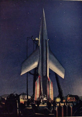
The space program would surely get more taxpayer support if the rockets were lit more dramatically at night. Come to think of it, our rocket exteriors should be designed by artists. No doubt they would be less efficient, but they'd look cool, and that would bring in taxpayer dollars.