Sunday, October 01, 2006

SALLY WORM SWIPED?

Did the latest Wallace and Gromit film, "Curse of the WerRabbit," steal portions of a character design from "Tales of Worm Paranoia?" Here (above) is the suspicious design in the W&G film.

Here (above) is Sally Worm from "Tales of Worm Paranoia." See any similarities? It's probably a coincidence but it makes me wince just the same.

Boy, look at those parallel lines between Sally's hand and arm. Come to think of it, look at the parallel lines on her body in the color picture. And her clasped fingers might have looked better if they'd wrapped around an imaginary ball. Aaaargh! Now that I'm looking at it closely I can see even more mistakes. All I can say is, "Oops!"

Saturday, September 30, 2006

A BLOG ABOUT GOING-TO-SLEEP SLEEP FANTASIES

This is a blog about sleep and I thought you guys would rather see these girls on a bed than me. Anyway here's the story.

I'm the only person I know who actually was objectively aware at the exact moment when rambling, try-to-fall-asleep fantasies turned into full-blown sleep. It came about because the phone rang at just that moment and I woke up with the memory still intact. Of course I wrote it down immediately. Here's how it played out.....
I was tired and in order to get to sleep I fantasized about being at a party. Of course the girls at the party all thought I was incredibly sexy and the guys all thought my ideas were brilliant. As the party progressed and my real body came closer and closer to sleep I began to wonder if the dream couple near me were saying things that I hadn't scripted. I thought I was imagining it at first, after all it was my fantasy and people had to say what I wanted them to say. After a moment I realized that I wasn't imagining it. They were speaking independently and it was really bothering me. Then I noticed what was happening to the furniture!

The table leg was slowly sprouting a dull-orange fuzz. This was just as disconcerting as the unscripted dialogue and I was mad that was loosing control over things. I cast a dirty look at the errand couple then shot another glance back at the table leg. The leg was still growing long, orange fuzz and now so was the sofa beside it. In a panic I looked all over the room and saw that everything, even the people were beginning to spout orange fuzz.

Whenever the fuzz from two sources touched each other the fuzz formed a haze of dirty orange color. "No, No , " I thought, "Stop with the haze! I order it!" but the haze areas kept growing. Then I thought, "What the heck! The haze is kind of interesting. So what if the picture and sound is going off? Let it happen!" The universe was disintegrating hand over fist when the phone rang.

Thursday, September 28, 2006

HAVE YOU SEEN JOHN'S LATEST POST?

Has everyone here seen John Kricfausi's latest (or nearly the latest) blog entry about his artistic influences? If you haven't then you missed the mother of all animation posts. I predict that copies of that article will be passed around for decades, it's that good!

Of course John discussed his own influences as a way of opening up a wider subject, namely the need for more diversity in animated comedy styles. It seems like all the good draughtsmen are doing Disney, Cartoon Network, Chuck Jones or Spumco. Some artists are doing independent styles but even those tend to fall into two or three catagories. This is very odd because the history of comics and cartoons is so much more diverse than that. Think about Don Martin, Milt Gross, the Fleischers, Jim Tyre, Rod Scribner, Chester Gould, Al Capp, Bakshi, Barney Google, Seuss, Natwick, Iwerks, Plastic Man, Ding Darling, classic kids books...well it would be a long list. The point is that cartooning is beginning to feel narrow and claustrophobic.

I don't know about you but I can't express myself with (for example) Don Bluth-type characters. I'm not knocking Bluth, I have a lot of respect for the guy, but characters drawn that way reflect his life experience, not mine. I grew up feeling a lot of economic insecurity, a lot of lust for women and a real desire to understand the world. Don Martin 's style speaks to me about economic insecurity, Tex & John speak to me about lust, and Clampett, Scribner, Wood, John, the Fleischers and some of the most innovative aspects of Disney speak to me about about exploring the possibility of things. That's the mix that feels right for someone with my background. Someone who grew up differently would have a different set of influences. Why are we both doing Don Bluth's style?

And how about Cartoon Network's style? It's a fine style for humor about nerds and their hip suburban friends. I wish the studio well and have only good feelings about it but I never considered myself a nerd and I'm not really hip...I'm more of a hip wannabe. A big part of my life and comedy experience could never be made to fit into the nerd/hip nexus. I can't express myself in nerdhip. I don't think in those terms.

A lot of classic comedy doesn't reduce to nerd/hip. Jackie Gleason, Sid Caesar, Kovaks, Jack Benny, Chaplin, Clampett Tex and John all did comedy about other things. Me, I think it's funny when you're sitting next to a beautiful girl and her big, mean bruiser of a boyfriend and she's coming on to you to make him jealous. It's funny when you're the only guy without a sandwich at a business meeting and someone's inadvertantly waving their pickle under your nose. It's funny when Moe thinks Larry and Curly are stupid when he's really just as stupid as they are. It's funny when Daffy imitates Danny Kaye or compulsively talks to Elmer when Elmer's trying to sleep. What does any of this have to do with nerd/hip? Where did this one-size-fits-all compulsion come from?

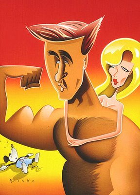
BTW, the caricature above is actually of Alex Baldwin but it looks like John, doesn't it?

Wednesday, September 27, 2006

ADVICE FROM A CHICK MAGNET


I'd like to introduce all my readers to my friend Scott. No, that's not him above. That's simply the subject of his expertise. Scott is one of the world's formost experts on women. He's also a chick magnet. He isn't quite at Vincent Waller's level but he's only a couple of notches below and that's saying a lot. Scott and I worked together on Tiny Toons and I can tell you that the hall outside of his room was the site of an endless traffic jam caused by all the girls in the office passing and repassing his room on any excuse they could think of. He could have papered the wall with all the phone numbers he got.

The reason I mention Scott is that one day he told me his secret for finding the right women to date. When I heard it my jaw dropped. It was the best advice about women I'd ever heard! In fact, everybody I told it to thought it was the best advice THEY'D ever heard! Honestly, when I told this secret at parties you could have heard a pin drop afterward. This is the atomic bomb of dating secrets. It has to do with two questions that the potential date, or her friends, must answer affirmatively.

Question #1: Does the girl like her dad? Scott will only date women who like their fathers. He reasons that if a girl feels mistreated by her dad she'll spend the rest of her life making other men suffer for it.

Question #2: Does she have brothers or sisters? Scott reasons that only- children are selfish and self-centered. The girl must have siblings. He's also a big believer in birth order. Avoid the last girl born into a big family because she's probably wild.

There it is. Scott told it to me and now I've told it to you.

Tuesday, September 26, 2006

TWO OVER-RATED "MASTERPIECES"

Here's (above) Manet's famous Olympia painting. It's said to be the painting that began modern art. If that's true then I'll concede it's historical significance but that doesn't mean I have to like it. The lighting is flat, the head looks grafted on, the body is just a line drawing which makes almost no impression on the bed and the woman is sterile and uninspiring. I like most of Manet's paintings but this Mel Ramos-style pop art just doesn't do it for me.

This (above) is a famous Carravagio. I don't like the man. He's a good technician but he has no soul. David Hockney thinks this picture was painted using projection optics and I'll bet he's right. And has there ever been a more bored, kitchy and uninspiring model in the history of fine art? Alright, there's "Olympia" but I'm not counting her.

Monday, September 25, 2006

THE INCAS WERE FUNNY!

I'm amazed at how often funny sculptures appear in collections of Pre-Columbian (i.e., before Columbus) art. The pictures I've been able to post here are just the tip of the iceberg. They get a lot funnier than this. The L.A. County Museum of Art has a terrific collection of funny, Virgil Parch-type sculptures, some of them more than 1500 years old. I'll post some pictures whenever I can find some good ones. You'll laugh out loud when you see them.


It's disconcerting to think that the earliest known peoples to appreciate formal comedy might have been the Central and South Americans. Among the 4 or 5 major nations only the Aztecs seemed to be serious and straight-laced about art. The others got jokes in every chance they could.

Maybe ancient South American comedy isn't better known because serious South Americans of the present are embarrassed by it. Or maybe the scuptures just don't seem like high art because they're funny. Anyway, my advice to time travelers going back to the golden age of that continent is to carry plenty of whoopee cushions and joy buzzers.

Sunday, September 24, 2006

LOVE THOSE CALIFORNIA WATERCOLORISTS

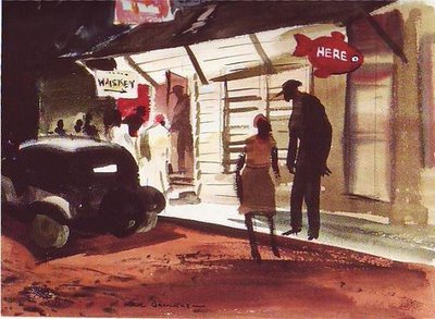
More pictures from the super-cool California Watercolor movement of the 1940s: Hardy Gramatky (above), Erle Loran (middle), and Dong Kingman (below). Click to enlarge.