Wednesday, October 18, 2006
HALLOWEEN PICTURES
I have a small but well-loved collection of funny Halloween masks, which I keep year 'round along the top of some book shelves in my living room. I was hoping I could add one mask a year to the shelves but most years there are no good funny masks and I have to make do with what I've already got.
This year I don't know what to think. I like the middle-aged man mask with the red nose and white glasses (above), I just don't know if I like it enough to give it a place of honor on the shelf. I mean I could get the cheesy Smith Brothers beard with the penile nose (above) instead. I know that would fit in. Then again living rooms are supposed to be tasteful. But then...well, I'll think about it.
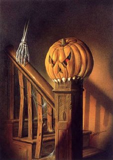
BTW, how do you like the cardboard crescent moon with the black cat on its nose (somewhere above)? The guy who designed that is my hero. He made it possible for kids to own something funny and beautifully designed for the price of a candy bar! I also like the poster of the pumpkin on the stairs.
The hanging pumpkin with the teeth is really well done but it probably costs a fortune! I don't see the point in making Halloween things that kids can't afford. Some people want to turn Halloween into a kind of adult Mardi Gras. That'll be fun for us but it'll cut the kids out. Do we really want to do that?
Labels:
halloween,
halloween masks,
pumpkin carving
Tuesday, October 17, 2006
PUNCH-UPS
When I did "Tales of Worm Paranoia" I hired a dialogue specialist (Mark Schirmeister) to help me punch up the dialogue. Thanks to Mark I got "...from the lowest protozoan crawling on his belly in the lowlands, to the great speckled trout that leaps in pristine, crystalline lakes in the uplands (sorry I repeat these lines so often). " When I hired Mark I was only doing what live action producers routinely did in the big studio era. They brought in specialists to punch up every aspect of film making.
There were action, romance, comedy and lighting specialists just to name a few. These people didn't do the whole film, just the parts that lent itself to what they do well. Today advertising still follows this practice. A beer commercial will call in a glass photography specialist to film the close-up where the beer pours into the mug. That seems perfectly natural to me.
The question I'd like to pose here is, why doesn't the animation industry follow this practice?
One of the differences between classic animated features and present-day ones is that modern features are almost completely devoid of imaginative set pieces. Dumbo had the "Roustabouts", "Casey Jr.", and "Pink Elephants. " Where are the modern equivalents? What happened? If modern studios have trouble conceiving of stuff like this then why don't they seek help outside the studio? Why don't TV artists working on serious shows run their comedy sequences past outside comedy specialists and visa versa?
The audience doesn't want to see the best that a particular unit can produce, it wants to see the best that possibly can be created, no matter who does it. My advice to both TV and feature producers is to build time into the schedule to run some of the finished scripts and storyboards past appropriate specialists for a punch-up.
Monday, October 16, 2006
I FOUND IT! MY DAUGHTER"S NECK HAIR DRAWING!!!
OK, based on this drawing (click to enlarge) I claim that my daughter "owns" neck hairs! If you've got a better neck hair drawing put it up now or forever hold your peace!
I may as well add that the original title of this drawing, emblazoned with marker over the top of the page, was "Hi! My name is Eddie! I am fat!"
Hmmm... this post seems a little sparse. Here's (above) a couple of photos to bulk it up, and a pithy caption to accompany them: "Scrumptious tongue mystery hat!!!! Noodle stretching putty service....tomahawk?"
Satisfied?
Labels:
caricature,
eddie caricature,
my daughter,
neck hairss
Sunday, October 15, 2006
ONE OF THE MOST BEAUTIFUL CARTOONS I'VE EVER SEEN!
Saturday night I saw what may be the most beautiful short cartoon made in the last 50 years! I refer to a rock video called "Classico"; song by Tenacious D, cartoon byJohn Kricfalusi. I can't begin to describe how gorgeous this film is. John kicked off the color revolution in TV cartoons years ago with the "New Adventures of Mighty Mouse," and the industry's been cruising on that advance for years. Now John's in a tinkering mood again and he's come up with something new, which I'll call hyper-color until somebody thinks of a better name.
I can't be too specific because I don't have a copy of the cartoon to study. Nobody does but don't worry. It'll be all over the net soon to promote Jack Black's new film,"Tenacious D."
The film is full of interesting techniques including frequent use of multiple background changes within the same scene; rich, saturated colors using what may be a "glaze" technique contrasted with flat pastels with the effect heightened by skillfully timed cuts; simulated multiplane effects; a new way of using FLASH; and most importantly, a deep understanding of how the right kind of line, shape, movement and cutting enhances color. And did I mention the hilarious gags and way-cool animation? What a colossal achievement!
Saturday, October 14, 2006
HIPPIE CARD GAME
I used to have a hippie friend who was a frequent shopper at the local "head" shop. One day he asked me to play a card game he just bought. I asked what the rules were and he said, "That's just it, man! There are no rules!!!!! No fascist telling you how to play! No CIA dictating your life! This is a game for the PEOPLE!"
He dumped out the cards and I swear they were just random pictures of things just like the pictures you see on this page. No numbers, no suites, no duplicates, just pictures. I spent two excruciating hours trying to "play" this game. My friend was happy as a bug playing with his glass of milk and chocolate chip cookies beside him. Me? I'm wondering if we should petition the fascists to re-involve themselves with the card game industry.
Friday, October 13, 2006
EXAMINING TEETH
Every set of teeth I've ever paid attention to seems to have a story to tell. Take the teeth on top. At first glance they seem normal enough but look a little closer. First of all there's a slight overbite but maybe that's normal so we'll let it slide. Then there's the two perfect front teeth. That's unusual all by itself because you rarely find absolutely perfect front teeth. All the stranger then that the chisel tooth next to them seems to be lonely and is inclined to hug the perfect bucks. The fang is shamefully wimpy. It's an accountant's fang, not a vampire's. You could argue that all the remaining teeth on the top are wimpy fangs. Nature has equipped this man to savagely rip into tuna fish sandwiches and Cup O' Noodles.
The teeth on the bottom row are OK except the snooty teeth in the back seem to have elevated themselves above their friends.
The teeth above are all over the place. Some face outwards, some inwards. The chisel teeth aren't even on the same level but seem to be an incline. It's hard to imagine why nature would produce teeth like this. I suppose this man is specialized to eat the tapered end of corn. The two front teeth curve down and inward like spider teeth. The noble bottom teeth join together to resist the goofy onslaught from above. If I had to guess this man's occupation I'd say...mmmm...professional corn-husker adept at picking out weevils with his teeth.
Aaaagghh!!!! Blogger's dropped the rest of my teeth pictures! I guess I'm only allowed two photos tonight! I'll pick this up again later.
Thursday, October 12, 2006
Subscribe to:
Posts (Atom)