Saturday, December 16, 2006

HOW TO IMPROVE YOUR PAINTING OVERNIGHT

I just watched Charles Reid's "Portraits in Watercolor" video and I have to say that I was impressed. Reid's technique is interesting but it's his mannerisms that really caught my eye. He seems to be a very nervous painter. The jerky, too-quick way he mixes his paints on the pallete, the way he brings the pallette up to his face, the way he almost seems to talk to the canvas under his breath all give the impression of an obsessed, crazed artist.

I don't mean to imply that I think Reid is crazy. He's not. But I admire him for taking on the attributes of a crazy person when doing so forces him into a greater intimacy with his picture. . Painters should curse at their pictures. They should engage in an angry, energetic and exhausting fight with their canvases. There's plenty of time to relax later when it's clear that the picture's going to work. The time of heightened risk, when success or failure hangs in the balance, should be supremely stressfull. Patton was right when he said the soldier who can loose and laugh wasn't much of a soldier. You should be so keyed up when drawing or painting that a dropped pencil or a ringing telephone would make you jump to the ceiling. Art is a serious business!

Wednesday, December 13, 2006

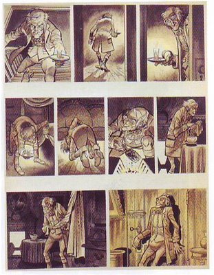
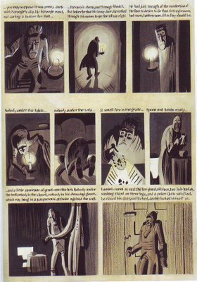
DAVIS & KURTZMAN DRAW THE SAME STRIP

Kurtzman wanted to pitch a comic book version of Dickens' "Christmas Carol" but after doing one page he decided the project was more likely to sell if he brought in Jack Davis to do it. Consequently we have the same page, even the same panels, done to a finish by two interesting artists. Which do you prefer?


I should mention the book I got these from but I can't find it. The title was something like "Interviews With Artists."

ITALIAN FASCIST SCUPTURE

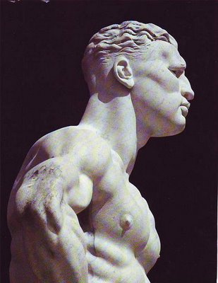
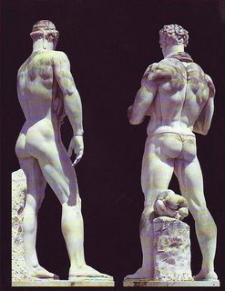
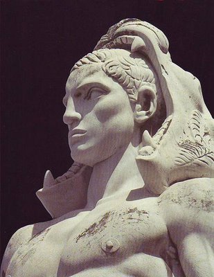
These statues were commissioned by Mussolini to decorate The Mussolini Forum, which was to house the 1944 Olympics before WWII intervened. As decorative sculpture they're not bad; as art...well, what do you think? Me, I'd say no. The technique is highly professional rather than artful and there's no transcendant quality in them.

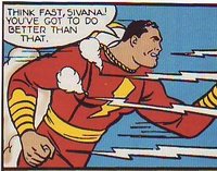
The statue above (topmost) put me off when I first saw it because it seemed to be glorifying a bully or a thug. I think I was wrong because beefy guys like that have been universally admired since the 30s. Even Captain Marvel (above) used to look that way. If you look close you can see some sensitivity and intelligence in the statute's eyes.
These are physiques (above) that I associate with Nautilus machines. I used to think exercizes that emphasize specific muscles were a modern invention but you see figures like this in Rubens and other old masters so I guess I was wrong. The guy on the right looks like he had a killer bowel movement.

I like this kind of manly sculpture (above) but the hair looks like it was turned out without much thought. Zaidenberg (the 40s how-to-draw author) used to draw deco hair like that using charcoal to make quick, chisel strokes. Ruskin in "Seven Lamps of Architecture" warned against schlocking what appears to be unimportant details like the hairline. I think he was right.

Tuesday, December 12, 2006

DISNEY'S NEW GOOFY CARTOON


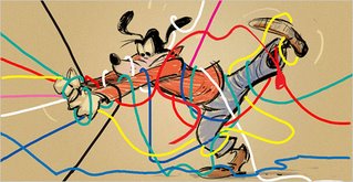
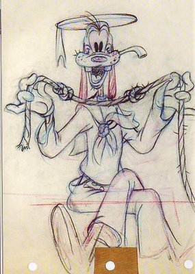
Warning: I'm about to criticize a cartoon that I haven't seen yet (it hasn't been made), that I've only seen two tentative concept drawings from (one shown above, topmost), and whose story I only know from a description in the newspaper. Not only that but I'm terribly hurt that they didn't ask me to work on it so I may, without knowing it, have a mean, small-minded desire to snipe at it from the sidelines. There, that's my disclaimer. Now the criticism...

I have to say that I'm wondering if the project is getting started on the wrong foot. According to the newspaper the story is about Goofy's attempt to install a new, high-tech TV in his house. Is that really a good idea? It's the type of premise that has no suprises built in. The gags and the acting could all be predictable. Not only that but it's a frustration story and frustration premises (like Pluto and the flypaper) tend to pass on their frustration and unease to the audience. When you think about it, the best Goofys - the ice hockey, football, and basketball cartoons, aren't about frustration. They may seem to be, but they're not.

On another subject, it seems to me that subtext of every good Goofy cartoon is the weird universe that Goofy inhabits and the delight the character takes in doing things with his amazingly agile hands and feet. The character is a full-animator's dream. He's also a physical actor's dream. Goofy is not the average guy next door any more than James Bond is the average spy. Goofy and Bond are hyper-characters and anything less than star-quality scenes will diminish them. Goofy can either exude charisma and magic as in the best Kinney cartoons or he can be a bland guy-next-door-type the way Reitherman treated him. Which way will Disney go? I guess we'll see.

Thanks to Amid's "Animation Blast" for the excellent Sibley animation drawing above. Drawings copyrighted by Disney.

Monday, December 11, 2006

PARTY AT THEORY MANSION!


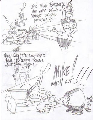
Gee, I guess that's the end of the party. I gotta get Mike to a doctor. If you don't have a ride home just sack out on the sofa! See ya!

Saturday, December 09, 2006

T. S. SULLIVANT: GENIUS

This isn't a post, I just wanted to put these pictures up for friends. Beautiful aren't they?

Thursday, December 07, 2006

PARTY INVITATION!

But to ease the pain of two days without Theory Corner......


I invite everybody to a party at the world famous THEORY MANSION (above)!!!