What I'm about to say was inspired by a recent blog entry by John Kricfalusi: "Dan Gordon and What Makes a Cartoonist," on "All Kinds of Stuff," Jan. 16, '07. I congratulated John on the article but when I quoted my favorite parts he was appalled that I seemed to have misunderstood the point he was making. Well, John's certainly the expert on what his intended message was but I still like my own deviation from it, which is presented below.
Using John's article as a springboard I now see character artists in the animation industry as being divided into two camps, the illustrators and the cartoonists. Illustrators, like the guy who designed the Robin Hood fox below, draw beautiful, well-proportioned pictures. Cartoonists (like Mad magazine artist Don Martin, above) draw funny pictures. Obviously some artists can do both but most have a bias in one direction or the other.

There's no reason for these groups to be antagonistic, after all a good cartoon requires both skills. The problem is that employers, who are almost never cartoonists themselves, favor the illustrators. After all, illustrators make the most professional-looking drawings. Writers, who often have employer's ear, also favor illustrators. Cartoonists chafe at unfunny scripts and will usually try to finess them. Illustrators make the perfect employee because they actually like the guidance provided by long and usually unfunny scripts, they just want to make the pictures look professional. Anyway, the consequence of all this is that cartoonists have to do a lot of hustling to get work, even in the cartoon industry.
Unfortunately a new group has arrived which is ambivilent to both cartoonists and illustrators: the 3D animator. A lot of 3D animators don't see the point in learning how to draw. They never had time to learn in school because 3D is so labor-intensive and besides, they reason that the people they work for will provide the characters. In my darkest moments I sometimes imagine a world where art school graduates not only can't draw but can't even imagine why anyone would want to draw. I rush to add that this is an admittedly unrealistic fantasy. Anime is coming up fast and is still drawing-intensive, even if it favors illustrators. John Kricfalusi loves cartoonists and continues to train them and at least three studios have put the word out that they're interested in hearing pitches for 2D projects.
Talking about John, I forgot to say why he was so disturbed by my talk about cartoonist/illustrator differences. John believes that there's no reason why caroonists shouldn't be able to draw as well as illustrators, if not better. Cartoonists in the past did it routinely, why shouldn't we? In spite of what I said in the opening paragraphs I have to admit that he has a point.
 Yes, absolutely! Especially for cartooning! By way of an example how about this picture (above) of a suburban sidewalk by Crumb. The kid looking at the girl with the funny hat reminds me of the Thomas Hart Benton picture of the farmer peeking at a sleeping nude woman. Both beautifully capture a sensual moment and both seem to have something to say about the enviornment the subjects are in. Farms and suburbs are the products of human thought and are therefore charged with sexuality.
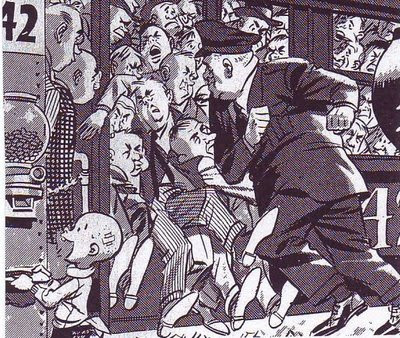
 Suburbans (above) must go to work, all at the same time. Wood found a rough beauty in that.
 A Crumb girl (above) takes time to read her notebook in a suburban greasy spoon. A wonderful depiction of a quiet moment in the city.
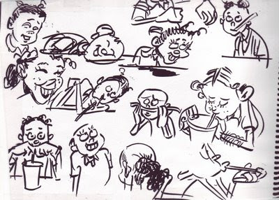
 This (above) is an old sketchbook page (previously published on this blog) that I did of my daughter when she was a kid. I did it in a suburban fast food restaurant. Life happens in fast food places just like it does in arab street bazaars and picturesque Provence streets. Why are so many modern artists blind to that?


