Tuesday, June 12, 2012

BETTE DAVIS AND VICTOR BUONO (PART 1)

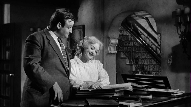
These frame grabs are from "Whatever Happened to Baby Jane?" Here ex-child star Bette Davis entertains a new boyfriend while her sister/prisoner, Joan Crawford, tries to escape upstairs. 


Wow! Bette looks great here (above). She's grotesque but the expressive acting shines through, even in a frame grab.

How do you like the lighting? PRO-fesh-eee-o-nal!


Above, a dainty sip from a cup, then.....


......Bette launches into a rant about modern music. She says they don't write music like they used to.


She says (above) she might have to re-enter show business to remind the world what real entertainment is.


Her gold digger boyfriend politely agrees.


Bette's (above) all fired up now. She's had this on her mind for a long time.


She (above) asks for her boyfriend's real opinion. She was a child star 75 years ago, and has never been on the stage since. Is it realistic to hope for a comeback?


With mock sincerity the boyfriend answers that it's never too late. Bette is ecstatic.


Delighted, she grabs his arm and offers to show him the sheet music for her old songs.

CONTINUED IN PART 2

Monday, June 11, 2012

BETTE DAVIS AND VICTOR BUONO (PART 2)

Above, Bette shows her boyfriend the sheet music.


They're interrupted by Joan Crawford screaming for help upstairs. Bette says her poor, sick sister gets delusional when she's hungry. She grabs her sister's meal (pre-prepared) and runs upstairs with it.

She gives her sister (above) the main course....


...which is (above) a big, ugly rat. Bette is not a nice guy in this film.


Joan screams....

Bette slaps her and runs downstairs.

Back in the living room (above), Bette does her childhood act with her boyfriend accompanying on the piano.


 You get the feeling that he's not really into it.


Bette ends on a high note.


 Not a minute too soon, it looks like.


It's time to discuss the boyfriend's "allowance."


Bette says it might be late this week. The boyfriend looks murderous.


Haw! Bette said it was just a joke!

***********************************************

Well, that's all there's time for. The film is pretty dark, and for that reason never got the audience it deserved. That's too bad. It contains the best performance of Davis' later career.


Sunday, June 10, 2012

WHAT DOES A MEMORY LOOK LIKE?

Every once in a while it's fun to think about thinking. Try this....sit in a comfortable chair and leisurely conjure up a memory of something. Try to be aware of the what the memory consists of. Is it a picture or a movie? Does the movie have sound? How distinct are the visuals? Can you entertain sound and pictures at the same time?


I just tried it and discovered that my memories consist mostly of still pictures and of movies that last for only a second. I can add sound, but it takes an effort to get sound and picture at the same time.

I conjured up my old high school (a facsimile above) and tried to remember what the students were like when sitting all together on the basketball court. I remember the boys punching each other on the arm til they were told to stop, and the general hub bub.


I was surprised to find that my memories weren't brightly colored. They came in desaturated tints, something like the picture above. If I focused on a color it brightened up, but when I turned my thoughts away again, it dimmed.


The memories were also pretty blurry. I couldn't make out the exact face and clothes of any one.


Come to think of it, they were VERY blurry. There were very few details....probably less than you see here (above).

The pictures didn't last long, either. I found that I couldn't keep a picture up to study it. My brain has no pause button. New pictures from different angles would appear, each with less fidelity to the original event than the first.


Of course I do vividly remember some details when I'm pressed (above).

Anyway, I believe the soupy memory was somewhat accurate, which is odd considering that the pictures were so fuzzy and ephemeral. Maybe the accuracy comes from something that was added to the pictures. Watching how the memory was constructed, I felt that a search had taken place, then a picture was put up, then a sort of emotional impression of the event was taken out of storage and combined with the picture.

Amazingly the non-visual, emotional impressions seemed to be the source for some of the movement I thought I saw. Sometimes I really didn't see that much movement in a single picture, I just strongly felt like I did.

Interesting, huh?


Thursday, June 07, 2012

PULP PAPERBACK STYLE

Vintage paperback books had some great covers. I imagine they did a lot to sell the story to potential buyers. But...a good cover isn't enough. To really clinch the sale you need....


....you need a good back cover. The buyer wants to know if the writer can live up to the promise made on the front. In this case the front is pure poetry:

Fran's filmy attire made it necessary for her to remain behind the door until I had entered and she had closed it, secluding us for the night.

That's a great sentence. In lesser hands it might have started with the prosaic, "Fran remained behind the door...", but this writer knew what the reader wanted. He opened with the infinitely more atmospheric, "Fran's filmy attire..." Instantly we're brought to the thrilling moment when a girl who cares about us opens the door. 

Unfortunately the meandering blurb on the back doesn't live up to the front. 


Here's (above) a case where the back copy is better than the front:

Completely nude, she posed for the scandalous painting. Her affairs were the talk of the Congo.

It's hard to imagine the whole Congo being scandalized by anything in a painting, but who cares? You imagine drums spreading the message to every corner of the jungle that some crazy white woman with a cat posed buck naked for a picture. The author casts a spell that makes it all seem plausible.


 I think the same author did this teaser (above) for another book. Man, he had the knack!


The author didn't intend it, but I prefer to think of Forbidden Nectar (above) as the blonde's name. We're assured that when a man gets the taste of Forbidden Nectar, there's no turning back. 

Boy, the writer likes purple prose. Forbidden Nectar was on her way into the bubbling pit of destructive passion, while Forbidden Nectar's man was being sucked down into the whirlpool of destructive lusts. Imagine what it would be like if ordinary people talked like that in the street.

Geez, some of the words are beautiful but the plot sounds unfocused.


I've heard that college professors moonlighted as freelance writers for lurid books, and  these blurbs (above) seem to confirm that. Imagine the savage passion summoned up by academic rhetoric like:

Fearing community disgrace, she's chosen him for her consort, one to whom she could go for necessary affection.


Here's (above) a story full of Thrust about Maria, whose middle name was trouble, a real tropical hussy. The book promises to tell how hussies like Maria are made...what they do to people. It all sounds very steamy and sexy...but wait a minute...Maria turns out to be a hurricane, and the story is about The San Francisco Weather Bureau! Haw!

I like the title. It indicates that the story is not about something as prosaic as a storm, rather it's about the infinitely weird and menacing "StorM."


Monday, June 04, 2012

IDEAS FOR STUDENT FILMS

This is a post for animation students. If you're taking a summer course that requires you to make a short pencil test film, then you could do worse than to start with a story like the ones you see here. I'm not suggesting that you swipe these ....they're just for inspiration. See what you think.

Here's (above) a great idea performed by comedienne, Lotus Weinstock. It's in a YouTube video called "How to Use Body Signals a Man Can't Resist." The video wouldn't embed, so you'll have to use this link:  http://www.youtube.com/watch?v=yXTDSGv4J8w&feature=related


Here's (above) the classic elevator sequence from "The Errand Boy." Something like this would look great in animation.


More Jerry (above). This hat routine is one of John K's favorites.


Still more Jerry (above).  Nice, huh?


Joke books are a good place to find visual gags. I can picture this gag (below) in animation:

"How did the blind kid burn the side of his face?

He answered the iron."

"How did he burn the other side?

They called back."


'GOTTA GET TO BED

Aaaargh! I just got home late at night, and am way too tired to write. I'll post tommorrow night (Monday).

Saturday, June 02, 2012

CALVIN KLEIN: HERO

That's Calvin Klein above, wearing one of his famous tee shirts. 


Klein had the smarts to realize that every man wanted a form-fitting tee shirt like Brando had in "Streetcar Named Desire." Actually, even Brando didn't have a tee shirt like that. The one he wore in the movie had to be pinned back. Anyway, Klein turned out great tee shirts for years til he sold the company and the new owner allowed the quality to deteriorate.

Calvin Klein was a hero. He was the first to make sophisticated design accessible to the common man. His clothes sold at Macy's for Pete's sake, and were only a little more than twice the normal price. In the world of fashion that's still dirt cheap. That means that anyone with a job could afford them, as long as they were willing to skimp on something else.


Actually, when you think about it, designer jeans had to sell for more than normal jeans. They could only sell to a limited market of reasonably fit people because there's just too many variations of  plump and pulpy. Also a lot of advertising was needed to launch the idea. 


The hippies hated Klein. For them, plain old Levis 501's represented the ideal of the classless society...any tinkering was the work of the devil. They were right in one way, but wrong in another. Status seeking is a fundamental part of human nature.You can't eliminate it, you can only hope to take the most harmful edges off it. By making fashion available to everyone, Klein created a new version of the classless society, one which persists right up to the present. 


Gee, all this talk about fashion calls to mind my own struggle with it. Here's (above) a low-priced shirt I bought in 2011 and have worn only once.  It's horribly shapeless, the fabric doesn't hang naturally, the collar doesn't cling to the neck and shoulders, and it's mostly cotton, so it requires ironing. The collar and sleeve sizes are correct but nothing else is.


Here's (above) a designer shirt I bought way back in 1984, and have worn continuously since. It has a nice shape, the fabric hangs naturally, the collar clings to the neck and shoulders as it should, and it's a polyester/rayon blend that requires no ironing. Don't be deterred by the polyester...all polyesters and rayon are not made the same. This fabric breathes almost as well as cotton.

The shoulders are reinforced for shape, but the soft three-part reinforcement (I'm pointing to it) still allows the fabric to hang naturally. It only cost twice as much as the checkered shirt I never wear. My only regret is that I didn't buy five of these when I had the chance.