
 Left to right (above): Kali, Katie and Marlo.
  Country singers Kali and Katie (above).
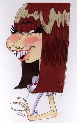 Swiped from Kali's blog, Katie's amazingly accurate caricature of Kali.
 Hot off the presses, here it is! It appears to be a whole book of anecdotes about Wood by the people who loved him and worked with him over the years. This may be the ultimate book on Wood! I'll let you know when I've had a chance to read it! Thanks Milt! It's a great present!
 I think I'll pay a visit to 15150 Parthenia in Van Nuys. I wonder if the apartment house is still standing?
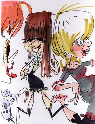 Voila! Caricatures (above) of Marlo, Kali and Katie, who also drew these! Click to enlarge! They still won't be as big as they should be but this is the best I could do with the bandwidth I have. I'll put up more soon!
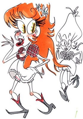 Marlo and Katie here (above) (dress designers note...this is the proper height for all dresses in the front)! How does Katie manage to distill so much happiness in a drawing? You could say these are philosophical drawings because they depict a world devoid of stress and conflict. That's the artist's job, to show the rest of us a vision of what the world could could be, to give us something to shoot for.
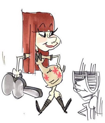 Here's Kali looking infinitely sunny and eager. Notice the great leg and topknot theories! Katie made an interesting choice here. Everytime I've seen Kali she's been upbeat and enthusiastic but, being human she must have the whole range of positive and negative emotions that the rest of us do and Katiie must have seen that negative side at some time or other. Katie wisely chose a single emotion to represent Kali. She chose happiness. She didn't choose it because it's a convention of caricaturists , but because it represented a side of Kali that appealed to Katie's own idealism, to her own vision of a better world...at least that's what I think happened.
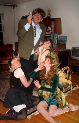 Here they are, the pictures of the famous opera "Die Flabberpuss" staged at John's Halloween party. Photos courtesy of renowned stage photographer Marlo Meekins.
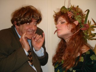 Here (above) the young shepherd boy discovers a beautiful forest nymph (Marlo) asleep on the branch of a tree. The lad feels something peculiar stirring within him but he's on a quest and must not dilly-dally.
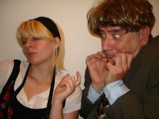 Here (above) the idealistic young shepherd boy encounters Katilda (Katie), the beautiful siren of the forest. She entices him to sup with her in her cave beneath a gnarly, mist-enshrouded tree. Once again the lad feels peculiar longings but he remembers his quest and bolts into the woods.
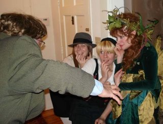 Running through the dense forest the boy hears screams behind him. Curious, he climbs a tree and sees Fabberpuss (above), the towering, mushroom-covered, evil, girl-eating troll menacing three quivering fairies (Kali, Katie, and Marlo). Well, there's no time to tell the whole story. Maybe I'll continue this later. Thanks Marlo for letting me swipe these photos from your blog!
 These pictures are all from the coffee table book called "Chicken Little" by Monique Peterson. I feel sorry for Peterson because she had the thankless job of trying to put a positive spin on what appears to be a story of endless woe in the making of that recent film. I never worked on a 3-D film so I can only guess what it's like. If the book is right it couldn't be much fun. The programs are clunky and unresponsive and seldom do what the animators want them to do.
 Maybe the strong suit of the 3-D programs is backgrounds and props but even there the results are mixed. The car (below) looks great but the theater (above) looks somewhat cold like something made out of a Leggo set. I can't imagine the cottage of the Seven Dwarves having any emotional impact in this style.
 Everybody knows that computers are the future of animation but that future isn't here yet. Right now 3-D animation programs confine us to a style of literal, unimaginative drawing that dates back to 1910. Even the stories animation tells have to be crippled to fit the limits of the medium. How can that be considered an advance?
BTW, I just got Amid Amidi's book, "Cartoon Modern" and it looks great! I'll do a blog about it when I have a chance to read it!
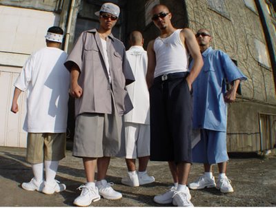 These days men's fashion really sucks. How did that come about? Everything is shapeless and looks like it came from a one-size-fits-all store. I don' t mind skateboarders' fashions because they're funny. You have to admit that wearing parachute-size pants almost below the buttocks is hilarious. No, what I object to is the urban gangsta look. Gangsters should look debonair and swashbuckling. I can't imagine Bogart taking any of these guys into his gang.
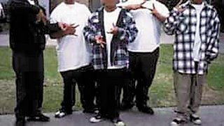
 caps that cover the ears, even in the summertime? Well, at least they're flamboyant and that's something. What I really don't understand is the middle class suburban variant exemplified by Chicken Little's clothes. What's with the tight green Arnold-Palmer T and the shapeless, oversized shorts? Click to enlarge it; the shorts look like the bird has a load in his pants. What man who wants to attract women would dress like he was wearing a diaper?