Monday, May 22, 2017

FLETCHER HANKS: CREATOR OF STARDUST

Stardust is a superhero who orbits the globe in a spaceship that alerts him whenever a crime's committed on Earth. 

Once alerted he slither-flies down to Earth and grabs the evil-doers.

"Grabs," you say? "What's so bad about being grabbed?" Trust me, it's bad. You never want to be grabbed by this guy.


When he's really mad he's not above separating bad guys from their heads. 


Grievous crimes require grievous penalties. For the crime of eliminating Earth's gravity and killing millions of innocent people... 


...the perpetrator is not only rudely grabbed but forced to spend eternity in a snow filled room in a floating apartment building.


Hanks also created Fantoma, a girl version of Stardust. She polices the world's jungles.


Hanks' jungles are full of criminals, both animal and human.  Here (above) a man studies science and becomes a super villain in order to take revenge on gorillas who tormented him.


For a while he causes all sorts of havoc. 


Ultimately, though,  Fantoma sides with the gorillas and restores order. 


Above, Stardust's romantic side. 

I think there's a Stardust action figure out there. Gee, I wouldn't mind having one.

Friday, May 19, 2017

CRIME POETRY


Am I the only one here who likes crime poems? Here's (below) the best one I know of.  When I was a kid it came with my board game, "Clue." I don't know the author's name.


Nice, huh? It's robust simplicity begs comparison with Service's "Dangerous Dan McGrew." It's so playful and unpretentious...so delightfully unmodern.  For comparison here's (below) a ponderous contemporary crime poem:

My beef with this poem (above) is that it saves the true meaning for the end. That's such a silly, modern thing to do. Apparently, the poet isn't inspired by the thrill of the chase. At the end we discover that he's only interested in detection as a metaphor for a sad comment on life.


My advice to all poets is to avoid melancholy zingers at the end of what you write. Avoid the temptation to bait and switch. Let the poem be about what attracted the reader to it in the first place. If there's a subtext or a secondary meaning let it be made by the stylistic zeal embedded in the writing.


Monday, May 15, 2017

GUS MAGER AND RUDOLPH DIRKS


While perusing samples of Gus Mager's strip "Hawkshaw the Detective" I stumbled on this example (above) of Hawkshaw done in the style of Rudolph Dirks, the "Katzenjammer Kids" artist. What the Heck!??? Was it Mager influenced by Dirks or was it an active collaboration? 
  

Either way the merging of the two styles was a match made in Heaven. Here's (above) the same page shown smaller.  The layout is arguably as beautiful as anything either man accomplished on his own.

Here's another example, and this time I'll guess that it's pure Gus Mager with Dirks serving only as an influence.

According to Stripper's Guide, Dirks asked Mager to do the gag strip above Katzenjammer so we know the two men knew each other.

Here's (above) Cliff Sterrett doing Mager. I wonder how that came about?


Monday, May 08, 2017

SPACE INVADERS

If ever space aliens invade the Earth they'll almost certainly start with easy targets like children and animals.

Some believe the invasion has already started. 


How else to explain cow tipping?


Intellectuals assure us that there's nothing to worry about.


 Well, they must know what they're talking about.  After all, they study stuff like this.


Even so....


Then again, everyday life on the street is still so placid, so normal, so delightfully uneventful.

 
Well, mostly uneventful.


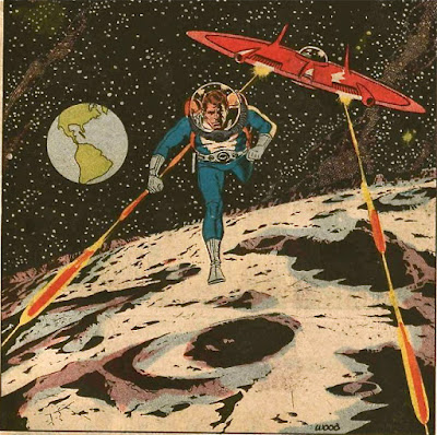
Did you read about the latest goings on up there on the moon? 


Being an astronaut is getting to be hazardous to your health.


But what do I know? I'm busy with the latest cleavage controversy. 


Thank goodness we have intellectuals to explain everything to us.

*****************

Copyrights belong to the copyright holders.

Wednesday, May 03, 2017

GEORGE HURRELL: GENIUS!

I want to talk about George Hurrell the photographer who more than anyone else was responsible for inventing the Hollywood glamour portrait. 

Here's (above) a sample of Hurrell's disastrous first photo shoot with Joan Crawford. It was shot with orthochromatic film which Hurrell urged the studio to buy but then quickly grew to abhor.  

The session turned out horrible but Crawford had a good eye for talent and she could see what Hurrell was struggling to achieve. Although she bullied him in that first session she afterward located him in the studio cafeteria and...on bent knee...begged his forgiveness.

 Good for her! What the two would achieve together would be historic.


Hurrell also did good work with Jean Harlow. That was a real challenge because she wasn't naturally photogenic.  Despite her reputation, in real life she was quiet and even rather wholesome, which is not at all the image the studio wanted to project. 


Here she is after Hurrell got hold of her.


What a difference the right photographer makes.


I think we can say that the studio got its money's worth that day.


I love to read about the technical problems Hurrell surmounted. I find it interesting that Hurrell's retoucher actually darkened the busy chair pattern (above) to the left of Crawford's face. I'd have lightened it in order to make the face pop out... and I'd have been wrong.

Hurrell rightly chose the more dramatic alternative where the heroine seems to have a mission...where she bravely confronts the darkness.

There's lots more to say about this, but I'll have to save it for another time.


Friday, April 28, 2017

WHAT'S FASHIONABLE NOW?

 I came across a fascinating book in the library called "The Sartorialist." It consists of casual photos of fashion minded people, all encountered on the streets by wandering photographer Scott Schuman.

That's Schuman above. He used to work in fashion but left to record how ordinary consumers interpret what's offered in the stores. He sees it as the street talking back to the industry. Wow! What an interesting idea!


 This (above) is my favorite of all the pictures in the book because it emphasizes the timeless appeal of shape and cut above color and graphic design. The color's great though, no doubt about it.


 Vests are still in style for men.

Geez, the problem with all these designs is that they're meant for trim people with good physiques.


 It's their reward for all the time spent walking to nowhere on treadmills and eating tasteless salads.


Schuman also devotes time to what he calls "curvy" people, but many of the pictures fail to excite. Let's be honest. Fashion is a thin person's sport.


It does have one unexpected asset, though. It can look almost as good on old people as the young.


Who'da thunk that nature would take pity on you at an age when you're watching endless re-runs of "Murder, She Wrote?"


This woman isn't old but she has white hair which is taken to be a sign of age, but which can look great.

I like the colors she's wearing: green, purple and yellow with blue and white stripes used as a neutral to set it off. It's a color scheme discovered by David Hockney.

I used to think of neutrals as grey and brown but really, they're anything that most other colors look good on top of.