These masks all look like photos of corpses from the real-life, forensic experiment called the "Body Farm" in Kentucky. They're genuinely creepy. The photography is excellent. I wish I could talk to the guy who took the pictures.
 These masks all look like photos of corpses from the real-life, forensic experiment called the "Body Farm" in Kentucky. They're genuinely creepy. The photography is excellent. I wish I could talk to the guy who took the pictures.
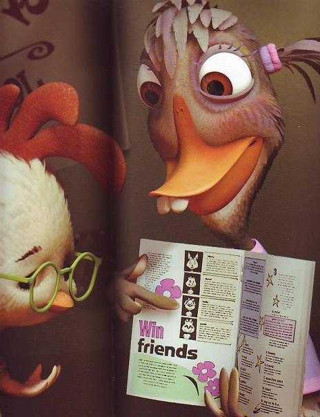 These pictures are all from the coffee table book called "Chicken Little" by Monique Peterson. I feel sorry for Peterson because she had the thankless job of trying to put a positive spin on what appears to be a story of endless woe in the making of that recent film. I never worked on a 3-D film so I can only guess what it's like. If the book is right it couldn't be much fun. The programs are clunky and unresponsive and seldom do what the animators want them to do.
 Maybe the strong suit of the 3-D programs is backgrounds and props but even there the results are mixed. The car (below) looks great but the theater (above) looks somewhat cold like something made out of a Leggo set. I can't imagine the cottage of the Seven Dwarves having any emotional impact in this style.
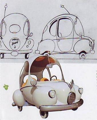 Everybody knows that computers are the future of animation but that future isn't here yet. Right now 3-D animation programs confine us to a style of literal, unimaginative drawing that dates back to 1910. Even the stories animation tells have to be crippled to fit the limits of the medium. How can that be considered an advance?
BTW, I just got Amid Amidi's book, "Cartoon Modern" and it looks great! I'll do a blog about it when I have a chance to read it!
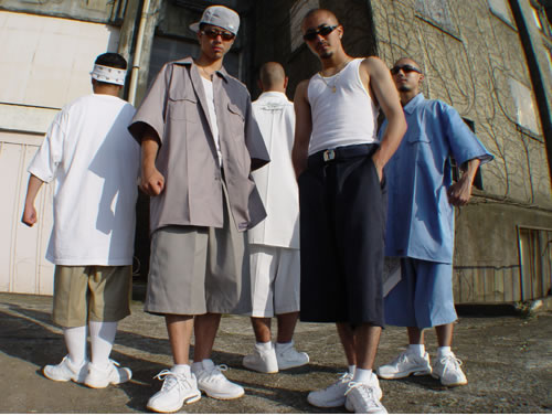 These days men's fashion really sucks. How did that come about? Everything is shapeless and looks like it came from a one-size-fits-all store. I don' t mind skateboarders' fashions because they're funny. You have to admit that wearing parachute-size pants almost below the buttocks is hilarious. No, what I object to is the urban gangsta look. Gangsters should look debonair and swashbuckling. I can't imagine Bogart taking any of these guys into his gang.
 caps that cover the ears, even in the summertime? Well, at least they're flamboyant and that's something. What I really don't understand is the middle class suburban variant exemplified by Chicken Little's clothes. What's with the tight green Arnold-Palmer T and the shapeless, oversized shorts? Click to enlarge it; the shorts look like the bird has a load in his pants. What man who wants to attract women would dress like he was wearing a diaper?
 Unfortunately these won't look like much unless you enlarge them and even then they're not reproduced big enough for the full impact to get across. I can't figure out why some graphics make such a bold statement when blown up and others don't.
 I've always wanted a set of muscles like the ones on the Doc Savage covers. That and a whole closet of torn t-shirts. The problem is that working out is boring, or at least it seems that way to someone who doesn't do it. There must be another way...
 And this is it! It's a little elaborate, maybe a tad expensive, but this guy is on the right track I think. A suggestion: loose the padded pants. They detract from the realism. That top combined with natural, skinny legs would be a killer combination!
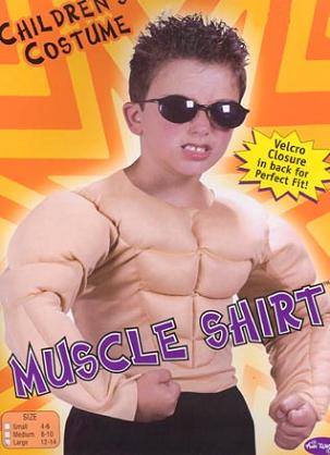 Every year I hope the Halloween costume industry will put out a good set of fake muscles but they never do. Look at the tacky shirt this kid (above) is wearing. The muscles look like curdled milk. Oh well, maybe next year.
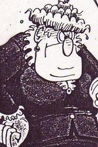
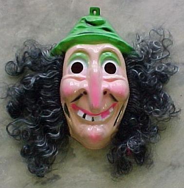 I love these two masks of womens' faces. They're both funny, vivd and full of energy. I especially like the bukram mask of the girl with black eyebrows. Bukram is a great medium. It allows for mass production but it retains the feel of a customized piece of folk art. There's a web site that has detailed instructions on how to make bukram masks. I may take a stab at it sometime. The monochrome mask with the big teeth is kind of ugly but I offer it here because a frontal view on an upshot face is an interesting juxtaposition. The cardboard witch and the Opper-style cartoon characters are
  nifty examples
  of good design that's made to sell for pennies. The witch looks like it was influenced by Nabi theories.
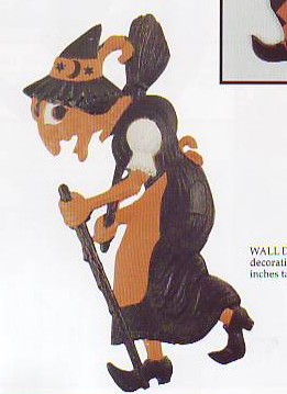

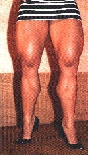
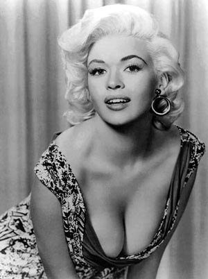 Bosom is a Victorian word that you don't hear too often nowadays. It denotes breasts which are not just big but are...expansive. Do Dolly Parton and Jane Mansfield have bosoms? Yes, I think so but I can't say for sure without examining them. A real bosom requires a certain amount of chest area above the boobs. I'm not a bosom fetishist, mind you, I like all kinds of breasts, but
  like all men I follow any news about this area with keen interest.

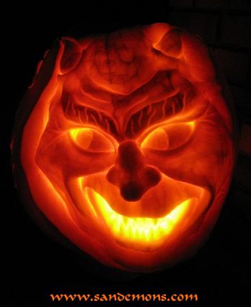
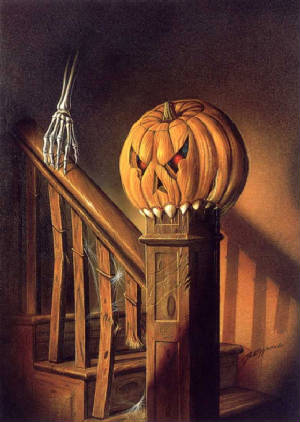
 Here's (above) a technique I haven't seen before. The pumpkin is stripped of all it's skin and the pulp is sculpted by itself. When it's lit with a candle the face is eerie and luminous.


 I like secular people...most of my friends are secular...but this post is a criticism of an extreme of secularism, something that historian Niall Ferguson calls vacuous secularism. The vacuous variety believes that religion (Christianity in the case of the West) never accomplished anything of value and was never anything but an obstacle to progress. That's just silly.
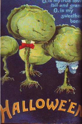
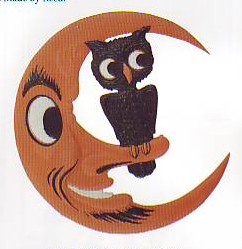
 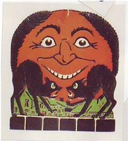 Here's some interesting ones. I thought you might like the horn with a picture of a witch who looks like a Jewish dad. Then there's the scarey moon that looks like it might be named Fred. Somewhere in this jumble there's also a cereal box from the 40s with a witch cut-out on the back.
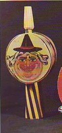 " like the picture does. I've seen that spelling before. Does anyone know anything about this?


 I have a small but well-loved collection of funny Halloween masks, which I keep year 'round along the top of some book shelves in my living room. I was hoping I could add one mask a year to the shelves but most years there are no good funny masks and I have to make do with what I've already got.
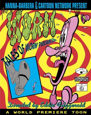 When I did "Tales of Worm Paranoia" I hired a dialogue specialist (Mark Schirmeister) to help me punch up the dialogue. Thanks to Mark I got "...from the lowest protozoan crawling on his belly in the lowlands, to the great speckled trout that leaps in pristine, crystalline lakes in the uplands (sorry I repeat these lines so often). " When I hired Mark I was only doing what live action producers routinely did in the big studio era. They brought in specialists to punch up every aspect of film making.
  One of the differences between classic animated features and present-day ones is that modern features are almost completely devoid of imaginative set pieces. Dumbo had the "Roustabouts", "Casey Jr.", and "Pink Elephants. " Where are the modern equivalents? What happened? If modern studios have trouble conceiving of stuff like this then why don't they seek help outside the studio? Why don't TV artists working on serious shows run their comedy sequences past outside comedy specialists and visa versa?
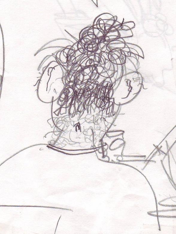 OK, based on this drawing (click to enlarge) I claim that my daughter "owns" neck hairs! If you've got a better neck hair drawing put it up now or forever hold your peace!