Sunday, July 23, 2017

TIME TO LEAVE LA!

MY KITTEN: "Go now. Saying goodbye is too hard!"

EDDIE: " (Sob!) You're right, Kitten. It's better to make a clean break! The neighbors'll take good care of you til I can send for you!" 

DOGS: "Woof! Woof!"

EDDIE: "Fido! Mergitroid! My luggage! Thanks, guys!"


 DAPHNE: "Bye, Eddie! Be sure to write!"


MARILYN: "Send us a card when you land!"


 SUPERMAN: "Bye Eddie! I'll drop by if I happen to be flying over that part of the country! Well, er...assuming there isn't any Kryptonite around."


MARIACHIES: "We'll save your seat at the restaurant! You weren't the best tipper, but even so..."


CHEERLEADERS: "2...4...6...8! Who do we appreciate!?"


MARIACHIES (SINGING): "He 'twas not the best tipper/ But his napkin drawings, they were hipper."


THE TWINS: "Bye, Eddie! Byyyyye!!! We put some chocolate in your pocket!"

TWIN #1: "Did you really give him the chocolate the dog licked?

TWIN #2: "Sure. I wanted to give him our best."

ON BOARD THE PLANE: Eddie finds something melted and gooey in his pocket:

EDDIE (VO): "What the heck!????"


**************

Eddie: I fully intend to keep up the blog in my new location. I'll just  need a couple of weeks off line to settle in. 'See you then!!!!!

Wednesday, July 19, 2017

THE LATEST ASTRONOMY PHOTOS: 7/19/2017

Have you seen the latest Juno pictures of Jupiter's red spot? This one (above) was taken July 11 from less than 10,000 kilometers away. The origin of the red spot is still a mystery. 


Here's (above) an odd one: a mysterious Martian cone 5 meters high and 15 meters across.  It's all alone. There doesn't appear to be other cones nearby. It was taken in February by the Curiosity rover. 


Here's (above) an artist's conception of the Earthlike planet called Trappist-1f.  Along with six other planets it orbits the star, Trappist 1.  The other planets may all have some Earthlike features. Since the planets are unusually close to each other it's fun to guess that if life sprang up on one world it would probably spread quickly to the other six. 


Last but not least: red sprites over the English Channel. Nobody knows what causes them but they're thought to a product of thunderstorm activity. They're rarely photographed because they only last for a millisecond.


Sunday, July 16, 2017

MODERN STORIES VS. CLASSIC STORIES


A CLASSIC STORY SAMPLE:  FROM THE OLD "LONE RANGER" RADIO SHOW

OUTLAW: "I'm gonna kill you right now, Lone Ranger!"
SHERIFF: "Oh no you ain't, Cal Steward! Put up your hands!"


A MODERN STORY SAMPLE:  FROM A CURRENT RADIO SHOW

KATE: "I wanted to cry but I couldn't. Know why? I didn't feel enough."
KITTY:  "That's better than feeling too much (sob!)...like me."


Thursday, July 13, 2017

ABOUT SCHTICK

The problem with animation writers, one of the many problems, is that they don't write visually. For them visual writing means lots of chases or excuses for fast cuts. When I think of visual writing I think of schtick.

Schtick has a lot to do with funny acting and funny situations. It's about small things, like the inability to find the sleeve of the jacket you're putting on.  Or maybe your guy drops his wedding ring into the soup of the bully sitting beside him and has to fish it out with his fingers without the bully noticing. Small stuff like that.

Schtick is great, and animation is tailor-made for it, but it takes some skill to integrate it into a larger plot and most writers don't want to be bothered.

In the sketches above (which are hard to interpret...forgive me, I'm too sleepy to redraw them for clarity) I tried to imagine what kind of schtick a man without control over his arms and hands would do. Imagine putting your arms behind your back and letting a friend substitute with his arms. If he was well-intentioned he could try to make his gestures fit what you're saying but it would be off somehow...somehow out of sync and wrong...but funny in a strange way. Now imagine what your own arms would be like if they were naturally independent like that, without the aid of a friend.

 Imagine what it'd be like if your arms had a mind of their own. While you're talking to friends the hand might become bored and squeeze your face, or they might squeeze the girl next to you. There's no telling what mischief they could get into.

 Or maybe it's played more subtle than that. Maybe you underplay it so the audience senses something's out of whack but they can't put their finger on it. Anyway, you see what I mean. Schtick is fun.


Tuesday, July 11, 2017

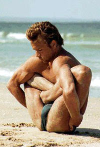
WHY ARTISTS SHOULD AVOID YOGA

For the life of me I can't understand why an artist would practice yoga. Actually, I can't understand why anyone at all would practice it. It's an awful lot of work and what do you get for it? You get to be rubbery. Since when was being rubbery so special?


What really needs to be explained to me is why artists would be interested in it. Am I the only one who's noticed that yoga poses are ugly? Why would an artist try to cultivate ugliness? We're the people who are supposed to make the world more beautiful!


Honestly, I think yoga goes out of its way to be ugly. Ugly poses occur far too frequently to be caused by random chance.


Even traditional Indian art ignores yoga. The dancing Shiva is beautiful by any standard and the Kama Sutra is informed by something resembling yoga but not dominated by it. I know nothing about Indian history but I'll hazard a guess that yoga came to India fairly recently, maybe only a few centuries ago.


India must have had a charismatic Richard Simmons-type who convinced everybody to dispose of tradition and adopt ugliness instead. Who WAS this malevolent person? Why would he do such a thing? Why did people listen to him?


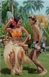
Yoga not only violates traditional Western ideas of beauty, it flies in the face of an international consensus. Everywhere you go outside of India the people have developed some kind of aesthetic fitness training.


Whether it's hula or karate or tai-chi or hip-hop, the moves are all intended to be beautiful. Only yoga defies the aesthetic standard. OK, that's my take on it. I'm going to get a sandwich.

BTW: DJ, a long time yoga practitioner, wrote a thoughtful comment to this post which is worth reading. He says yoga has roots that are at least 4,500 years old.  Give it a read!


Friday, July 07, 2017

THE ROMAN IDEAL VERSUS THE CHRISTIAN IDEAL

 Who's your favorite sculptor? Rodin?  Carpeaux? Bernini? Maybe the ancient Greek sculptor who did The Winged Victory of Samanthrace. Good choices, all.


 My own all-time favorite is an ancient Roman artist, whose name I don't know. The top two photos in this post are both his. Both show extraordinary men who've suffered greatly but are determined to prevail. I'm reminded of the old saying that the most beautiful thing in all the world is that of a good man struggling with adversity.


Okay, we've seen the pagan Roman view of the good man. Now for contrast here's (above) the Christian view of the good man as shown by Donatello. He's intelligent, self-disciplined, thoughtful and kind. You could ask, "Who has the better outlook, Donatello or the Roman?"

In my view they're both right. The world needs both types.


Monday, July 03, 2017

HAVE A WONDERFUL FOURTH OF JULY!!!!!!!!!!


Happy Fourth of July!!!!! It's a great day, isn't it? I thought I'd celebrate by posting one of my favorite patriotic songs. It's sung by Kate Smith, from a film made in the early forties.


Yikes! I tried to post two more items but Google wouldn't accept them. That's Okay, I'm lucky to have gotten the two that you see above. Have a good holiday, everybody!!!!!!!!!!


Saturday, July 01, 2017

KISSING


Here's some old doodles that I discovered while packing. I posted these before but I figure a second view won't hurt. I wish I'd saved more stuff like this. 

All this is really just an excuse to show hands in motion. 


Thursday, June 22, 2017

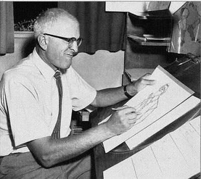
MILT KAHL: THE FAMOUS "ENVELOPE STORY"


A lot of animation fans don't know that Milt Kahl, one of Disney's greatest animators, was actually laid-off by the studio for a number of years. This is how it happened.....

Kahl was a well-known discontent and once every six months or so he'd throw his pencil down, storm into Walt's office and threaten to quit. "None of those idiots can animate! I help them with their scenes and then I have no time for my own. They're just a bunch of bums! I'm in there holding up the whole damn animation department by myself! I don't need this aggravation! I'm outta here! I quit!" Walt, who'd been through this many times, would just look at him sympathetically.


"Ooooh , I get it,"says Milt,  "You don't think I'd do it do you!? Ha! You just watch me! I'm serious this time Walt! I've had it!" Once again, Walt would just stare.


Finally, when Kahl was at the height of his rant, Walt would discretely hit the intercom button and whisper, "Bring me the envelope." His secretary would come in and quietly slip it to him. Meanwhile Milt would still be fulminating: "Those #$&@ lard asses couldn't do a thing without me! This whole stupid studio would crumble without me!" Walt would listen attentively while slowly nudging the envelope across the desk.


"Huh," says Milt,"What's  that!? A bribe!??? Oooh no you don't! You can't buy me off! I mean it, I'm outta here!" More ranting then something green was added to the envelope and it was nudged across the desk again. This ranting and nudging would go on and on until finally Kahl stopped in mid-rant, stared at the envelope, looked inside, then grabbed it and went back to work for another six months. This went on for years and it was a marvelously effective system.


Eventually Walt died and his son-in-law Ron Miller took over the studio. One day Kahl pushed past the secretary and stormed into Miller's office threatening to quit. "I've had it," says Milt, "I'm the only one around here who knows what he's doing! I'm tired of this %@#& hell hole! I quit!!!" Miller was shocked. All he could think to say was something like, "Gee, Milt! I'm sorry you feel that way. We'll all miss you very much!" Do you see what happened? No one told him about the envelope!!!


Kahl was dumbfounded. "You think I'm kidding, don't you? I really mean it, Ron! I'll walk out that door and never come back!" "Yes," said Miller almost tearfully, "I know. It's very sad!" Amazed, Kahl turned his back and stormed out of the office. He was gone for years!

Well, that's the famous "envelope story."

This story was told to me over lunch by John Kimball.  Pictures thanks to Creative Capers, Mike Pelensky and Andreas Deja.


Saturday, June 17, 2017

RUBE GOLDBERG: GENIUS

One of my favorite newspaper cartoonists of the WWI era was the great Rube Goldberg. Unfortunately for Rube he's mostly remembered for the "Rube Goldberg Device" where a chain of events eventually causes a bucket of water to tip over and fill the thirsty man's glass. That's all clever and appealing but it's not the man's best work. If you've only seen the inventions, then read on. You're in for a treat! Be sure to click to enlarge!

The poses in "I'm Cured" (above, topmost) are terrific, especially the running pose on the upper right corner. When I first saw it I was so inspired by the jacket that I ran out to a thrift shop and bought one just like it. The thing rides way up in the back and when I raise my hands up the jacket shoulders stay up there, even after I put my arms down again. What a find! I still have it.

And how do you like the thinking poses on the strip above? That's how I feel when I'm thinking. I feel smarter just looking at it.


Aaaah! Refreshed at the fountain of Goldberg! For me these four panels (above) are art, suitable for a museum. I love the running poses on the bottom! Rube's universe is all about ordinary people. Not handsome men and beautiful women, just ordinary people doing the best they can.


Rube, who was tall himself, did great tall people. I love the placement of trees (above) behind the guy.


How do you like the arms on the woman above? The simple staging, deliberately stiff pose, and obsessively horizontal lines in the shadows make the picture even funnier.


That's Rube on the lower left. Goldberg always said that he had a great childhood and this photo bears that out. But where's his mother?


Thursday, June 15, 2017

BACK SHOTS


I used to storyboard for a live-action director named Colin Higgins, and Colin told me to use back shots as frequently as possible, because it's a great way to reveal character. I agree and I used to call for it in animation sometimes, though I probably shouldn't have. Only a few classic animators like Tom McKimson felt comfortable with this angle, and most modern animators probably dread it. Anyway, back shots are what we're talking about here.

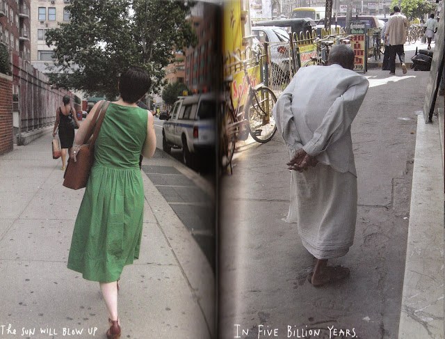
The old Pakistani man on the right (above) seems to be suffering from osteoporosis, and from a side view he'd probably appear like a question mark. The squared shoulder, the half-hidden head, and the gentle and wise position of the arms and hands seem to tell you all you need to know about him. This is an exceptional amount of information, even for a back shot.

The girl in green (above, left) is wearing a light and airy, unpretentious house dress. The hairstyle is neat and practical, the attitude of the body is confident and contented. She's a likable person, all the more because she appreciates the positive visual impact of clothing wrinkles!


Two people who are worlds apart: The bridesmaid full of anxiety, with the bondage strings in the back (above, left), and the traditional old woman, making her way down the street in a shapeless, widow's dress. You admire the older woman because you know she's devoted thousands of hours to bringing up a family.


Osteoporosis (above) again, though a milder case. The jacket is modest but not unfashionable, and the hat is color co-ordinated. High-heeled boots. Maybe this woman is an artist. The spindly legs disappearing up into the jacket, come to an odd end at the top where the hips are unexpectedly wide. It creates a mystery, which is a very considerate thing to do for the people who walk behind you.


You see lots of back shots like this (above) in drawings made a hundred years ago. The jacket is tight around the shoulders with gravity pulling down loose fabric in the back. It's the perfect suit for a tall, older man on the go, someone who was used to thinking on his feet and giving orders. The interior volume of the umbrella makes a perfect contrast. He's taking large, manly strides.


Holy mackerel! An interesting dress (above)! It's inappropriate because it's too tight, but that doesn't prevent her from projecting a strong personality. She thinks she looks good in it, and her confidence wins us over; besides, she's probably doing it to impress a guy, and whenever a girl dresses to impress a guy can't help but be flattered.

I always find myself rooting for girls like this, hoping they'll get the get the guy they're after. I always want to know their story. Everybody should possess some clothes that that subtly suggest a backstory.


Whew! Another strong contrast! The woman on the left (above) is vain, overly fashion-conscious, probably flaky, maybe abuses pills...but, she makes an effort to please, and that makes up for some sins.

The woman on the right (above) is earthy and self-confidant, probably more intelligent than people give her credit for. She's independent, proud that she thinks for herself, maybe not open as open to new ideas as she should be. I always think this is a wrong life strategy.

You should never be self-contained. There should always be a part of you that needs other people, and can be hurt by them. I think people should always be somewhat incomplete without other people, regardless of the consequences. But what do I know?

BTW: The pictures are all by Maira Kalman. Sorry, I can't remember the name of her book.