Showing posts with label herriman. Show all posts

Sunday, March 27, 2016

MARY BLAIR SECRETS

 It's always fun to run familiar pictures through Photoshop filters to see what happens. Sometimes the simplified color and shapes make it easier to see how the artist organized his ideas. I'll try that here with a couple of pictures, starting with a Mary Blair concept sketch for the nursery in Disney's "Peter Pan."

BTW: I like the granular light coming from the green lamp.


Wow! The filter shows a monochrome brown picture with color accents...no surprise there...but the shapes are revealed to be dominated by linear horizontals punctuated by spaces, like some kind of I Ching diagram. The red and white shapes are more organic and attention-getting.


As I said, most of the picture is brown but what colors there are seem to be double complementaries, like the kind in the diagram above. Some artists avoid this color strategy because it's unappealing when a picture has only those kind of colors. That all improves when the colors are used as accents within an otherwise monochrome scheme.


Here's (above) a terrific Boucher. Maybe it's a detail from one of his allegory paintings, I'm not sure. 


Put a filter on it and the structure is revealed.  The two cupids and the bust form an obvious triangle, but...Yikes!...there's a strong, dark horizontal about 2/3 of the way down from the top, and a blue/black focal point under the cupid's art paper.

The colors appear to be basic red, yellow and blue primaries modified by tints and shades and co-habiting with neutrals.


Last but not least...here's (above) the George Herriman caricature I put up recently. Let's take one more look at it, this time filtered.


Holy Cow!!!!! Boy, am I glad I did that! The blacks form spots all over his shape. That means the points of black were an important design unifier, and not just borders around the colors.

Interesting, eh?


Thursday, March 13, 2014

NEWSPAPER CARTOONISTS OF 100 YEARS AGO


I thought I'd show a few examples of early newspaper comics you might not have seen. This one (above) is extracted from a page by William F. Marriner. He was a terrific draughtsman and a really funny guy.

He died in 1914 at the age of 41. At first it was believed he was shot after he came home and interrupted a burglary in progress, but a neighbor quoted him as saying that if his wife didn't come home soon he'd kill himself and torch his home, which is exactly what happened.


Can you believe it? Comics strips were used to illustrate serialized books (above). We should do that today.

This comic was printed in a Sunday supplement magazine, This Week. It looks more recent than a hundred years old, but I couldn't resist including it

Imagine being a kid cartoonist and growing up with newspaper comics like this (above). I like the way this artist packs the page with art.


Above, another brilliant Sunday page by Powers.
I can't believe the comics page attracted artists of this caliber (above). Whatever happened to this guy?


Ahhh, refreshed at the fountain of Rube Goldberg (above).


Here's (above) a detail from George Herriman's "Stumble Inn." Fantagraphics says they'll publish a whole book of this strip soon.


Oh, what the heck! I 'll put up the entire Herriman page.

***************************

BTW: All these strips were stolen from Alan Holtz's amazing blog, "Stripper's Guide." You can find a link in the right sidebar.  


Sunday, June 14, 2009

SEIBOLD, SEGAR & HERRIMAN


I spent a few hours this weekend catching up with my comics reading. I started with Fantagraphics' Popeye series, the one with Olive Oyl on the cover. Wow! What a revelation! If you're a cartoonist laboring under the difficulty of creating gritty, earthy, and appealing characters, you could find no better inspiration than these E. C. Segar strips from 1930-32. Click to enlarge.


Olive Oyl's a great character. Time after time she dumps Popeye for someone better, then has to crawl back when it doesn't work out. Seegar evidently believed that some people are just meant for each other, and no amount of effort can change that.


I also read some of "The Kat Who Walked in Beauty," a collection of Herriman's Saturday pages from 1920. Sorry the sample strip (above) is split in into two parts. The source was too big for my scanner to take it in all at once.

This stuff is pure genius! Maybe modern readers have trouble with it because current humor is all about punchlines and hip attitude. In Herriman's day it had more to do with funny drawings, weird situations, ambience, parody of formal illustration, and silly staging. Anyway, if you've had trouble warming up to Herriman's Krazy Kat strips, but you're still curious to know why the man is so well-regarded, then this is the book for you. Buy it now, before it disappears.


The book calls these strips "panoramic." They're pretty long. Boy, some newspapers must have been as big as bed sheets!

I'm no historian, but surely Herriman was the co-inventer of the what we think of as the newspaper comic style. Herriman wasn't the first strip artist, but he must have been one of the first to work in a style which wasn't derived from book illustration and political cartoons. The style is truly funny and lends itself to infinite variety and expression.


The two pages above (fragmented, not related to each other) are from a graphic novel that's been around for years: "The Beauty Supply District" by Ben Katchor. I got it from the library for the art work and didn't even bother with the story. Now just an hour ago I discovered that the story might be worth reading after all, but it's too late...the book is due. I guess I'll have to take it out again.

Anyway, what attracted me were the backgrounds. They're so out in front that they completely overwhelm the characters, but you have to admit that they are interesting. It's funny that some artists are attracted to...to things. Artists like that can never tune out the environment and historical context. They're always aware of the door behind them, and the varnish on the table top. It would be fun to do a cartoon story where different characters get different background styling, depending on their personalities.


The last artist I spent time with over the weekend was J. Otto Seibold, the kids book illustrator. He did the Mr. Lunch and Olive the Reindeer books. That's him above.


I found this (above) unrelated picture next to Seibold's on the net. I reproduce it here for the edification of the men on the site.


Sorry for the digression. Anyway, Seibold has an interesting style. The book jacket says he was the first kids book illustrator to do his books on the computer. He works in that wall-eyed post-modern style, but he manages to make it his own.


His earlier books (above) were colored conservatively.


Now he takes big risks with the color (above), and it's paying off. Seibold was a background concept artist on Pixar's "Monsters Inc." I wonder why they didn't use any of his architectural ideas. Seibold does films of his own, but the ones I saw always missed the mark. I wish I could have directed one of them, even though it's far from my style.


Seibold lives in San Francisco with his wife, author (I can't read the first name)___Vivian. She has a store that sells Seibold-type clothes and pictures, and which has interesting mannequins (above) throughout.


Seibold's much-imitated style is everywhere now (the picture above was done by another artist). Seibold is only one of many artists who do Seibold...but he manages to stay out in front of the pack.


Friday, July 18, 2008

CARTOONIST PHILOSOPHERS (AND WHAT A CHAIR IS FOR)

Billy Debeck put soooo much effort into this sheet music cover (above). It's as if the act of drawing was a sheer delight to him and he couldn't bring himself to stop.


A beautiful girl strokes an old man's beard (above) and he's in seventh heaven. Can any other graphic art portray happiness as well as cartoons can ?


I stole this (above) from John K's blog (original clippings from Marc Dekter). Milt Gross never seizes to amaze. The people are funny, the spaces are funny, and the character relationships are funny...but he doesn't stop there. When you enlarge this you'll see that the whole strip is a celebration of the simple fact that rooms and staircases exist. You can spend years cultivating an awareness of little things like that in a Tibetan monastery, or you can read Milt Gross for a nickel. Gross make us glad to be alive by celebrating the commonplace.


Haw! For Opper (above) everyone has a uniform including hobos, and when you wear the uniform of that profession or personality type then you act accordingly. We want to play roles and the uniform gives us an excuse.


Goldberg, like Gross, is capable of expressing profound loving relationships between people. Here (above) the wife threatens the husband with a rolling pin, but you get the feeling that the real reason he gives her what she wants is because he loves her. She's fat and plain-looking but he loves her anyway, and she loves him. Cartooning is an incredible medium. It can express the deepest emotions with just a few lines.


Bud Fisher (above) celebrates open space and, amazingly...the nature of chairs (!). Fisher made me realize what a chair is for. They're obviously for comfort but they're also for reflection, which we apparently have to do frequently. We sit and think about everything we just saw, then after a minute we pop up, ready to see new stuff. We walk around seeing more things, then we plop down and think about the new stuff we just saw. It goes on and on like that. Apparently the indoor world is so strange and unnatural that we have to spend part of every day talking ourselves into accepting it.


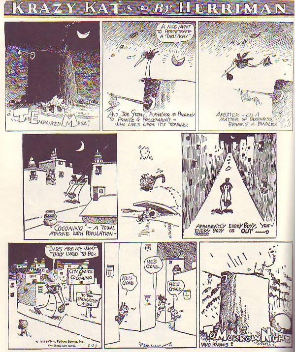
Here (above) Herriman's characters gather outside the mysterious wall. Cartoon characters can't bear to stand around randomly. When there's nothing to do they organize themselves into a group pattern. The closely-knit clump of creatures walks from place to place, occasionally releasing one of their own to perform a real-world task. When the task is done the lone creature returns to the clump.


Here's (above) a couple of Herrimans stolen from Mark Kausler's site. According to Herriman we love to sit in containers and put everything, including ourselves, on top of mounds. How would we know that if it weren't for cartoons?

Sunday, November 19, 2006

WHY I LIKE KRAZY KAT

Whatever you do be sure to click to enlarge before you attempt to read this. Herriman's work doesn't read very well when it's reproduced small and that's the only way most people have read it..that is, if they've read it at all.

I confess that I've only recently begun to like Herriman. Like almost everybody else I used to think of it as primitive, plotless and pointless. Moderns aren't the only ones to feel this way, even in it's own day editors only carried it because the big boss, Randolph Hearst, liked it. It had a fan following which included Hemingway, Picasso, T.S. Eliot, Menckon, Stein, and Edmond Wilson but the public was divided about it. Me, nowadays I love it, in fact it's one of the best strips ever in my opinion. Take a look at the Sunday page above, printed originally in 1926.

The drawing of the mesa in panel one is exquisite. Blogger doesn't reproduce fine, cross-hatched lines very well but if you could see the larger print version it would blow you away. It's moody in a way that only graphics can achieve. The mesa lettering reminds me of the title letters Eisner used in The Spirit. Come to think of it, the content of the words throughout the page are funny and full of the love of language. They're also beautiful, even the ones in word balloons: ignorant, horse-hairy kind of letters, the scratchy kind that fleas would make if they could write.

The stork tries to deliver a baby in the town but the closely-packed, glowing, night-time town is empty. Look at the size of the buildings relative to the characters! I love that! I also like the fact that the buildings are larger when they need to be. Why be consistent? How do you like the bird walking down the street with the buildings diminishing behind him in railroad perspective? That street almost animates! In the end the sun, which is bottom shaded like a ball, comes up below the mesa throwing sizzling, frenetic clouds before it. All this in a page displaying a wonderfull and innovative balance of shapes, of blacks and whites, and strangely appealing steel wool-type lines. Wow! What a treat!

Buy this book or you'll regret it later: "Krazy & Ignatz" by George Herriman (covers 1925-1926).