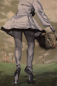
Showing posts with label surrealism. Show all posts

Wednesday, April 08, 2015

TALES OF HOFFMANN

If you saw the Powell/Pressberger film "Red Shoes" and didn't like it then you're not going to like this film either, because it's Red Shoes on steroids.


I like Red Shoes a lot but I sympathize with people who cringe at the almost too rich, over-the-top gaudiness of it. Even so, the film is a neat piece of work and so is its 1951 successor, "Tales of Hoffmann." I just saw Hoffman over the weekend at Steve Worth's house and that's what I'll talk about here.


The opera was written by Offenbach in 1880 or thereabouts. He died months before the play opened and while the music and libretto were still undergoing changes, a significant fact it turns out.

Since there were different and disputed versions of the original manuscript, successive producers took liberties with the opera and customized it to their liking.


That liability turned out to be an asset. The opera is never without backers who want to attach their own vision to it and as a result it's been staged frequently and creatively through the years, with enormous variety in the art direction.


The Powell/Pressberger version (above) is a tour de force of visual style. It ranges from a kind of dry-brushy, modern type...


...to designs derived from old tapestries and beer steins...


...to a kind of impressionistic surrealism (above) reminiscent of Odilon Redon.


I'll digress for a moment to explain that Redon (his work, above) was a French symbolist painter of the 19th Century. That movement was a precursor of Surrealism. You don't hear a lot about it anymore, and it's not really my taste, but it was tremendously influential in theatrical design.


Anyway, the dominant background style of the film is a surreal take on the traditional Romantic ballet style (above). Even in that context there's plenty of innovation. Take this shot, for example. Note the color and lighting on the archway of marionette heads.


There's a cut to a close-up as the ballerina dances closer to camera and when we return to a wider shot the colors and lighting have changed. Not only that but the marionette heads have been switched for slightly different ones. Look closely...some of them aren't the same.


 Martin Scorsese is a big fan of this film. He likes the unreality of it and claims that he learned how to compose cinematic scenes from it. He also got the idea of shooting to music from this film.

Here's the trailer. If you buy it be careful, though. Americans will want the version that plays on our electronics.

Friday, March 27, 2009

THE IMMENSELY INFLUENTIAL ALEXEY BRODOVITCH


Surely one of the most influential of all American artists was Russian emigre Alexey Brodovitch, the art director of Harper's Bazaar magazine from 1934 to 1958. It's hard to exagerrate what he did during those years. He transformed an ordinary womens magazine into an avante-garde art magazine that managed to sell clothes at the same time it was transforming the country's way of seeing the world.


Actually Harper's is still out there on the stands, but as you can see (above) it's a pale shadow of what it once was. 


I'm amazed that Brodovitch managed to sell so many middle-class women on something as weird as surrealism. 


I'd be amazed if the art magazines of the day offered the same value for the artsy dollar as Harper's and its imitators (above). 


Some of the best photographers of the day worked for Brodovitsch: Brassai, Henri-Cartier Bresson, Richard Avedon and Irving Penn, just to name a few. 


You could have framed the covers. 


In case you don't recognize the name Richard Avedon, that's his work above. The leaping girl holding the umbrella at the end off this piece was Avedon's too. Harper's was full of pictures like these and only cost 45 cents in 1947.


Can you believe this (above) was on the cover of a mainstream magazine? Women were reading this stuff when their husbands were reading "Field & Stream."


High fashion magazines were criticized for their use of cold, souless models. No doubt that harmed the women who were dumb enough to try to imitate that cold model lifestyle in real life, but what about all the other women? For them these magazines increased their awareness of art, of all things graphic, of style and sophistication.


A number of old covers like the one above and the Vogue cover higher up, contained... I don't know what else to call it...an element of evil.  The women on the covers look like they're staring out at the reader from a room in Hell. It's weird. I can't figure out what that means.


I wonder if Brodovitch and Harper's were unwitting catalysts of the feminist movement. Women who read these magazines over a period of years must have developed a more artsy attitude about life than their husbands, and that was bound to cause a disconnect somewhere down the line. Even today you see more women in art museums than men.  

Mens magazines like Playboy tried to catch up by wedding naked pictures to essays and sophisticated stories, but that effort, admirable and flamboyant as it was, wasn't exactly comparable to what Harper's achieved. Harper's was actually in the forefront of the art world. For about fifteen years Harper's readers actually got to participate in a real, high-quality, cutting-edge art movement. It must have been exciting! It may have changed a generation of women. 

Playboy was actually the true successor to Harper's, and it succeeded in its turn in influencing a whole generation of men. I don't know of any magazine that does that now.


Sunday, March 22, 2009

GOOD AND BAD SURREALISM


Surrealism was a powerful invention, which proved to be useful not only in painting but also in photography (above), music, film and novels. The problem with the technique is that it's usually considered to be beyond criticism. A lot of bad surrealism ( I don't mean the photo above),  gets by because no one knows how to logically criticize something that's supposed to be beyond logic. I say "supposed to be," because it seems to me that the best surrealism does mean something on some level.


Take Dali's "The Persistence of Memory" (above), for example. I don't see anything having to do with memory in the picture, but I do see a world where time has been slowed down and been rendered meaningless.  The dead tree, arid plain, and stagnant ocean tell us that such a world would be a bleak sort of Hell where nothing interesting or significant ever happens. It's like the Earth would be if it survived to see the energy-deprived, heat death of the universe. It's a useful metaphor when you're vegetating in a waiting room or looking back on a life of quiet desperation.


But not every kind of surrealism has meaning. The picture above is simply a collection of random images placed on a bleak, Daliesque-type plain. It heightens our awareness of how weird the world is, but not much else. The artist didn't have an idea to communicate.


Here (above) the artist is communicating, though what he's saying is open to interpretation. For me it says The dynamic world of heavy industry is present in some sense, even in a quiet and sedate room like the one above. It's a reminder that worlds can intersect, that dual realities can exist, that one world can suddenly and violently impose itself on another.  


Here's (above) another one where the artist has nothing to say. He attempts to remind us that man is capable of mathematical and abstract thought, but says we don't produce anything worth hearing about. The message is anesthetizing rather than interesting. This is the kind of arid, humorless surrealism you used to see on newspaper editorial pages. 


More meaningless surrealism (above). The images exist because the artist was free-associating and didn't know what else to say. 


Back to meaning again. This is Dali's "Daddy Longlegs" picture (above) where the artist posits a world of absurdity. Far from being arid and stagnate, this one posits frantic but meaningless activity. It's all about futility; beautiful, marvelous futility.  Once again, it's a great metaphor.


This (above) is one of the worst surrealist pictures I've ever seen. It has no meaning whatsoever. Even surrealist pictures have to have meaning. 


I don't mean to say that surrealism always has to contain serious messages. Some of my favorite examples are in ads that are just plain funny, like the parody of Dali above. Dali's bleak view of the world was always deliberately undermined by his sense of humor and drama. He seems to refute his own notion of absurdity by putting us in the judge's stand where we can laugh at the meaninglessness of it all. 


My favorite kind of surrealism is the kind (above) that makes fun of surrealism. Surreal commercials that sell things like peas and stockings are hilarious. They seem to say, "The world is meaningless, and you may as well commit suicide, but while you're meditating on that, how about a nice, cold glass of Schlitz beer?"


Dali's imagery is so funny that it's hard to resist parodying it, as Volkswagen did here (above). It's a very skilled picture, which isn't surprising because  you have to have skill in order to joke about Dali. That's because his own pictures are so obviously the product of old master technique and funny, high-fashion sophistication. His message is a dual one: The world is both meaningless and full of meaning. Striving is ultimately meaningless but strive we must, because we are striving creatures who cannot be happy unless we are constantly trying to improve ourselves.


Wednesday, March 18, 2009

SOME FUNNY CLASSIC PHOTOGRAPHS


Or maybe "funny" isn't the right word. Whatever you call them, there's definitely something off center about these fashion photos from the 30s through the 50s. What do you think of the crutch photo above?


Girls running through surreal landscapes in their slips (above) were a staple of 30s fashion magazines.


Cocteau (above) was a favorite subject of photographers and fully half the pictures of the man show him sitting on his own drawings.  I'm ashamed to admit that no photographer's ever asked me to sit on my drawings, a sure sign that I'm small potatoes in the art world. 


Famous portrait photographer Cecil Beaton was accused by his enemies of being bourgeois because he so frequently posed his models in ornate trappings (above).  "Bourgeois" is a meaningless insult in classless America, but it's a crushing invective in Europe.


Boy, Cocteau (above) could sure design book covers!


So could Beaton (above). He designed the cover and the clothes.


Was Beaton gay, you ask? I don't know. Perhaps there's a clue in the design of his real-life apartment, shown above. 


Beaton (above) loved to have his subjects clutch skulls and snuggle up to sculpture.


Horst was Beaton's competition. No skulls for Horst. His models showed their class and their sense of the futuristic by always hugging the side of the frame.


Horst was terrific at still-lifes (above). Here's a flower, a cup, and a strainer, all menaced by a threatening toothpaste tube.


No toothpaste tubes the day Horst took this (above) one. 


No doubt about it, women (above) will have to go back to wearing hats again. Hats with big, gaping holes would be nice, as would fake stuffed bird hats.  Fake furs showing the whole animal, paws, head and all, will also have to make a comeback.


Heeheeeheeeheeeheeeheee!

ANNOUNCEMENT: I'm going to take the "Love Nerds" site down in a week or so. I just didn't get a big enough response to keep it running. If you posted something and that's your only copy, then you might want to dupe it before I take it down.

Sunday, September 28, 2008

MY CREEPIEST POST EVER!


Get ready for a really creepy set of pictures. These are similar to the pictures I gathered twenty years ago when I was deeply depressed because I couldn't find work. I didn't really believe in luck, but somehow I got it into my mind that my luck had turned bad, that I was a cork on the waves of fate, that I was drowning with no rock to grab hold of. It's not a pleasant memory. Maybe I was flirting with a nervous breakdown and didn't know it.


Anyway, for a few miserable days I found solace in gathering together pictures on the theme of luck, and luck gone bad. I threw in a few disaster pictures too. I had the crazy idea that by hanging them on my bedroom wall, I'd derive some kind of wisdom from them. Fortunately I had the sense to realize that doing that would spook my family, so the walls were spared.


Actually the idea might not have been as crazy as it sounds. I've frequently been jolted out of depression by pushing whatever downer ideas I had to such an extreme that they seemed outrageous and even funny.


Images like these (above) from Hitchcock's "Spellbound" fit into that category. They're serious and scary, but somehow funny at the same time.


At first I confined myself to images of luck, good and bad, then I branched out to weirder stuff.


I've never been interested in tarot cards, but in my addled state I began to wonder if there was something about them I should investigate.


Like so many people before me, I marveled at the simple directness of the "death" card. Kelly says death might only mean the end of something, and might be a positive sign, but in my ignorance I interpreted it as literal death. No, I wasn't suicidal. When you're a family guy that avenue is closed.


I thumbed through Dore's depictions of Dante's "Inferno."


The idea of seemingly bottomless pits leading to a netherworld seems appealing when you're depressed.


I remembered Poe's story about a maelstrom which began with a description of a black sea hidden away from the world.


A storm at sea is the ultimate metaphor for turbulent thoughts.


Here's an oceanic vortex. Adventure stories I read when I was a kid frequently mentioned vortices and I got the idea that they were a frequent occurrence. "Moby Dick" contained a frightening description of one.


Anyway, you might be curious to know how I got out of this depression. Well one day, after months of shopping my portfolio all around town and being turned down, I actually succeeded in getting work. The moment I shook hands with my new employer every one of those weird thoughts flew out of my head, and never really returned. It's amazing how work can improve your mental health, almost overnight.
.


Years later, I read Knut Hamsun's novel "Hunger," which may be the ultimate story about going nuts from lack of work. I won't reveal the unforgettable ending, but I can recommend the story to people who feel they're at the end of their tether.


I hope I didn't depress anybody with this stuff. It had a happy ending after all.