
Underlighting is an interesting effect. It emphasizes completely different details than top lighting. Look at the examples above . The two pictures are of the same person, only the light is different. The difference is amazing! The bottom-lit picture (picture #1) is simply unsettling. The the top-lit picture (picture #2) is over-the-top scary.
Amazingly, department store dressing rooms favor the scary top lit scheme. It's the easiest light to do and it makes people look thinner.
 Underlight looks simple to shoot but you still have to pay attention to the overall effect. Here (above) a light was necessary to separate the back of the head from the background and a dark shirt was worn to eliminate the distracting body and keep the focus on the face.
  This still (above) seems too good to be true. Were the eyes and mouth really that black in the original photo?
 Girls playing victims look great underlit. It's such an unflattering light for them that seeing it there makes the girl seem completely out of her element and at the mercy of the killer.
 Peter Lorre (above) looked great when underlight .
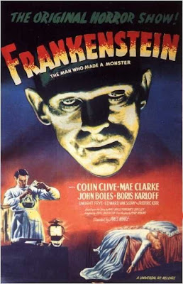
 Frankenstein was simultaneously hit by top light as well as a bottom light.
 Above, an interesting interpretation (above) of Frankenstein's head, emphasizing the lower face and blacking out the forehead and hair.
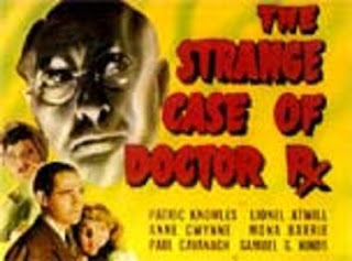
 Underlighting didn't seem to do much for this actor (above).
A classic example (above) of underlighting: The eyes are highlighted, the nose is a tall, dark cone, the upper lip is white with a dark moustache of shadow right above it to make the mouth seem bigger and wider.
 One more comment about Frankenstein: he was sometimes lit to give the face two distinct tones, with the bottom half being grey. It's a great effect. The bright toplight makes him seem intellectual and supernatural. The greyed-down bottomlight makes him seem like the embodiment of fate-ordained death.
The brow ridge is still very prominent here and it marks the dividing line where the bottom of the face turns gray. Is that just lighting or did they help the light along with darker and lighter make-up in some scenes? How do you like the eyes and sides of the mouth?
