Friday, September 26, 2014

TIM BURTON INSPIRED COSTUMES

Wow! Here's a beautiful costume in the Tim Burton vein.


Here's Burton's "Blue Girl with Wine." It's inspired lots of Halloween costumes. 


Here's (above) one. 


And here's (above) a similar one, inspired maybe by "Corpse Bride." It looks like this girl  has contact lenses with white corneas. 


Here's contacts with black corneas! Can you really buy things like that?


Holy Mackerel!!!! Where do I get hold of this (above)? I must have one!!!


A nice photo! No wonder photographers like cloudy days! 

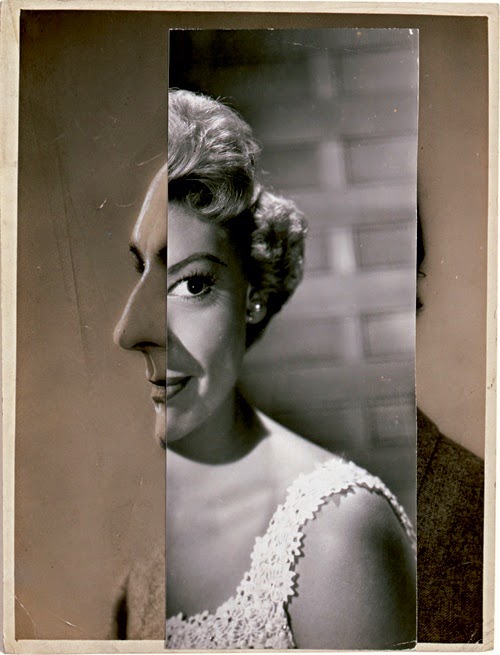
Not bad, not bad!


Thursday, September 25, 2014

SCARY HALLOWEEN PICTURES


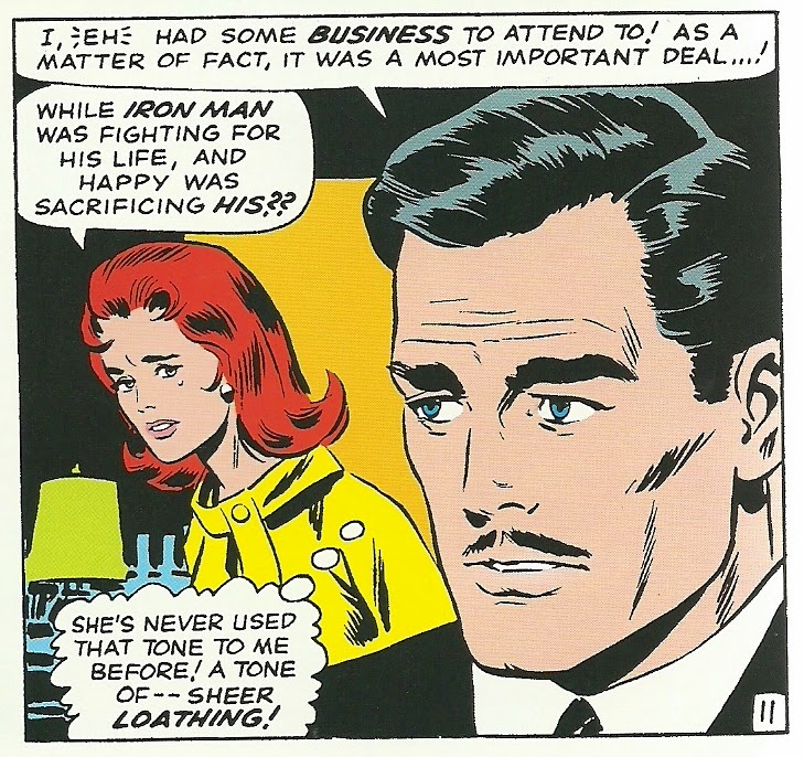
Some artists have a knack for simple, dramatic graphics. It's a rare skill that adds value to whatever it's applied to. If this (above) were a book cover you'd have to check out what was inside, almost regardless of the subject. 


I think the artist was Don Heck. His work in this period was wonderfully stylish. 


Unfortunately he didn't stay that way (above). What happens to artists as they get older? Why the decline? I don't know the answer, but B. F. Skinner wrote about the subject and offered this solution: start a new career in midlife. Would that work? I wonder. 
  

Anyway, back to Halloween weirdness. Are there people with hands so big and powerful that they could grab somebody's midsection like this? It's a gruesome thought.


Maybe if Goliath had grabbed David...but no, not even then. I love the ability that art has to make the implausible seem plausible. Something like this would make a great carnival sideshow banner.


 Framed funny faces make great Halloween porch decorations.


Here's (above) a good one of Frederick March. 


Yikes!


Here's a picture by Travis Louie, the popular painter of portraits that morph into monsters. This artist deserves some kind of life achievement award because for decades he's produced new high quality pictures every year.

Tuesday, September 23, 2014

MORE HALLOWEEN PICTURES (2014)


 Voila!...the ultimate Halloween pictures! They're from French 19th Century stereoscopic images called "Diableries." They were the ViewMaster images of their day, sculpted in clay on tabletops.


The composition and textures are awe-inspiring.


The frontal images were monochrome but If the images were reversed and viewed from the back, some of the figures would appear in color.


That's because a gel containing watercolor tints was sandwiched inside and covered with tissue to disguise the technique.


The Diableries bear a resemblance to Mexican folk art dioramas (above). Is that a coincidence? Mexico and France were briefly joined (well, sort of) in the 19th Century. Maybe some kind of cultural pollination occurred during that time.


Many thanks to Brian May and his colleagues for what appears to be a terrific book on the subject!


Sunday, September 21, 2014

HALOWEEN PICTURES


I was thinking about possible Halloween porch decorations today, something to scare the Trick or Treaters.  How about something like this (above) looming over the front door?  


Is it okay to put up menacing circus posters on Halloween? The gorilla in this poster looks like he's about to bash his tormentors with one of their own.

Before recent times people must have been terrified by gorillas. Here's (below) an excerpt from a gorilla adventure story:  


Above, a Picasso-influenced picture, perfect for a Halloween porch decoration. Very nice!


Above, a dark ride figure. 

Where did I get this? I forget. It looks like the top of a haunted House ride. I like it because the shapes suggest how houses could be made to look in real life. This should be the second floor of a two-story house. I don't believe in wasting interesting detail on the tops of high buildings.


This (above) reminds me of scenes in the sci-fi thriller "Inception."


Above, a couple of stills from Mario Bava films.


Geez, even I can be a mask (above)! Wait a minute...I just noticed that my nose has the texture of an orange.


Here's a caricature done by Bill Peet. If you're a cartoonist and you have an old newsprint pad and some crayon stubs lying around then you can do what Peet did and make all the porch decorations you'll ever need.


Above, more porch cartoon ideas...but who did these? Dan Krall? I forgot to write down the name.


Wednesday, September 17, 2014

ATLAS SHRUGGED PART III


Here's the trailer for Atlas Shrugged part III. I saw it this afternoon and I'm glad I did, in spite of it's many flaws. The film is a ringing endorsement for capitalism, and business men are portrayed as heroes. How rare is that?

The characters are somewhat wooden as idea-based characters usually are, but that limitation is intrinsic to the category.


BTW, since we're on the subject of film...what do you think of this photo of Peter Bogdonavich and Orson Welles? The basket looks like it contains canned soup, macaroni and cheese, tuna fish, and maybe fish sticks...or are they cocktail wieners?

Someone made the comment that Orson has his lunch, but what about Peter?


Tuesday, September 16, 2014

EXPLORING THE INTERNET


I thought I'd do a quick and dirty survey of the adult internet sites. Theory Corner covered this a few years ago but the net's changed since then and it might be interesting to see how things are different now. 

I'll start with a category I'm already familiar with...the one devoted to hairy nerd girls. I'm fond of this category myself but don't ask me to explain why....we're all play things of the gods. Anyway, this group hasn't changed much. 


Here's a category I'm not familiar with, but I'll give it a shot. It's about girls flicking cigarette ashes on guys' heads. This girl (above) is remarkably friendly, a clear departure from the tradition that says only mean girls should play this role. I know I'll appear like a prude, but I admit to being disturbed to see a venerable tradition of meaness set aside like this. 


This (above) is from a foot site that specializes in dirty feet. Yes, there is such a thing, and maybe that's new. Are those ants on the girl's feet? YUCK!!!!


Another constituency that's still with us is the tramplers. Some men still like to be walked on.


I can''t explain why that is, it just is. 


Men are hard to understand.


Anyway, I promised to talk about new categories, and there is something new on the scene. I speak of the practice of adding "mature" to everything. If there used to be sites covering fat girls in miniskirts, now there are additional sites covering "MATURE  fat girls in miniskirts."


Matures have moved into every category: there's rubber suit matures, verbal abuse matures, blowing smoke in your face matures, naked hitchhiker matures.....there's mature everything.


 You can laugh but there must be big money in this stuff, because there's a zillion sites like that. I guess that's the Baby Boomers doing their thing.


Maybe that's for the best. Thanks to Boomers we now have a choice. You can still get verbal abuse from a mean twenty-something, but that's boring.


Now you can also get it from an elderly, more nuanced abuser...somebody who's been around, who knows how to juggle vowels and consonants. Now you get to choose.

Interesting, eh?


Sunday, September 14, 2014

PEREZ PRADO: GENIUS


This (above) is the very best version of the very best recorded Mambo that I know of: Perez Prado doing "Que Rico El Mambo." I don't know the name of the terrific female dancer, but the guy is Resortes, the comedian Cabral did so many fine posters for. Que Rico catapulted Prado into international fame in the early 50s, but it only lasted for a few years then Rock and Roll came in and swept everything else away.


While he was in the States Perez somehow got sidetracked into American Easy Listening/Bachelor Pad-type music (above). It was a step down in my opinion, but he did help to kick that genre into a Golden Age of its own before he decided to get back to his roots South of the border. Cuba by then was a communist dictatorship so he bailed into Mexico, which must have been a real shot in the arm for that country.


Here's (above) the Dolly Sisters, who were Hungarian Americans I think. Anyway, they do a great job on Perez's Mambo. Wielding castanets in the background is ace vocalist Benny More.

BTW, I like Prado's use of Las Vegas-type show girls. It fits this kind of music.

Also BTW: Thanks to Steve for turning me on to "Que Rico El Mambo."


Thursday, September 11, 2014

ANIMATING MIME EXERCISES


I'm not working right now so I spent part of my day yesterday animating on my ipad mini and reading notes I took on a book about mime. I'm not thinking about becoming a mime...I just wondered if they might know some things that animators could use.  Anyway, it occurred to me that I might combine the two things by animating a couple of standard mime exercises on the ipad. I could do it rough, with stick figures...it might not be much trouble.


Is it a good idea? Probably not. Even so I'll try one or two. If they don't work out there's always the "delete" button.


If anyone reading this has studied mime maybe you'll recognize this exercise:

Let your attention go to a particular part of the body. It's a soloist. Let that part do something people might like to watch, and keep the rest of the body relatively still.  Gradually let the body join in, in the role of a chorus or a counterpoint. 


Here's another one:

Posit that you have a safety zone, a circle about two feet in diameter. It might be a place of fun while the outside world is one of drudgery, or it could be a place of relaxation while the rest of the world is full of high tension. When you're in it you're safe, but you're allowed to stay in there only for a few seconds then you have to leave.


Interesting, eh?


BTW: The pictures illustrating the end of this post are all of pantomimists, which makes them mimes of a sort. Pure mime is more stylized than pantomime. It's like ballet in that it requires a beautiful silhouette and graceful, silent actions. Pantomime isn't as physically demanding but it's funnier and may allow an occasional spoken word.

Shown are Mr. Bean, Sid Caesar and Imogene Coca, and Red Skelton.