Friday, April 22, 2016

THE LATEST FASHION

The tiny house movement appears to be here to stay. Even people with money to spend want houses that are thin and cramped.

Thin exteriors could bring about a civil war in the home design industry. Minimalism still dominates interior design and that requires big, empty spaces. The only way to reconcile these two opposing philosophies is to have a house with only one big room that combines all functions. In a room like the one above you would eat off the sofa and take a shower in the planter. 


It looks like the interior faction is going to be on the losing side. That's too bad because there's been some minimalist innovations that even a maximalist like me can get behind. I kinda like interiors like the one above, though they might be better suited for offices than homes.  


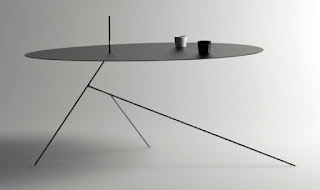
The hot furniture designer now is Tom Dixon. That's his work above. He likes the digital look. I dunno. It's not my taste.


The table above might work if it could be made sturdy.


But really...flat surface table design is so...yesterday. Maybe the tables to come won't be tables at all. They'll be contrivances that make it appear that the plates and cups are floating.


Minimal dining utensils, naturally.

I notice that blob-shaped day-glow sneakers are all the rage now.

Since car design follows shoe design that means near future cars will be day-glow blobs also.

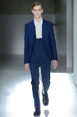
I used to think mens t-shirt fashions were here to stay, but a new formalism seems to be right around the corner.


Tight suit jackets with long sleeves will make what's in your closet obsolete.


Way above the ankle pants have been here for a while.


And women's fashions...that's a subject for another post.


Tuesday, April 19, 2016

SOME THOUGHTS ON ICE SKATING


I'm not normally a fan of ice skating, but when the Winter Olympics is on TV the event I watch with most interest is figure skating. You don't see much comedy skating in those events, though, and I miss it. I guess that's because the scoring is always based on acrobatics that require long, graceful glides.


Maybe the Olympics is the wrong venue for comedy. Wether it wins medals or not, what I want to see on ice is comedy sketches.  Maybe some fat skaters once in a while.


Serious skating obviously favors the thin but funny skating often favors the fat, especially in sketches with characters the audience can relate to, as in the story of a likable overweight novice who's only doing it to impress his girl. Everybody likes to root for the underdog. Think of Jackie Gleason's skating sketch in The Honeymooners.


To make that kind of sketch work, a fat male skater requires a skinny, long legged, Shelly Duval/Olive Oyl-type girlfriend...


...yeah, someone who looks like this....


...and a smug, male super skater who competes for the girl's attention,
someone with a personality like Kenneth Mars (above)...


Or Carl Reiner (above, left).


Funny props and costumes are acceptable...


...but they can't be much fun to wear, especially if the head is covered.


If you were a skater wouldn't you love to choreograph a comedy routine for the ice? Maybe something like a girl vocalist (above) surrounded by her skater sidemen.


You'd think hip hop would be a natural fit for ice skating but a few YouTube videos I saw convinced me that it's hard to do that kind of thing on skates. The dancers would appear slow.  Even so, somebody must have tried it. It would be fun to see "Gangnum Style" or "You Can't Touch This" moves on ice...even if they're just punctuation  between the big acts.


 Don't underestimate punctuation. Some of the funniest stuff comes in short doses. In the example above creative executives periodically dance in and try try to modify or censor the dances.


A flock of tall, thin, frenetic Gilray dandies would work great on ice...maybe in a takeoff of ballroom dancing.


Monty Python-type battling housewife skaters?


I like Keaton's image of dozens of would-be brides chasing a rich bachelor. Would that work?


Would some version of Keaton's boulder sketch work on ice? With fake boulders, I mean.


Of course, any ice show would have to include drama as well. I once heard that skaters don't like to skate on ground covered by fake mist. Would it work better if the mist was over their heads like menacing clouds? Hmmm...maybe that's not practical.


If overhead mist was possible, imagine the the effects you could achieve! Lightning, ghosts, long undulating Chinese dragons...anything could be made to appear from the clouds.


Most skating comedy would work best in small theaters (above) where the audience could see the faces of the skaters. Theater of any sort usually doesn't come off well in giant stadium theaters.

Thursday, April 14, 2016

50S ULTRA MODERN

Steve showed me a great Taschen book...books, actually; it's a heavy three volume set...on the subject of Julius Schulman's architectural photography. I thought you might like to see a few of the pictures.

How do you like the living room above? It makes a powerful argument for low, beamed ceilings.  Normally I like to see large spaces like this broken up into enclaves but not this time. The large space is luxurious rather than awkward.


 Here's a different house that employs what I call the "Wally Wood Theory of Entrances." It's the idea that on entering a house you should be able to see the first and second floor simultaneously.


Haw! Maybe Wood got the idea from this architect; I don't know. Anyway, it's a great idea provided you don't mind using stairs frequently. There's so many steps in so many places that, if this Escher-like layout was real, you'd end up using the carpeted steps as chairs and tables.


Above, another view of the same real-world rooms. More often than not the owner probably chooses the sunken living room but seeing both floors at the outset makes him aware of what else the house offers. It emphasizes the house's personality.


Here's (above) yet another house. Boy, talk about bringing the outside in!


Yikes! Here's a room that I like even though it's wildly impractical and looks like a set from a cheesy 60s Euro-trash film. I like the thin, iron, seemingly weightless staircase, and the funny stone walls. You might think a room this drastic couldn't be made more extreme, but you'd be wrong.....


....anything can be made more drastic. Apparently the architect lamented his earlier conservatism and added a velvet circular couch and an outrageous overhead light fixture. The top of the fixture is surrounded by a circular shower curtain...for privacy, I guess. After all, if you went to all the trouble of climbing up there, you'd surely want to relax for a bit in seclusion.

I need to find out the name of this architect and see what else he did.


Sunday, April 10, 2016

WONDERFUL PORTLAND (PART 2)

I promised more about Portland, and here it is. Portlanders are proud of their city's bridges, and with good reason. At least one of them, the Steel Bridge, is a genuine work of art.

Unfortunately it would take film rather than still photography to capture the way the perspective morphs as you approach this thing. Coming on to it, the whole structure seems to animate before your eyes. Architects take note: naked steel girders are aesthetically pleasing. Witness the Eiffel Tower in Paris.


Portland is one of those cities that provokes artists to have utopian dreams. My own vision for the city is one of downtown Steampunk (above), combined with suburban Craftsman houses, Chinese gardens, hippie breweries, and high tech enclaves ...all mixed with that unique Northwest flavor that's the envy of everyone who's seen it. Rather than one style I picture the town as a marvelous platypus of all the town's historical influences.


Now, on another subject,  I'll ask if anyone out there recognizes this building, above.


Right! It's the Timberline Ski Lodge on Mount Hood (above)! Exteriors of this resort were used in the film, "The Shining." I and my posse spent a few hours there.

After the movie came out the resort was inundated with guests who wanted to recreate scenes from the movie.  According to the net, the hotel resisted at first then did a turnabout and got in on the act. Now you can even be married there "Shining Style" with the hotel's assistance.


Guests bring their own tricycles and evil twin costumes.


Holy Mackerel! Does the house provide the axe? If so, that's service!


The hotel architecture is an attraction all by itself. Everywhere there's massive, thick timber. You feel like you've stumbled into Paul Bunyan's house.


The lobby ceiling is to die for. As time goes by I'm more and more convinced that ceilings are the most important factor in a room. 


And the furniture...it's one of a kind. The hotel was built by skilled WPA workers during the Depression.


No building of this type would be complete without a portrait of the intrepid  founder, and here it is. I wish I had a poster-size copy of this for my wall at home.


Of course the main attraction is Mount Hood, seen here from the vantage point of a comfortable sofa in front of a window. There's the ski lift on the left. If it's hard to see, click to enlarge.