Wednesday, February 02, 2011

JULIUS SHULMAN: PHOTOGRAPHER

All these photos are by Julius Shulman, the greatest architectural photographer of the 20th Century,  maybe maybe the greatest ever. Shulman lived here in L.A. and a lot of the houses he photographed were in Southern California.

Shulman didn't build these houses, he just photographed them. It's always tempting to imagine that a good photographer just gets lucky, but that wasn't true in Shulman's case. He had a vision which he imposed on his subjects.  Modern architecture for Shulman wasn't only about angles and light, it was about a new sensibility which was light hearted, optimistic, adventurous and intelligent, and which somehow told a story. It was said that sometimes Shulman's photos were better than the buildings he shot.


Here (above) the architect attempted to prevent Shulman from taking the picture because he thought the house wouldn't photograph well in the fading light.  Fortunately for the architect, Shulman did it anyway. 


Shulman loved modern architecture. He loved it so much that, when modern became post-modern he packed up his equipment and quit. He hated postmodernism, and I feel the same way.

Modernism at its best had a heroic, optimistic and pioneering feel to it. Post modernism seems to say, "Look, everything worth doing has been done, so we'll just do modern versions of what the Romans did 2,000 years ago."


Shulman's best work was done in black and white, but he slowly adapted to color a little bit at a time. That diagonal above is based on a sketch by Leonardo DaVinci.


Shulman often favored one point perspective. He liked the way it made details rush out at you, and simultaneously suck you into the picture. Sometimes he completely re-arranged the furniture to heighten the speed effect. Is that blurring on the right side a deliberate attmpt to get movement into the shot?


Just for the heck of it,  I deleted the color from Shulman's picture. Most of it works fine this way, though the black and white drains some of the vibrancy from the right.


Here's (above) a modernist house with a strong Japanese influence. I wouldn't say it was completely practical, but it sure looks good in this Shulman picture. Should houses be practical? Maybe the architect's done his job by creating fascinating spaces that clients can customize later.  What do you think?

Anyway, the drawing on the right illustrates what was wrong with certain modernist houses. When the blinds were open and the walls were transparent, the house looked great.  When the blinds were closed, and the walls were opaque,  the house was reduced to a big, unadorned shoebox.

It's a fixable problem...you just vary the shapes...but some modern architects considered that to be a dilution, a compromise with the old ornamental bias. Well, Shulman's job was to make the houses look good, and you can't deny that he did that.


 I'll end with one more Shulman picture (above)....


...and a picture of the man at his desk. He was in his mid 90s when this photo was taken, and still perfectly lucid and thoughtful.  Get Netflix to send you the documentary about him called, "Visual Acoustics." There's a book by the same name.

BTW: Is that not a tres cool design for a workspace? Oh, what I'd give to have a room like that!

And BTW again: I have lots more to say about Shulman and the vision he imposed on modernism. I'll try to post about him again soon.

Saturday, January 29, 2011

OVERWEIGHT/UNDERWEIGHT

No doubt about it, skinny and fat are funny.  It's hard to make fun of skinny people, though. It's actually fashionable to be skinny now. 

Emos made it hip to be that way. Have you seen the jeans guys are wearing now?


Maybe it was always hip to be thin. I mean, look at Sinatra. He could walk in the rain without getting wet.

 Guys like that probably get beaten up a lot in high school, but the ones who survive have it made for the rest of their lives. 


Girls love skinny guys. Frank needed body guards to fend them off.


Thankfully the gods of comedy have supplied us with overweight people in abundance. The problem is, that they're too easy a target. It's hard to think of a fat joke that hasn't been done before. 


That's why I think stocky is the new fat. There's plenty of stocky people, and stocky is funny. You just know that there's millions of stocky jokes just waiting to be written.


Stocky is everywhere. It's what happens when your body expands in every direction, not just your stomach and hips.


So that's my resolution for 2011: learn to draw stocky.  Revel in it. Try to understand the stocky universe.


BTW: I need to take a few days off. I'll be back Wednesday night, Feb. 2nd!


Thursday, January 27, 2011

POETRY CORNER: THREE NIFTY POEMS


Here's three readings of poems that I think you'll like. The first is a Paul McCartney poem, "Maxwell's Silver Hammer" (above).  Of course that was a Beatles song, but Paul wants it to be remembered as a poem as well as a song, and for good reason...it sounds good to the ear, even when it's spoken.

John Lenon hated this song, which he regarded as one of Paul's "granny" poems. He called it "fruity." I disagree. Paul was fascinated with the English ability to abstract macabre crimes and make them seem somehow cute. The English are a sentimental people, and Paul thought that was worth noting in a song and a poem. He was right.

Anyway, give a listen and try to regard the lyrics as poetry. Here's (below) a print version of the opening:


Hmmmm. The lyrics are written out in a way that makes the cadence hard to decipher if you don't know the melody. I'd have written them the way they're sung, like this:

Joan was quizzical; studied pataphysical
Sci-ence in the home.
Late nights all a-lone with a test tube; Oh,
Oh, oh, oh.


Here's (above) a reading of W. H. Auden's "Stop All the Clocks." Auden dispenses with overt poetic flourish (or wants us to think he does) and speaks plainly and sincerely about the death of a friend. It's very touching.


Here's (above) a dramatic reading of a real breakup letter.  It's poetry of a sort, though you only think of it that way when you hear it read the proper way, as it is here. This would be a hit at a poetry reading!


Above, an unannounced bonus!

Tuesday, January 25, 2011

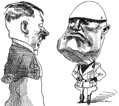
IS FASCISM A GOOD IDEA?

Am I imagining it or is fascism slowly becoming respectable again?  China's a fascist country in some respects, and in my more paranoid moments I wonder if its success is prompting some people to wonder if we should follow them down the same path. It's a creepy thought.  


If you ask college students who their favorite philosopher is, the chances are that they'll say Nietzche. Yes Nietzche, the same guy who believes in the world-changing superman whose morality transcends notions of good and evil. What's with that?

And the news is full of troubling ideas. The latest one for me was a high-ranking official in Britain saying that new discoveries in economics have proved that economic crises are caused by erroneous ideas held by the public, and that the government needs to launch a propaganda campaign to instill the right ideas. There's a sense in which that idea is innocuous and completely innocent, but in my paranoid moments I imagine Josef Goebbels saying the same thing.


Okay, I admit I'm probably too sensitive about this stuff. I'm a classical Enlightenment-era liberal. I believe in parliaments, individual rights, checks and balances, a free press, tolerance of opposing views, private property, competitive business, and all that. Every once in a while I like to be reassured that we're all more or less on the same page in that respect.  


A philosopher you hear more and more about these days is Carl Schmitt, an unrepentant Nazi legal philosopher who believed that any effective government must include an element of dictatorial power within its constitution. It must be able to assert that something is right, just because it is, and is beyond rational argument. He hints that people who insist on arguing the issue anyway, must be isolated and made to appear anti-social.


I'm amazed that an intelligent guy like Schmitt could buy into an idea which is so clearly open to abuse, but Schmitt was a legal scholar and those guys have a narrow focus. They don't like messy things like English common law, with its emphasis on precedent and tradition.  They're looking for fundamental principals. A simplifying assumption that a party or a leader can do no wrong (as long as they don't change their minds), allows them to construct a logically consistent set of laws, and I guess consistency is all they really care about. 


What sets Schmitt apart from other Nazi theoreticians that I've heard about, is that Schmitt frames his ideas in a sugar-coated language that modern academics can relate to. His most famous book, "The Concept of the Political" never mentions fascism.  He simply asks if we desire to keep alive the concept of politics, i.e., a state that has a political point of view, is effective, and gets things done. Well,  everybody wants to see things get done.  When you frame it in a nice way like that, Schmitt's ideas seem downright reasonable.  Except they're not. 

Okay, enough of this! That's the end of my paranoid rant! 


BTW: how do you like these WWII era posters? The black and white picture on the top is an ink wash, isn't it? I'm astonished at what can be accomplished with ink and a little bit of water.  


Sunday, January 23, 2011

FUNNY LIGHTING AND STAGING

This (above) is a dumb composition, isn't it? I mean that as a compliment.  It's for a comedy so the art director wisely violated the normal rules of composition. The picture's too symmetrical,  too much attention is paid to the tablecloth, and the three doors are distracting...but so what? It's funny.

I LOVE ignorant staging!
You don't always need funny sets to make live background elements funny. It's about how you shoot them and light them. 

Here's (above) two ways to shoot a cup, the normal way and the funny, ignorant way. The cup on the left looks fine, but you'd call it dignified, rather than funny. In the world of cups it's a solid citizen, a device that earns its way by being useful to humans, a cup whose mother is proud of it...but it's not funny.

The cup on the right however, the one in the wide shot, is lonely and insecure, and maybe something of a klutz. He's probably always spilling things on humans. How do we know? Because the world he inhabits is so awkward. The ocean of empty space around the cup, the funky table, the lip of the table and the awkward area underneath...it all says that this silly cup hasn't got the brains to sit closer to the camera.  He's funny.   

BTW, I'm glad the art director didn't show too much detail in the cup background. Too much detail would have hinted at a larger story, and taken our attention away from the simple ignorance of the situation.


Study the deliberately ignorant and theatrical staging (above) in silent comedies. It just shouts, "This is a funny picture!"


Too many people assume that sets were made this way (above) because the films were made in a primitive time, when nobody understood composition. That's not true. Old timers understood composition at least as well as we do now.  They simply thought this way of doing things was funnier..


Even the lighting (above) was ignorant in those days. Lots of film people knew how to light properly, but comedians favored frontal lighting, which flattened out the face and gave it a cartoony, graphic look.


Stan Laurel insisted on in it in the early films he did with Hardy. 


Later he allowed very light shadows on one side. Other actors in their films were allowed to have deeper shadows, but not the two stars.


Still later, they were forced to use the same stark lighting that dramatic actors used. By then, producers were insisting that comedy people conform to dramatic rules.


By luck or intentional skill, early TV used the kind of flat lighting that we saw in some silent comedies. It made everything more funny. 


Lighting wasn't the only thing that was funny in early TV. The sets were funny too.  You can see the influence of old silent comedy staging.   


Me, I think that ignorant composition is bliss.


BTW: Mike's the biggest Laurel and Hardy fan that I know, and he wrote the following comment: 

"When Laurel & Hardy - whom I revere - left Hal Roach Studios in 1940 to move to 20th Century Fox in '41, they seem to age 20 years overnight. This was the direct result of the new studio's intrusive and insensitive meddling with the team.

Fox, who seem to have been as determined to ruin Laurel & Hardy as Paramount was to ruin Popeye (and MGM was to ruin Keaton, Our Gang and the Marx Brothers), insisted on uniformly realistic makeup and lighting in all their films. It didn't matter if it was a drama, musical or slapstick comedy - an approach about as individual as a cookie cutter.

Laurel instinctively knew the team needed stylization to be believable in the special world they created and inhabited. Besides keeping them young - and preserving the comic illusion that they were overgrown children - the subtle clown-white makeup the team had been using since their silent film days also kept them slightly cartoony, and that much more removed from harsh reality. Stylized sound effects, lively music and flat lighting accomplished the same feat, exactly what the team needed, and had had at Roach.

Of course, the front office couldn't resist tampering with the scripts as well, and their literal, assembly line, sausage factory approach was exactly opposite to what L&H had been used to up until that time. These are just some of the reasons why the boys are still delightful to watch in Saps as Sea, their last film shot at Roach in 1940 - and already old and tiresome in Great Guns, their first one made at Fox only one year.

Unfortunately, corporate interference with creative artists is just as destructive now as it was then. In the words of Scotty Beckett: 'They'll never learn...' "


Friday, January 21, 2011

TWO VERSIONS OF "PORKY IN WACKYLAND!"


Wow! I discovered this on YouTube: it's Clampett's original Wackyland cartoon, side by side with the later color remake by Friz, "Dough for the Do-Do." Many thanks to "wecanstopnwo1" for taking the trouble to post the cartoons this way. It makes it lot easier to compare and learn from.

Of course, the original black and white version is better, that's obvious. The reason for comparing the two is that the same mistake in BG styling that's in the flawed color version is still with us today, all these years later: The color backgrounds aren't funny. No doubt producers believe that it's not the BG artist's job to be funny, but that's a mistake. Producers need to know that funny people are needed in all aspects of production, including backgrounds. Come to think of it, I wish they'd undertake more projects that would require funny people.

The newer BGs are technically more polished, but they're too literal, too unimaginative, too lacking in humor. Also, the color version horizons are too high. Why all the wasted space in the foreground? It's more ignorant, and therefore more funny, to place the character lower in the scene in a graphic-intensive story like this one.

I also like the newspaper strip feel of the earlier backgrounds. I'm seeing hints of Sterrett, Gross, Seuss and even a little Smokey Stover in the original BGs.


I like the way B and W Porky's plane is lower (and more ignorant) in the frame when we first see it, and I like the demented row of B and W trees more than the colored mountain silhouettes in the next scene.  The first time we see the Wackyland sign on a long shot (above) works better in the B and W, and the path the B and W sign is sitting on is more dynamic and ignorant, as are the trees.


Check out the next scene, which is a close-up of the sign (above). The energetic lettering and tonal contrasts in the B&W version make the scene funny, even with no animation. The color sign, on the other hand, is simply information. What a pity that this film fell into the hands of a humorless designer!


Well, a full comparison would take up too much space. I'll just close with one more point, which has nothing to do with backgrounds: namely that black and white is easier to make funny than color. It shows off funny drawings better. You'd never wish that Clampett's "Coal Black" and "Great Piggy Bank Robbery" were colorless, but aren't you glad his "Porky's Surprise Party" (above) was done that way?  Good old Bob! He doesn't get credit for it, but he developed two successful styles, the first one for the better cartoons done by his B and W unit.

Wednesday, January 19, 2011

LUNCHTIME BOOK CHAT #4

I just read a depressing book on the economic crisis and now I'm ready for something lighter, maybe one of the books on this page. Here's (above) a book that caught my eye: "The Girls of Murder City." How do you like the cover? it's good enough to be a poster!


The story is about the gaggle of beautiful female murderers (example, above) in 1920s Chicago. It was considered hip to be a female killer in those days and the press treated the girls like superstars.


Even prison guards would ask for autographs. 


The author got caught up in the whole thing, and frequently weighs in with lines like: "Just pleasantly buzzed, as usual, the kind of tingling warmth that held you like a new mother." Nice!  I've gotta check this out!


Steve lent me this book (above). It's by Leslie Carbaga, author of the wonderfully researched and beautifully layed-out Max Fleischer biography. It's all about breasts. I had no idea there was so much to say about the subject. 


It's full of charts like this one (above),  depicting the different types. Some men will no doubt use the charts as checklists.


The book isn't perfect. There's too much tacky language, and I don't agree with some of the points he makes. He blames religion for girls' reluctance to have casual sex, but the females of most species are like that. I don't think female turtles play hard to get because of what they learned in church. And he's down on marriage, which I think is the best thing since sliced bread...if you get the right person. Marriage means everybody gets somebody, and the richest man of the tribe doesn't get to grab all the girls for himself. 

But I'm nitpicking. Leslie makes a lot of good points and the book looks like a fun read.


Here's a new hardcover sketchbook by my friend, Tim Walker. Tim's done everything in the TV animation industry. Things were going great for him until a few years back when he discovered that he couldn't control the shaking in his right hand and was diagnosed as having Parkinson's Disease . Everybody concluded that Tim's professional life was over; after all he was right-handed, and that hand was useless to him now.  Everybody gave up on Tim except Tim. He simply refused to accept defeat.

The man sat down, and through sheer will power, taught himself to draw with his left hand, thus the title of the book, "Drawings From The Left." The book begins with drawings he made when his right hand worked, and seamlessly morphs into newer drawings done with the left. If the captions didn't tip you off, you'd never guess where the dividing line is. Tim had no history of ambidexterity. He just plain...did it, and now he's back at his old desk at Warners, rushing to meet deadlines like everyone else. Man, some people are irrepressible!

Examine the book at: http://jamestimwalker.com/about-tim-walker.html

BTW: If you have a blog of your own, have you noticed how well Blogger enlarges pictures? You'd have to fiddle around with Photoshop to get the same quality enlargements that Blogger gives you with the touch of a button. And Blogger doesn't even brag about it. Somebody at Blogger deserves a pat on the back!

Monday, January 17, 2011

SOME THOUGHTS ABOUT TUTORING


When I was in school I used to hate classroom discussions. The subject always devolved into who's more intelligent, boys or girls, or whose innocuous comment was actually indicative of closet racism. I could get that kind of stuff on the street. I thought the purpose of school was to be taught by people who know more than I do.

A while back I put this opinion into a blog post, and to my surprise, it provoked some pretty interesting replies. One commenter was obviously a teacher. He said that he could tell that I never had any first rate teachers in school, because if I had I would never have questioned the value of discussion.  He said a good teacher guides the discussion. The idea is to take a cultured, articulate, and well organized mind (the teacher's), and show the students in detail how that mind handles the topic at hand. It can only be properly done in groups small enough to allow some personal attention, and only with motivated students. Amazing!


Well, the guy called it right. I had some teachers who were okay,  but none who were really first rate. There just aren't enough first rate teachers to go around. The mind boggles to think how fast you could learn something, if you had the personal attention of someone who was really skilled in that subject.  And that brings me to the point of this post: teachers aren't able to give you individual attention...but tutors can.
.


I'm a huge believer in tutoring. It's not something that's only for slow students, it's something for the the brightest kid in class. There's no faster way to learn than to have someone personally talk you through a problem and digress if need be to teach you something you failed to pick up earlier. In the case where you already know the material, a good tutor can put you on a whole different level by exploring interesting tangents or by putting the material to practical use. A motivated student combined with a motivated tutor is a powerful combination.

Schools like Oxford used to teach almost exclusively by tutoring. There were regular lectures by professors, but the real education took place in the student's own quarters, arguing with, and being prodded and interrogated by the tutor (the don). In Japan after school tutoring is common, even for gifted students. I wish it were more common here.


There's another good reason for tutoring. If tutoring were widespread, if it transcended the remedial and got into some meaty subjects, if it was handled, not by the school bureaucracy, but by free agents and by private industry, then we'd have a chance to re-introduce imagination and competition into the schooling process. Who knows? You could even have tutors like the ones in the illustrations for this post!