Tuesday, July 04, 2006

LOOKING AT THE SAME PICTURES IN BLACK AND WHITE

Well, I don't think we nailed this problem last time. I tried Jorge's method of printing the covers in black and white and that helped a lot. Now we see the girl is done entirely in middletones. In B&W her panties almost disappear. The whole middle part of her body appears as one, big, grey haze. It's as if that part of her was an uncluttered area where the eye could rest, a blank area to contrast with the stark angles and colors elsewhere.

In B&W I see that my eye starts the picture by fixing on the guy's face, but the face lacks detail so I allow the wedge of white light to carry my eye down to the girl's thighs. Being a guy I naturally want to linger there but there's no detail to fix my attention. I follow the greater complexity of her upper body to her eyes and they lead straight back to the guy, which is where we started. My eye keeps circling the page.

A commenter last time mentioned that the guy (above) looked like he was lit by colored gels on spot lights. The girl is lit more naturally. Two people that close together still get a different light treatment.


In black and white you can see that a lot of this cover (above) is in middletones. Only the yellow in the titles comes off light. The guy appears to be both underlit and toplit. The girl is only bottomlit. Interesting. They have seperate lighting.


For me this is a warm picture with cool accents though you could argue that the cool threatens to dominate. My eye starts on the girl's face then travels down to her thighs where it gets lured away by the yellow in the bottom title. From there it travels up the guy to his face, which is looking at the girl, which completes a circle. The problem is that the two are looking at each other so intensely that there's a temptation to keep your eyes on the two heads. Spizz was put off by the overt sexuality in this picture but it seems to me that the artist had to give the girl a sexy, detailed body to keep the eye moving.

Monday, July 03, 2006

WHY ARE THESE COLORS SO APPEALING?

Here's a couple of terrific magazine covers. I'm especially interested in the way they're colored. Can any painter out there explain the color schemes to me?

Using my color wheel I see that the girl in the cover above seems to be orange and blue which are complimentary colors. The guy seems to be a double split complimentary with red and violet facing green and yellow. I love how he's a dark silo against white while she's a light area almost totally enclosed by darks.


The cover above seems to be done in analogous colors: from blue-violet all the way around the color wheel to yellow-green. No blues, no pure greens. Once again the guy is a dark silo against light color and the girl is light totally surrounded by dark.

Can anyone who knows more about color than I do add to what I've said here? I know what I've written doesn't begin to describe what's really going on here.

Sunday, July 02, 2006

SHOULD SHORT MEN PURSUE TALL WOMEN?


Yes, of course they should! Is a girl likely to accept such a man? No, why should she? There are plenty of tall men to choose from. Is the short man likely to be humiliated in the futile attempt to get a tall woman? Of course! It'll be a horrible experience for him. Should he attempt it anyway, even if the odds are overwhelmingly against him? Of course he should! Let me explain!


Men exist to compete with each other for women. That's the role that nature has given us to play. It's our lot in life to be disappointed, humiliated, frustrated, chased away by other men, and be otherwise miserable in our attempt to get women who are simply not in our league. A man who can make rational calculations about love and then act on them is an alien creature, devoid of human emotion.

I think tragedy is part of life and it's unnatural to go to extremes to try to avoid it. We are made better by the pursuit of the tragic end. The short man will try harder when he goes after the tall woman. He'll learn to dance, he'll try to get a better job, he'll try to cultivate wit and conversation. These will all come in useful later when he's eventually (and inevitably) snubbed by the tall woman and enters the competition for quality short women.

By the way, I'm not short myself but I see the dramas that are being played out on the street and I can't help but form an opinion about them. By trying too hard to avoid humiliation short men deprive themselves of essential, ennobling life experiences.

WHAT DO YOU THINK?

Saturday, July 01, 2006

HEADS THAT ARE GRAPHIC STATEMENTS!


It seems very odd to me that some people choose to make a graphic statement out of their head. Even more odd is the fact that some people deliberately choose to make their heads resemble favorite objects or foods. I call your attention to the man above who appears to have modified his upper body and head to resemble a salt shaker.


Here's a guy (above) who's made his head into a mushroom. A mushroom is a friendly, simple and sophisticated food which I guess makes it appealling as a head shape.


This man (above) appears to be paying tribute to the humble, flacid penis.


Here's (above) two feather dusters, one facing down and the other facing up. I kinda like feather dusters too but I don't think I'd want to look like one.

Here (above) is a head modeled on the cap of a Bic pen. People really like these objects. A modern pen cap has no threads and no clickable button like old ballpoints used to. A modern cap is simple and useful and these qualities appear to have attracted admirers who wish they could be pens. It's a real tribute to the product designers (I know bobbed hair goes back to the time before Bic pens but I assert that the bobbed hair enthusiasts of our day do it for a different reason than their predecessors).


The simple egg has it's admirers and imitators. My guess is that the individual above used to dye Easter eggs when he was a kid and it was such a pleasurable experience that he decided to be an Easter egg when he grew up. He's not alone. Lots of people try to be their favorite foods.

A FEW INTERESTING PICTURES


A friend turned me on to this killer WW2 syphilis poster (above). I don't know the artist's name.


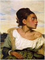
Here's a detail (above) of a painting I'm especially fond of, Delacroix's "Orphan in the Graveyard." The girl looks stupid to me but she's portrayed with great nobility as if the artist was saying, "Even a girl like this is a human being and as such she has a divine spark and the potential for greatness."

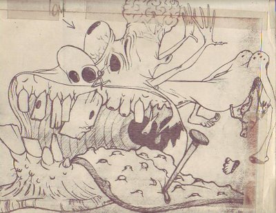
Here (above) is the whole Delacroix picture. Below is an old drawing by John K where he's trying to out-Woverton Basil Wolverton.


Thursday, June 29, 2006

LIFE DRAWING!


These are horrible pictures. The anatomy doesn't make sense, the line quality is non-existent, the shapes and volumes don't fit into each other. ..terrible! And the color looks like it was done by a five year-old. I almost threw these away a dozen times. Now I'm glad I kept them because they're a memory of a session which proved to be a breakthrough for me. That was the night I realized I could draw and paint anything I wanted, regardless of what the model actually looked like.

All of the pictures on this post are of the same model. I drew her fat, thin, long-armed, short armed, red-haired, black-haired, small breasted and big breasted. I love the thin forearm. Imagine what she'd look like if she let her arms hang straight down!

Here I added wallpaper just for the heck of it. I do that a lot now but this is where it started. I'll post some more from this memorable night when the drawings turn up.

Wednesday, June 28, 2006

OK, LINE UP! THE FILM DOCTOR IS IN!


ASK DOCTOR UNCLE EDDIE:

This week's question: "I love the cartoon I'm making but I have to admit that it doesn't really take off till the middle. By then half my audience is gone! How do I start a cartoon?"

-Perplexed


Dear Perplexed: "It's easy! You start a cartoon the way a dirty joke teller starts a dirty joke. The first thing a joke teller does is make you like him, the teller. He establishes his own personality first. He dominates the scene, he gets a rhythm going, he exudes playful mischief, he creates an atmosphere which is electric with potential."


"That done, he gets started on the set-up. The set-up is the most important part of the joke. It has to be ignorant as hell. The teller gets you to smile and even laugh way before the punch line. It's as if the real joke was that the people in the story would put themselves in such an improbable and silly situation. The punch line is just an excuse to justify the funny set-up."

"Transpose all of this to a cartoon and you have your beginning. How do I know it works? Because this is more or less what Bob Clampett did. He'd start a barnyard cartoon by first establishing that it was a cool barnyard, where cool animals live. He infused the cartoon with a bouncey rhythm and a sense of life and playfulness before the plot ever got started. He took the time to make friends with the audience. A lot of animation directors seem like they're scared of the audience and try to keep it at a distance. Directors like Bob and Tex liked the people they were making cartoons for and took pains to bring them in."

BTW, the caricature of Uncle Eddie is by John K.