Friday, November 24, 2006
THE FIRST MODERN BATHROOM SYMBOLS
Believe it or not, I'm old enough to remember the first time male and female stick figures were used to designate restrooms. Previous to that the restrooms were labeled with words like "Ladies" and "Gentlemen" or "Seniors" and Senioritas."
I remember the very night I first saw the new symbols. They were on the lavatory doors of a Marie Calander's-type family restaurant that my friend's dad took us to. A bunch of frustrated patrons were gathered outside the restroom doors trying to puzzle out what the signs meant. The consensus was that the bell-shaped, flared stick figure might be a be a girl with a dress but what was the other figure? One lady thought it was a woman wearing a pant suit. Maybe both the bathrooms were for women, one for traditional dress wearers and one for pants-wearing new-agers. Somebody guessed that the the mens' rooms were somewhere on the other side of the building.
Every once in a while a frustrated citizen would knock on the door and if there was no answer he'd cautiously open the door and let himself inside. Everybody waited with baited breath to hear what he was seeing. When he came back with the answer the relieved crowd streamed into the appropriate rooms then ten minutes later a new crowd would form and the whole cycle would start up again.
What everyone in the crowd would have agreed on was that the new symbols were bold and futuristic. We all felt like we were entering restrooms on the starship "Enterprise." I wondered if it meant we'd all be wearing capes and gauntlet gloves and be carrying ray guns soon. It was heady stuff. A real glimpse into the future.
Thursday, November 23, 2006
HAPPY THANKSGIVING!
I take Thanksgiving very seriously. Americans have a lot to be thankful for. I think about Valley Forge and about Washington nobley returning control of the Continental Army back to Congress after the War of Independence, of the Marines who died on Iwo Jima, of the fact that even the President of the United States couldn't enter my house if I didn't allow him. I think about how what we think of as the Jazz Age and the age of pulp magazines and Clampett cartoons coincided with millions being hauled off to slave labor camps in Siberia. I'm truly grateful for all that America's done for me and I'm delighted that a holiday exists to celebrate that. Now for some serious eating!
Happy Thanksgiving, everybody!!!!!!!
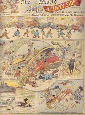
SUNDAY COMICS PAGES FROM 1895!
This comics page from Pulitzer's "World" is almost 110 years old! Click to enlarge. That means the Sunday comics page (at least the title page) was better a century ago than it is now! I don't know about you but that hurts my pride. Where are our artists? We should compete with these old guys!The subject matter of these pages is interesting. One is about fires in high rises and the is other about train wrecks. These were serious problems in those days and I'm suprised to hear them treated with such levity here. I'll write more about this paper soon. Thanks to Jenny for recommending the book I got these pictures from: "The World on Sunday" by Baker & Brentano.
Tuesday, November 21, 2006
COMPUTERIZED SOCKS
Sometimes I have trouble using my %$&#@ computer. Fortunately I have a techie daughter who answers my questions but I can see the thought balloon above her head which reads, "Why does my dad have so much trouble with this stuff? What's wrong with his generation? Why are they all so dense?" Consulting my crystal ball I can see where all this is leading...
PUTTING ON SOCKS IN THE YEAR 2150
Dad: Help! Daughter, you gotta help me! I can't put on my socks! They won't let my feet in!
Daughter: (rolls eyes up) Well, maybe you didn't enable them!
Dad: Enable? What's that?
Daughter: (rolls eyes way up) You know, enable them! You have to activate the program!
Dad: What program? I just want to put on my socks.
Daughter: (rolling up eyes again, can't believe how stupid her dad is) Here, let me do it (she punches a code into the sock)! Here!
Dad: I still can't put it on!
Daughter: Well, maybe you need a new driver!
Dad: How do I get that?
Daughter: Dad, if you'd taken that community college course in socks I told you about you wouldn't have to bother me with questions.
Dad: I shouldn't have to take a course to put on a pair of socks! When I was a kid eveything was so simple!
Daughter: When you were a kid socks didn't tell you the weather.
Dad: I don't want socks to tell me the weather!
Daughter: (exasperrated) Here, take this book: "Putting on Socks for Complete Dummies." It's only 300 pages and comes with a CD ROM. And here's the name of an online sock message board. You'll get the hang of it yet!
Dad: (Groan!)
Monday, November 20, 2006
MY DOODLE STYLE
I feel silly posting these doodles. I'm only doing it because Katz, Ryan and others wanted to see some drawings and all my current stuff is related to what I do at work. I turn out tons (OK, ounces) of this stuff every day. The style of the show doesn't look like this but this is the style I use when I'm exploring ideas and poses. It's sort of my stick figure style.
Sunday, November 19, 2006
WHY I LIKE KRAZY KAT
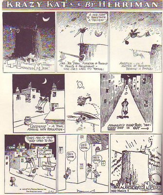
Whatever you do be sure to click to enlarge before you attempt to read this. Herriman's work doesn't read very well when it's reproduced small and that's the only way most people have read it..that is, if they've read it at all.
I confess that I've only recently begun to like Herriman. Like almost everybody else I used to think of it as primitive, plotless and pointless. Moderns aren't the only ones to feel this way, even in it's own day editors only carried it because the big boss, Randolph Hearst, liked it. It had a fan following which included Hemingway, Picasso, T.S. Eliot, Menckon, Stein, and Edmond Wilson but the public was divided about it. Me, nowadays I love it, in fact it's one of the best strips ever in my opinion. Take a look at the Sunday page above, printed originally in 1926.
The drawing of the mesa in panel one is exquisite. Blogger doesn't reproduce fine, cross-hatched lines very well but if you could see the larger print version it would blow you away. It's moody in a way that only graphics can achieve. The mesa lettering reminds me of the title letters Eisner used in The Spirit. Come to think of it, the content of the words throughout the page are funny and full of the love of language. They're also beautiful, even the ones in word balloons: ignorant, horse-hairy kind of letters, the scratchy kind that fleas would make if they could write.
The stork tries to deliver a baby in the town but the closely-packed, glowing, night-time town is empty. Look at the size of the buildings relative to the characters! I love that! I also like the fact that the buildings are larger when they need to be. Why be consistent? How do you like the bird walking down the street with the buildings diminishing behind him in railroad perspective? That street almost animates! In the end the sun, which is bottom shaded like a ball, comes up below the mesa throwing sizzling, frenetic clouds before it. All this in a page displaying a wonderfull and innovative balance of shapes, of blacks and whites, and strangely appealing steel wool-type lines. Wow! What a treat!
Buy this book or you'll regret it later: "Krazy & Ignatz" by George Herriman (covers 1925-1926).
Subscribe to:
Posts (Atom)