Sunday, December 14, 2008

CLAMPETT'S "OLD GRAY HARE"


A quick disclaimer: every shot and clip here was stolen from John K's blog, the 12/8/08 installment of "John K Stuff. " John delivered a marvelous analysis of this scene from "The Old Gray Hare," which I won't attempt to improve on.  To tell the truth, I have no idea what I want to say about this animation, I'm only writing because it's one of my all-time favorite Clampett scenes, and I can't let the occasion of seeing it discussed go without comment.

http://www.cartoonthrills.org/blog/Clampett/45OldGrayHare/bugsdeath1short.mov


This is the famous Elmer head roll, animated by Bob McKimson. Bugs is brilliant as the dying rabbit, but the scene is stolen by Elmer's reactions. Elmer underplays the scene, and Bugs overplays it, and yet our eyes are mostly on Elmer...proof, if it was needed, that good reactions are reliable scene stealers.

A lot of directors like to play reactions on a one-shot, which is usually a mistake. People like to see the give and take between the action and re-action, and cutting is a distraction. I remember that Jackie Gleason almost always did his slow burns in two-shots.


Elmer slowly rolls his head right and left in perspective. 2D animators hate this because flaws in the inbetweens always show up when you go this slow. This didn't deter McKimson who was a killer draughtsman.

There are so many delights in Elmer's character design. The big hat emphasizes the head rolls nicely. McKimson could have gone for a perspective distortion by leaning the hat far into camera as it rolled, but he wisely underplayed it. Come to think of it, the whole character design is an example of underplaying the extreme and flamboyant elements. The huge head and tiny, peanut body are sooooo graphically drastic, but Clampett softens them, makes them appealing.


I love the way Elmer reacts to what Bugs is saying. Whenever Bugs has an accent in his animation, Elmer does a quick recoil then drifts back to his previous pose. I love the hand hesitantly patting Bugs' stomach. I love the way Elmer looks offscreen when the delusional Bugs points something out, then drifts back to his original pose. Drifting back after a quick movement is a powerful technique. I love the way Elmer looks at Bugs with those impassive, old-people's eyes. I don't think I've ever seen those kind of eyes in any other Hollywood cartoon.


In the first three pictures at the top, I love the way Elmer seems to be studying Bugs. I'm getting off the subject, but in real life I love the way an irritated person will sometimes study the guy who's irritating him. He'll study him like a scientist for a moment, and it all seems so academic and scholarly, then all of a sudden the irritated person will leap up and try to strangle the other guy. I love it when people on the street try to study each other.


It's amazing that Clampett, who has a reputation for being wild and over-the-top, is also the master of subtle, under-the-top, as in this sequence. Clampett makes you laugh and cry, always in the same cartoon. John K is the same way. No doubt John was influenced by cartoons like this, where subtle acting and broad action go hand in hand.

Wednesday, December 10, 2008

HOW WILL THE ECONOMIC CRISIS INFLUENCE STORYTELLING?


Let's plunge right in!!!

If there is a serious economic crisis ahead the big beneficiaries will be TV and the internet. Lots of unemployed people mean lots of people at home connected to the media. These people won't have a lot of purchasing power, but they'll exist in such large numbers that no advertiser will be able to ignore them. Of course what's advertised will have to change. I imagine we'll see a lot of ads for soup, gum, soap, coffee, and the like...things that are cheap and accessible.


We'll probably see a larger audience for network programming since that's free. Cable companies will grow and even prosper for a while, but if the crisis deepens people won't be able to afford what they're offering. Maybe cable can save itself by attracting new advertisers and lowering fees. Maybe they'll acquire network and internet assets. It's hard to predict what'll happen here because at some point TV and the internet will merge, and what the outcome of that will be is anybody's guess.


The demand for animation may level off for a while, but will grow in the long run because frustrated, out of work people like to see exaggerated media. If Americans don't wise up and produce a more dynamic and imaginative product, the beneficiary of that growth will be Asia. A year ago, anime was poised to take over the international animation market, but in my opinion that takeover has been blunted, maybe permanently. The new crisis will create new consumers with new attitudes and Japan, which has animated the same way, and told the same type of stories for half a century, may not be able to adapt.


If the last depression was an indicator, the tastes of viewers will shift over time. In the early years of the Depression audiences wanted escapism and flocked to see stories about rich people in opulent apartments. As time passed audiences acclimated to the hard times, and they were willing to accept gritty stories of reality on the streets, provided they were about appealing and flamboyant gangsters. At the same time we saw stories that were influenced by the heroes of the pulp era, detectives and monsters, and at the tail end of the Depression we saw "arty" and propaganda films, which would evolve into what we later called "Noir."


My prediction is that audiences of the next year or so will prefer the kind of media that traditional television does well, dopey but comforting formats like Oprah and Letterman. After that tastes will dramatically shift to favor feature film-type stories. My prediction is that comedy will be king for a while, then it'll be joined by edgy drama. The comedy will be more sincere and earnest than we're used to, but stand-up will continue, and we might see a lot more physical comedy. Drama will find a new paradigm. It'll be something different, something built around the appeal of specific actors and writers we may not have paid too much attention to til now. Cartoons will be broad and cartoony, because that's what people living on the edge like to see. Horror and religious films too, so long as they also find a new paradigm.


One more prediction, based on audience preferences in the Great Depression: people will want to see dramatic characters that are effective and competent on the job. If this crisis produces any good effect It'll be that America will once again value "can do" types of people. Out of work people identify with people like that.


Tuesday, December 09, 2008

ADDAMS FAMILY-TYPE CHRISTMAS GIFTS!


Ho! Ho! Ho! Ho! HO! Maybe it's the depressing economic news, but I'm in the mood for a different kind of Christmas this year. This time I need something that gives vent to my frustration, something...special! With that need in mind, here's my list of 2008 gift picks...


The pricey one first...how's about giving that special someone a binocular microscope! There's nothing like the gift of live, squirming bugs, like the hornet above, seen close-up!


If you had a bad experience with microscopy before, it's probably because you didn't know how to stain things and prepare the slides. Maybe you didn't know how to light them! You won't have those problems with a binocular (stereo) microscope. Binocular scopes don't use slides, and just about any lighting - a desk lamp or flashlight - will do just fine. That's because binocular scopes are low powered for a microscope. Don't expect to see the bug's cells, Just expect to see the bug nightmarishly large and big enough to bite your face off!

[Actually the picture of the pond skater above was taken with a binocular scope, and the hornet near the top with a monocular scope. Both are taken from the net but accurately reflect the views I routinely see with my own binocular scope. I usually end up viewing a little bit wider than this in order to see more of the bug, and increase the stereo effect. The closer you get, the more things flatten out.]


Edmund Scientific sells a 20 X 40 binocular scope for 200 bucks. That's a bargain! My own scope is a different model, but I got it from Edmund for roughly the same price and it works great! I have a link to their catalogue on the sidebar.


Ever since I saw "Nightmare Before Christmas" and read Dickens' "Christmas Carol," I've thought of Christmas as having horrific overtones. it's not primarily horrific, but it has a little bit of that in it, don't you think? Well, maybe I've gone off the deep-end, but it strikes me as almost appropriate to hold a seance to say Merry Christmas to one's dear departed love ones, and here's the book that can help you do it.


I never read it (that's the book above), I just stumbled on it by accident on the net, but looking at the funky ad made me curious. Even a room full of skeptics is bound to produce some kind of group vibe that would be interesting. If at least a third of the people present were believers in ghosts, that would be even better!


The book claims to walk you through an entire seance. It includes a script for the host and info about tricks that can be done in the dark...sounds good to me! The more raucous (above)the better!


If I were staging it, I would have a finale where accomplices sneak into the dark room wearing black robes and loudly kidnap one of the guests. They'd need to throw a lot of stuff, too.

Anyway, the price for this book is 25 bucks. Come to think of it, if someone gets this book on Christmas, they probably won't be able to stage the seance til New Years. That's OK, new Years would be perfect for it!


Here's (above) a gift idea I always suggest at Christmas, but so far as I know only one person has ever taken me up on it. It's the gift of drinks and free meals for life! Here's how it works:

From the hardware store buy a yard or so of transparent flexible tubing (not pictured), the kind you wrap around naked wires for insulation. The inside should be about as wide as a pencil. Run the tube down the inside of a long-sleeve shirt till one end peaks out from the cuff and the other end discretely peeks out of your open shirt collar, next to your neck. Now you have all you need to suck up the drink of the person beside you without being noticed. "OK," you say, "that gets the gift recipient a free drink, but how does he get the meal?" Read on!

The meal comes to you courtesy of Extend -O- Fork (shown extended above), which is available on-line or from any fun shop. You probably saw them the last time you made a rubber chicken run and just never noticed them. It's a normal-size fork that telescopes out like a car aerial. You simply divert the attention of the unintentional meal sharer and feast! Together with the drink-sucking tube, it's the perfect gift!

The total cost: Under $10!

Thursday, December 04, 2008

WHY I LIKE GARY LARSON


I'm a huge fan of Gary Larson's "Far Side." I even bought the 2 volume set that contains almost everything he ever did. I and the rest of my family pick it up all the time, and it comes in handy for killing water beetles and black widow spiders. Come to think of it, it would kill just about anything it was dropped on. The paper's the heavy kind that's made by melting powdered rock into the page. The result is a book that's as heavy and indestructible as a cinder block. I know it'll be a comfort to Gary that, long after his bones have turned to dust, people will still be killing bugs with his books.


Gary doesn't like to see his work on the net, but I want to talk what he does and I don't know how to do that without illustrations. I thought I might strike a balance by using only illustrations that are already on the net, that I got off Google Images. That way I'm not adding to what's already out there. I hope that's OK.


Well, Larson was the best newspaper cartoonist of his time, was he not? What I wonder is how he managed to get along with the syndicate. Didn't they try to censor him? Didn't he get notes like: "Nix this! Nobody'll understand it!" Maybe doing one panel cartoons helped. Maybe they come under less scrutiny.


And I can't figure out how the syndicate let him do cartoons without regular characters. Syndicate people can't be too different than the kind of people who run TV animation, and those guys (women, actually) want nothing but repeating characters in repeating locales like "The Simpsons." How did Gary manage to talk them into doing different characters and different situations?


Larson is the king of funny and deliberately ignorant staging. I love the way those two tall slabs (above) are awkwardly jammed up against each other in the middle of a ridiculously huge, empty plain. And look at the people! Larson must have watched a lot of old black and white animation. This cartoon (above) reminds me of old animation where people pour out of giant, deflating buildings like hordes of ants.

It's funny to think that, while TV executives were telling us that modern audiences required talking heads, Larson was out there making a fortune by doing broad, cartoony humor. His characters don't run around like the ones in the old cartoons, but the concepts are broad as they come.


Larson is frequently cited as an artist who can't draw well, but whose subject matter is so weird that it doesn't matter. I disagree. Larson's a terrific artist. If you don't think so, compare his work to imitators like Shuster and McPherson above. Unlike his imitators Larson's layouts are always clear and funny, and built around pleasing shapes and interesting negative spaces.

A lot of Larson's humor is in the backgrounds. I like to think that's because he thinks the world that characters inhabit is weird and funny, not just the characters. In the kitchen cartoon above Shuster draws a completely generic room. he doesn't seem to have an opinion about it. If Larson, who does have an opinion about kitchens, had drawn the same room he would have let us know how weird it was that people cook their food in a funky, boxy place like that.


One-panel newspaper cartoons used to be fairly flat. If all you're going to do is have a guy sit on a chair and make droll comments to his wife, I guess flat is all you need. Not so with Larson. He often deals with big, flamboyant subjects that need room and 3 dimensions to play. His characters are almost flat but his backgrounds go way back!

BTW, I notice that Larson uses a clean Rapidograph-type line. No thick and thin, no scratchiness. Apparently Crumb isn't the only artist who draws that way. Me, I usually prefer thick and thin, but I admit that there's something obsessive and weird about lines with uniform thickness, and that perfectly compliments Larson's type of humor. It's a case where the medium exactly matches the message.


Terrific staging (above)! Clampett did something similar toward the end of "Book Review." Chaplin did it in "The Rink." It's a deliberately unnatural and ignorant background that obviously exists just to put across a gag!


Here's (above) some weird Larson people bunched unnaturally close together and talking underneath an absurdly empty and bleak ceiling. You're laughing before you read the punchline. That's the way cartoons are supposed to be. The art is supposed to be funny, not just the words. The mood of the room is supposed to be funny, all by itself.

How do you like the patterns on the women's dresses? How do you like their hair styles and glasses? Isn't it a relief to see women who are drawn funny, and not cute or beautiful? Let serious people draw beautiful women. We're cartoonists. We're above that. Women should only be attractive when that's necessary to motivate the gags, as it frequently was in Tex Avery and John K cartoons. The same goes for men. No attractive men unless the gag needs them!!!


I love the way Gary uses windows. In his cartoons we're frequently looking into a room or out of it. We humans love to be inside our boxes, which we decorate with little knick-knacks, but we have a great curiosity about what's going on outside the box. We can't seem to make up our minds about where we want to be, inside or outside. Inspired by Larson, I'd love to do a cartoon with lots of window action.

A closing note: I didn't mean to slam Mc Pherson as hard as I did. He's a Larson spinoff, but he puts a lot of work into everything he does and manages to be funny much more often than most of his peers.

Wednesday, December 03, 2008

MARSHALL VANDRUFF: CARICATURIST


Geez, I love Marshall's caricatures. They look like they were done on Photoshop, but they're from the early 1990s and I think they derive from darkroom manipulation and prismacolor enhancement.

Marshall did these when there weren't very many people in the computer caricature field. Interesting, huh? (Marshall deserves a much better intro than this but I'm so sick from medication that I can hardly keep myself from falling off the chair I'm sitting on.)


Sunday, November 30, 2008

THIS GENERATION: THE NINE TYPES OF WHITE GUYS


OK, here's my understanding of the nine types of white guys currently on the street. I'll probably get this wrong, but I figure I'll never get straightened out if I don't hazard a list, so here it is...


1) HIP HOPPERS: Mostly black and Hispanics dress this way, but lots of white guys, too. Baggy, floppy tee shirts, long wide buccaneer shorts, exposed underwear, Pfat shoes, hoodies, bald head, tattoos, ear rings, etc. Baggies are on the way out, but you still see plenty on the street, especially baggy shorts.


2) SKATEBOARDERS: Lots of baggy and/or grunge, but now also tight jeans, like the 80s skater above, drawn by David Gemmill (all the drawings on this post are by David). Skater sneakers. Long hair or bald. Baseball caps on the way out, unless they have net sides and squarish fronts like the ones truckers wear.


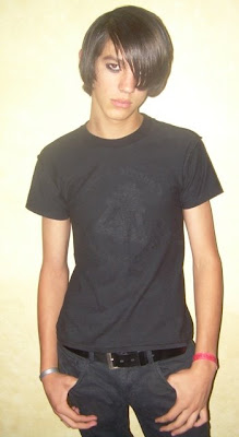
3) EMOS: Ultra sensitive, concerned about global warming, wear tight black jeans, thick red and black flannel shirts for the skinny Canadian lumberjack look. A few wear eye make-up and get tramp stamps.


Emo Music: My Chemical Romance. Yuppie-type emos like Coldplay. Emos pretty much control rock.


INDIES: Emo sub-group that favors sentimental neo-folk music and is outraged when a band sells out. Eclectic dress that borrows from other groups. Music: Tegan and Sara (that's them above, singing "Nineteen"). Song: "How to Save a Life" by The Fray.


4)PREPS: Short for "preppy." They like to look good in clothes. METROSEXUALS: A sub-group within the preps, they're even more concerned about clothes and style (argyle). They're not gay, but some are influenced by gay attitudes.


5) ART SCHOOL HIPSTERS: Tight black jeans, 80s Rayban sunglasses, Hair over half the face.


When hipsters smoke, they smoke bidis (beedis?), a type of expensive, bad-tasting, hand-rolled, fruit-flavored, herbal cigarettes that come from India. Hipsters feel superior to emos, shop at "American Apparel."


6) GAY: Preppy, shop at Abacrombe & Fitch.

7) GOTHS: Tight black jeans, black everything. Critical, sarcastic, but not as surly as they used to be. Skinny goths shop at Hot Topic, fat goths at Torrid.


8) JUST PLAIN GUYS: tee shirt and jeans. Most guys fall into this category. Here David depicts a just plain guy (himself) encountering what I would call an art school hipster. Me, I like the way the girl is dressed, but it looks like David is critical.


9) NERDS: Cultural or intellectual interests, plain or eclectic clothes.


Well, how did I do? Did I get it right? Thanks to Kali Fontecchio for all the good information (probably messed up and misunderstood by me), commenters Darbyshire and Patrick who turned me on to Indies, and David Gemmill for the great drawings. David should do a book on the LA club scene!

Also, commenters brought up two more categories: Retrophiles (young fogeys into old media), and heavy metal rednecks. I completely forgot about rednecks! That's what happens when you live in LA; you lose touch with what's happening in the rest of the country!