Wednesday, February 25, 2009

THE BEST CURRENT LITERARY NOVEL?


I've said before, "The Hippopotamus" by Stephen Fry is the best current literary novel that I know of. You could argue that this is faint praise given the sorry state of novels nowadays, but that would be to deny Fry recognition of his real achievements, which are substantial. As I said, he's the best, and this post is my argument. Here's an excerpt from the book. See if you agree.

A caveat: Fry is gay and if that bothers you, then you may not like the book. To tell the truth, it put me off a little bit. I'm not gay myself and reading stuff like this makes me wince sometimes, but I'm glad I stuck with it. I don't know of any modern novelist who can match this prose. Like all the best writers, the man makes us aware of the startling power of the English language when its used by a first-rate speaker. 

Another caveat: the story is just OK, it's whole reason for existence is to provide an excuse for the beautiful words and scenes.  If you buy the book and don't like the story, don't say you weren't warned. But you should buy the book anyway, just for the words and the characters...they're that good! Better still, buy the spoken word reading of the story by Fry from Amazon UK.  The reading is brilliant!

Finally, I'll just mention that I bought the book used and have had to put up with underlining left there by the previous owner. Also, part of the passage I chose deals with masturbation.  I have no interest in reading about that, so it's here in spite of the subject, not because of it. I chose this passage because it's mostly narrative, which is Fry's specialty.

The scene starts in a bar where a middle-aged guy is drinking to forget that he's just been sacked by the magazine he works for. He's joined by a cousin of his who asks if he'll come to her apartment so she can discuss something serious in private.


Well, that's it! Do you agree on the literary value of the piece? Sorry about the light, less-than- clear text. I need to get a new printer.


Sunday, February 22, 2009

CARTOON ACTING


Well, I gave the talk on cartoon acting at Woodbury on Saturday night, and it turned out great. I made a few gaffs, and had some lapses of taste that appalled the audience,  but taken all in all it was a fun night.


The Chief Presenter, discussion leader, and Master of Ceremonies was Steve Worth. Steve put up some great acting scenes that were so intense that I found myself lost in thought right up to the minute I was supposed to speak. 

The clip immediately preceding me had to do with a tearful, poverty-stricken mother who was about to throw herself and her baby into the river. It turned out to be the best introduction imaginable! The audience was so happy to be relieved of their anxiety about the poor mother that they laughed at just about everything I said, whether it deserved it or not....the perfect set-up for a talk about comedic acting!


After the show I met Margaret Kerry, the actress and dancer who did the live action reference for Tinkerbell in Disney's 50's version of "Peter Pan." She did the voices for Spinner and Paddlefoot in "Clutch Cargo," and even worked for Hal Roach on "The Little Rascals." Margaret was super nice and still beautiful, a delight to talk to.


The earlier part of the day was pretty interesting, too. Lester Hunt, the philosophy professor and author from Wisconsin, and who comments on Theory Corner every time the subject is philosophy or aesthetics, treated me to pizza at Lido's! 


Boy, Lester and I have a lot in common! We agree about so many different things that I was actually relieved when we found something to disagree about. Lester likes Thoreau and I don't. The problem is that he's right about so much else that it's making me wonder if I misjudged Thoreau. I'm really not looking forward to it, but I'm determined to spot read through "Walden" some time in the near future.


After lunch we drove up to Ayn Rand's old house at 10,000 Tampa, which is not far from where I live. Other famous residents of the area were Barbara Stanwick and Marlena Dietrich. We took pictures of ourselves at Nobel Middle School, which is at her old address, and we cruised around the mini-mansions above the area because a commenter to this site once said that the true location of her house was  slightly North of the school. 


Back to acting, I think I'll put all my theories of that type into a xerox-pamphlet that I'll sell on this site. Don't worry, it won't cost much. I just want to be able to call myself an author.


Thursday, February 19, 2009

INTERESTING STAIRCASES!


Thank-you, Thank-you Vincent for sending me these wonderful pictures of staircases, all formatted and ready to go! My computer's been on the fritz for two days now, and suddenly sprang to life a few minutes ago, just when I was ready to jump into bed. Thanks to Vincent Waller I have something I can put up tonight to prove that I'm not dead.

What a pity to have to rush through these photos! I love the idea of having a real tree in the living room (above). It would proably be a delivery system for ants and weevils that want to get into the house, but sacrifices need to be made for the sake of beauty.  Is this tree still alive? I've heard of trees that thrive even when the center's been cut out. 


Very nice (above), but it appears that the steps don't take you all the way up!


A terrific idea (above) for saving space!


Iron railings work great on stairs (above).


Good place to put CDs (above), though I'll bet the owners forget to close the lids and walk on them.


A necessity (above)! Every house needs a built-in sliding board!


Here are stairs (above) that are deliberately hard to use. For such a house I recommend second floor hallways like the one below.....


...hallways (above) that are also deliberately hard to use. 


Holy Cow! Stairs (above) that look like a piano keyboard!


Hmmmm...doesn't work because the book shelves have to be unnaturally deep so they can double as stairs. Interesting thought, though!


Monday, February 16, 2009

I'M SPEAKING AT WOODBURY!


Here's a few of the live action characters I've played on this site in the past year or so, starting with "The Smoker" (above).  Acting is fun, especially on the internet where you're your own boss and can do pretty much anything you want to do.


I'm on the subject of acting because I've been invited by the ASIFA Hollywood Animation Archive to talk about acting at Woodbury University this weekend. I won't be the only person on the bill, so you won't have to stare at my ugly face for the whole night. If you're in the Burbank area this Saturday Night, why not drop in?

BTW, that's "The Upstanding Swiss Mountain Boy" above.


Maybe the whole thing will be a disaster! I don't have time to prepare, so I'll have to speak off the cuff. I've delivered both my best and worst talks using that method, so whether I'll get lucky this time is anybody's guess. I'll just try to have fun doing it, so at least one person present will get something out of it.  


That's Captain Hook in the two pictures above. I did two photo stories about him, and I could easily have done four or five more.  I love that character! 


I stopped doing photo stories and movies for this site after I had an operation last September. Somehow people tinkering around in my innards had the effect of inhibiting my graphic sense. It even attacked my ability to draw for a while, but that's all over now. I'm working on all cylinders again, as if nothing ever happened.


But my photo sense...recovering that has taken months. I think I'm almost back to normal in that regard, and I'm nearly to try some more photo shoots. I'll give it just a few more weeks. 


Just to identify the pictures: The three above are The Card Sharp, The Old Lady and The Nerd.


At Woodbury I'll illustrate everything with pictures. 


I got these poses off the DVD that came with Ed Hooks' book on animation acting. I won't be talking about Ed's theories at Woodbury...like every egoist, I naturally prefer my own theories. 


I hope somebody puts excerpts of some of Hooks' video on YouTube. I no longer have access to the book and I'm dying to be reminded of what the other gestures were.


Here's the address and the time (below).  I've never been to Woodbury before, so I'll probably get lost, just like you will.  Maybe we'll meet each other wandering around in the dark. I met the Iranian filmmaker Marjane Satrapi that way after another ASIFA event. 


ANIMATION SALON: ACTING FOR ANIMATION
Saturday, Feb. 21st 8pm
Admission FREE to the animation community
Woodbury University
School of Business / Fletcher Jones Foundation Theater
7500 Glenoaks Blvd.
Burbank, CA  91510


For the campus map:

http://www.woodbury.edu/s/131/images/editor_documents/8.5.08CampusMap&Directions7.08.pdf


For the location of Woodbury University:

Sunday, February 15, 2009

THE UNDER-RATED RED GROOMS


One of the most under-rated artists of the last half century is Red Grooms, who reached his peak in the 7os.  I didn't pay much attention to him until recently because I thought he couldn't draw, and was too sloppy. That was really stupid of me because, more than any other painter of his time, he managed to encapsulate and comment on the spirit of his age.


His life-size, walk-through subway sculptures (above) are some of the best art done anywhere in the 70s.


This (above) is a great depiction of a New York subway station! The subway car has no wall facing our side so we can see the people inside. Wearing their white disco boots, weird hair-dos, Superfly hats, etc., they calmly ride a marvel of engineering back to their homes where they can relax with  "The Beverly Hillbillies" and a TV dinner. 


Grooms was an alert to the contrasts that you find on the streets of American cities. It's a combination of exuberant and vibrant life with gritty technology and bizarre architecture.


How did grooms do it!? You can fault his drawing, but I don't think anything approaching realism could have captured the claustrophobic, funky, ugly but beautiful feeling of the urban street (above) in those times. 


Actually, I think Grooms is a good draughtsman. Two commenters, Stephen and Anonymous, said that his drawing style reminded them of Paul Cadmus (above). You could add Reginald Marsh and Robert Crumb to the list. Hans says the pictures remind him of Ralph Bakshi's style.


He frequently portrayed vast panoramas and drastic perspectives (above) on stand-up brick shapes.


Here's (above) a Grooms deli. Somehow he managed to get across how much fun it is to watch people and talk to friends in a busy, big city restaurant. He even calls our attention to the idea of vinyl padded booth seats, and formica tables which are two of the over-looked delights of modern living.  They're probably an American invention.


Here's a New York bohemian bar. Boy, does it look inviting! Grooms is accused buy his detractors of dwelling on the grotesque, but just as often his work is a love letter to the city he obviously has great affection for.


He did a lot of bookstore pictures. He wisely realized that books and ideas are two of the engines that make modern cities so much fun to live in.


Wednesday, February 11, 2009

GYPSY ARCHITECTURE


My entire knowledge of gypsies comes from old black & white, Hollywood werewolf movies. In those movies gypsies dress flamboyantly, are superstitious and quick to re-act to insult, and are wanderers who travel around in beautiful covered wagons. Well, I was partly wrong.  An increasing number of them aren't wanderers anymore.


Thanks to the enlightened tolerance of Romania and Moldova, the gypsies in those places often have permanent houses. Some of the gypsies are even rich and can afford custom-made villas and mansions.  A book called "Gypsy Architecture" documents these upscale neighborhoods where each house is built gypsy-style, with turrets, tiles, and layered rooftops (above). The style mixes Indian, Turkish, and even Chinese.


I'm really happy for the gypsies. Finally a place of their own! I read that very often the rich owners won't live in them.  The rooms are all furnished, and the appliances work, but the purpose of the house is impress people, and living in them would just get them dirty. Better to keep them pristine, as showpieces. The whole family sleeps outside. 
 

Boy, those columns on the clover-leaf porches look like ones you'd see in India!


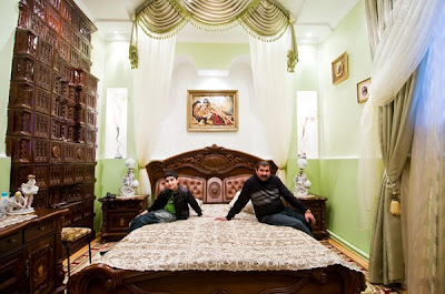
A few interiors, courtesy of Anonymous.  I don't know what to make of these shots. There's a huge kitsch element here, but there's also a sincerity that commands respect.


And imposing fireplace (above) combined with a strangely vacant room. 


A high ceiling (above) combined with an unconventional color scheme.


Definitely different (above) than what I'm used to seeing here! I wish I could go to Romania and see these rooms for myself!