Sunday, May 10, 2009

THE WEIRD WORLD OF BOOK COVERS


It's hard to imagine now, but at one time book covers were called "dust covers," and were thrown away as soon as the owner got the book home. People liked the look of leather bound books on their shelves. Some people still do and they'll pay premium prices to have uncovered leather-bound editions of their favorite novels.
 
Since it was necessary to put the name of the book on the dust cover, publishers would sometimes indulge in mildly fancy lettering or woodcuts.  The rule was that the dust covers had to use course paper, be cheap,  and be monochrome.


What changed all that was the proliferation of posters, especially film posters. Publishers reasoned that if posters could sell films, why couldn't they sell books?


For a while book covers did what film posters did and tried to sell personalities.  That was a mistake. Books and films are different media and have to be sold different ways.

Here's (above) a cover that attempts to sell "Too Much of Water" by fixing a visual image of the heroine in our minds.


Here's (above) an attempt to sell the same book by focusing on the idea of murder on the high seas at night.  Surely this is the cover that really sold the book.


Publishers continued to  put personalities on the covers (above) but it generally didn't work. I say "generally," because it worked for Doc Savage and Harry Potter and a handful of others.


The James Bond books (above) finally settled on a generic handsome man seen at a distance, allowing the reader to fill in his own specifics. The reader was allowed to imagine the specific character.


Large art departments arose at all the major publishers. The people who worked there cultivated an image of mystical seers, who had a mysterious sixth sense for what would sell. The front office cut them a lot of slack and authors were seldom consulted about what would appear on the cover. 


Genre novels (above) were the easiest to make covers for.


It took a while to figure out what kind of covers fit modern literary novels (above). The solution, when it came, was fascinating. Since most new literary books portrayed their characters as victims and anti-heroes, the covers would portray people who were out of focus, as if viewed through tears. The lettering was jagged, as if the book were written by the trembling fingers of a traumatized sufferer.


A variant on this was the deliberately under-stated, thin line style (above) which appealed to New-Age readers. I'm guessing that the idea was to flatter the reader who perceived of himself himself as a delicate thing, a contemplater of nature and not a purveyor of what he considers evil smoke-stack industries. 


Here's (above) an interesting variant on the idea that a cover should sell the mystery, not the personality of the crime solver.


The Dell "Keyhole" symbol (above) on the map covers was a nice touch. They should resurrect it.


Magazines gradually phased out illustration and replaced it with photography. The book cover people tried this too, but to no avail. Buyers of fiction still preferred illustration. I'm glad they did, but I wonder why. 


Of course, there was the occasional photo cover (above), even on paperbacks. Some of them sure pop out!


Photos currently dominate non-fiction covers. The cover designers still attempt to appeal to the  unconscious yearnings of their readers.  Here the reader is flattered by the association of reading with high culture and timeless architecture. The print is low-key and seems to say, "We readers may be quiet and unassuming, but we make the world work, so how about some respect!?"


English book covers (above) were among the worst in publishing. Why that was, I don't know. 


Finding the right cover for a literary novel like "Catcher in the Rye" can be tough. Here's (above) a cover, maybe by Fletcher Stone Martin, in the scratchy sensitive style. 


The first paperbacks attempted lurid realism (above), a style I usually like, but in this case it didn't fit the subject.


Another scratchy cover (above), well executed but it doesn't communicate the feel of the story. 


Finally the book was successfully issued in plain red, the cover of Caulfield's hat. The publisher threw in the towel when he realized that he'd never find a picture that captured the flavor of the novel. 


I'll close with a couple of examples of the eccentric but always interesting cover style of Victor Gollancz. 


Gollancz was a radical left publisher (he published Orwell) who defied the common wisdom by making chatty covers without pictures. Most were yellow because that color read best in railway terminals. Gollancz must have worked closely with his authors because all the books of his company that I've seen have a common author's ethos, that of a friendly, creative, and passionate man who's eager to engage in argument about subjects that most people never think about.

I have a few of his books. One is a  book that gives star ratings to the great classics of English literature. What an odd but wonderful thing to do! Another claims that the 17th century was the greatest of centuries, and yet another is a defense of fascism, which attracted a lot of socialists in its early days. I don't have the slightest sympathy for either fascism or socialism, but Gollancz is high on my list of people I wish I could have had dinner with. 

BTW: In my opinion the author shouldn't be permitted to chose the cover unless he has exceptionally good taste and market savvy.  Most authors will chose a picture that conveys what the book was trying to say, and this is sometimes a mistake. The art department, if it's a good one, will add to what the book was saying. They're concerned with selling a lifestyle, something most authors don't care about, but which has tremendous reader appeal.  

Tuesday, May 05, 2009

TAKING A STROLL THROUGH LONDON: 1899


Actually some of the photos are more recent than that, but they're all pretty old. I thought you might be interested to see the city as it looked from the vantage point of a casual stroller, about a hundred years ago.

That's regent Street above. No poor folks there. Employees of the shops often lived in nearby hostels. Click to enlarge.


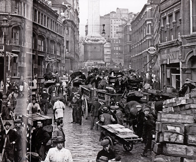
This (above) is Billingsgate, under the shadow of the monument to the victims of the Great Fire in 1666.


Above, The Round House in Chalk Farm, built in 1847.


In the 16th century this tavern (above) was frequented by river thieves and smugglers.


Above, Marylebone Station as it looked in the 1920s. Lack of funds meant the station had to be designed by a staff engineer, and he took a bolts and braces approach. It's still impressive.


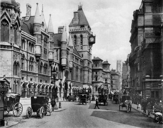
Above, The Royal Courts of Justice. I spent a few hours here, being a tourist and looking in on a couple of cases. This is my favorite spot in London.  What a debt we all owe to English law!


Many, many, many thanks to Kellie for the interesting links, which included this Youtube video.


Sunday, May 03, 2009

NEW ASTRONOMICAL PHOTOS


Boy, it pays to check in on the Hubble and NASA sites every few weeks! I'm constantly amazed at what can be found there. Above a galaxy is being stripped of its spiral arm by another galaxy. The culprit isn't the big galaxy on the bottom, but one of the smaller galaxies higher up in the picture. 


Here's a photo of stars in our own Milky Way, from the region where stars are densely packed and fast moving.


Here's (above) a planet only 25 light years away. It moves in the debris field from some giant explosion.


Here (above) the expanding ring from a nova breaks up into smaller shapes, forming a kind of bracelet.


A happy face in a Martian crater!


Here (above) are opalescent storm clouds on Jupiter.  Click to enlarge.


This (above) is one of the latest and best of all Saturn photos. It's a garden of hurricanes as seen by the Cassini probe. My guess is that all the white dots, even the ones that ones that aren't obvious spirals,  are swirling storms.  Long jet streams of clouds flow through the hurricanes like rivers.  Be sure to click to enlarge. 


Here's (above) a liquid ocean of hydrocarbons on Titan. The picture was taken with radar, which pierced the dense clouds.


One of Saturn's many moons (above).


Above, another moon of Saturn. What made the craters look like that?


Four more moons of Saturn, taken by Cassini. Click to enlarge.


Saturday, May 02, 2009

WHATEVER HAPPENED TO PREFAB HOUSES?


I love the idea of customizable prefab housing, the kind an old lady could build with a screwdriver. The idea is at least a hundred years old, but sad to say, it's an idea whose time still hasn't come.

When I researched this I was surprised to see that Thomas Edison tried to make prefab houses. His idea was to make them out of concrete and build them on the site using molds.


The caption under the picture above tells the story. He sold only eleven of the houses, which were not highly regarded by the people who lived in them.


He even made concrete furniture for the houses!  Above are some concrete phonographs.


Habitat-type prefab condos were attempted in the 60s but the people who lived in them had nothing but complaints, and they got a bad rep. Here's (above) an hexagonal variant. You ordered the hexagon at the factory showroom and a crane put it into place on a frame.


Remember the flying saucer prefabs? You can still buy them.  There were plans to make high rises out of them but I don't think they were ever built. 


The prefab ideal still persists, maybe because people are reminded of it by Legos.


Lego should go into the prefab business and design real houses that look and build just like the Lego toys. I'm serious! Well, maybe the grass should be real.


I like plastic when it doesn't pretend to be something else. Fill large-size Legos with styrofoam for insulation and build real structures with them!


La Corbusier's famous "wine rack" experiment was actually built. A frame was put up and prefab  housing units were slid into place like wine bottles in a wine rack. 


In theory people living in Corbusier's wine rack could change apartments every year, to take advantage of new architectural fashions. The old apartment is simply slid out by a crane, and the new one is inserted, like a file drawer.  I'd be surprised if anyone actually did this.


Where prefab actually took hold was in small backyard structures like tool sheds, gazebos and dog houses.


Some people do attempt to live in these tiny houses. The company that sells the one above advertises that dinners seating 4 or 5 people can be comfortably held there. Of course you probably have to sleep on the table afterward.


IKEA makes prefab houses for the European market, or at least they did when the founder of the store was still alive. That's one of them above. Not very good-looking in my opinion.


The houses are meant to be furnished with IKEA furniture. A consultation with an IKEA interior designer is included with the price of the house.


Maybe 20% of all new Japanese houses are prefab (above). Toyota makes a lot of them.


Here's (above) a Japanese styrofoam prefab. Styrofoam may be the building material of the future, provided a way can be found to prevent the house from blowing away.


Maybe a little old lady with a screwdriver actually could build one of these (above).


Laugh if you want to, but whole communities of styrofoam igloos exist in Japan.


Japanese prefabs come in all sizes and shapes. The one above works fine as a counterpoint to the older houses on the street, but a whole block of houses like that might be a bit much. 

If prefab makes a comeback then the post-modern look will probably get new life. One reason prefab was abandoned years ago was that complicated prefab shapes didn't ship very well. The new architectural aesthetic with its emphasis on simplistic, flat, walls probably ships very well.


That's all I have to say on the subject, but I couldn't help throwing in this off-topic picture of a Japanese home. The builder wanted his homes to look like they were miniature communities, even though they were occupied by single families. The rooms deliberately appear like little separate buildings surrounded by paths and courtyards. Actually they're all one structure. Nifty, huh?


Monday, April 27, 2009

MIKE'S MUSIC


Mike played this for Kali, John and I over the weekend. I'm ashamed to say that I never heard of Sam & Dave before I saw this. Boy, they sure put on a show! I read that these guys actually hated each other. 


The studio band behind Sam and Dave was Booker T. and the MGs. Here (above) they do their own number, "Green Onions." When I get rich I want this to play whenever I enter a room. Imagine everyone dropping what they're doing and making a path for you as you stroll in, cigarette in hand and Rayban Wayfarers (sunglasses) on nose, through the awed crowd with this music playing in the background.

Gee, I wish cartooning was like this. Wouldn't it be great if what we did with a pencil was just as entertaining, just as cool, and just as innovative and soulfull as what Sam & Dave and Booker T. did?