Tuesday, February 08, 2011

BUSTER KEATON CHASED BY ROCKS / CHAPLIN SLOWED DOWN


Hitchcock called the chase the best use of cinema, because audiences love it and it can't be done adequately in any other medium. Since this (above) is the best chase, and if Hitchcock's right about the medium favoring chases, then you could argue that this sequence of Keaton's is the most cinematic ever committed to film.

According to animator Jonathan Lyons, Keaton got the idea when he tested a previous version of the film ("Seven Chances"), and found that the audience laughed when rocks followed him down the hill. He reshot the sequence for a lot more rocks, and the rest is history.


Here's (above) a fuller version of the sequence. It's cluttered with a big ad on the bottom, but the inconvenience is worth it.

The storyline is that Keaton stands to inherit a million dollars if he marries before a certain time. An army of local spinsters catches wind of it, and chase after Keaton wearing bridal outfits. Keaton has to avoid the spinsters and get to church in time to marry the girl he really loves.


Here's (above) a fascinating look at a Chaplin scene, shown speeded up (which is how the audience saw it), and shown slow (which is the way it was actually shot).  What a revelation! I've gotta try this, both in live action and in animation!

Both videos were stolen from Johnathan Lyons' blog, "Comedy for Animators." Credit to Ben Model who originally posted the Chaplin material and did the commentary. Ben has a fascinating film channel on YouTube.

http://www.youtube.com/user/silentfilmspeed

http://comedyforanimators.com/

BTW: Milt Gray told me that A high school yearbook containing cartoons by a 17 year-old Bob Clampett is on the auction block at eBay now.  I don't think Clampett owned this copy, but he was on the yearbook staff, and the book contains lots of his printed drawings. He did these when he was 17! Here's a sample:


The last time I looked, the book was going for $250.00. The eBay address:

http://cgi.ebay.com/ws/eBayISAPI.dll?ViewItem&item=130483480966&ssPageName=ADME:L:LCA:US:1123


Also BTW: Mike F. wrote an interesting comment about Chaplin's partner in comedy, Eric Cambell:
"Eric Campbell - one of the 2 or 3 greatest comic heavies in the entire history of the movies - died tragically in an automobile accident in 1917, which is why he disappears from Chaplin's troupe of regulars after the Mutuals.

Chaplin never really found a suitable replacement; at least none that was Campbell's equal. Frankly, neither did anyone else. Campbell's villains are sovivid, so over-the-top cartoony that the comparison with Bluto is almost inevitable. Likewise, it's almost impossible to imagine that Campbell and Chaplin were pals offscreen (they were). It's equally jarring to see photographs of him out-of-character, smiling and apparently harmless.

Along with Margaret Dumont, Franklin Pangborn and James Finlayson - he's easily among the most memorable live-action comedy foils of all time. BTW, his greatest performance, arguably, is in Easy Street. Once seen, it can never be forgotten."


Sunday, February 06, 2011

JULIUS SHULMAN (PART TWO)

There's so much to say about Shulman's architectural photography. I only scratched the surface last time. Let's take a look at a few more pictures. We'll start with Shulman's take on the Bradbury Building (above) in downtown Los Angeles.


For comparison, here's (above) a color photo of the same building by a lesser photographer. Do you see the difference?

Shulman always managed to find something new to say, even when he shot familiar sites like the Bradbury Building. Other photographers dwelled on the Victorian feel of the building, or on the detail in the beautiful ironwork.  Not Schulman. He saw a sci-fi forest of iron surrounding a great hole in the Earth. Where does it lead? Maybe to the center of the planet. Maybe to a lost civilization.  Shulman prompts us to ask, was the architect manic? Was he a mystic? Was he supremely rational? Should a good architect be all those things or none? The better picture poses questions and hints at stories.


I imagine that Shulman frightened some architects by bringing out aspects of their buildings which they'd have preferred not to emphasize.  The raised deck in this room was needed to give the room a dynamic sweep, but it has no obvious function.

A lesser photographer would have created a diversion, like an acted out cocktail party so we wouldn't ask questions about what the room was supposed to be for. Not Shulman. He presents the room to us in all its ambiguous glory, and invites us to have an opinion about it.  He asks what we think of the notion that a room needn't be defined, that it can challenge us to be creative with it. I like the idea myself.

What's behind that ochre screen? Is that a kitchen? Is this a dining room? Maybe it's a rec room, I'm not sure.  If it's a rec room then it was probably eventually used by its owners for storage...I mean, people accumulate things and most modern architects don't plan for that. That's okay.  Funky storage can be beautiful too. It's a subject that's sadly neglected. I wish I had time to write more about it.


Shulman brought out the playfulness of the best modern architecture. Here's a carport and patio combined. I like the way the patio continues the lines which originate in the house. In some modern houses it's hard to tell where the outside begins and the inside ends.


Wow! Here's a terrific living room, interpreted by Shulman. It's modest and cozy, but it's also dynamic and exciting.  That's a wonderful combination! Today most of the materials can probably be bought at Home Depot...er, or maybe not. That beautiful horizontal beam on the ceiling might be steel.

The people on the patio are casual, the props are simple. The emphasis here is on everyday living. Shulman invites us to speculate on what the quality of our lives and of our thoughts would be if we were exposed to a stimulating physical environment every day of our lives.


For comparison, here's (above) a home designed by an ordinary architect.  A surprising number of architects and contractors are visually illiterate.  Look how awkward and uninspiring the room is. The furniture sucks too, but that's the easiest thing to change. 


Here's (above) Shulman's own house, built for him by an architect friend. I assume this picture was taken from his studio/workroom. It's separated from the house by a small Japanesey courtyard filled with plants and dappled sunlight. Elegant simplicity. Very nice.


Schulman was proud of his garden (above). Over the years he planted anything that took his fancy, wherever there was a free spot. He planted seeds from things that he ate, and even had a giant sequoia growing in there. After decades passed he had a unique forest, right outside his window. What a guy!

BTW: In a comment Jonathan Lyons said he lives in this kind of house and it's cold and noisy.  Fascinating! This is the first feedback I've ever gotten from someone who actually lives the modernist dream. I should mention that Jonathan has a really nifty site called "Comedy for Animators." Check it out:

http://comedyforanimators.com/

Friday, February 04, 2011

FRENCH OMELETTES (OMELETS) THE THEORY CORNER WAY


If you already make omelettes then you probably put milk in them, brown them on the bottom, and like them to have a uniform texture. That's okay. That's "country style," and if it works for you, why change?

Me, I prefer to eat what the brick throwing radicals, and nihilist philosophers in Paris eat. We sophisticates prefer the classical French omelette that I'm going to discuss here. Those omelettes don't brown on the bottom, not even slightly. They're never made with milk, and they're not uniform in texture. They're not even completely cooked. Here's how they work:


It's best to start with a three egg omelette that you make for yourself. If two are eating, then make two separate omelettes, one after the other. Don't make one giant omelette, then split it in two.

I use a good quality 7 or 8 inch (across the bottom) non-stick omelette pan. One famous writer prefers cheap non-stick pans because they heat up faster, but the better pan feels good, and is more fun to use. Anyway, three eggs work perfectly in a pan this size.

Break three ROOM TEMPERATURE eggs and empty them into a bowl. Add a tablespoon of water (not milk), a little melted butter, and some salt and pepper. DON'T SKIP THE WATER. Whip the eggs vigorously with a fork.  IMPORTANT: don't over whip them; stop BEFORE the whites and yolks are completely mixed!


Put a pat of butter in the pan, turn the heat to medium high, and roll the butter around so it also coats the bottom  and sides of the pan. Let the butter sizzle for a moment or two and, when the sizzling diminishes a little, then pour in the eggs. Turn the heat down a little.

Let the eggs sit for 6 seconds then lift the pan a little above the burner and shake it vigorously back and forth while prodding the sides and middle with a rubber spatula. If the pan smokes then lift it a little higher off the flame. Incidentally, by prodding I mean that you're opening channels for the uncooked, liquid parts of the egg to make contact with the pan. You're also separating the eggs from the pan so they slide easily. Watch the way Jacques Pepin and Julia Childs shake the eggs in the videos below!


The egg will cook fast. At the midway point, when half the omelette is still somewhat creamy, quickly add whatever PRE-PREPARED filling you have. All the filling should be on the half of the omelette that's farthest from you. Remember, LESS IS MORE!  The main taste you're after is that of egg and butter. The filling is just an accent. TOO MUCH FILLING WILL RUIN AN OMELETTE.

BTW: For filling a first time classic omelette I would use only shredded fatty white cheese, mixed with a little a little brandy or sherry, a little salt, and some chopped chives. Put all these fillings in an easy to find  bowl, ready to pour immediately when needed. Stopping to locate anything while you're cooking could result in overcooked eggs.


Now, with the filling poured onto the egg, and the egg still still creamy in parts, you'll want to fold it over and move it onto a plate. It'll continue to cook by itself outside of the pan.  When its on the plate and ready to eat, the center will be creamy like the example in the picture above.


But I'm getting ahead of myself. It's time to describe in detail how to fold and de-pan. Aaaargh, this is hard to convey with words....come to think of it, just watch the videos below to see how this works.  It's not hard, and if you goof it up, the eggs will probably still taste okay.


Finally, with the omelette on the plate, you can add a blush of butter to the top so the chopped, leafy spices and salt you're about to put on won't fall off. Which spices? According to Pepin they are: chives, basil, parsley, dill, tarragon, and chervil leaves.


My supermarket doesn't carry chervil, so I can't comment on that. Tarragon is expensive. I use it, but it doesn't add much.  Dill and parsley work great. In my opinion the most important of Pepin's spices are chives and basil. Fresh chives come in a plastic carton that sells for $1.80 at Trader Joe's. They have a subtle flavor, so chop enough to make an impact.

I think that's it...did I leave anything out?


Oh, yes..... It's a good idea to have toast and jam, or potatoes, or salad, or white wine, or whatever you intend to take with the omelette, already made or cooked and ready to consume when the omelette is done. You'll want to eat the omelette as soon as it's delivered to the plate!

I'll end with some troubleshooting tips:

If the finished omelette is disappointing, you might not have used enough salt. Or maybe you require Tabasco sauce, or maybe you put in too much filling and the taste of that overwhelmed the omelette. Maybe you used milk instead of water, and that made the eggs leathery. Maybe you used one or two eggs instead of three, and so starved the pan.  Maybe you failed to accompany the omelette with a good side dish, or with wine or a good coffee. Omelettes don't taste right all by themselves. They need accompaniment. Maybe you substituted some healthy oil for the butter. Maybe you used...Aargh!... margarine. I hate to say it but that kind of chintzing is a mistake. To enter The Land of Deliciousness you must be willing to risk a heart attack.


I tried a number of internet recipes and in the end I preferred Pepin's way, only with the addition of brandy and a little butter mixed with the raw egg. The only experiment I have yet to try is adding a separately made soft boiled egg over the finished and depanned omelette. That's because I'm curious to see if I can get more "eggy" flavor into the omellete. Have you ever noticed that soft boiled eggs have an intense egg flavor that no other egg dish has?  Wouldn't it be great if an omelette could have flavor that's equally intense?


The two videos I promised:


Wednesday, February 02, 2011

JULIUS SHULMAN: PHOTOGRAPHER

All these photos are by Julius Shulman, the greatest architectural photographer of the 20th Century,  maybe maybe the greatest ever. Shulman lived here in L.A. and a lot of the houses he photographed were in Southern California.

Shulman didn't build these houses, he just photographed them. It's always tempting to imagine that a good photographer just gets lucky, but that wasn't true in Shulman's case. He had a vision which he imposed on his subjects.  Modern architecture for Shulman wasn't only about angles and light, it was about a new sensibility which was light hearted, optimistic, adventurous and intelligent, and which somehow told a story. It was said that sometimes Shulman's photos were better than the buildings he shot.


Here (above) the architect attempted to prevent Shulman from taking the picture because he thought the house wouldn't photograph well in the fading light.  Fortunately for the architect, Shulman did it anyway. 


Shulman loved modern architecture. He loved it so much that, when modern became post-modern he packed up his equipment and quit. He hated postmodernism, and I feel the same way.

Modernism at its best had a heroic, optimistic and pioneering feel to it. Post modernism seems to say, "Look, everything worth doing has been done, so we'll just do modern versions of what the Romans did 2,000 years ago."


Shulman's best work was done in black and white, but he slowly adapted to color a little bit at a time. That diagonal above is based on a sketch by Leonardo DaVinci.


Shulman often favored one point perspective. He liked the way it made details rush out at you, and simultaneously suck you into the picture. Sometimes he completely re-arranged the furniture to heighten the speed effect. Is that blurring on the right side a deliberate attmpt to get movement into the shot?


Just for the heck of it,  I deleted the color from Shulman's picture. Most of it works fine this way, though the black and white drains some of the vibrancy from the right.


Here's (above) a modernist house with a strong Japanese influence. I wouldn't say it was completely practical, but it sure looks good in this Shulman picture. Should houses be practical? Maybe the architect's done his job by creating fascinating spaces that clients can customize later.  What do you think?

Anyway, the drawing on the right illustrates what was wrong with certain modernist houses. When the blinds were open and the walls were transparent, the house looked great.  When the blinds were closed, and the walls were opaque,  the house was reduced to a big, unadorned shoebox.

It's a fixable problem...you just vary the shapes...but some modern architects considered that to be a dilution, a compromise with the old ornamental bias. Well, Shulman's job was to make the houses look good, and you can't deny that he did that.


 I'll end with one more Shulman picture (above)....


...and a picture of the man at his desk. He was in his mid 90s when this photo was taken, and still perfectly lucid and thoughtful.  Get Netflix to send you the documentary about him called, "Visual Acoustics." There's a book by the same name.

BTW: Is that not a tres cool design for a workspace? Oh, what I'd give to have a room like that!

And BTW again: I have lots more to say about Shulman and the vision he imposed on modernism. I'll try to post about him again soon.

Saturday, January 29, 2011

OVERWEIGHT/UNDERWEIGHT

No doubt about it, skinny and fat are funny.  It's hard to make fun of skinny people, though. It's actually fashionable to be skinny now. 

Emos made it hip to be that way. Have you seen the jeans guys are wearing now?


Maybe it was always hip to be thin. I mean, look at Sinatra. He could walk in the rain without getting wet.

 Guys like that probably get beaten up a lot in high school, but the ones who survive have it made for the rest of their lives. 


Girls love skinny guys. Frank needed body guards to fend them off.


Thankfully the gods of comedy have supplied us with overweight people in abundance. The problem is, that they're too easy a target. It's hard to think of a fat joke that hasn't been done before. 


That's why I think stocky is the new fat. There's plenty of stocky people, and stocky is funny. You just know that there's millions of stocky jokes just waiting to be written.


Stocky is everywhere. It's what happens when your body expands in every direction, not just your stomach and hips.


So that's my resolution for 2011: learn to draw stocky.  Revel in it. Try to understand the stocky universe.


BTW: I need to take a few days off. I'll be back Wednesday night, Feb. 2nd!


Thursday, January 27, 2011

POETRY CORNER: THREE NIFTY POEMS


Here's three readings of poems that I think you'll like. The first is a Paul McCartney poem, "Maxwell's Silver Hammer" (above).  Of course that was a Beatles song, but Paul wants it to be remembered as a poem as well as a song, and for good reason...it sounds good to the ear, even when it's spoken.

John Lenon hated this song, which he regarded as one of Paul's "granny" poems. He called it "fruity." I disagree. Paul was fascinated with the English ability to abstract macabre crimes and make them seem somehow cute. The English are a sentimental people, and Paul thought that was worth noting in a song and a poem. He was right.

Anyway, give a listen and try to regard the lyrics as poetry. Here's (below) a print version of the opening:


Hmmmm. The lyrics are written out in a way that makes the cadence hard to decipher if you don't know the melody. I'd have written them the way they're sung, like this:

Joan was quizzical; studied pataphysical
Sci-ence in the home.
Late nights all a-lone with a test tube; Oh,
Oh, oh, oh.


Here's (above) a reading of W. H. Auden's "Stop All the Clocks." Auden dispenses with overt poetic flourish (or wants us to think he does) and speaks plainly and sincerely about the death of a friend. It's very touching.


Here's (above) a dramatic reading of a real breakup letter.  It's poetry of a sort, though you only think of it that way when you hear it read the proper way, as it is here. This would be a hit at a poetry reading!


Above, an unannounced bonus!

Tuesday, January 25, 2011

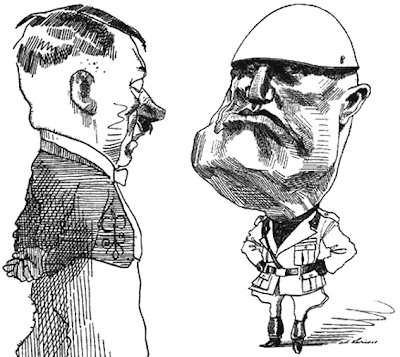
IS FASCISM A GOOD IDEA?

Am I imagining it or is fascism slowly becoming respectable again?  China's a fascist country in some respects, and in my more paranoid moments I wonder if its success is prompting some people to wonder if we should follow them down the same path. It's a creepy thought.  


If you ask college students who their favorite philosopher is, the chances are that they'll say Nietzche. Yes Nietzche, the same guy who believes in the world-changing superman whose morality transcends notions of good and evil. What's with that?

And the news is full of troubling ideas. The latest one for me was a high-ranking official in Britain saying that new discoveries in economics have proved that economic crises are caused by erroneous ideas held by the public, and that the government needs to launch a propaganda campaign to instill the right ideas. There's a sense in which that idea is innocuous and completely innocent, but in my paranoid moments I imagine Josef Goebbels saying the same thing.


Okay, I admit I'm probably too sensitive about this stuff. I'm a classical Enlightenment-era liberal. I believe in parliaments, individual rights, checks and balances, a free press, tolerance of opposing views, private property, competitive business, and all that. Every once in a while I like to be reassured that we're all more or less on the same page in that respect.  


A philosopher you hear more and more about these days is Carl Schmitt, an unrepentant Nazi legal philosopher who believed that any effective government must include an element of dictatorial power within its constitution. It must be able to assert that something is right, just because it is, and is beyond rational argument. He hints that people who insist on arguing the issue anyway, must be isolated and made to appear anti-social.


I'm amazed that an intelligent guy like Schmitt could buy into an idea which is so clearly open to abuse, but Schmitt was a legal scholar and those guys have a narrow focus. They don't like messy things like English common law, with its emphasis on precedent and tradition.  They're looking for fundamental principals. A simplifying assumption that a party or a leader can do no wrong (as long as they don't change their minds), allows them to construct a logically consistent set of laws, and I guess consistency is all they really care about. 


What sets Schmitt apart from other Nazi theoreticians that I've heard about, is that Schmitt frames his ideas in a sugar-coated language that modern academics can relate to. His most famous book, "The Concept of the Political" never mentions fascism.  He simply asks if we desire to keep alive the concept of politics, i.e., a state that has a political point of view, is effective, and gets things done. Well,  everybody wants to see things get done.  When you frame it in a nice way like that, Schmitt's ideas seem downright reasonable.  Except they're not. 

Okay, enough of this! That's the end of my paranoid rant! 


BTW: how do you like these WWII era posters? The black and white picture on the top is an ink wash, isn't it? I'm astonished at what can be accomplished with ink and a little bit of water.