Thursday, March 03, 2011

LIGHTING THE CITY AT NIGHT

Recently Michael Sporn and his friend Bill Peckmann put up a blog post about O. Wilson Link, the great railroad photographer of the 40s and 50s. I've long been a fan of Link's work, and it was nice to see him get some recognition on the internet.

http://www.michaelspornanimation.com/splog/


It was Link's book that made me realize that dramatic Hollywood-style lighting could transform the urban night time landscape. It could make the night more fun to inhabit.

Of course I'm not talking about making night into day. That would be too expensive, and would probably look terrible. I'm talking about selected targets that are near existing nightspots. And I'm talking about dramatic lighting, the kind of thing you see in Film Noir movies.


I like the way night light transforms things. The locomotive above may have looked unimpressive in the day, but at night it appears to be a cyclops emerging from the smoke, maybe to scratch its back on the railroad office. The right kind of dramatic lighting could lead to whole new urban mythology.


The right kind of lighting could extend commercial hours and bring more business to a city. Paris is a good example. It's called "The City of Lights." It got that name in Louis XIV's time, when he ordered oil lamps to be put at all intersections in the city, especially in the shopping districts. The idea was to promote the novel idea of night time shopping, and to promote Paris as a tourist destination.

Louis's innovation was a big success, and was much imitated. It began to dawn on people that the city at night was potentially a thing of beauty and mystery. Night was no longer a nuisance to be endured. Thanks to Louis, it was a resource to be exploited.


And why not? Half our time on this planet is spent on the dark side of the Earth, staring up at outer space (above). We should celebrate the experience, not just tolerate it. Thanks to electric lighting, and the example of Film Noir (and Louis and Link) we have the ability to make the night come alive.  We have the ability to be poets of the urban landscape.


You could argue that lighting shouldn't have to save the appearance of a bland building. Buildings should be built from scratch to look good at night. Balconies, iron fences, trees, tiered sidewalks, alleyways, recessed enclaves, stairs, railings: all cast interesting shadows. An architect should ask himself what combination of features will allow the building to appear differently at different times of day, and at different seasons (above). He should think about what silhouette value it'll have, and how it'll look at night.


Foggy towns have great tourist potential, provided the fog is helped along by the right lighting, and provided that there's night time cafes and restaurants. Towns like this might even even consider fog enhancers. And how about adding plants that thrive only in foggy areas?

Well, I guess its possible to overdo this. If it starts looking fake and contrived, then we've gone too far.


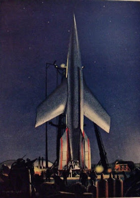
The space program would surely get more taxpayer support if the rockets were lit more dramatically at night. Come to think of it, our rocket exteriors should be designed by artists. No doubt they would be less efficient, but they'd look cool, and that would bring in taxpayer dollars.


Wednesday, March 02, 2011

MY FLYING DREAMS

This is about a recurring dream that I used to have when I was a kid.


It was always about flying. I was obsessed with it. Maybe it's because I learned to walk on one of those bouncy toddler thingies (above) that were all the rage back then.


None of the other kids could fly but I was certain that I would figure it out. When I got a little older I realized that I was wasting my time. People couldn't fly because they're just not built for it. What we are built for is jumping, and if you jump high enough it's just like flying....so I began to dream about jumping.


Finally I managed to make it work, at least in dreams. In dreams I could jump as high as the rooftops.


In my best dream of all, I jumped all the way downtown, into the big city. It was great!


Most people (above) weren't even aware that I was overhead.


Admiring girls (above) waved to me from open windows.


Occasionally (above) I'd stop to rest on a rooftop or flagpole. 


In this dream I figured I'd head out to the seashore to get a slice of pizza. 


I landed on the roof of a beach shack but the lady that lived there got mad and chased me away. 


Wanting to get away from there fast, I did a big running jump into the air way over the sea. It was my biggest leap ever. About half a mile out I came down on a tiny platform (above) on a long pole sticking out of the water.


I carefully sat down, and took in the immensity of my surroundings. 


Overhead the clouds put on a show for me. I saw what looked like a cat chasing a school bus, and a giant profile of Lincoln.


It was spectacular, but I began to feel lonely. I had no one to share it with. 
  

I must have been looking at the clouds for a long time because when I looked at the sea (above) again it was a lot rougher than before. I became aware of the menace posed by the unimaginable volume of the sea water.


Cold winds blew, and it began to rain. The pole swayed back and forth, and I had trouble holding on. A nearby boat was nearly swamped. I knew if I fell into the water there would be no rescue. 


As if things weren't bad enough, night was coming. Somehow I knew that attempting to leap back to land wouldn't work. I had to face the fact that I'd probably never survive the night. 


It all seemed so crazy and pointless.  What meaning does my life have if it can be snuffed out so easily? And why do I have to die out here, where nobody can even see it? All the pain of freezing and drowning...WHY? What purpose does it serve?

This is where I'd always wake up.


Monday, February 28, 2011

FLESHY FACES TO DRAW

How about some faces to draw? I'll start with one (above) that I can't begin to describe. It's fascinating, but why? Maybe it's because the skin is so vivid and so....fleshy. I can't take my eyes off it. I've heard the skin described as an organ. It's more than a covering, it's alive. It gets rid of waste, regulates the water content, electrical properties and temperature of the body, sends out chemical messages that affect sex behavior, and provides all sorts of visual clues about the state of our health...it's an amazing thing.

For most people the skin is just a graphic canvas on which sits more memorable things like the nose and mouth. For some people the skin is the memorable thing.  My guess is that this kind of skin wrinkles sooner than most, but it's also sexy and appealing.


Above, a rectangular face made to seem more so by rectangular glasses. The skin is just background.


Hepburn's high cheekbones (above), prominent chin, thin nose, conspicuous nostrils, and sunken cheeks created a unique look. 


 Here's (above) another fleshy face, this one dominated by smooth and elastic skin, and expressive mouth muscles.   


Here's (above) a blank face on which surface features are attached. The nose, eyes and mouth appear to be glued on. The dark hair accentuates the effect. She'd look better with light hair.

Aaaargh! My computer won't accept more pictures right now. I have more to say about fleshy faces. I'll save it for another time.

Friday, February 25, 2011

MORE ABOUT "THE GIRLS OF MURDER CITY"


I'm still reading "The Girls of Murder City, " but I have other books to read, and it looks like I won't be able to finish it before it has to go back to the library. Too bad, it's a fun book with a lot to say about  journalism and the way Chicago (above) was in the 20s.


My favorite girl murderer in the book is Beulah Annan (above). According to the cover blurb, she was "a Kentucky farm girl turned jazz baby whose wistful beauty obscured an ice-cold narcissism." Her husband adored her, and worked long hours to support her, but she found him boring, and she had a taste for bad boys.


One day one of those bad boys brought a couple of bottles of wine to her  apartment. Her husband was at work so the two sat on the couch drinking and fooling around, and then the guy asked to borrow some money. She gave him a few bucks but her tone might have been derisive because he replied that he might decide to leave her, and then where would she be? As he got up to leave, she grabbed her husband's revolver and shot him dead.


She didn't know what to do with the body so she left it where it was in the middle of the floor and danced to records for a couple of hours. Her favorite song was "Hula Lou," which she played over and over til her husband came home.  The husband was flabbergasted, and he called the police. When they questioned Beulah she calmly confessed to what I wrote above.

The end of the story, you say? Hardly. It was just the beginning.


The murder occurred in 20s Chicago which was the scene of a circulation war between The Chicago Tribune and Hearst's Herald Examiner.  On stories like this one the two papers could be relied on to take opposite points of view. For the Tribune Beulah was a spoiled brat and a dangerous killer. For the Herald Examiner and The American she was the lonely victim of a workaholic husband: a fragile, fairy-like waif from the farm trying to navigate the heartless big city. The scene was set: The Trib and the Herald nose to nose, with a fabulous murder trial and with Beulah Annan's life hanging in the balance.

Geez, I'm running out of space. I'll take this up again next time.

Wednesday, February 23, 2011

THE UNKNOWN CHAPLIN


Steve Worth recently invited visitors to the ASIFA Hollywood Archive site to a get together at his house for a session on how Chaplin wrote his stories and gags. To get things started he showed the first part of a terrific DVD set called "The Unknown Chaplin." It was the part of the set that focused on outtakes from Chaplin's Mutual shorts. If you weren't there...too bad!...you missed a great night!

Well, if you had to miss it, all's not lost. I'll talk about a couple of the points we covered here. The opinions expressed are my own.


Here's (above) a set that Chaplin made for a short called "The Floorwalker." He had this entire set built, including a real escalator, with no script and no idea about what gags he'd do (he never worked from a script when he did the shorts). He just had faith that everything would come together when the time came to film it. And it did. It was a funny film.

He was right about scripts. They're fine for drama, but too often inhibit comedy. Slapstick live-action film is all about you and your talented friends doing what you're enthusiastic about, and what you have a proven knack for. Comedy is fragile. It resists being made from blueprints that were hammered out by a committee.


Here's (above) an unused shot from another short: "The Cure." The set is a spa hotel where the guests drink restorative water from a fountain. There's a big open space for outdoor gags, and a revolving door for...revolving door gags. It's OK, but Charlie felt that something was lacking.


After some trial and error he figured out what was missing....a hole! Putting the water in a hole in the ground was more iconic, and had more opportunities for gags.  What a brilliant idea! In the new version, anyone wanting to enter the hotel had to pass over the hole without falling in. The hole created an enormous amount of tension just by being there.


Back when the fountain was still there, Charlie played a bellhop. Here (above) he laboriously wheels in a big, Type-A, rich man played by Eric Campbell. He tries a few takes where he overshoots and slams Campbell into the wall and into the other guests. I thought the gags were fine, but Charlie thought they were just a rehash of Max Sennett, and this sequence was never used.


After the fountain was replaced by a hole, Charlie had a "Eureka" moment: the best way to maximize the hole was to have Charlie play a swaggering drunk who was always on the verge of falling into the hole. He was right! The bellhop was funny but the drunk was even funnier.

Now at last the main character was a perfect fit for the props. A bellboy can interact with a hole and a revolving door just like anybody else, but a drunk...he has an especially hard time with things like that!


Was it worth all the takes it took to figure this out? Yes! The bellboy made me smile, but the drunk made me laugh.  That's a big difference. If you've ever seen good prints of Chaplin's Mutuals with an audience, then you know what it's like to be surrounded by howls of laughter for an entire film.  Out loud laughter is the gold standard of comedy. It's worth the extra effort. It's worth staying flexible and making changes til you get it right.


Monday, February 21, 2011

BROADMOOR: FORTRESS HOSPITAL FOR THE CRIMINALLY INSANE


The forbidding fortress above is Broadmoor Mental Hospital, where the most dangerous criminals in Britain are kept. Every man in there is not only a murderer, but he's also clinically insane. There are only 250 or so inmates, but it takes a facility this big to handle them securely.


Above, the hospital walls.


The four surrounding towns all have sirens mounted on towers to give warning if an inmate escapes.  The sirens are turned on at a fixed time every week for two minutes to be sure they're in good working order.  School children are drilled in what to do if the siren goes off any other time.


This (above) was one resident of Broadmoor: Graham Young, a serial poisoner. Prevented by his incarceration from murdering more family members, he devoted himself to poisoning other inmates.  He learned how to do it from medical books he found in the hospital library. He figured he had to experiment on other inmates so he'd do a good job on the general public when he was released....which he was after only nine years. Horrors ensued.


Here's another Broadmoor guest: Robert Maudsley, called "Britain's Hannibal Lecter." Killing a truck  driver got him sent to Broadmoor where, like Graham Young,  he turned his attention to other inmates.  He killed several. In one instance he forced another patient into his cell, and he...he....Aaaargh! It's too horrible to talk about.  Suffice it to say that he was nicknamed "The Spoon" after that.

Now they keep him in a glass cage, something like the one that housed Lecter in "Silence of the Lambs." His furniture has to be made of compressed cardboard. When he's taken out to exercise he's  accompanied by six guards. He's reputed to have attempted to bite his mother's face when she came to visit him.

Had enough? Me too! This is giving me the creeps!

Saturday, February 19, 2011

SCHIAPARELLI

I admit that I don't know much about the fashion world, but a couple of weeks ago I thumbed through a giant book (above) about designer Elsa Schiaparelli, and I'm glad I did. She was one of the makers of the modern world.


Her first Parisian designs were heavily influenced by Surrealism. She had a great sense of humor. What do you think of the fur shoes (above), or the hat (also above) that deliberately looked like an upside-down shoe?


After a time she set up a second studio in Britain,  to be close to the wool manufacturers. They were experimenting with all sorts of new weaves and she wanted to be the first to see if anything interesting could be done with them. Seeing that a famous designer had set up shop right across the street, the mill people went out of their way to come up with new fabrics for her. It's a case of art and industry combining for mutual benefit.


She designed funny, over-the-top clothing all her life, but the designs which most interest me (above) are the minimalist, almost military designs she did in the thirties and forties.


She was going for simple shapes that emphasized quality fabrics and careful cutting. I imagine that Calvin Klein must have been influenced by Schiaparelli, only he took the additional step of making this kind of elegance available for a price that most working women could afford.

[Let me digress for a moment to defend Klein against his many detractors. Like a lot of people I was dismayed when Klein turned jeans into a high fashion item. It seemed to defeat the whole purpose of jeans, which was to break down class barriers and promote a youthful, adventurous approach to life. What I failed to realize was that tastes change and jeans were doomed to drop out of sight anyway. By adding design to them Klein gave them decades of additional life on the shelves...and they still functioned as class levelers. No small achievement, that. Klein was a hero.]


Over time Schiaparelli developed "The Knack." It seemed that everything she touched, even scarves (above), were characterized by simplicity and elegance.


I don't think Schiaparelli designed this (above), but it owes a lot to her sense of fun and surrealism. Lots of things we take for granted now began, at least in part, in Shiaparelli's head. One writer credits her with the idea of the fashion show, with it's combination of runway, art, music and long, skinny women. Man, some people just write their names on an entire age!