Sunday, September 11, 2011

MY FAVORITE HALLOWEEN MASKS SO FAR (2011)

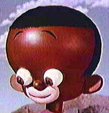
New versions of classic EC and Creepy Magazine masks seem to be in this year. I kinda like the one above.

Niiiice! I think it's (above) made out of wood!


The Crypt Keeper (above)! Very nice!


Variations of this mask (above) have been around since I was a kid. No wonder! It's a classic!


Haw! Above, a sort of Rankin and Bass witch!


Above, a good sidekick for an evil mastermind.


Above, what appears to be drag queen Frankensteins.


Lots of people didn't like the Saw movies. I kinda liked the first one. The mask from the film looks like something Tim Burton would have come up with.


Nice, but I wonder if most people would look as good in this mask as this (above) guy does?
A bit too weird for me (above) , but it's nicely..."executed."


Egad! It's a Big Daddy Roth, "Not Brand Eccch"-type Frankenstein!

I think I'll get one of these foreheads. I might have to travel somewhere incognito!

Thursday, September 08, 2011

THE MYSTIQUE OF RASPBERRY CREPES

Everybody loves crepes. It's a mystery why, because they're as thin as bathroom tissue and couldn't possibly add much flavor to the fillings people put inside them.


They break easy, too. The %X&$# things just won't stay together, and they have to be cooked just right. So why, you're asking, do millions of people all over the world go to so much trouble to make them?

I know the answer, but it's impossible to communicate it with words. Crepes have the unique ability to plant obsession in the mind of their maker. I hate to say it, but you'll have to make a few to see what I mean. If you haven't done that already, then here's your chance. That's my own, well-tested recipe for raspberry crepes below.


A few comments before we start....

First, these breakfast crepes are made to go with a good quality hot coffee. This formula won't work if you try to drink juice or water instead. Think of the coffee as being the most important thing, and the crepe as a flavor enhancer for the coffee. Make the coffee first so it'll be ready the instant the crepes are finished.


Secondly, this recipe uses crepes that you buy from the supermarket. They won't be as good as the kind you could make yourself, but they're still pretty tasty, and they're easier for beginners to use.

Third, I make these with fresh raspberries, but any berry will do, including frozen berries.

Okay, let's start. I keep my crepes frozen til they're needed. No thawing is necessary; the crepes are room temperature and come fully cooked right out of the bag.

Put a crepe on a plate and spread a little berry jam or preserves onto it in a confined area shaped like a 1/4 pie slice. If you're tempted to use cream cheese, don't.  Spreading it will tear the crepe.


Now put a little butter and sugar into a pan and turn the heat to low+. When it's hot and the sugar begins to caramelize, put in the berries...fewer than you think you'll need. Keep turning the berries and very gently press down once in a while to be sure they're cooking. Add a few drops of lemon juice and a couple of drops of vanilla extract. When the berries have turned into into something messy and juicy, that's your cue to take them off the flame and empty them into the pie slice area of the crepe.

Add a little nutmeg, cinnamon, and maybe brandy. Brandy isn't necessary, but if you use it, take care to use only a few drops lest the crepe become soggy and break.

Carefully fold the crepe in half, then fold it again into a triangle shape.  Add whipped cream (I use Reddi-whip because the gas doesn't leak out of their nozzles...) to the top,  and top it off with a single uncooked raspberry.


Now for the final step. On the plate beside the finished crepe pour some good quality melted vanilla ice cream. That's for dipping. If you expect to dip a lot, and require more ice cream, put the melted ice cream into a separate saucer.

Quickly wipe the frying pan with a damp paper towel to make it ready for a possible second crepe and that's it...you're ready to eat!

Troubleshooting: If your crepe falls apart, you put too much filling into it. Either that, or the filling was too soggy. You could fix that by using two crepes instead of one, but that would ruin the taste. I don't know why, but the thinness of the crepe, which causes so many handling problems, is absolutely essential to the flavor.


If the crepe does tear, it's no big deal. It'll still taste good. Some people get around the tearing problem by rolling the dry, unfilled crepe up like a cigar.  They dip the cigar into the soggy ingredients and eat it that way. That's fine, the crepe stays together that way, but for me it's cheating. You'll never understand the mystique of crepes if you do that.

Obsessing over keeping the triangle from falling apart is part of the game. You master it, then you get to feel superior to all the lesser people who can't do it. Millions of crepe eaters agree that this ridiculous show of status is somehow important....and it is.

And, oh yes...don't forget the coffee!

MAKING CARTOONY ROOMS


People ask me what I'll be selling in the Theory Corner Store. Well, my own theory booklets, tutorials and comics, for one thing, but I'll also include a lot of stuff that other people are selling. Sometimes I'll get a commission and sometimes not. Sometimes I'll even give away things for free.

Usually what I'm selling will be featured here first, on this blog. The store is a kind of archive for the stuff I'm selling and write about here, only in the store I'll include prices and contact info.

That's what this article is: some of the items here will turn up in the store when it opens. I don't have my seller's permit yet, and in this case I won't make a cent...but it's fun to write about, so I'm happy.


Anyway, the subject is "Making Cartoony Rooms." Here's a nod (above) to the king of cartoony environments, Cliff Sterret."


Well, to start with, you need a big old comfortable chair, maybe one a little darker than the one above. I don't know how practical these chairs are because they're hell to get through a modern doorway, and they completely dominate a small room. If you could find one that's scaled down a bit, that would be perfect.


This (above) is definitely a chair fit for a cartoonist, but it doesn't look very comfortable.


Wow! A terrific Cliff Sterret rug (above), just made for cartoon people! I wish I could have gotten a bigger picture of it; it's a thing of beauty! It's round, and about five and a half feet across.


It probably needs a black and white cat to set it off.


For draperies...never, ever use pull-down shades on a window without draperies...I suggest a zebra skin pattern, or maybe something cartoony and cheery like this Lucy Cousins design. Or maybe a pattern that dupes the Sterret rug. The internet is full of cool fabric designs.


Sterret was fond of mushroom-shaped lamps (above) on high end tables covered with Charlie brown-type cloth. This example is too small and throws all it's light out of the stem, but the better kind are undoubtedly out there somewhere.


On second thought, I think I'd prefer to get my light from a floor lamp in back of the chair. As a side table I prefer a small pillar (even shorter than the one above) with a statue of Napoleon on it.


Or maybe Dega's dancer.


Or maybe the classic discus-thrower. It reminds me of the statue at the base of the stairs in one of the Betty Boop cartoons.


Here's a Napoleon from The Louvre gift shop. It's pricey. There's gotta be a cheaper version.


For artwork, I prefer one of the big, funny Picasso posters (above) (NOT "Guernica"). Don't frame them, but it's okay to mount them on foam board that's the same size as the picture.


I would also put up a framed picture of Whistler's Mother, the Mona Lisa, or the Venus DeMilo. No substitutes. It has to be one or all of these three.


A small, framed picture of Julie Newmar (above) never hurts.


Maybe a framed picture of Dali (above).


Or Mortimer Snerd (above).


A framed Percy Dovetonsils (above) would help.


Or a Square-framed picture of George Pal's "Jasper."


Or Tex Avery's lady (above), the one who bought Screwy Squirrel. This looks great in a red frame.

Or maybe one of the marker pictures John K. is selling. Check out his blog!


A tasteful vase or two gives the room a good vibe.


Here's some vases that the Memphis design group used to sell. Very Sterret-like, don't you think?


I deliberately refrained from discussing wallpaper and accessories. Funny wallpaper (like thick, vertical awning stripes) scores high on cartooniness, but it makes the room seem small, and geez, what if you changed your mind later?

About accessories: they can be expensive! That doorknob (above) costs a fortune!


Wednesday, September 07, 2011

WATERCOLORIST HARDIE GRAMATKY

Hardie Gramatky (that's his painting, above) was of course, the famous author and illustrator of the "Little Toot" children's books. He also animated for Disney for seven years beginning in 1929, and was a major figure in the California Watercolor Movement.  Michael Sporn just put up a post about his animation, and I thought I'd supplement it with a few words about his painting.

Strangely Gramatky never worked as a background painter at Disney's. He was an animator,  and was reputed to be a pretty good one. Check out his animation (and David Nethery's interesting comments) on Michael Sporn's blog, the Sept. 6, 2011 entry:  http://www.michaelspornanimation.com/splog/

BTW how do you like the juicy, vivid colors here: purple, black and green? How do you like the loose, painterly line?


A lot of artists are more familiar with Gramatky's later work (above), which was full of contrasts and used the white of the paper whenever possible. I don't know who pioneered this style, but over time a large number of California painters adopted it.

You don't suppose Gramatky invented this style, do you? 


My painting teacher would never let any of us use black. What would he have said if he'd seen Gramatky's pictures, which are full of it? The picture above looks like something Milton Canniff would have done. Click to enlarge. 


Gramatky excelled at all the styles he tried, but my favorites were done in the gritty, cartoony, quick sketch method he applied to Depression-era subjects like the one above. 


If I didn't know Gramatky did the painting above, I'd have guessed it was an early painting by Lee or Mary Blair. 


Like I said, Gramatky did the Little Toot books (above). I have early printings of two of them, and I treasure them. I wonder if these were published by Western Publishing, who did the Golden Books line. Western benefited from a lucky accident that delivered first class lithographic equipment into their hands. The company attracted top illustrators partly because artists knew their work would be printed beautifully.


Gramatky was a close friend of urban painter Millard Sheets, and the influence (above) shows. 


I was only able to locate one oil painting (actually acrylic according to Linda Gramatky) of Gramatky's. That's it above.  It's terrific, but  I think watercolor conveyed Gramatky's cheerful, light-hearted personality better. 


Sunday, September 04, 2011

VINTAGE MENS MAGAZINES (EXPANDED)

While searching for the pictures I used in the Philosophy Girls post (the previous post), I stumbled on some interesting men's sleaze magazines from the 50s. These weren't high class mags like Playboy and Esquire, these were the raunchy low class ones that dads all over America hid in their sock drawers.


What struck me about these magazines was how expertly they were put together. They usually combined high and low class elements. You'd find genuinely beautiful and insightful photographs side by side with the lowest sleaze. It seems incongruous at first, but when you think about it that's the way real life is...the sublime and the ridiculous served up in equal portions.

How do you like the picture above, shot in glorious, dramatic, philosophical black and white?


The photos were often shot in small apartments with modern, minimalist furniture. I imagine that a lot of readers lived like that, or wanted to. It was really smart of the magazines to avoid classy locations.


A lot of sleaze magazines avoided the porn laws by selling themselves as art reference. Every issue had to feature some models in classical art poses. I love the example above, which is funny and kitschy, but also artistic in its own way. Click to enlarge.


You would think that the sleazies would favor girls who look kind of dumb and slutty (above). After all, in real life girls like that are more likely to be sexually available.Well, these women are represented in these magazines to be sure...


..but the pearls of greatest price (above) were not exactly slutty girls...they were fallen girls...world-weary, downright evil...fallen girls, like the one above.


These women (above) came off as completely dissipated. They'd not only seen the dark side of life, they dwelled there. It was the only side of life they knew, or cared to know. 


Editors liked to give these girls "Evil eye" poses. 

Were the girls in these pictures really that bad in real life? Who knows? For the sake of magazine sales they certainly had to look like they were. 50s man wanted to feel like he had an adventure when he read magazines like this. He wanted to feel worldly, like he'd come in contact with the seedy underbelly of life and only just barely escaped unscathed. The magazine was selling reader self-image as well as sex.

Interesting, huh?

Wait a minute! Is there room for a Post Script?  Auralynn When, who gave me the link for these photos, says diversity is what made the sleazies so interesting. These magazines contained good girls, bad girls, beautiful girls and plain girls. Some were completely confident in the nude, some were embarrassed to be seen only half naked. Auralynn says that's what made these early magazines so vibrant. A good analysis!