Tuesday, March 05, 2013

ANOTHER MILDRED PIERCE POST

Yes, it's another post on the 40s version of "Mildred Pierce!" I admit it, I just can't get enough of that film. I'll keep watching it til I figure out why I keep watching it. 


Camus called the book's author, James M. Cain, America's greatest writer. I think I can guess why an Existentialist would say that. Cain believes that all people have both a good and a bad side, and for that reason the world is dominated by moral ambiguity and unhappiness. 

 Just for the record, I don't buy Cain's depressing philosophy but he's such a good writer that I give him the benefit of the doubt for the duration of the story.
  

Warning: I give away some of the less important plot elements here. 


There's a shooting at the start and Mildred is made to tell her story to the police. The novel doesn't start that way, but the device is pure genius because it justifies the narration and the flashbacks that follow. It's a nice way to compress a complicated story. 


Mildred's a simple housewife, but her excessive dedication to her snooty daughter brings her into conflict with her husband. It's tragic because they're both good people. 


She leaves her husband and takes up with an amiable weasel. He's amoral but she needs companionship. 

After she leaves her husband and ventures out into the outside world, she encounters four or five major types of people. It's like a medieval morality tale that introduces us, one by one, to the different kinds of false friends and demons that are out there. All have a good side, but all will eventually betray her. 


Mildred gets a job as a waitress and meets a woman who will become her friend. The friend is helpful when Mildred starts her own restaurant, but is also self-absorbed, and isn't proper friend material.


Unable to find a genuine friend, Mildred tries romance with a formerly rich gold-digger. He has a nice side, but..... 


Even the daughter she made so many sacrifices for treats her badly. Unable to find any good in the world she heroically tries to create the good by spoiling her kid. 

Yikes, I have lots more to say, but I'm running out of space. I'll have to continue this another time. 


Sunday, March 03, 2013

AARON PHILBY'S KOREAN CARICATURES

Man, that Aaron Philby is one heck of a caricaturist! I would have thought Koreans would be hard to draw, they're another culture after all, but he makes it look like a lot of fun. 


 I could swear I've seen this couple (above) here in America!


Haw! The girl's body appears to be hidden in the crevices of her boyfriend's face. 


A head like a telephone (above).....very nice!


The subject (above) has immense appeal, and is perfectly set off by those flat, cardboard-type buildings and overcast sky.


At first glance it looks like the boy, ignoring the wind storm that's raging around him, is biting his girlfriend's peanut-shaped head. 


Holy Cow! This guy (above) has teeth like mine! I like the discreet little patch of stubble under the nose, and the heart that's been squeezed out of their union.


This guy (above) is one of those lucky people who are born cool. His girlfriend looks soooooo happy about it.


Couples (above) should always have interlocking heads. It's a symbol of their romance.

That's it for now, but for those who are curious to see more work by Aaron Philby, the man resides here:

http://aaronphilby.blogspot.com/ 


Thursday, February 28, 2013

CARTOON ANATOMY (REVISED)

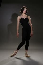
Oh, Man! Wouldn't you kill to have a figure drawing class that included real-life models that look like this (above)? I lined up a couple of draped models like this one the last time I taught a cartooning class, but they weren't very well received. 

Students who were good at drawing traditional models seemed to have had the hardest time adapting to this type. I think they were frustrated because they couldn't figure out how to apply what they'd learned in other classes to comedy. 


Me, I believe in the value of both kinds of figure drawing. I love short, drastic poses like the one above, and I also like slower, analytic posing of the classical kind. 

John K has an interesting take on figure drawing sessions. He believes in long, long poses that give a student plenty of time to analyze what they're seeing and figure out an approach.

Lately I've been drawing poses off the net. Pictures can't substitute for live models, but I always get a good seat this way and I don't bother anybody when I get up to get a cheese sandwich.


I love dead leg poses like the one above. They're funny and they give the illusion that one leg is longer than the other.


Wow! A rare Double Dead Leg Pose!!!!! How often do you see that!?


I never thought about it before, but there's such a thing as abdominal dresses (above). What a gift to cartoonists!


They're sexy, but they're the kind of thing you want somebody else's girlfriends to wear, not your own.


One last word about dead legs: they appear in walks too. Not in Preston Blair's classic walk, but in walks you see on the street. After pushing forward with the rear leg some people don't lift it to the front, they just slide it forward with the toe dragging (or almost dragging) along the ground.


I like the idea of someone having an an assertive, power stance when they're standing still, then a languid dead leg walk when they're in motion. That seems like a contradiction but in real life people often have contradictory behaviors.  

Tuesday, February 26, 2013

SHOULD ANIMATION USE OVER THE SHOULDER SHOTS?

The answer is, no!  A thousand times, "No!" At least not the in the close way those kind of shots are served up in current films. Close like that, the actors are made to seem so sappy, so devoid of context, so self-indulgent. They kill the suspense in a scene because we know the actors aren't going anywhere. The format nails them to the floor so they can carry the scene with face acting alone.


I prefer wider over the shoulder shots like the one above. Made wide like that, there's more suspense. You never know if the actors are going to fight or not, or if one of them is going to bolt and run. The body poses are more nuanced, and the visible background lends a context to the conversation.


Live action films seem to require a variety of shots, including medium shots and close-ups. Even so, if I were a live action director I'd always be looking for opportunities to use full shots like the one above. I love whole-body acting.

Funny comics (above) were the perfect medium for that style.


I don't know why anybody would want an over the shoulder shot in a comedy. The reaction to a gag is often just as funny as the gag. You want to see both at the same time.


If you must use an over the shoulder shot, at least have the decency to dress the foreground figure in wool, as Auralynn is here.


Come to think of it, maybe there is room for an occasional OTS. Here's a video I did which contains nothing but over the shoulder. If the video has annoying stops try clicking on the hidden YouTube icon on the bottom right.

AFRICAN KINGS

Modern Africa is a continent of contrasts. You have to wonder if these are genuine primitive tribesmen living in the outback, or if they're sophisticated city dwellers who are wearing the old-time clothes for some cultural event. 


My admiration for African art knows no bounds, partly because they realize the value of cartooning. Look at the cartoony furniture; look at the cartoony mask behind the king.


All tribes are not equally gifted in their ability to create great clothes for their king. These threads (above) just don't fit right.


The costumes here (above) look Hindu rather than African but the carvings on the throne look African. I include it because it's a reminder that one function of a king is to administer justice. In some cultures only royalty are fit to preside over courts because only they are presumed to have no personal stake in the disputes they judge.

Framed pictures like this one would be a great gift to give to a lawyer. The engine of impartial justice takes many forms. All over the world people crave it, and will make great sacrifices for it.


Probably the king doesn't live in this (above) room. I imagine it's a sacred space where the tribe's totem images are kept. On the other hand, maybe he does live here. I'll assume that this isn't what you'd call a wealthy tribe.


Some tribes are luckier. They're rolling in dough. They can afford to put up their monarch in a sumptuous modern palace like this one (above).


That's all I have to say about kings, but maybe there's space enough to describe a village in Mali (above) that I just discovered. It appears that the village is overpopulated and the people have to live shoulder to shoulder in the confines of a small space.


Talk about crowding...if you sneeze, the next man's toupee falls off. 


The odd thing is that there appears to be plenty of space (above) just outside the perimeter. There must be a reason for the crowding but I can't imagine what it is.

Sunday, February 24, 2013

LEVINE AND KURTZMAN'S "CHRISTMAS CAROL"

Here's a novelty that I didn't know existed before: a "Christmas Carol" parody written by Harvey Kurtzman and drawn by caricaturist David Levine. It appeared in Esquire sometime in the early sixties.

It's not Levine's best work, and Kurtzman's seen better days but, c'mon, any collaboration by talents like these demands a viewing. BTW, click to enlarge.


It's eerie to see Levine doing comics. Lots of famous illustrators came to grief in the comics medium. Evidently sequential storytelling requires a knack that's rarer than commonly supposed.


Then again, you could argue that this is a parody of comics in general as well as of the Christmas Carol in particular. It probably looked a lot better on slick magazine paper than on the net, and it probably made a nice visual counterpoint to the photography in the rest of the magazine.


I'm amazed at how well the formal, standard-font lettering works in the word balloons, and how the borderless panels fit Levine's style so well. Elder did borderless panels for Humbug and the same technique didn't work for him.


Friday, February 22, 2013

HANSEL AND GRETEL

Yikes! I thought I'd Photoshop myself into some Wally Wood artwork, but the result was so unfunny that I think I'll end this experiment here, after doing only one panel. Stupid me for thinking I could compete with Wood. I'll put up the rest of this in a few days.

BTW....Don't you hate trying to draw with a mouse!???