Wednesday, April 10, 2013

THE BEST SHERLOCK HOLMES YET?


I found an Amazon review of this wonderful DVD set that so accurately reflects my own thoughts that I think I'll open with an abridged version of it. The reviewer wrote: 

"I needed another adaptation featuring Sherlock Holmes about as much as I needed a full frontal lobotomy. I patently refused to accept this new BBC adaptation and refused to watch it--but I relented (I'm so weak willed) and now, hat in hand, I repent. This glorious updating is fast, smart, and riveting entertainment. What an idiot I would have been to miss it!"


"Set in contemporary London, "Sherlock" modernizes three classic mysteries. Episode One is "A Study In Pink" and, by itself, it is an absolutely perfect film. The way the murder is introduced, the stellar screenplay, the ingenious play on familiar characters, the droll humor, the emotional resonance, and the technological innovation to update this tale all work in perfect harmony to create an unforgettable re-imagining of Sherlock Holmes." 


"Benedict Cumberbatch turns in a star making portrayal as Holmes. Cumberbatch, with his unorthodox appearance, has always stood out for me--but this is easily his most memorable performance.' 


"But surprisingly, it is Watson who is the real revelation here. Martin Freeman brings incredible depth as a war veteran who is alternately awed and frustrated by Holmes. While the banter is devised for maximum cleverness, there are real characters in "Sherlock." While Richie's cleverness led to a "too cool for school" vibe, the BBC version has actual emotional consequence by fully fleshing out the lead characters....[This] ranks with the best. KGHarris, 11/10."


Well said, K. G. Harris! I'll simply add that this BBC treatment also gives full vent to the philosophical side of Conan Doyle's creation. Sherlock can do what he does, not only because he has brains, but because he's able to screen out distractions and focus entirely on the problem at hand.


Can he do that because he has Aspergers? The screenwriters might have thought so, but I'm not so sure. My impression of Aspergers is that it gives focus but denies perspective. It wastes focus by attaching it to what are trivial ends. That doesn't gel with what we know about Holmes. One of his greatest strengths is exactly that he does know what's important. The screenwriter also has Holmes say that he's a high functioning sociopath, but I don't buy that either.


How much focus any of us ordinary people can give to an intellectual task isn't really known. If we were disciplined to do that from an early age, that would no doubt help, but we all have the suspicion that too much prodding would be harmful. It's hard to know how much is too much. Besides, even if we wanted to do that for our kids, how would we go about it? No institution is geared for that.


One more observation: I like the music in this series. I'm always interested to know what I believe to be the hidden emotional messages in music (sans lyrics), so I ask myself what the Sherlock music is saying. Unexpectedly, it seems sad. What I'm hearing is "You wanted this, and now you've got it. Feel the exhilaration of being truly human and accept the tragic outcome."


The title graphics that overlay the opening music carry a message of their own. First we see (above) the modern London skyline, replete with Ferris wheel. It's very tranquil, though the monochrome adds a dissonant note.


After that we see Piccadilly Square and Soho, and the traffic races ahead in fast motion. That and the montage of scientific close-ups that follow make us feel that we're seeing London as the dangerous place it really is, through the eyes of some extraordinarily perceptive person. Later in one of the stories somebody says something like, "The rest of us shuffle around the city and see only shops and cars. He looks around and sees a battleground." Yikes!


*************

BTW, a friend asked if he should get this collection for his 12 year old niece since one of the episodes involves a dominatrix. My answer was a loud "yes!" The positive messages in this series easily outweigh the negative. Also, twelve is the last age where kids would consider watching or reading something recommended by their uncle. After that they care only about what their peers think. 


Monday, April 08, 2013

RANDOM THOUGHTS ABOUT ANIMATION WALKS

Sometimes a funny story begins with a doodle of a funny character. You like how the character looks and you just have to see what would happen if you gave him a walk.  In the act of doing the walk you see unexpected things that you like, and they redefine the character. When you have a funny character who can do a funny walk you almost can't help but think of funny situations that would justify that walk. Before you know it you have a funny story.


I don't know what this woman (above) was doing in real life, but the pose suggests a  funny walk where the girl leans way back and walks with her hands on her hips.

NOTE: I wrongly omitted the label that would have identified the source of the really interesting photo above. It's from a site called "photocase.com," and the photographer's username is "erdbeersuehtig." I'll put that info back in.


Leaned back torsos are more common in runs...I guess people are more able to accept the  unrealistic weight distribution that way. 

I like this guy's attitude. He runs with his arms close to his side. He takes big strides but looks up in the air, as if he's on an idealistic quest of some sort.
   

Almost any character's going to look good on top of long, red legs like these (above). Doesn't seeing this just make you want to draw?

Let me digress to make the point that tall people are underrepresented in animation. When they're used at all, they're just dim-witted sidekicks for some short guy. Maybe tall people will rebel and then we'll have lots of tall heroes with short, dullard sidekicks. Of course we'd have to have vertical TV sets.


This pose (above) suggests a character who doesn't look where he's running. Open manholes, curbs, and tree trunks are all problems for this man, but he's in too much of a hurry to do anything about it.


Can you really buy a funny walk clock like this (above)? Where do I sign up?


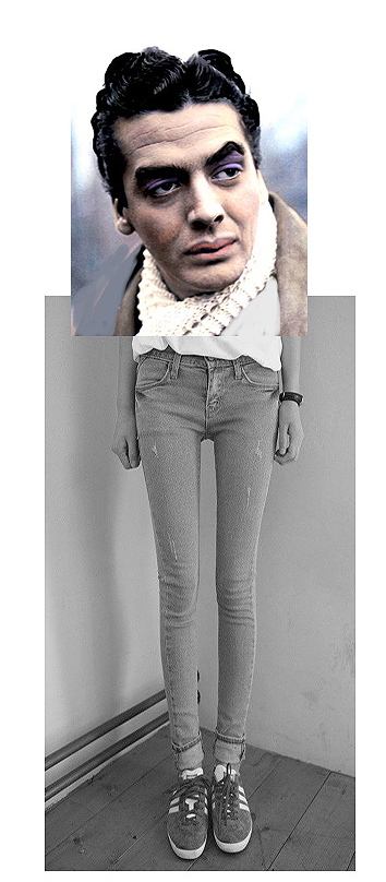
Above, another collage doodle. How would you describe a walk like this?

Here's (above) a walking vehicle. I like the foreground foot in the photo because it seems to imply that the foot comes down in discreet, floppy stages. First the heel, then the arch area, then the pad beneath the toes, then...one by one...the toes, ending with the big toe.


Sometimes an idea for a walk might begin with an idea for an unusual shoe (above).
This man's shoe (above) makes me imagine a guy lying on his back on the sidewalk with his legs doing the walking and dragging the man behind, The man might read a newspaper while his legs do all the work. Or maybe he  has a laptop on his chest and he's catching up on the latest post on uncleeddiestheorycorner@blogspot.com.

Thursday, April 04, 2013

THE ART AND SCIENCE OF SEDUCTION

Sorry ladies! This post is for men only.  Are you alone, men? Is the door to your computer room locked?   Good. Then we can commence.


Well, for starters you'll have to spring for a nice restaurant (above).


You'll want something romantic: candlelight, wine, linen, high prices...and oh yes, strolling violinists...they're a must for atmosphere.


If you're lucky they'll spend all their time at other tables. You have a mission to accomplish, and for that you need to reduce everything else to background.


Up til now you've engaged in idle chit chat, but now the time has come to get serious. When your girl isn't looking, extend your cuff where you've written the secret dialogue I've prepared for you on this blog. Read it one final time to firm it in your memory, then retract it. Don't be scared. Trust me, this dialogue is foolproof, and it'll work even if you flub it. All women, with no exception, are vulnerable to this sort of thing.

At the right moment hold her hand, look into her eyes, and with all the earnestness you can muster, say  the following without deviating from a single word....

YOU: "You know, I have a fantasy about you. Do you want to hear it?

[She says she does]

YOU: "I'm waiting for you in your living room. It's night and the room is dark except for the coals of a dying fire that smoulders in the fireplace. You emerge from the back wearing only a towel. Your inky black hair is shiny with water from the bath, fingercombed back."

[She makes a joke of it, but you continue in earnest, slowly and deliberately.]


YOU: "I want to drown myself in your taste, in your scent, in the feel of your skin. I want you to come to me, and you're unable to stop yourself."


[At this point, you need to...intensify. Never lose eye contact. If you have it in you, deliver "The Look."]

YOU: "In my dream all my focus is on you. I sense that a border has been crossed, and we both know it. I tell you to not to think about reason and logic. Don't think about what's proper or improper..."


[Now lean in.]

YOU: "...just clasp my cheeks between you palms. I tell you that I want to feel the heat of your hands race through my body from my face to my toes. I want to feel the fever of the night! I want to haul you over to me and slant my mouth over yours in a kiss."


[She's struggling to make a joke of what you're saying, but she can't. She's mesmerized.]

YOU (V.O.): "Resist if you think you can, but I know you can't, because there's a longing in you that you can't deny."


[At this point the whole restaurant is eavesdropping. People at other tables are ignoring their food, carried away with what you're saying.]


   YOU: "I tell you to lean a little closer....I want you to take my full kiss."


 YOU: "You stand on your toes and wind your arms around my neck."


YOU: "You burrow your fingers into...the damp hair...on the back....of my.....neck. And then...and then.........."


BAM!!!!!!!!!!!!!!!!!!!!!!!!!


[Her world explodes! Her brain careens around the inside of her skull!!!!!!!!!]


[She upturns the table and leaps across the empty space, smothering you with kisses while tearing at your clothes! The whole restaurant erupts in applause!]

After that...after that......well, it's time to end the post.


BTW: Sorry there's no attribution for the terrific animation at the top. I can't remember where I pulled it from!

NEW TRENDS IN ARCHITECTURE


Reading architect Sarah Susanka's "Creating the Not So Big House" has opened my eyes to what's happening in home architecture now. According to the author the new trend is to customize everything.

 A client that likes to cook might have the kitchen as the central living space (above) and not the living room. In fact, the kitchen might be at the front of the house, with the front door opening directly into it. In the same way any other previously neglected feature can be emphasized and expanded: the homes office or the rec room or even the consevatory.


Here's (above) a home that subordinates everything to...are you ready for this?...the bedrooms! When you enter the house through the front door, this (above) is what you see...the second floor bedroom corridor leading to the over-sized master bedroom in the back. 

Here's the same house, with the same corridor, showing the view of the front door. Everything inside is subordinated to the bedrooms. 

I like this customizing notion, though if the idea is too esoteric the owner might have trouble selling the house. 


This (above) isn't one of Susanka's pictures. I digress to say that I can't help wondering how far this idea of customized houses will go. To living room swimming pools (above)? To indoor stables for horses? 


Anyway, back to Susanka: as I mentioned in a previous post she mixes good ideas with bad ideas. Here (above) she endorses the notion of the arid reading alcove. Geez, that's an ugly space! I hope she doesn't buy into the belief of some architects that the living room is dead. Living rooms are great when they're designed to be used. I use mine constantly.

BTW, catch those ugly white cabinets! Brutalist living room cabinets are all the rage now, and so are freestanding bedroom wardrobes. Whatever happened to closets? Who starts these silly trends?  


Susanka doesn't mention vertical interior gardens which are more and more in evidence these days. I haven't been able to find good examples on the internet, but they exist, if only in magazines. 


 I wonder if indoor ceiling gardens (above) will ever become practical?  They seem to work in restaurants, but those are probably plastic. 


I'm glad that conservatories (above) are making a comeback. They don't cost much to make and they don't have to be enormous like the kind you see in films about English manor houses. They can be tiny alcoves off the kitchen like the one above.
                                                                                                                                                                                                                                                                                                                                                                                                               
I'm also glad that architects like Susanka still believe that the demarcation between inside and outside should be gradual and blurred, and not abrupt like it is in most houses. In the picture above (not Susanka's) the front door is somewhere to the right. You have to pass under a tunnel of trellised plants on the side of the house to get to it. I like that.

I'll end by reiterating that Susanka's books are worth taking a look at even if you find fault with some of her examples. She writes to be understood, which is a rarity in her field, and her enthusiasm is infectious.

Monday, April 01, 2013

WHY SOME WOMEN SHOULDN'T WEAR JEANS

What do I think most women should wear on casual, every day, non-work occasions? The answer (above) is simple: plain, ordinary house dresses. They look great!


Not so plain ones (above) are okay too, the important thing is simplicity and artfulness. Co-ordinating different tops and bottoms is risky. A dress consisting of a single pattern just works.

Of course you need tasteful design, which is surprisingly common in house dresses, and surprisingly uncommon in other womens wear. Other dresses often emphasize sex which is okay when it works, but how often is that?  The dress above is sexy only in the sense that it communicates the intention of the wearer to be thought of that way, but it doesn't have anything else going for it. It's single focus makes the wearer seem shallow.


 I know what you're thinking: why should women wear dresses at all? Why not slacks or jeans? The answer is that they're terrific, especially for younger girls, but what about the average woman?  Does the 25 year-old above look that great in jeans? Not really. Maybe jeans are oversold.


The idea that jeans are casual wear that you can just slip on and automatically look good in is a myth. Lots of jeans look awkward (above) and don't work with average tops. You can fill a closet with pants that disappoint.


The truth is that about half of all women (above) aren't suited for jeans. You need to be close to your ideal weight to look good in them. House dresses are better at hiding what the average woman needs to hide.


I'll end with a question: why do women shop so much? Why all the money spent on clothes?  I don't know the answer, but maybe it's because they need to shop continuously just to find a few things that actually work. Most non-housedresses don't work, and the women who buy them are always suffering buyers remorse and having to shop again. Women are paying the price for having an unrealistic idea about what makes them look good.