Wednesday, January 01, 2014

HOW CRIME COULD SAVE NEWSPAPERS


That's a real life crime scene above. This bathroom was the scene of a murder.... I don't know the particulars. If you're like me you won't be able to resist staring at it, maybe in the superstitious belief that a location can have a malevolent personality and can be a collaborator in violent crimes. Isn't that what Stephen King was getting at in "The Shining?" 

I covered up the gory part of the photo with scrap paper. That's because I want to demonstrate that even an empty room can be interesting if it's known to be the locale of a crime. Still pictures can be an amazingly effective medium for things like this. A newspaper might devote a whole 20% of a page to an empty crime scene photo like this.

  Newspapers are always looking for a way to stay relevant and one way to do that is to up their game by making their crime reporting more exciting. Big cities are plagued with crime and this is a way to turn a liability into an asset...well, sort of.

   
Newspapers can't compete with TV for breaking news, or with computers for quick summaries, but they're great for pictures people want to study, like the mugshots above. Readers like to linger on the faces of people in the news, even if those people are criminals. We're all interested in life's other side.


Newspapers also have the advantage that line drawings have more impact on pulp paper than on computer screens. I'm not sure why. Maybe the tactile grit of the paper has something to do with it. Maybe McLuhan's theory that imperfect definition increases viewer participation explains it.

I've long believed that newspapers should have an artist sketch what the police speculate happened at a crime scene. Of course the sketch only illustrates a first impression and may be made irrelevant by new facts as they emerge.


Lots of readers are amateur sleuths and they'd appreciate diagrams like the ones above.


Here's (above) a police shootout. No doubt the photographer risked his life to get the picture. Police should allow news photographers the freedom of movement necessary to get pictures like this.


Of course there's always the possibility that exciting crime reporting may inadvertently encourage wrongdoing. To counteract that the paper would generally show things from the point of view of the police. The worst kind of sociopathic career criminals would be treated in print as rats and predators.


Better crime reporting should be supplemented with daily photo essays emphasizing ordinary life in the big city. Here's an excerpt from a Life magazine essay in which a cameraman followed a doctor, a general practitioner, as he made his rounds during the day.


From a different essay here's (above) two women getting ready for a day at the beach. Good photographers can find a lot to shoot, even in surroundings as common as this one.


Sunday, December 29, 2013

HOW WAS YOUR CHRISTMAS?

So how did you fare this Christmas? 'Get all your shopping done?


I used to dread Christmas shopping, but having a camera changed my mind. Crowds are fun to photograph. Unfortunately I can't post my own crowd pictures because they include members of my family, but these pictures I got off the net make the point nicely.


I had a terrific Christmas with all my kids and their significant others present. One of our dinner guests was a special agent with the FBI. We regaled her with questions about the Bureau, one of which was, "What's a special agent? Are some poor, forlorn agents designated as unspecial, disappointingly average agents?" No, it turns out that all agents are called special.

BTW, take a look at that old "FBI 10 Most Wanted" list above. Why don't newspapers carry that list anymore? Surely readers would like to see it. A more exciting reporting of crime would give papers a needed circulation boost.


My kids played a lot of video games while they were here, most of them from an internet game repository called Steam. Their favorite game was "The Stanley Parable (above)."


They were also partial to "Prison Architect. (above)."


I got lots of presents. Here's one of them (above). Can you figure out what it is? A microphone you say? Nope. It's a wine stopper! It's part of a kit that includes a wine thermometer.


Here's another...an elephant-size box of chocolates (above).


And still another....a reprint of a century old-book by Buffalo Bill Cody. It's a great read. I recommend it!


One of the things I gave my wife was a nifty microphone with a USB connector. BIG Mistake! She was certain that I got it for myself, which isn't true, but I confess to hoping that she would lend it to me sometimes. Geez, now I have to make it up to her somehow.


The church service on Christmas Eve was simple but surprisingly moving. The sermon reminded me of Linus's speech in the first Charlie Brown TV special (above).


Tuesday, December 24, 2013

CHRISTMAS EVE WHEN I WAS A KID

I was a kid TV was packed with Westerns. Like every other boy I saw Christmas as a time to load up on cowboy guns to shoot my friends with. But... hmmmm...wait a minute. That's a big subject that would require a whole post. Let me start over again.


Last minute shopping was the norm in those days. You bought most of your gifts in the week preceding Christmas. I did my kid shopping at the local hardware store but my mother liked to go to the big downtown department stores, and she'd take me with her.


The window displays there were the talk of the town. The people nearest the window were invariably kids. No kid near the glass would give up his spot voluntarily so the kid behind had to artfully nudge him aside without seeming to do it.

You did it by insinuating your shoulder into the tiny space between two kids, then a whole arm, then your body, taking care never to look at the kid you were displacing. I was good at it, but no sooner was I in than some other kid would start nudging me aside.


Inside the store the competition for breathing space was fierce. The squeeze was so great and the air so foul that sometimes I had to fight to stay conscious.

On Christmas Eve night we'd decorate the tree. The rule was: do everything in excess. Cover the tree with tinsel and balls til the poor, drooping tree was covered with  sentimental spaghetti. Of course we used the biggest, heaviest, fire-prone lights we could find, the kind that are called "outdoor lights" now. A few people used the tiny lights but they were regarded as mavericks and misfits.


After the tree was decorated we'd get on our coats and walk around the neighborhood looking at our neighbors' lawn decorations. Some people covered their houses with lights. That seems a bit gaudy to me now, but at the time I thought it was the height that beauty could reach. I was awed.


Back at home we listened to soulful Christmas carols or watched variety shows where the celebrity host would take you home to meet his family.


Finally it was time to go to bed, and that's when the stockings were hung. Mine was usually a knitted cloth stocking that was criss-crossed with pesky fibers inside.

Parents liked to stuff stockings with oranges and chocolate coins but on a good year you'd find a Chinese finger trap and a back scratcher. If you were really lucky you might get an Adam's magic trick, like the cup and ball or the sliding drawer that made nickels disappear.


Even going to bed was special on Christmas Eve. My mother would put on starched sheets and take extra care in tucking me in. The rest of the year I'd cringe under the blankets fearing monsters from the closet, but not on this night. On Christmas Eve night I'd lay in the dark listening for the arrival of Santa, ready to stay up all night if necessary.  I probably fell asleep within ten minutes.

Aaaargh! I'm too sleepy to continue. Merry Christmas Everybody!


Tuesday, December 17, 2013

ITTEN'S COLOR BOOK


If you've attended art school in the last 40 years the chances are that your color classes used one of these books (above) as a text. I find that amazing since these books are intended for use by abstract artists who paint flat color fields, a category that doesn't include many artists. How on Earth did these specialized books come to dominate color education? I have a theory that might explain it, but I won't reveal it til the end of the post. 

Anyway, there's more than one reason why these books get used year after year. For one thing, they're cheap. The Itten book comes in a small thin edition and the paperback of Albers' book is almost pocket-sized.


Another reason is that both books have an academic, high-minded tone. Artists seem to like that. Maybe it's because we artists flatter ourselves as being the equivalent of doctors and scientists. We like having a book on the shelf that only the select understand.


Maybe it's because a lot of our ilk used to be Marxists and Freudians and that gave us a taste for the edgy manifesto style those authors use. Itten had a keen awareness of how image can sell a product. That's him above, carefully dressed and looking like the villain in a James Bond film.

Anyway, I had a chance to thumb through the books the other day and here's what I saw.
   

Both books start the same, with an emphasis on color gradients. They both begin with a black and white palette (above) where the values are restricted in different ways.


So far, so good. With the idea of limited black and white choices established, they go on to show how the same kind of limit (above) works for colors, too. You can favor the middle value colors with only a few darks and lights, or favor the darks and lights with only a small number of middle values. That's an interesting idea.


Unfortunately at this point they branch off into the esoteric. Both write more than you need to know about simultaneous contrast. Albers gets into a long discussion of flat, transparent colors layered on top of each other (above). It absorbs a lot of his attention at the expense of concepts that might have been a lot more useful.


Itten got into esoterica of his own. That's his color square pattern above. His book is full of them. The patterns are very pretty but, really, they're just pleasing colors of different types with some pure black and white to set them off. Why devote so much ink to them?


Maybe Itten would argue that setting off colors is no small thing. Look at the target above. It's just the three primary colors set off by black and white, but what a difference the black and white makes. Black and white are powerful activators of other colors.

Now here's the theory I promised: these books get bogged down in trivia and are only minimally useful for art students not specializing in abstraction or flat graphics. I believe the reason the books, especially Itten's book, dominates art schools is that it's so beautiful to look at. Itten's patterns especially look good on white paper with black print. The paintings themselves aren't always that interesting or profound but surround them with black and white as Itten did and they're riveting. Itten's arresting page layouts also help.

In other words, the real contribution Itten made was his re-invention of the art text book. In his shrewd hands the subject of the art book was less important than the look of the book itself.

Interesting, eh?


Sunday, December 15, 2013

ISAMU NOGUCHI

Here's some work (above and below) by one of my favorite American artists of the 1950s: Isamu Noguchi. He's a recent discovery for me. I never heard the name til Auralyn told me about him.

 
He's most famous for the boomerang coffee table (above). Are these still for sale? Imagine: a museum-quality object d'art that you can afford to have in your own living room!


These shapes (above) are drawn on a grid on paper, but it's not inconceivable that somebody's made a mass market cardboard mobile of this. I'll have to look it up.


Wow! I'd love to have a plaster copy of this (above)! That's Noguchi in the foreground.


Here's one that looks like it was influenced by Kandinsky. 


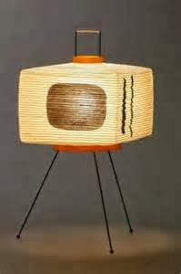
 Noguchi designed a lot of paper lanterns. Here's one that looks like a TV.


Early on the man was a realistic sculptor. Geez, the guy could do everything!


Thursday, December 12, 2013

STILL MORE NEW YORK CRIME PHOTOS

Can you take a few more crime photos? I warn you, it's grim stuff, not for the faint of heart.


We'll start with a crook being transported by the police. He hides his face from the photographer, no doubt because he doesn't want his mother to see the photo in the paper.


Above, Brooklyn teenagers reveal the armor they tried to wear to a rumble.


Above, a homicide victim...killed in his own apartment by a shot through the window. The picture was taken in 1925. 


Across town another man was murdered, also in his own home. Police always take at least one photo from directly above a corpse in the belief that this conveys more information than any other kind of shot. 


Maybe one of the murder victims was killed by one of these men (above). They're professional hitmen. Here they clown around for the camera, maybe in the belief that their lawyer will get them off. In this case they were wrong.


In 1960 John Favara (above, left), a neighbor and friend of mobster John Gotti (above, right), accidentally ran over and killed Gotti's twelve year-old son. A few months later Favara was kidnapped and "chainsawed" to death.


Yikes! A convict's bleak funeral in the mudflats.


Above, another hoodlum being transported by the police. The guy looks contemplative, as if he can see a vision of the horror awaiting awaiting him in prison. Imagine it...years away from the rest of the world, locked up in a cage with violent crazies.


Pictures of criminals were hard to get in the 19th Century. They just wouldn't sit still.


Flashbulb photography changed all that. Here's (above) the wife and child of the man who kidnapped Lindberg's baby. This was taken the day after his execution.

Probably newspapers can't run this kind of picture in our day. In my opinion that's a mistake. The news is made more exciting by pictures like this.


Was this a crime? Maybe it was just an accident. Imagine being a policeman and having to see things like this day in and day out.


*****************************

These photos were sampled from two interesting books: "Shots in the Dark" by Gail Buckland and Harold Evans, and "New York Noir."