Showing posts with label newspapers. Show all posts

Tuesday, May 17, 2016

THE BEST NEWSPAPER FORMAT

By far the most exciting front page newspaper format I know of was that of a weekly British tabloid: "The Illustrated Police News" which ran from the 1840s to 1938.  


The paper was lurid to be sure, but it was immensely popular and it spun off a host of imitators. Of course you could argue that the Police News itself was an imitator.


It was a much more exciting and densely illustrated version of The London Illustrated News (above). It also benefited from traditions laid down by the Penny Dreadfuls and the broadsheet tradition of The Newgate Calendar. Even so, the IPN had a flair that its rivals couldn't match. 


Illustrated news naturally favors the type of news that lends itself most readily to illustration, namely violent crime and sex.


Wow! Now THAT's (above) a front page!


The paper must have had a reputation for being low class. It also must have occurred to lots of people that a more upscale version, covering more traditional news, was needed. It occurred to the chief engraver for the IPN, who started his own illustrated paper called "The Graphic."


The Graphic sold well but it lacked the pizazz of the Police News. It relied on realistic etchings and on photography when that became available. In my opinion that was a fatal decision. 

Photography is too literal, too limited to what the camera can actually see. 


Not only that, but it doesn't reproduce on pulp paper very well. Photography is a fine supplement to illustration but it doesn't do much to help the newspaper that it dominates. In my opinion photography never worked in pulp newspapers and only came into its own in glossy-paper magazines like LIFE.


Monday, January 13, 2014

NOBODY LETS ME TAKE THEIR PICTURE!


Yikes! I misspelled "Photographer" in the headline, and I can't change it. I guess I'm stuck with it.

Wednesday, January 01, 2014

HOW CRIME COULD SAVE NEWSPAPERS


That's a real life crime scene above. This bathroom was the scene of a murder.... I don't know the particulars. If you're like me you won't be able to resist staring at it, maybe in the superstitious belief that a location can have a malevolent personality and can be a collaborator in violent crimes. Isn't that what Stephen King was getting at in "The Shining?" 

I covered up the gory part of the photo with scrap paper. That's because I want to demonstrate that even an empty room can be interesting if it's known to be the locale of a crime. Still pictures can be an amazingly effective medium for things like this. A newspaper might devote a whole 20% of a page to an empty crime scene photo like this.

  Newspapers are always looking for a way to stay relevant and one way to do that is to up their game by making their crime reporting more exciting. Big cities are plagued with crime and this is a way to turn a liability into an asset...well, sort of.

   
Newspapers can't compete with TV for breaking news, or with computers for quick summaries, but they're great for pictures people want to study, like the mugshots above. Readers like to linger on the faces of people in the news, even if those people are criminals. We're all interested in life's other side.


Newspapers also have the advantage that line drawings have more impact on pulp paper than on computer screens. I'm not sure why. Maybe the tactile grit of the paper has something to do with it. Maybe McLuhan's theory that imperfect definition increases viewer participation explains it.

I've long believed that newspapers should have an artist sketch what the police speculate happened at a crime scene. Of course the sketch only illustrates a first impression and may be made irrelevant by new facts as they emerge.


Lots of readers are amateur sleuths and they'd appreciate diagrams like the ones above.


Here's (above) a police shootout. No doubt the photographer risked his life to get the picture. Police should allow news photographers the freedom of movement necessary to get pictures like this.


Of course there's always the possibility that exciting crime reporting may inadvertently encourage wrongdoing. To counteract that the paper would generally show things from the point of view of the police. The worst kind of sociopathic career criminals would be treated in print as rats and predators.


Better crime reporting should be supplemented with daily photo essays emphasizing ordinary life in the big city. Here's an excerpt from a Life magazine essay in which a cameraman followed a doctor, a general practitioner, as he made his rounds during the day.


From a different essay here's (above) two women getting ready for a day at the beach. Good photographers can find a lot to shoot, even in surroundings as common as this one.


Wednesday, November 09, 2011

MUG SHOTS COULD REVIVE NEWSPAPERS!

If newspapers are going to build circulation again, they'll need to show more photos, and few things are more interesting to look at than photos of criminals (above).

't
Dramatic crime photos like the one above are better suited for magazines than newspapers. Newspaper readers prefer something more sedate. They like to see unposed criminal faces that they can study at leisure. Maybe that's because most people want to confirm their belief that they're good at judging people by their appearance.


I like crime portraits that beg to tell a story. Take the one above, for example. The woman looks intelligent. In another life she might have been the District Attorney rather than a prisoner in the dock. How did she end up in jail? Did a man lead her astray? Was she born bad? Is she actually evil? You want to know more about her, and that sells newspapers.


Some criminals (above) look bad through and through. You need pictures of those people, too. Maybe seeing them caught and held up for public display satisfies the part of us that yearns to grab a torch and a pitchfork and storm Frankenstein's castle.


Most newspaper photos are served up in bad resolution, but that's an asset, not a liability. Marshal McLuhan said that old black and white TV was more emotionally involving than modern color TV. The mental effort we were forced to exert in order to construct images from the old TV scan lines compelled us to get involved with what we were seeing. Well, dot printing has the same effect.

Hazy newspaper reproduction forces us to become involved with the pictures. Newspapers are actually a perfect medium for a certain type of picture. By "certain type" I mean that  the subject matter has to be at least potentially interesting, something which current newspaper photos never are.

Saturday, January 17, 2009

WHAT KILLED NEWSPAPERS?


A long time ago I wrote about this subject, and I might even have used some of the same Weegee pictures to illustrate it. If so, don't worry because I have a lot more to say about the subject now, and I don't think anyone will be bored. The subject is newspapers.


The question I want to ask today is, who killed the newspapers? Did the internet do it? Everybody seems to think so, but surprisingly the answer is no, it didn't. The short explanation is that newspapers were dying before the internet got anywhere near as big as it is now. What killed newspapers was TV news, which offered news in film clips for free, and which was more current in its updates.  Advertisers who could afford it simply moved to TV. 

What short memories we all have! This problem was much discussed at the time. I could say more about this, but I have bigger fish to fry here. Remember, this was the short explanation. There's a longer and much more interesting one.


What really killed the newspaper was its inability to adapt to changing times. When the whole population moved to a counter-culture, "Rolling Stone" sensibility in the 1970s, the newspapers retained the same stolid feel that they had in the Civil War. I'm no supporter of the counter-culture, and I almost admire editors for resisting it, but change was in the air and the newspaper people seemed to be clueless about it. Where previous generations could rely on newspapers to reflect some of the sensibility on the street, the 70s generation turned to magazines to do that, and used papers only for the hard news and sports.


I know what you're thinking. It was the fragmentation of America, the lack of consensus, that drove people to the magazines, but that's only partly true. There's no reason why newspapers couldn't have have offered articles catering to different ideas in the same volume. Actually they eventually did that, and it wasn't uncommon to see liberal and conservative columnists on the same editorial page. Really, the whole problem was bigger than simple political diversity. It had to do with the feel of the paper.

Newspapers felt irrelevant. While magazines were talking about The Playboy Philosophy, radical politics, libertarianism, rock and roll, sex & drugs, flying saucers, Small Is Beautiful, talking to the dolphins, the new conservatism, levitating gurus, Black Power, hippie pads, high and low fashion, underground comics, science fiction, the New Journalism, feminism, caricatures, gossip about movie stars, etc., etc....newspapers simply fell back on hard news and sports. What a disconnect! The times were interesting but the newspapers weren't. 


You don't have to be sympathetic to any of these new ideas in order to talk about them, but you'd have hardly known they existed if your only source had been the newspapers. And the format...people after the 60s wanted more intimacy, more pictures. Where were the pictures? 


Clearly by the mid-seventies the newspapers suffered from a severe lack of imagination. Actually the rest of society did too, but we're talking about newspapers here. Did the unions kill the papers by making it difficult to take on new blood? Did dwindling circulations make them timid about experiment? Were newspapers increasingly owned and run by committees? Were the editors too hidebound? How about tax and corporation laws that put boards in charge of companies that were previously run by one risk-taking individual? Did lawyers deliver the deathblow by suing over everything in the paper? Were their human resource departments weeding out aggressive and gifted people who didn't happen to have college degrees? What accounts for the shocking lack of imagination in this field, a field that once included some of the best minds of their generation? Somebody in the know should attempt to answer this.


The pictures I put up here are by a famous newspaper photographer of the 40s and 50s named Weegee. A lot of them were rejected by the papers so he put them in books.  You can see how stupid the newspapers were for rejecting these. This kind of intimate material was exactly what newspaper readers craved, but could only find in magazines. All the newspapers had to do was pay attention to what the magazines were doing to please the public, but they stubbornly refused.  Would this have diluted the news? Not in the least! It's possible to have serious news on page 20 and gossip about movie stars on page 30. There's no contadiction.


Newspapers killed themselves. It was a case of unnecessary death from severe lack of imagination.


Saturday, August 26, 2006

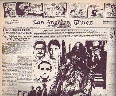
NEWSPAPERS USED TO PUT COMICS ON THE FIRST PAGE!

At least the LA Times did on this Sunday in 1931 (above). It's a good-looking page, isn't it? Only an artist could have created a page like this. Newspapers need artists, not just for cartoons but to do page layouts. They just don't know it.


Compare it to a typical modern page (above). The layout and choice of pictures is uninspired and the color doesn't add anything except cost. I doubt that an artist was consulted.
Normal color photos don't look good in washed-out daily newspaper color. U.S.A. Today was the first daily paper to carry lots of color photography but they were smart. They knew the color news photos sucked so they made a big deal about making a flashy artist-driven weather page with large, solid areas of flat color. Not only that but they put the flashy weather on the back page where every commuter on the train could see it while the owner was reading the side with the bad photos.


It seems like drawings began to disappear from the first page of the Sunday Times somewhere in the mid-30s. Maybe WWII, with its need for diagrams and maps, brought them back for a while but after that they vanished almost completely. Why? I wish I knew. Anybody care to make a guess?