Wednesday, March 05, 2014

TED GEISEL DRAWS HANDS


Geisel is, of course, the real name of the kids book author, Dr. Seuss. I love the way he used to draw hands. I've blogged about this subject before, but I thought it might be worth revisiting if I added photos of my own hands to help make my points.

Geez, this hand (above) is brilliant. It would belong in a cartoon museum if there was such a thing. What would you call it? A caricature of a hand?


Hmmm...well, not exactly.  Real hands (above) don't look at all like the kind Geisel drew. Geisel's hand has long, breadstick fingers and elegant sweeping lines. It's so different than a real hand that "caricature" doesn't seem to describe it.   


Here's (above) another Geisel hand. It looks gnarly and boney and...I'm searching for the word...deep-fried. It's less a caricature of a hand than a rethinking of what a hand is. 


A real hand (above) is a multi-purpose tool that can be used for pointing and a hundred other things. That's all fine and good but Geisel favors the hand that's tailor-made for a task, and so do I. Geisel's deep-fried hand is a specialty tool. It's meant for pointing and nothing else.  It would be no good for holding a spoon and sipping soup. 

In the course of a funny cartoon a character's hand design may change many times....yet, paradoxically, it still must recognizably be the same character's hand. Interesting, huh?


 Here (above) I'm guessing that Geisel just wanted to show how gnarly and ginger root-like a hand could be. Look at the joints and spots and wrinkles and hairs. Look at the weird bend in the thumb. Whatever the hand is pointing to is probably less interesting than the hand itself.


For comparison, here's (above) a real hand. How boring! In order to make interesting hands the Geisel way it might help to ask, "What is a cartoon hand for?" The answer is, it's for spilling and dropping, for scratching an itch, for insulting others with gestures, and for quirky, independent behavior that embarrasses its owner.


Saturday, March 01, 2014

AN INTERNET COURSE ON PLATO


The handsome bust above is of Heraclitus, a Greek philosopher who lived before Plato's time. I put it here because I want people to think it's Plato and be favorably disposed to him, at least for a moment. The guy (Plato) is out of favor now and needs every help he can get.


A while back I talked about Coursera, an internet school which offers free lectures and courses (graded or ungraded) on liberal arts subjects. Well, one of Coursera's latest offerings is a class on three of the dialogues of Plato. I'm not a Platonist but I grudgingly like the man because...Aaargh!... it's hard to finish that sentense. Plato's not a logician like Aristotle. What he has to offer is more subtle, more difficult to articulate. I'll give it a shot here, but I'm not confident that what I say will stand up to scrutiny.


Plato (that's him above) wants to be useful to real people in real situations. He believes in logic but he accepts the fact that real people are bound to culture and tradition and have a kind of in-built romantic bias. In order to reconcile all that he's willing to entertain ideas that are somewhat contradictory, something that Aristotle would never do.


If you were to tell Aristotle that you don't believe in ghosts but would be scared to spend a night in a haunted house, Aristotle might turn his back on you in disgust. Plato, on the other hand would be sympathetic, but...he might require you to at least try to find a unifying principal.


Plato's aware that accepting contradictions can lead to chaos so he emphasizes the need for  character and thoughtfulness. A philosopher should study mathematics so he has a good ground in logic, but he should also sharpen his intuition and be self-critical and pious. Most people aren't capable of this kind of self-discipline, which is why Plato didn't believe in democracy. Neither did his hero, Socrates (above). I do believe in democracy, but it's possible to enjoy Plato without agreeing with him.


Anyway, that's my understanding.  The class only started a couple of weeks ago. The teacher (above) is a little hard to take because he's always injecting his own jokes into the lectures...something Plato himself did. Anyway, I'll stay with him because I'm grateful to him for donating his time. I don't think he gets paid for this.


Friday, February 28, 2014

THE ART OF ANIMATION DANCING


That's (above) the old Chouinard art school in the 30's, the school that later morphed into Cal Arts. It was Walt Disney's idea to combine the Chouinard Art Institute and the LA Conservatory of Music so that different artistic disciplines would be taught under the same roof. It was an interesting idea...cross pollination and all that...but did it work?


One problem was that formal modern dance got very serious more than half a century ago...too serious... and dancers committed to that might not have been the best people to inspire comedic animators.


You have to wonder what would have happened if a showbiz dancer like Bob Fosse had supervised the Cal Arts dance program. Imagine the young Fosse lecturing to an animation class.


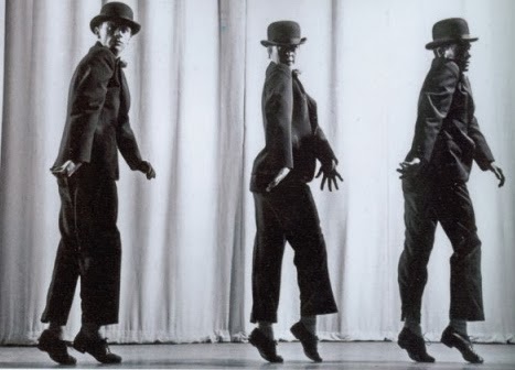
He would have shown them things like the Astaire tilted hat, the Jolson extended arms, face-open palms like a minstrel, clowning pantomimes, hiccuping joints, locking arms and legs that take a pose then suddenly drop it, tiny stepping like Jimmy Durante with knees bent and arms dangling behind...it would have been quite a show.


Fosse believed in keeping the actors moving, in establishing a stylized, confident flow that's never contradicted by a wrong gesture. He was influenced by what vaudevillians used to call "eccentric dancing," and he combined that with ballet.


Wow! What a teacher he would have made! What an influence such a teacher might have had on subsequent animation styles. Hmmmm....if any Cal Arts students are reading this will you write to Theory Corner to let us know how the dance/music/ animation synthesis is working out these days?


Tuesday, February 25, 2014

VIMEO TEST


Untitled from withnail pimple on Vimeo.

I thought I'd test Vimeo, just to see how it works. Holy Cow! They put graphics over the bottom of their videos!  Not only that, but they put that stupid link underneath. What were they thinking?

MORE RECENT ASTRONOMY PHOTOS


Sorry for not posting sooner. I've been very busy, and still am. Just so nobody thinks I'm dead, here's a few recent photos from the "Astronomy Picture of the Day" site. 

Above, that's Dingo Gap on Mars as seen by the Curiosity Rover.


How big is our galaxy? VERY. Our galaxy contains an area equal to that occupied by all six of the galaxies shown. 


Here's (above) the center of a nearby galaxy. The stars are so densely packed, so close together, that a person standing on a planet there would see nothing but extremely bright light in all directions, all day long. I can't even imagine how intense the ambient radiation would be.

If intense radiation was confined to a small area in the very center of galaxies I wouldn't bother worrying about it, but I think it's more widespread than that, and may seriously hamper our ability to explore the galaxy and find intelligent life.


Above, the Earth at night as seen by the International Space Station.


Here's (above) the surface of Enceladus, a moon of Saturn.


Here's something you don't see every day. I'm talking about that white dot near the middle of the picture. It's an ultra-compact dwarf galaxy. It's tiny but it concentrates half its 200 million suns in a radius of only eighty light years. On the average the stars there are 25X closer than in our own neighborhood of the Milky Way.

A super massive black hole at its center leads astronomers to guess that it's the remnant of a larger galaxy that was torn apart by proximity with something else.


This (above) is the Earth seen from from a distant probe. From this angle the Moon seems close enought to Earth to scrape it. This is exactly the way Wally Wood used to draw planets and their moons, way before there was any photo reference for it.


Tuesday, February 18, 2014

FEMALE CRIMINALS OF THE 1920S and 40S

I put up a lot of old-time mugshots lately, and I thought I exhausted the subject, then Jorge sent me a link to more that I'd never seen before. These were police photos of prostitutes taken in Montreal in the 1920s. What a find!

None of them were what I expected. American gangster movies of the period always portrayed prostitutes as high-living Flapper-types (above). After seeing Jorge's pictures I'm wondering if that image was exaggerated. I don't see any Flappers here.


Here's a few of the Montreal pictures. The woman above was a madam in a house of ill repute.


So was this woman (above).


And so was this woman (above). Yikes! Two of these women managers were pretty mean-looking. I wonder if that's because some of their employees were virtual slaves. I don't know if that's the case...I'm just guessing.


Some of the women (above) who were mere sex workers in those houses looked pretty mean themselves. 

Maybe they were madams in training. They look hard as nails.


Some of the workers looked tragic, as if nothing good ever happened to them in their entire lives.


Others looked simple-minded.


By the 1940s the women (above) in the mugshots looked more normal...well, sort of.


Maybe by then more women were in that business voluntarily. 'Just a guess.


What were women in that line of work like before the 1920s? I'm not sure, but this mugshot (above) from 1920s Australia might contain a clue.

BTW: Most of these pictures were derived from a site called "vintage everyday," 1/26/2014

Sunday, February 16, 2014

MILEY CYRUS AND JOHN K./A MATCH MADE IN HEAVEN

http://youtu.be/8yxUlR65E9E
Miley Cyrus's "Bangerz" concert tour opened on Valentine's Day in Vancouver and, to judge from this phone video (below), it must have been something to see.
................

Yikes! Youtube removed the video clip I had above. I was hoping it would show why I liked her in spite of the overly raunchy things she does. She has a sense of humor and  believes in knocking herself out to put on a creative show. Just out of camera range was the animated film John K did as a backdrop.  I saw parts of it while it was being made.  Pret-tee impressive!


Haw! There's the film in the background. Do you see it? It's just behind the giant and dwarf Miley dances with. Kudos to animators Alex and Gabriel.


I wish I knew more about the people who put the show together. The art direction looks spectacular.

Holy Cow! She looks great in costumes.


She even looks good in buck teeth.


John's film is stunningly creative and has to be seen to be believed, but I don't know how fans can do that. It's not a stand-alone music video, it's a backdrop for a band.


 For now animation fans will just have to buy a ticket to the show. Here's the schedule for the rest of this month. It looks like it'll come to L.A. on the 20th and 22nd.


Here's the price guide for the concert at the Staples Center in LA. The prices run from $80 for the pink seats to $1900 (!!!!!!!!) for the yellow ones. If you want to meet and greet Miley that'll run you...are you ready for this?... $2660. Yikes! Major concerts like this are unbelievably pricey! I wonder what sitting behind the stage would be like.